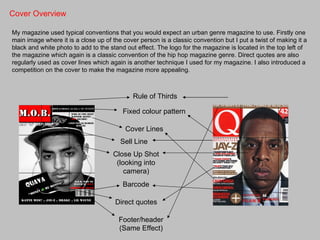
1. In what ways does your
media product use, develop
  or challenge forms and
 conventions of real media
        products?
Cover Overview

My magazine used typical conventions that you would expect an urban genre magazine to use. Firstly one
main image where it is a close up of the cover person is a classic convention but I put a twist of making it a
black and white photo to add to the stand out effect. The logo for the magazine is located in the top left of
the magazine which again is a classic convention of the hip hop magazine genre. Direct quotes are also
regularly used as cover lines which again is another technique I used for my magazine. I also introduced a
competition on the cover to make the magazine more appealing.


                                             Rule of Thirds

                                         Fixed colour pattern

                                          Cover Lines
                                        Sell Line
                                     Close Up Shot
                                      (looking into
                                         camera)
                                         Barcode

                                      Direct quotes

                                       Footer/header
                                       (Same Effect)
Contents Overview

 Like my magazine cover, my contents page uses rule of thirds. The colour pattern of white, red and
 black is continued with the flasher, title and sub-titles. I have described the main features and what
 can be expected to be found on those pages. These pages are also page referenced. I continued the
 competition as again it is an effective method of getting people to read the magazine.


                                          Cover Title
                                      Consistent Font

                                    Continued Colour Pattern
                                     Variety of shots
                                       for images
                                         Listing of
                                   artists/album/tracks

                                     Rule of Thirds

                                    Sub-Titles (Page
                                      Referenced)
Article Overview


My double page spread is a question and answer interview with my cover artist. I used a drop capital to
initiate the article and continued to use it on the answers of questions as this is classic conventions of
magazine article writing. I wanted to separate my double page into two halves to tell two stories from the
artists perspective. In the photos I wanted a clear contrast that is why they are from two different angles
with one coming down on the artist and one looking up at the artist. I also chose to use the column format
as the layout again as this is classic conventions that are used in majority of magazines.


                                          2 Main Images
                                          Separated into 2 parts
                                          Drop Capital
                                          Pull Out Quote
                                          Fixed colour scheme
                                          Columns
                                          Headline
Planning
  • The planning for my cover, contents and article
  was very important as it allowed me to follow the
  conventions of magazine production.
  • By analysing real magazine covers I could see
  what I need to put in mine to ensure that it
  looked as real as possible. For example
  following a clear colour scheme throughout the
  process is something all magazines have.
  • I also prepared drafts for each piece which
  was useful as it was a guideline to follow of how
  I wanted my magazine to look. Even though it
  changed throughout the process for
  improvement it gave me a solid basis to start
  from and what direction to be heading in.
  • With using the theme of urban music as the
  theme for my magazine I wanted to emphasise
  diversity which the music is known for. For this I
  wanted to ensure that the photos I taken were
  all different shots, from close ups, to long shots,
  to high angle and low angle. This helped me
  keep within the theme of the magazine.
  • My questionnaire also helped me with the
  creation of my magazine as I asked people who
  were my intended target audience questions of
  what they would expect to find and I put in the
  magazine what they identified. As I found that
  they like a fixed colour scheme in their
  magazines.
2. How does your media
product represent particular
      social groups?
Representation
• My magazine represents predominantly males of around the age of 16-24 so it covers a broad range of
age groups from teenagers to adults.
• As the hip hop and rap genre is usually associated with gang culture I wanted to highlight the success
stories that come out of the genre. This is where I used my article so show the normality of the life of an
artist. I asked questions such as ‘what is your favourite restaurant?’ and gave responses like ‘Nandos’
this illustrates a normal life.
• Yet I still aimed to give the magazine that thuggish feel to keep in with the genre of the magazine as I
did not what to change conventions of the genre to much where people could not relate to it.
• My magazine contrasts through the positive a negative light that the people in the photos are seen. My
cover photo is quite intimidating and the artists looks aggressive as his looking straight into the camera
which would follow the conventions of the urban genre.
• On the other hand the photos on my contents page are quite up lifting and give the impression of a
positive image is being portrayed.
• Finally the images in my article counter each other as there is one photo when my model looks like his
taking his work serious and the other photo looks more positive with him laughing and socialising. This
co-insides with my original plan as I wanted to separate the article into two halves to show the two lives
to being successful.


                                           Contrast in negative a positive
                                                       images
• Conventional of Hip Hop genre
for the artist to be looking into
the camera in an intimidating
fashion
• He takes up a large portion of
the cover so you know he is
important/successful. Symbols
something quite powerful
• Contrast in dark and light
colours with the colour scheme.
Shows the counter balance
between positive and negative.
• Stereotypical there is a mixed
race artist on the cover as this
ethnicity is usually associated
with the hip hop genre.
• More positive bright colours
in contrast to the cover.
• The model again looks
intimidating with his hood up
in a photo which represents
the hip hop genre.
• The pictures are taken in an
urban setting where hip hop
originated from.
• Again a mixed race
ethnicity of the model goes
with the stereotypical nature
of hip hop.
• Contrasting image angles and
attitudes in the photos, shows
two sides to the genre of the
music making and time away
from music.
• Putting strokes on the text
empowers it all and makes it
stand out which is an aim of hip
hop artists.
• Artists doesn’t look into the
camera on either photo signals
quite a mysterious feel, likes
something is more important.

Question 1

  • 1.
    1. In whatways does your media product use, develop or challenge forms and conventions of real media products?
  • 2.
    Cover Overview My magazineused typical conventions that you would expect an urban genre magazine to use. Firstly one main image where it is a close up of the cover person is a classic convention but I put a twist of making it a black and white photo to add to the stand out effect. The logo for the magazine is located in the top left of the magazine which again is a classic convention of the hip hop magazine genre. Direct quotes are also regularly used as cover lines which again is another technique I used for my magazine. I also introduced a competition on the cover to make the magazine more appealing. Rule of Thirds Fixed colour pattern Cover Lines Sell Line Close Up Shot (looking into camera) Barcode Direct quotes Footer/header (Same Effect)
  • 3.
    Contents Overview Likemy magazine cover, my contents page uses rule of thirds. The colour pattern of white, red and black is continued with the flasher, title and sub-titles. I have described the main features and what can be expected to be found on those pages. These pages are also page referenced. I continued the competition as again it is an effective method of getting people to read the magazine. Cover Title Consistent Font Continued Colour Pattern Variety of shots for images Listing of artists/album/tracks Rule of Thirds Sub-Titles (Page Referenced)
  • 4.
    Article Overview My doublepage spread is a question and answer interview with my cover artist. I used a drop capital to initiate the article and continued to use it on the answers of questions as this is classic conventions of magazine article writing. I wanted to separate my double page into two halves to tell two stories from the artists perspective. In the photos I wanted a clear contrast that is why they are from two different angles with one coming down on the artist and one looking up at the artist. I also chose to use the column format as the layout again as this is classic conventions that are used in majority of magazines. 2 Main Images Separated into 2 parts Drop Capital Pull Out Quote Fixed colour scheme Columns Headline
  • 5.
    Planning •The planning for my cover, contents and article was very important as it allowed me to follow the conventions of magazine production. • By analysing real magazine covers I could see what I need to put in mine to ensure that it looked as real as possible. For example following a clear colour scheme throughout the process is something all magazines have. • I also prepared drafts for each piece which was useful as it was a guideline to follow of how I wanted my magazine to look. Even though it changed throughout the process for improvement it gave me a solid basis to start from and what direction to be heading in. • With using the theme of urban music as the theme for my magazine I wanted to emphasise diversity which the music is known for. For this I wanted to ensure that the photos I taken were all different shots, from close ups, to long shots, to high angle and low angle. This helped me keep within the theme of the magazine. • My questionnaire also helped me with the creation of my magazine as I asked people who were my intended target audience questions of what they would expect to find and I put in the magazine what they identified. As I found that they like a fixed colour scheme in their magazines.
  • 6.
    2. How doesyour media product represent particular social groups?
  • 7.
    Representation • My magazinerepresents predominantly males of around the age of 16-24 so it covers a broad range of age groups from teenagers to adults. • As the hip hop and rap genre is usually associated with gang culture I wanted to highlight the success stories that come out of the genre. This is where I used my article so show the normality of the life of an artist. I asked questions such as ‘what is your favourite restaurant?’ and gave responses like ‘Nandos’ this illustrates a normal life. • Yet I still aimed to give the magazine that thuggish feel to keep in with the genre of the magazine as I did not what to change conventions of the genre to much where people could not relate to it. • My magazine contrasts through the positive a negative light that the people in the photos are seen. My cover photo is quite intimidating and the artists looks aggressive as his looking straight into the camera which would follow the conventions of the urban genre. • On the other hand the photos on my contents page are quite up lifting and give the impression of a positive image is being portrayed. • Finally the images in my article counter each other as there is one photo when my model looks like his taking his work serious and the other photo looks more positive with him laughing and socialising. This co-insides with my original plan as I wanted to separate the article into two halves to show the two lives to being successful. Contrast in negative a positive images
  • 8.
    • Conventional ofHip Hop genre for the artist to be looking into the camera in an intimidating fashion • He takes up a large portion of the cover so you know he is important/successful. Symbols something quite powerful • Contrast in dark and light colours with the colour scheme. Shows the counter balance between positive and negative. • Stereotypical there is a mixed race artist on the cover as this ethnicity is usually associated with the hip hop genre.
  • 9.
    • More positivebright colours in contrast to the cover. • The model again looks intimidating with his hood up in a photo which represents the hip hop genre. • The pictures are taken in an urban setting where hip hop originated from. • Again a mixed race ethnicity of the model goes with the stereotypical nature of hip hop.
  • 10.
    • Contrasting imageangles and attitudes in the photos, shows two sides to the genre of the music making and time away from music. • Putting strokes on the text empowers it all and makes it stand out which is an aim of hip hop artists. • Artists doesn’t look into the camera on either photo signals quite a mysterious feel, likes something is more important.