Style Sheet
Colour Scheme
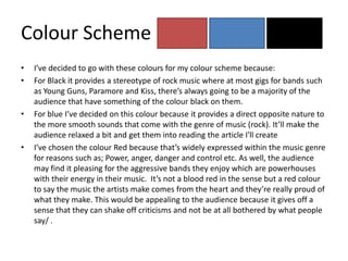
•   I’ve decided to go with these colours for my colour scheme because:
•   For Black it provides a stereotype of rock music where at most gigs for bands such
    as Young Guns, Paramore and Kiss, there’s always going to be a majority of the
    audience that have something of the colour black on them.
•   For blue I’ve decided on this colour because it provides a direct opposite nature to
    the more smooth sounds that come with the genre of music (rock). It’ll make the
    audience relaxed a bit and get them into reading the article I'll create
•   I’ve chosen the colour Red because that’s widely expressed within the music genre
    for reasons such as; Power, anger, danger and control etc. As well, the audience
    may find it pleasing for the aggressive bands they enjoy which are powerhouses
    with their energy in their music. It’s not a blood red in the sense but a red colour
    to say the music the artists make comes from the heart and they’re really proud of
    what they make. This would be appealing to the audience because it gives off a
    sense that they can shake off criticisms and not be at all bothered by what people
    say/ .
Different shades for colour scheme.
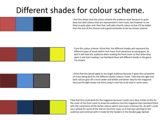
                I feel this shows that this colour scheme the audience want because its quite
                basic but dark colours that are represented in rock music, but however to me
                they’re quite plain and I feel that I will add a fourth colour so that it’ll be bolder
                than the rest of the choices and a good contender to be my chosen scheme.


                 From this colour scheme I think that the different shades will represent the
                 different types of music within rock music from paramore to young guns. As
                 well it will relax the audience when reading the front cover so that when they
                 open it and start reading I can bombard them will different bands in the genre
                 I've chosen.


                I think that this would apply to my target audience because it gives the convention
                of music being dark for the different darker colours I have. I feel that the light and
                dark colours give off a much wider and bolder and better idea for the magazine
                because the light shows not every song in rock has to be loud in some cases.


              I feel that this could work for the magazine because I could use a blue similar to this for
              the cover of the front cover to draw the audience into the magazine then bombard them
              with the convention of the darker colours which rock music is famous for. As well I could
              use a yellow for some of the text on the front cover so it’d be eye catching for the
              audience and continue with it inside for the headers in the Double page Spread.
Potential fonts for article headings
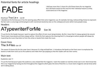
                                                                      I did have more than 1 choice for all of these items for my magazine


 FADE                                                                 but I felt these stood out the most for their individual reasons so they
                                                                      could stand out in the magazine


Masthead: True Lie s size 60
I decided on this font because it has the wearing away effect that some magazines use, for example, kerrang, rocksound big cheese to represent
the fact rock is a very large and broad genre with mainstream bands but also on the underground scene which many people enjoy.
Headers

ATypewriterForMe                                                   Size 36
I'll use this for the header because I want to capture the effect of rock music being timeless. By this I mean that it’s always going to be around.
There’s been many bands and there always will be. I think this font captures the meaning that it’s a broad genre where people will always be
inspired by the music they listen to from the artists or bands that create the music.

Cover lines
The X-Files size 14
The reason ill choose this for the cover lines is because it’s a big and bold font. It introduces the bands on the front cover to emphasise the
bands to make them stick out to the audience and make them eye popping so that the readers will see their names.

Main text
Euphemia size 11
I’ll use this font because it gives the audience a very relaxed feel the magazine. I want the readers to read the article over to let them know that
this is our magazine by having one font throughout the magazine which gives the tone of that this is a music lovers magazine and we know what
we’re talking about.
Examples of articles


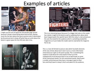
I might use this sort of layout for the Double page spread          This is an interesting layout because it’s a bigger text ratio so the reader
because it shows a band doing what they do best, playing            has a better insight to the band as well as updating them about what
music for the fans where the text to picture ratio is dominated     been happening for the specific band. With the colour’s, text and picture
by the pictures but it shows off what they can write about the      this sets the mood for the audience which is something needed for
band in a given space for the 25% text ratio it has.                magazines so it just makes the reader want to read what the magazine
                                                                    has to say


                                                                  This is a more 50-50 text to picture ratio which has both elements
                                                                  of the two articles above but it sets it out as a more informative
                                                                  article because it gets to the point quickly. This is something the
                                                                  audience could desire for some bands if they’re on the
                                                                  underground circuit because they’re not as well known as some
                                                                  of the mainstream bands. For the mainstream bands, they’d want
                                                                  a smaller article because they have a message to give to their
                                                                  fans and they’d want to keep it short and sweet for the audience.
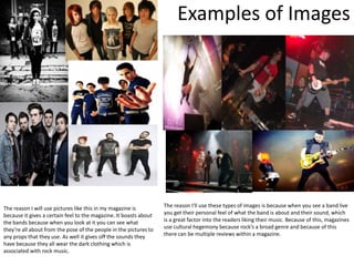
Examples of Images


The reason I will use pictures like this in my magazine is         The reason I'll use these types of images is because when you see a band live
because it gives a certain feel to the magazine. It boasts about   you get their personal feel of what the band is about and their sound, which
the bands because when you look at it you can see what             is a great factor into the readers liking their music. Because of this, magazines
they’re all about from the pose of the people in the pictures to   use cultural hegemony because rock’s a broad genre and because of this
any props that they use. As well it gives off the sounds they      there can be multiple reviews within a magazine.
have because they all wear the dark clothing which is
associated with rock music.

Style sheet

  • 1.
  • 2.
    Colour Scheme • I’ve decided to go with these colours for my colour scheme because: • For Black it provides a stereotype of rock music where at most gigs for bands such as Young Guns, Paramore and Kiss, there’s always going to be a majority of the audience that have something of the colour black on them. • For blue I’ve decided on this colour because it provides a direct opposite nature to the more smooth sounds that come with the genre of music (rock). It’ll make the audience relaxed a bit and get them into reading the article I'll create • I’ve chosen the colour Red because that’s widely expressed within the music genre for reasons such as; Power, anger, danger and control etc. As well, the audience may find it pleasing for the aggressive bands they enjoy which are powerhouses with their energy in their music. It’s not a blood red in the sense but a red colour to say the music the artists make comes from the heart and they’re really proud of what they make. This would be appealing to the audience because it gives off a sense that they can shake off criticisms and not be at all bothered by what people say/ .
  • 3.
    Different shades forcolour scheme. I feel this shows that this colour scheme the audience want because its quite basic but dark colours that are represented in rock music, but however to me they’re quite plain and I feel that I will add a fourth colour so that it’ll be bolder than the rest of the choices and a good contender to be my chosen scheme. From this colour scheme I think that the different shades will represent the different types of music within rock music from paramore to young guns. As well it will relax the audience when reading the front cover so that when they open it and start reading I can bombard them will different bands in the genre I've chosen. I think that this would apply to my target audience because it gives the convention of music being dark for the different darker colours I have. I feel that the light and dark colours give off a much wider and bolder and better idea for the magazine because the light shows not every song in rock has to be loud in some cases. I feel that this could work for the magazine because I could use a blue similar to this for the cover of the front cover to draw the audience into the magazine then bombard them with the convention of the darker colours which rock music is famous for. As well I could use a yellow for some of the text on the front cover so it’d be eye catching for the audience and continue with it inside for the headers in the Double page Spread.
  • 4.
    Potential fonts forarticle headings I did have more than 1 choice for all of these items for my magazine FADE but I felt these stood out the most for their individual reasons so they could stand out in the magazine Masthead: True Lie s size 60 I decided on this font because it has the wearing away effect that some magazines use, for example, kerrang, rocksound big cheese to represent the fact rock is a very large and broad genre with mainstream bands but also on the underground scene which many people enjoy. Headers ATypewriterForMe Size 36 I'll use this for the header because I want to capture the effect of rock music being timeless. By this I mean that it’s always going to be around. There’s been many bands and there always will be. I think this font captures the meaning that it’s a broad genre where people will always be inspired by the music they listen to from the artists or bands that create the music. Cover lines The X-Files size 14 The reason ill choose this for the cover lines is because it’s a big and bold font. It introduces the bands on the front cover to emphasise the bands to make them stick out to the audience and make them eye popping so that the readers will see their names. Main text Euphemia size 11 I’ll use this font because it gives the audience a very relaxed feel the magazine. I want the readers to read the article over to let them know that this is our magazine by having one font throughout the magazine which gives the tone of that this is a music lovers magazine and we know what we’re talking about.
  • 5.
    Examples of articles Imight use this sort of layout for the Double page spread This is an interesting layout because it’s a bigger text ratio so the reader because it shows a band doing what they do best, playing has a better insight to the band as well as updating them about what music for the fans where the text to picture ratio is dominated been happening for the specific band. With the colour’s, text and picture by the pictures but it shows off what they can write about the this sets the mood for the audience which is something needed for band in a given space for the 25% text ratio it has. magazines so it just makes the reader want to read what the magazine has to say This is a more 50-50 text to picture ratio which has both elements of the two articles above but it sets it out as a more informative article because it gets to the point quickly. This is something the audience could desire for some bands if they’re on the underground circuit because they’re not as well known as some of the mainstream bands. For the mainstream bands, they’d want a smaller article because they have a message to give to their fans and they’d want to keep it short and sweet for the audience.
  • 6.
    Examples of Images Thereason I will use pictures like this in my magazine is The reason I'll use these types of images is because when you see a band live because it gives a certain feel to the magazine. It boasts about you get their personal feel of what the band is about and their sound, which the bands because when you look at it you can see what is a great factor into the readers liking their music. Because of this, magazines they’re all about from the pose of the people in the pictures to use cultural hegemony because rock’s a broad genre and because of this any props that they use. As well it gives off the sounds they there can be multiple reviews within a magazine. have because they all wear the dark clothing which is associated with rock music.