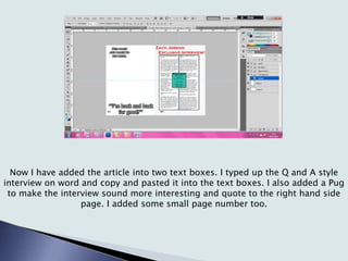
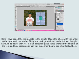
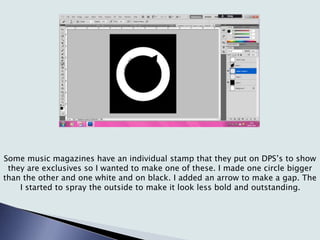
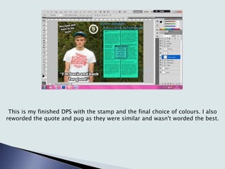
This document summarizes the process of laying out a double page spread (DPS) for a music magazine. It describes adding gridlines, outlining boxes for text and images, and planning the page layout. It then discusses filling in the text boxes with an interview, adding a main photo, experimenting with colors, and creating an exclusive stamp to brand the DPS. The finished DPS includes the stamped branding and finalized text, quote, and colors.
The document describes the process of designing a double page spread (DPS) for a music magazine. It discusses planning the layout with gridlines, adding outlines for text boxes and a photo, typing the interview content, experimenting with colors, and creating an exclusive stamp to brand the DPS. Minor tweaks were made to improve clarity, such as changing the background and rewording some text.
The document summarizes the draft process for a music magazine double page spread interview layout. Over four drafts, the designer tested different formatting choices like justified text columns, pull quotes, backgrounds, and added elements like page numbers, introductions, titles, and photos. The final draft incorporated minor tweaks like an outlined title, text color changes, and a red bar to improve the overall look and readability of the spread.
The document describes the process of designing a double page magazine spread. Key steps included:
1) Adding the title, subheading, and byline to establish the layout and size of the spread.
2) Incorporating the article text using different fonts, colors, and a pull quote, with a transparent background image.
3) Adding the magazine logo and centering the band image on the second page to structure other elements.
4) Positioning the subheading, pull quotes, and smaller images to complete the spread.
The document describes the process of creating a magazine contents page. Key details include:
1) A text box was used to write the magazine name in the same font as the cover but in a different color to match the background.
2) Section headings in capital letters and red were added, along with red rectangles to make the headings stand out.
3) Numbers were added to help readers locate sections easily using an elegant feminine font for contrast.
4) Headings and article details were styled differently for overview and more information.
5) Two black and white images of the same person from different angles were added at the bottom with enhanced contrast.
This document summarizes a student's process of designing their magazine from initial concepts to the final product. It shows early experiments with layouts and designs for the front cover, contents page, and double page article spread. Feedback was gathered to refine the designs. The final front cover incorporated a preferred photo and layout. The contents page included more photos within two facing pages. The double page spread featured text molded around the background photo while maintaining the color scheme. Screenshots demonstrate the layers and fonts used to create the magazine.
The document describes the process of designing a double page spread for a magazine article in three steps. In step one, the designer crops and enlarges a photo to fill most of the page according to the rule of thirds. In step two, the designer adds the article text in different colors and includes pull quotes and additional photos. In step three, the designer adds identifying information for the artists, an exclusive label, page numbers, and information about an upcoming album. The final spread resembles real magazine articles and uses consistent colors and layout to draw attention to the focal article.
The document summarizes the progress on a double page magazine spread. It discusses inserting a light effect, masthead, and interview text using a white font for contrast. Images are then added to convey the "two sides" theme, with a slight glow applied to make them stand out professionally. The font and images are designed to be clearly readable together.
The document summarizes the steps taken to layout the contents page of a magazine. It describes adding section titles and boxes, formatting the text and numbers in different colors, including a subscription section and cover picture, and strategically placing relevant photos to complement the contents list. The key challenge was selecting and arranging photos to create a cohesive design with a clear focal point around the band interview photo.
The document describes the process of designing the front cover of a magazine. It discusses placing the main features in the initial layout, editing and positioning images, and experimenting with fonts, headers, and mastheads. Various design elements are then added such as the main cover line with rotated text, secondary cover lines in different fonts and colors, transparent boxes, and pull quotes. Positioning, sizing, coloring and layering of text and images is adjusted throughout the process to make the cover aesthetically pleasing and highlight key information.
The document summarizes changes made to three pages of a magazine:
1) The front cover image was changed to feature a model dressed in boyband style clothing to better indicate the genre as pop music.
2) The masthead was moved to a pink box with white writing to look better and be more eye-catching based on feedback.
3) Yellow was added to the front cover to make it more eye-catching and link it to the other two interior pages, which also featured yellow.
The document describes the process of designing various pages for a music magazine, including the front cover, contents page, and a double-page spread. For the front cover, the designer cropped and edited an image, added a masthead and other design elements. For the contents page, the designer used brushes to create textures and placed images and text. The double-page spread features an interview with a band, with the designer adding the band's name, article text, and questions and answers in different styles.
Georgina Whiteley created a double page magazine spread and cover in Photoshop. She began by drawing backgrounds on her phone and importing them. For the cover, she added a girl with a halo to represent the main character. Georgina then added headings, subtitles, and designs like underlining and a rose. Text was arranged around larger headings. Colors were adjusted to match the scheme. Boxes outlined where text and images would go. Details like a ribbon and tagline were added. One page was completed by adding text and inverting/screening images. The other side was filled out similarly. Page numbers and borders finished the spread.
1. The document discusses the design, language, and branding considerations for a magazine called "Residence" focused on house and dance music.
2. For the design, large images and complementary colors are used on the cover to make it eye-catching, and different colors are used to clearly separate sections in the contents page.
3. Mature and technical language is used in the articles to match the target audience of 16-40 year olds interested in dance music.
4. A distinctive logo combining the letter R and a house silhouette was created to brand the magazine and be easily recognizable throughout.
Production of music magazine double page spreadniamhydohertyx
The document describes the steps taken to create a double page spread layout for a music magazine. The key steps included:
1) Creating a new project with a double page spread layout and black and white background color scheme.
2) Inserting the main image on one page and adding a masthead with the artist's name and magazine title.
3) Adding an introductory text about the article with the artist's name styled to stand out.
4) Importing the interview text from a word document and including drop quotes and capitalization for visual interest.
The document summarizes the process of designing a magazine front cover for a house music/clubbing magazine. The photographer took photos at a music festival with strobe lights and lasers that provided the perfect lighting effects. They chose a main cover photo that featured the crowd dancing, a DJ, and festival branding. For the masthead, they used a blue font to stand out against the purple cover photo, and designed it to relate to DJ culture by including backwards letters. Additional subheadings were added around the cover photo and masthead in coordinating colors to balance the layout.
The document summarizes the process of designing a magazine front cover for a house music/clubbing magazine. The photographer took photos at a music festival with strobe lights and lasers that provided the perfect lighting effects. They chose a photo that featured the crowd dancing, a DJ, and festival branding to appeal to the target audience. For the cover design, they used purple and blue colors to match the main photo. They designed a masthead with the magazine name in a font that was easy to read. Additional subheadings were added around the photo to complete the front cover layout.
The document discusses the selection and editing of photographs for inclusion in a music magazine. Several photos are evaluated for their composition, quality, and suitability for representing the genre of music. Some photos are chosen for clearly showing a model with a music instrument or capturing an editor meeting artists. Others are rejected for being low quality, dull, or not adding anything new. The chosen photos then undergo editing to improve brightness, contrast, and remove imperfections. Formatting and design elements like mastheads, headings, and boxes are added to lay them out on the page in a cohesive style matching the magazine brand.
The document describes the process of designing a contents page for a magazine about house/electro pop music. Key steps included:
1) Adding a "CONTENTS" header in capital letters and coloring the "O" pink for uniqueness.
2) Including the magazine issue and placing subheadings and page numbers on a grid for organization.
3) Highlighting the main feature with a pink border to draw attention and using consistent colors throughout.
4) Including photos that represent the fun, vibrant tone of the music to engage readers.
The document describes the process of designing a magazine front cover and contents page through multiple iterations. Updates are provided after each revision with explanations of the changes made, such as making text and page numbers larger and bolder to stand out, adjusting layouts and positioning of images and text, and changing fonts, colors and sizes. The goal is to create aesthetically pleasing designs that effectively present information to readers.
The document discusses the design choices made for the contents page of a music magazine. Originally, the author wanted to title the page "The R-Side" as a reference to album sides A and B, but realized this did not fit. They then decided to title it "Stream" to reference how music is now streamed online. The contents include article headlines written to be intriguing and link to themes of power and domination. Font and formatting choices were made to mimic established music magazines and seem sophisticated. Artist names are highlighted and all content relates back to music.
This document contains details for a photoshoot plan, including model shots, lighting, editing, and intended connotations. It provides instructions for shots of the models George Shelley, Luke Friend, and Poppy Casson in various poses and settings with different lighting and intended meanings, such as George on stage at a concert. It also includes plans for close-up shots of a guitar and piano with intentions to feature pop musicians. The document discusses photo selections for the contents page and drawn designs for fonts and colors. It provides feedback and adaptations made in response, such as changing the color scheme and fonts.
The document outlines a production plan for a magazine from Monday to Sunday. On Monday and Tuesday, the layout staff will use programs like InDesign to set up page layouts and place advertisements. From Wednesday to Thursday, the editorial team will proofread a hard copy and correct any errors. On Friday, the magazine will be sent to the printer for mass printing and distribution.
The document describes the design process for magazine covers and contents pages. It discusses choosing colors, images, and text to attract a young audience interested in dance music. Photos of a DJ were used throughout to tie the sections together visually and reinforce the music theme. Catchy text and advertisements were added to the cover to encourage sales. The contents pages list stories and their page numbers in bright colors. The article page continues the color scheme while featuring photos and an interview text about the DJ.
Simran conducted an experiment designing a magazine cover featuring Ed Sheeran. She used tools like the burn tool and adjusting brightness, contrast and saturation to darken the background and make Ed stand out. She included the price, recent music news headlines, and top artists to engage readers. Based on a survey, she priced the magazine at £2.50 which she felt was reasonable. She believes people can relate to Ed Sheeran's songs about relationships and drinking, so he makes a good cover subject. For her own magazine, she will target females using different colors like pinks, blues and purples.
This document summarizes the process taken to create the contents page for a magazine. Key steps included:
1. Separating the page into sections using ruler lines and adding titles of varying sizes. Social media links and a subscription box were also included.
2. Filling sections like "Band Index" with content such as band names and album images with captions.
3. Continually editing content, images, and layouts - such as swapping section positions and images.
4. Adding final touches like a slogan, logo, and another edited image to complete the contents page.
This document summarizes the steps taken to design the contents page of a magazine, including:
Organizing content into one column with graphical headlines to make sections easier to find. Using red, yellow, and black for headlines to match the front cover. Adding a date and issue number bar at the top labeled "CONTENTS". Including advertisements and photos to make the magazine more engaging for readers. Numbering photos so readers know what articles photos correspond to.
This document outlines the draft process for a magazine project. It describes 7 drafts where changes were made to improve the design and layout of the cover, contents page, and double page spread. The key changes included experimenting with color schemes, images, and text layouts. The final draft incorporated feedback from previous drafts to create a cohesive design across all pages that resembled a professional magazine.
This document summarizes the steps taken to design a double-page magazine spread. The designer first placed a background image and additional images of band members throughout the spread. Text boxes were then added and formatted to contain an interview on the left page and an album review on the right. Additional text boxes were inserted as needed. Page numbers, logos and headlines were positioned. Quotes were pulled from the text to entice readers. The final spread featured additional text and lighting adjustments to complete the design.
This document summarizes the steps taken to design a double-page magazine spread. The designer placed background images of a band, added text boxes for articles, and included page numbers, logos, headlines, and images. The designer adjusted layout elements and text boxes to optimize the design and flow of content across the two pages. Additional elements like a drop quote were included to entice readers into the full articles.
This document summarizes the design process for a magazine page layout featuring an interview with a band. Key details include:
- The designer edited a photo to add contrast and brightness to use as the background.
- Design elements like boxes, text columns, and quotes were added to balance the page and follow magazine conventions.
- Information about the band like tour dates and song reviews were included in sidebars.
- A banner was added stating the article is an exclusive to attract readers.
The document describes the process of designing a magazine contents page. Key points:
- Photos and bold colors are used to make headlines and sections stand out.
- Advertisements and additional photos are added to engage readers and preview articles.
- Feedback suggested making changes to look more professional, so photos of indie artists were replaced with images that better fit the rock magazine style.
- The revised contents page uses varied photos, cropping, and a subscription call-out to be more realistic.
The document describes the process of designing and laying out a magazine from start to finish. It discusses selecting fonts and images, arranging elements according to design principles like the rule of thirds, and iteratively making adjustments to colors, positioning, sizing and cropping of elements to improve visual consistency and aesthetics across pages. The final layout includes a cover page, contents page, article pages, and double-page feature spread.
The document describes the process of designing a magazine front cover and contents page. Several revisions were made to improve the layout, including changing images, adjusting text sizes and placement, and altering colors. For the double page article spread, multiple layouts were tested by adding and removing boxes, pictures, and text before settling on a design with a large lead image, three columns of text, and additional smaller photos.
The document describes the process of designing the front cover, contents page, and a double page spread for a magazine. Key steps included blowing up an image on the cover to hide the background, adding a red outline and barcode to the masthead, and manipulating images to look more "vampire-like" or give a professional look. The final cover included additional information like "Win something" to entice readers. The contents page listed artists and included photos. The double page spread positioned interview text on one page with a related manipulated image on the other.
The document describes the design choices made in creating a double-page album review spread for a magazine. A purple border was used to suit the album being reviewed, and an elegant font reflects the Italian artist's stage name meaning "Spring". A red box contains additional album information to balance the magazine's color theme of red, white, and black. Photographs of the artist were edited by removing backgrounds and adjusting colors to match the design. Star ratings, page numbers, and fonts were used consistently with inspiration from other music magazines. The spread was created in Photoshop with boxes and guidelines to organize the text and images.
The document describes the process of designing layouts for different print publications, including a fanzine, broadsheet, and tabloid. For each layout, the designer placed colored boxes to indicate where elements would go, added fonts, images, and text, and adjusted placement until satisfied. The designer felt the fanzine and broadsheet layouts turned out well but could have improved the tabloid more. Feedback provided affirmed the layouts looked professional but offered minor suggestions. The designer felt their InDesign skills improved through this project.
The document describes the design process and choices for a double page magazine spread about a new band. Key design elements included using different fonts and tilting text for the headline to make it stylish and challenge conventions. Color was added to highlight parts of the headline and follow the magazine's style. A byline, standfirst, main band image, article text wrapped around the image, drop cap, grab quote, page number, and caption were all included to make the article look complete according to normal conventions. The final version enlarged the grab quote and headline to draw more attention.
The document describes the process of designing a magazine cover over multiple sessions. It involved planning colors, fonts, and layout. Choosing the right blue background color took 10-20 minutes. Formatting the masthead and header required experimenting with colors, fonts, and positioning. Feedback from peers prompted changes like enlarging the masthead and adding more cover lines. Overall, thorough planning and research helped with the design, and it's important to be open to changes based on stepping back to view the work objectively.
This document contains summaries of four design projects:
1) A newspaper front page about a mass shooting with a graphic replacing the subtitle of 58 people overlaid on a rifle.
2) A music poster advertising a concert with a microphone and piano graphic and use of piano key colors in the text.
3) An art poster with masks in the background but difficult to read black and white text that could be improved with more photos or patterns.
4) The inside spread of a music magazine with a profile, quote graphic, and 3-row text grid that was an improvement over the initial 5-row grid. Room for additional images and varied text colors was noted.
The document describes the process of designing the front cover, contents page, and article page for a magazine. For the front cover, the designer added a black background, close-up image of the artist making eye contact, masthead in a bold font, and cover lines spaced out. For the contents page, the designer included the masthead, picture, "Contents" header, colored box, front cover advertisement, artist profiles with page numbers in alternating colors, category descriptions, and editor's note. The article page features images of the artist, article title in red and green, drop-capped article text in red, and photo credit byline.
The document describes the process of designing and laying out a student magazine. It discusses selecting fonts and images for the front cover, adding photos and arranging content on inside pages like the contents page and a double-page feature spread. Various design elements are refined through multiple iterations, such as adjusting photos, rearranging text, and changing colors and sizes of titles, images and text blocks. The goal was to create a cohesive design with consistent visual elements and an emphasis on selected photos and text over others through sizing and positioning.
The document summarizes the steps taken to create the front cover of a music magazine. First, the background color was changed to an "indie effect" and the main image was isolated. Next, the masthead, cover lines, and barcode were added in different colors and fonts to distinguish sections. A flash highlighting it as the first issue and a footer describing the contents were also included. Final adjustments were made to make the cover effective for the intended audience.
The document describes the process of designing a magazine cover from start to finish. It discusses laying out the overall structure first with text boxes and shapes before adding specific elements like images, text, and graphics. Key elements like the masthead and barcode are added. Backgrounds, colors, sizing, and positioning of elements are adjusted. Images are changed to better interact with readers. Additional text and graphics are included to fill space and provide more information to readers. The goal is to create an engaging and informative cover that draws readers in.
The document describes the process taken to design a double-page magazine spread reviewing an album. Key details include:
- A purple border was used that suited the album's theme and the artist's Italian stage name meaning "Spring".
- A red box was added to provide extra album review information, maintaining the magazine's color theme of red, white, and black.
- Photographs of the artist were edited by removing backgrounds and adjusting colors to match the design.
- Stars were added next to the album name and artist to indicate ratings.
- Text was added in columns using invisible boxes in Photoshop for formatting. Different fonts and colors were used for titles versus body text.
The feedback from the audience questionnaires was useful for making decisions about the music video. Most people liked the two locations used in the video as they represented loneliness well. However, some felt the park location could have been better without houses and a playground in the background. While many liked the costume as typical indie wear, others would have preferred something different. Most agreed the video had a narrative about loneliness, though some felt it lacked variety in shots. Suggested changes included improving locations, adding more shots, and changing the ending.
The feedback from the audience questionnaires was useful in several ways. It showed that the target audience wanted different things than expected, with many wanting a performance-based video filmed on a stage. This feedback informed decisions about the locations and type of video. Additionally, the questionnaires helped decide on costumes as most wanted typical indie wear. While responses varied, overall the feedback was positive and provided suggestions on improvements like adding more shot types or locations. This highlighted the importance of gathering audience input before production.
The equipment list includes a Panasonic HC-V110 camcorder, a Velbon DF-51 tripod, and a Velbon DL-11 dolly. The Velbon DF-51 tripod is an aluminum tripod suitable for cameras and camcorders, featuring a 3-way quick release pan head, tilting platform, geared center column, 3-section braced legs, quick release leg locks, and bubble level. The Velbon DL-11 dolly is compatible with the Velbon DF-51 tripod, with folding 2-section arms and a weight of 1.1 kg.
The student learned significant Photoshop skills over the course of creating preliminary and final covers, contents pages, and a double-page spread for a music magazine. For early works created in Photoshop and Publisher, the student found images and layouts could be improved. However, with practice, the student gained confidence and skills, producing a final contents page they were proud of with creative elements. The double-page spread demonstrated mastery of Photoshop tools to create professional design elements. Overall, the student was pleased with their progression from an initial basic cover to polished final pieces showing learning and improvement.
Jack Richards learned about various technologies through creating documents using Microsoft Publisher and Adobe Photoshop. He found Publisher to be basic with limited features, while Photoshop had many tools that allowed him to produce higher quality, more professional work. He also used fonts from dafont.com and various storage devices, computers, a camera, and phone in the process.
This document describes the process of laying out a magazine contents page. The designer started by outlining the page structure with boxes before adding text and images. Reviews was given a large blue box as it is a major part of the magazine. Navigation elements like page numbers and artist names were made prominent. Additional boxes and images were added, resizing elements to improve visuals. Text size was adjusted to fit more content while maintaining readability.
The target audience for this grime music magazine would be lower-middle class males ages 16-20 living in urban areas. The document provides stereotypes about the target audience, stating they enjoy the danger and violence portrayed in grime music videos. Images used in the magazine feature only male artists dressed in stereotypically "chavy" dark clothing to appeal to the target audience and represent the dark themes of grime music.
The student used several technologies to create a school magazine cover including Microsoft Publisher, Adobe Fireworks, and Adobe Photoshop CS6. With Publisher, the student was able to easily align and format text and images. Fireworks allowed removing backgrounds from images that were difficult in other programs. Photoshop provided many layers, effects, and tools to create high quality work for a music magazine cover, including crosshatch filters and magic wand and stroke tools. The student also used Bandicam to record an evaluation and Dafont.com to find fonts, taking photos with a Toshiba Cameleo and Nikon camera and saving work to laptop and memory cards.
The document summarizes the learning and improvements from the author's preliminary magazine cover task to their final music magazine project.
In the preliminary task, the author's front cover lacked appeal and their contents page had some editing issues. They rated these 4/10 and 5/10.
For the final music magazine, the author applied lessons learned. Their front cover used proper magazine conventions and their contents page was professionally sectioned. They were able to effectively use Photoshop tools and rated the front cover 8/10 and contents page 8/10.
Their double page spread featured a blended background and sectioned text for a professional look. The author saw clear progression from their initial task to their final project in magazine
The document summarizes the learning progression from the author's preliminary magazine cover task to their full music magazine product evaluation.
In the preliminary task, the author felt their front and contents covers lacked appeal and had some design flaws. They rated the front cover 4/10 and contents page 5/10.
For the full product, the author was happy with improvements using Photoshop. Their music magazine front cover looked more professional using conventions like mastheads and cover lines. They rated it 8/10. The contents page was sectioned into parts and kept the house style, rating it also 8/10. The double page spread followed the background and included cover lines, rated 7/10. Overall the author felt they
The document summarizes the learning and improvements the author experienced from their preliminary magazine cover task to the full magazine product.
In 3 sentences:
The author felt they improved their knowledge of magazine conventions and design software. Their preliminary covers showed basic magazine elements but lacked refinement, while their final product demonstrated mastery of techniques like overlays, filters and consistent house style. The progression showed how the author gained skills in magazine layout, editing, and creating a professional final product.
This document provides information on the business strategies, functional areas, recruitment processes, training programs, and motivational benefits of several major UK retailers: Sainsbury's, Waitrose, Tesco's, McDonald's, and Marks & Spencer. It outlines their aims, objectives, ownership structures, and how they obtain new employees, train staff, and reward workers.
The document summarizes the learning progression from the author's preliminary magazine cover task to their full music magazine product evaluation.
In the preliminary task, the author felt they lacked knowledge of magazine conventions but learned through trial and error. Their second cover was an improvement but still had room for growth.
For the final music magazine, the author was happy with the professional results and clear improvements using skills learned in Photoshop. The front cover incorporated proper magazine elements. The contents page was well-laid out and consistent with the house style. The double-page spread effectively featured the article subject across both pages. Overall, the author gained valuable experience in magazine design that showed in the higher quality of the final product compared to the
Microsoft Publisher was used to create a school magazine cover because it was easier to use than Photoshop. Key features used included templates, overlapping and positioning images and text, importing fonts and images, and text alignment tools. Adobe Fireworks was used to remove backgrounds from images that were difficult to isolate in other programs. Adobe Photoshop CS6 allowed for high quality work through effects, layers, grouping, shapes, strokes and filters. Fonts were found on dafont.com and imported for magazines. Photography was done with a Toshiba Cameleo camera and Nikon Coolpix, saved to SD cards, and designs were created and saved on a laptop using Photoshop files on a memory card
The student learned significant Photoshop skills over the course of creating preliminary and final covers, contents pages, and a double-page spread for a school and music magazine. For the preliminary covers, the student struggled with layout and design elements. However, skills improved for the final projects, where the student was able to incorporate more sophisticated design features like varied box sizes and a yellow highlight circle. The student felt most successful with the final contents page and double-page spread, applying skills like two-column layout, balanced use of images and text, and a creative quarter-circle graphic. Overall, the student saw a "massive improvement" and was happy with applying learned Photoshop techniques, while also identifying further learning opportunities.
The student learned Photoshop skills over the course of creating preliminary and final covers, contents pages, and a double-page spread for a school and music magazine. For the preliminary covers, the student used basic Photoshop skills but recognized areas for improvement. Subsequent contents pages showed honed skills in layout and balance of information and images. For the final project, the student felt more comfortable in Photoshop and was able to incorporate creative elements like custom shapes and effects. Overall, the student saw major progression from an initial poor cover to a final double-page spread that effectively incorporated design principles and tools learned along the way.
Jack Richards learned about different design software through creating documents for school. He found Microsoft Publisher easy to use but limited, while Adobe Photoshop had a steeper learning curve but more capabilities. He also used fonts from dafont.com and various technologies like memory sticks, SD cards, laptops, computers, cameras, and phones in the process. Overall, he discovered Photoshop produced more professional results despite being more complicated than basic Publisher.
The document discusses three potential magazine distributors - IPC Media, Immediate Media, and Bauer Media. IPC Media distributes a wide range of magazines, including music magazines, and would not see the writer's new music magazine as direct competition. Immediate Media focuses on magazines for females and children and also distributes Top of the Pops, which would compete with the writer's magazine. Bauer Media distributes several music magazines but the writer feels they would not be interested in another music title. The writer chooses IPC Media as they have experience in music magazines but the writer's concept is different and would not directly compete with IPC's titles.
The document discusses the target audience and design of a new pop music magazine. It aims to appeal to both male and female readers ages 14-22 by including content about both male and female artists. The magazine will have a blue and red color scheme and articles focused on both music and topics like fashion that would interest its mixed-gender target audience. It will be affordable to appeal to its younger readership and include both print and digital versions.
The document reflects on the progression of the author's skills in using Photoshop to design magazine covers, contents pages, and spreads over multiple iterations. The author notes they started with a basic preliminary school magazine cover to learn Photoshop basics. Subsequent preliminary pages showed improvement in layout and design. For the final magazine, the author used Photoshop instead of Publisher, which allowed more advanced design. Though the final cover was conservative, subsequent pages demonstrated growing skills with elements like quarter circles and creative stamps. Overall, the author felt their work showed clear progression from early pieces to the later contents page and double-page spread, being happy with the balance of information and design in the final pieces.
Earth Day How has technology changed our life?
Thinkers/Inquiry • How has our ability to think and inquire helped to advance technology?
Vocabulary • Nature Deficit Disorder~ A condition that some people maintain is a spreading affliction especially affecting youth but also their adult counterparts, characterized by an excessive lack of familiarity with the outdoors and the natural world. • Precautionary Principle~ The approach whereby any possible risk associated with the introduction of a new technology is largely avoided, until a full understanding of its impact on health, environment and other areas is available.
What is technology? • Brainstorm a list of technology that you use everyday that your parents or grandparents did not have. • Compare your list with a partner.
Evolving Lifecycles with High Resolution Site Characterization (HRSC) and 3-D...Joshua Orris
The incorporation of a 3DCSM and completion of HRSC provided a tool for enhanced, data-driven, decisions to support a change in remediation closure strategies. Currently, an approved pilot study has been obtained to shut-down the remediation systems (ISCO, P&T) and conduct a hydraulic study under non-pumping conditions. A separate micro-biological bench scale treatability study was competed that yielded positive results for an emerging innovative technology. As a result, a field pilot study has commenced with results expected in nine-twelve months. With the results of the hydraulic study, field pilot studies and an updated risk assessment leading site monitoring optimization cost lifecycle savings upwards of $15MM towards an alternatively evolved best available technology remediation closure strategy.
Download the Latest OSHA 10 Answers PDF : oyetrade.comNarendra Jayas
Latest OSHA 10 Test Question and Answers PDF for Construction and General Industry Exam.
Download the full set of 390 MCQ type question and answers - https://www.oyetrade.com/OSHA-10-Answers-2021.php
To Help OSHA 10 trainees to pass their pre-test and post-test we have prepared set of 390 question and answers called OSHA 10 Answers in downloadable PDF format. The OSHA 10 Answers question bank is prepared by our in-house highly experienced safety professionals and trainers. The OSHA 10 Answers document consists of 390 MCQ type question and answers updated for year 2024 exams.
Kinetic studies on malachite green dye adsorption from aqueous solutions by A...Open Access Research Paper
Water polluted by dyestuffs compounds is a global threat to health and the environment; accordingly, we prepared a green novel sorbent chemical and Physical system from an algae, chitosan and chitosan nanoparticle and impregnated with algae with chitosan nanocomposite for the sorption of Malachite green dye from water. The algae with chitosan nanocomposite by a simple method and used as a recyclable and effective adsorbent for the removal of malachite green dye from aqueous solutions. Algae, chitosan, chitosan nanoparticle and algae with chitosan nanocomposite were characterized using different physicochemical methods. The functional groups and chemical compounds found in algae, chitosan, chitosan algae, chitosan nanoparticle, and chitosan nanoparticle with algae were identified using FTIR, SEM, and TGADTA/DTG techniques. The optimal adsorption conditions, different dosages, pH and Temperature the amount of algae with chitosan nanocomposite were determined. At optimized conditions and the batch equilibrium studies more than 99% of the dye was removed. The adsorption process data matched well kinetics showed that the reaction order for dye varied with pseudo-first order and pseudo-second order. Furthermore, the maximum adsorption capacity of the algae with chitosan nanocomposite toward malachite green dye reached as high as 15.5mg/g, respectively. Finally, multiple times reusing of algae with chitosan nanocomposite and removing dye from a real wastewater has made it a promising and attractive option for further practical applications.
Monitor indicators of genetic diversity from space using Earth Observation dataSpatial Genetics
Genetic diversity within and among populations is essential for species persistence. While targets and indicators for genetic diversity are captured in the Kunming-Montreal Global Biodiversity Framework, assessing genetic diversity across many species at national and regional scales remains challenging. Parties to the Convention on Biological Diversity (CBD) need accessible tools for reliable and efficient monitoring at relevant scales. Here, we describe how Earth Observation satellites (EO) make essential contributions to enable, accelerate, and improve genetic diversity monitoring and preservation. Specifically, we introduce a workflow integrating EO into existing genetic diversity monitoring strategies and present a set of examples where EO data is or can be integrated to improve assessment, monitoring, and conservation. We describe how available EO data can be integrated in innovative ways to support calculation of the genetic diversity indicators of the GBF monitoring framework and to inform management and monitoring decisions, especially in areas with limited research infrastructure or access. We also describe novel, integrative approaches to improve the indicators that can be implemented with the coming generation of EO data, and new capabilities that will provide unprecedented detail to characterize the changes to Earth’s surface and their implications for biodiversity, on a global scale.
2. Here I added the some gridlines to help plan the layout. The middle line
indicates the middle of the page where the fold will be. The second is the
middle of the second page giving me a better idea where the article will go.
3. Here I started adding the basic outlines for the article box. There is the outline
which shows where the text will be inside. There is the centre line which shows
where the columns will be and there is a box in the middle which I will put
something in but I m not sure what yet.
4. Here I planned the page more as I thought I would have to plan a lot on the DPS
as it is big and needs to be set out properly. I decided to put information about
the artists album inside the box. His album is called ‘Revelation’.
5. Now I have added the article into two text boxes. I typed up the Q and A style
interview on word and copy and pasted it into the text boxes. I also added a Pug
to make the interview sound more interesting and quote to the right hand side
page. I added some small page number too.
6. Here I have added the main photo to the article. I took the photo with the artist
to the right with the bushes filling the back ground and to the left as I thought
it would be better than just a plain coloured page. I also changed the colours of
the text and box background as I was experimenting to see what looked best.
7. Some music magazines have an individual stamp that they put on DPS’s to show
they are exclusives so I wanted to make one of these. I made one circle bigger
than the other and one white and on black. I added an arrow to make a gap. The
I started to spray the outside to make it look less bold and outstanding.
8. This is my finished DPS with the stamp and the final choice of colours. I also
reworded the quote and pug as they were similar and wasn't worded the best.