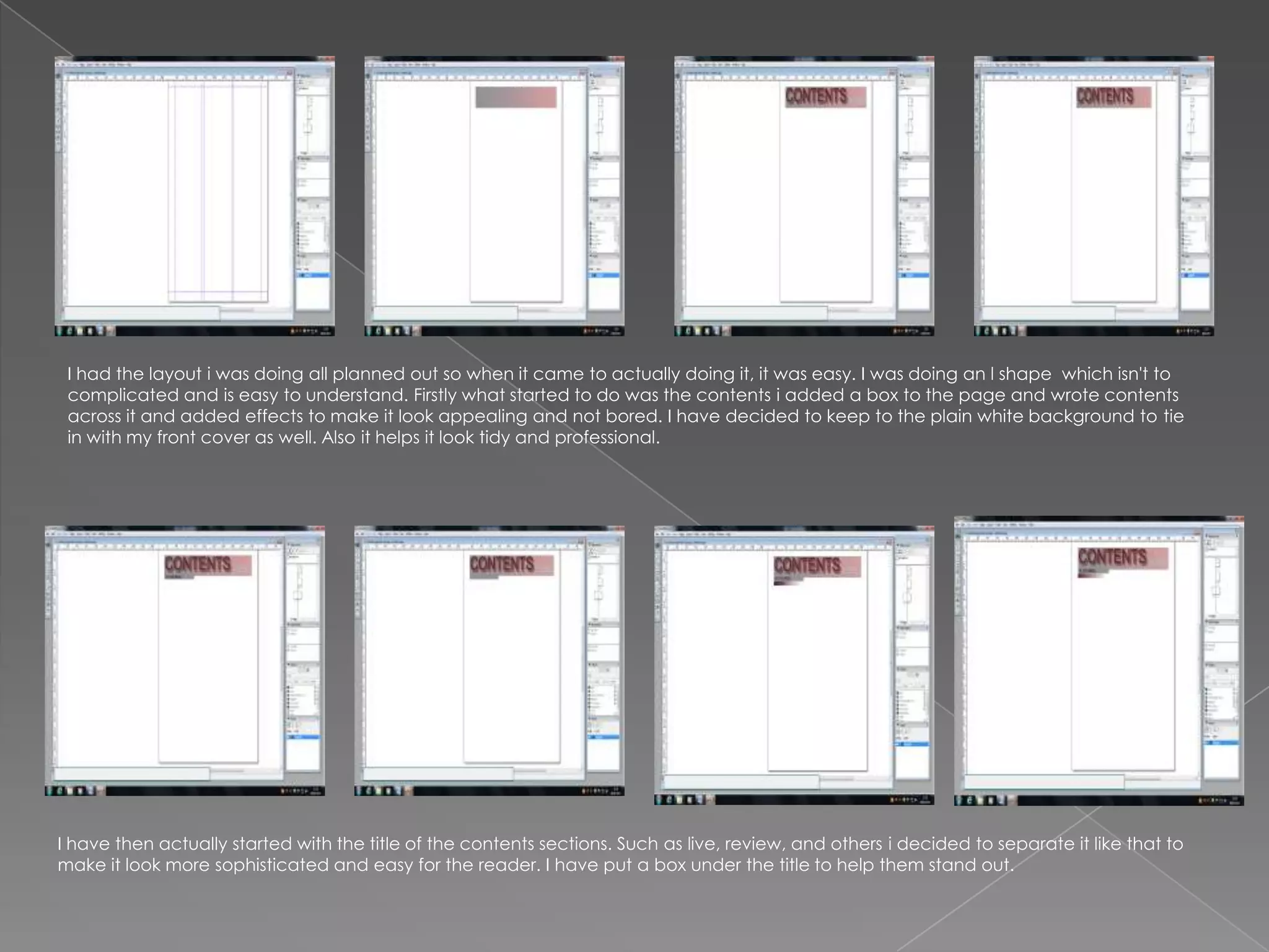
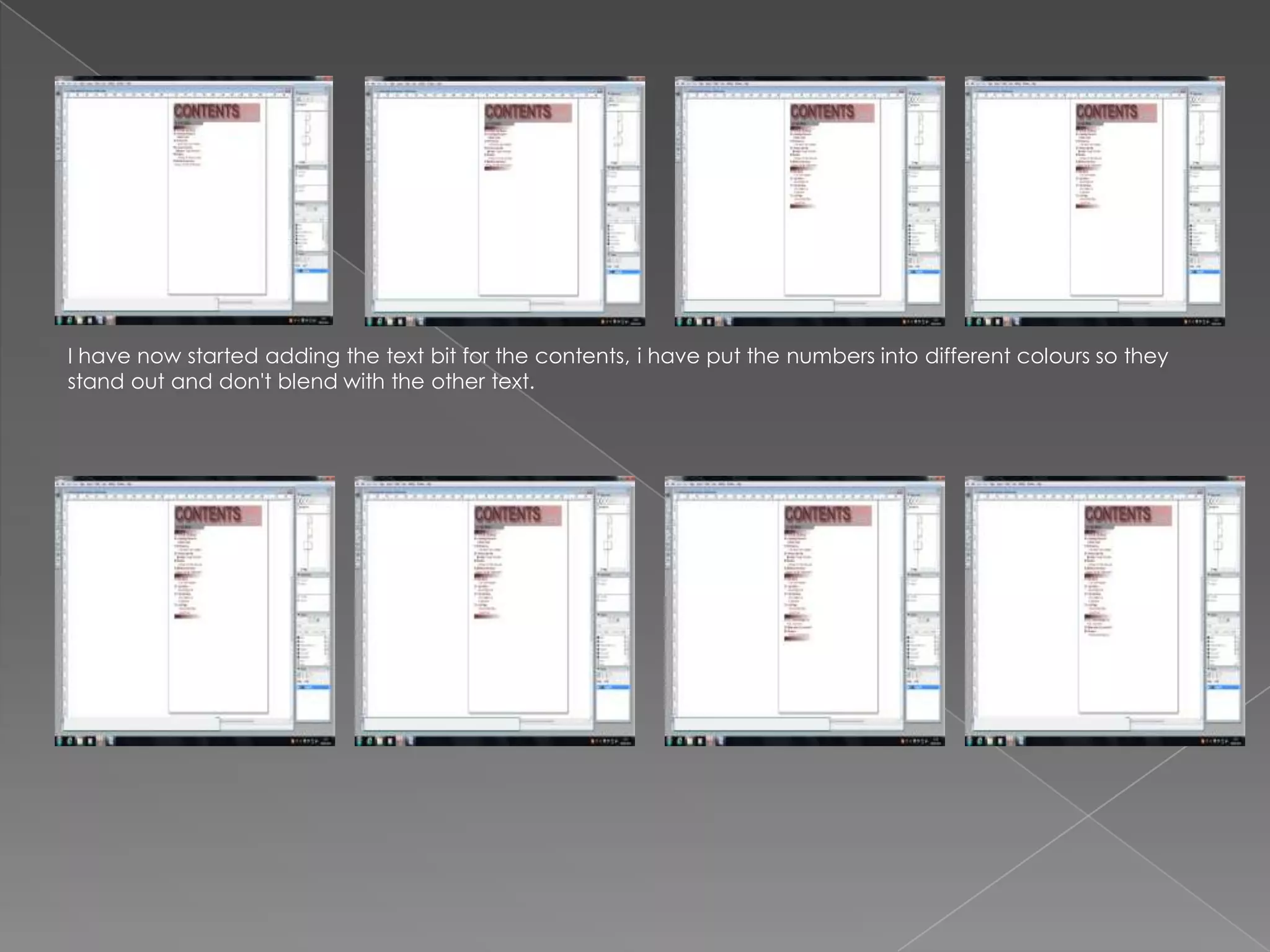
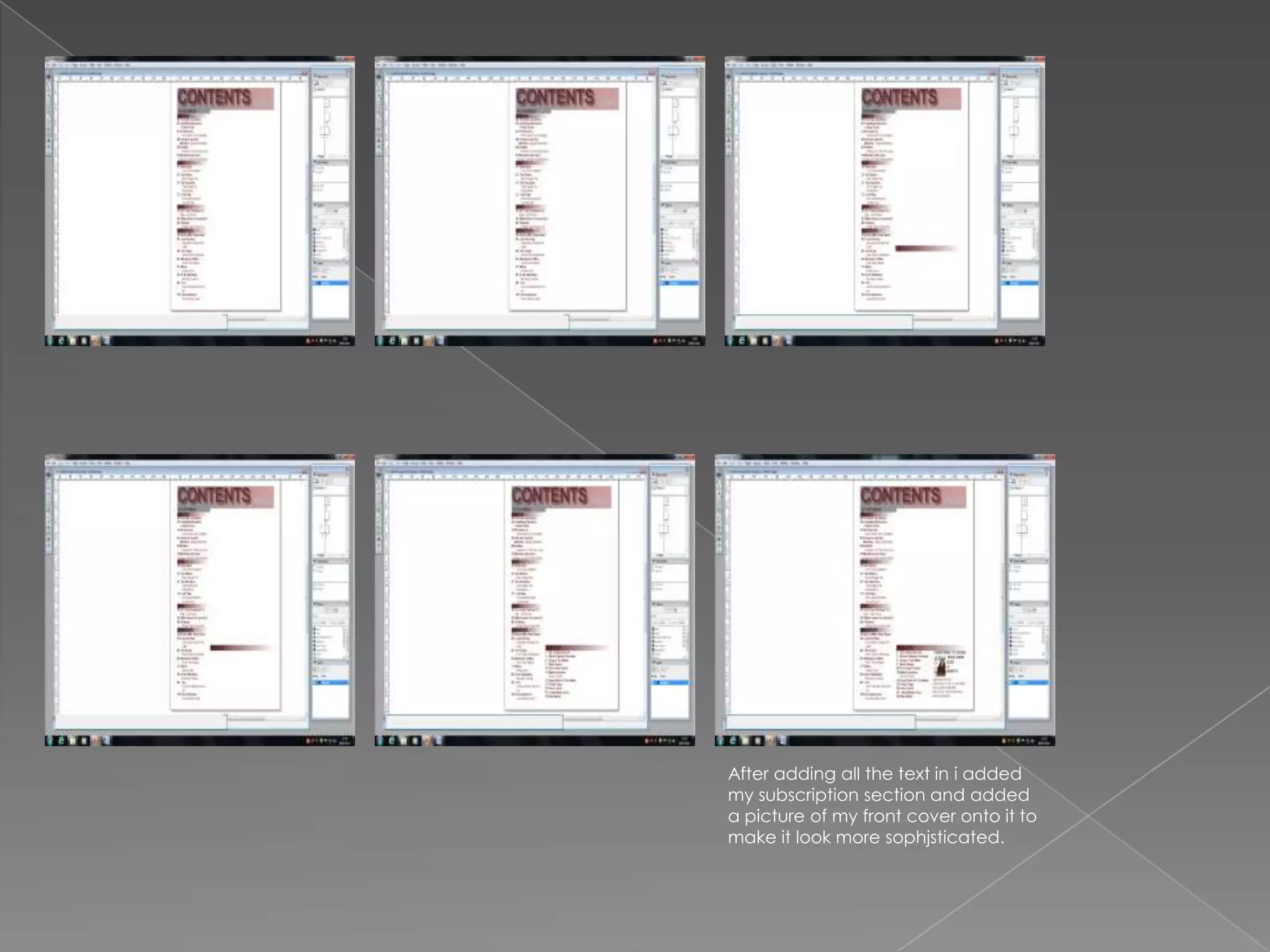
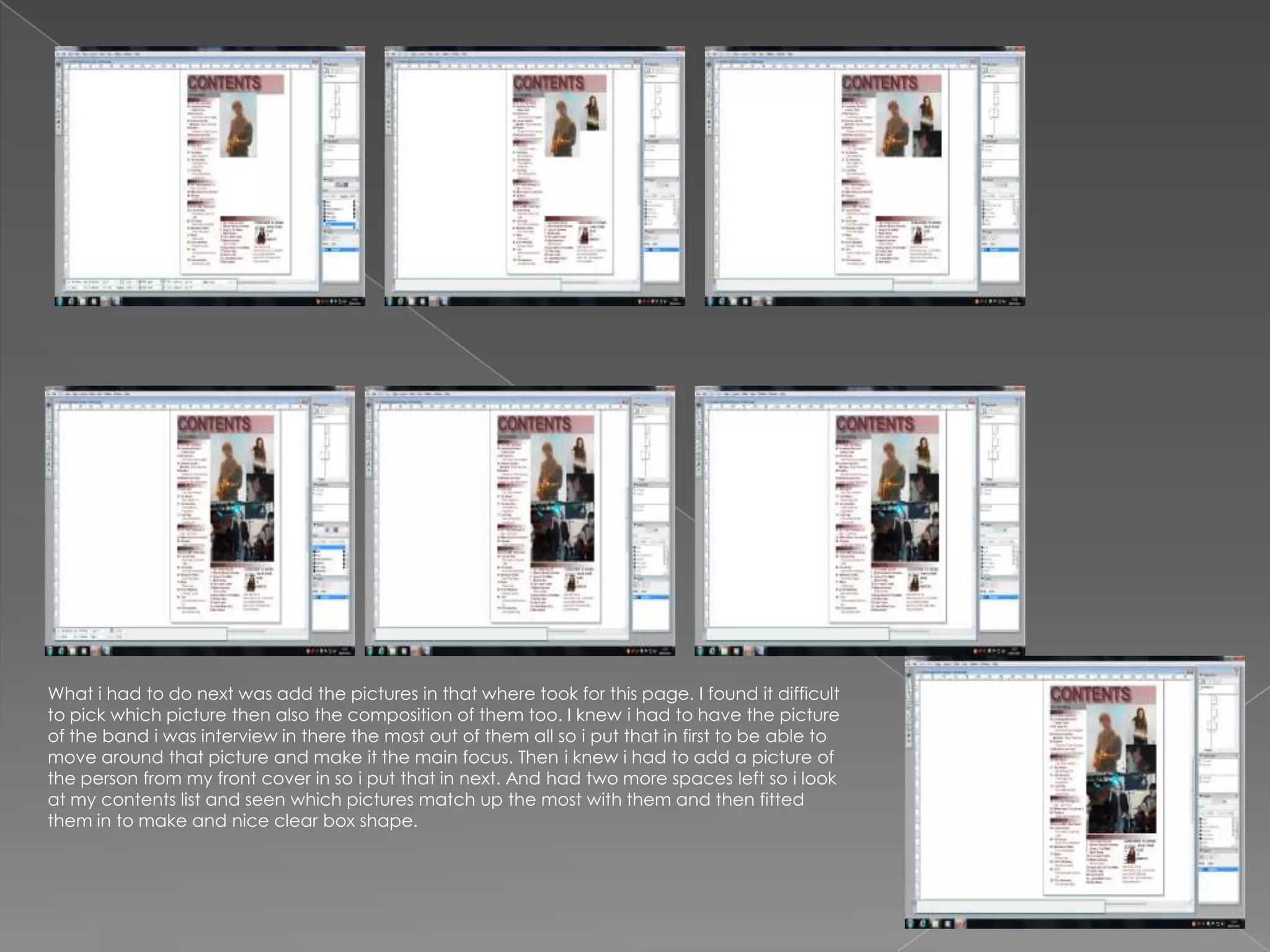
I had the layout i was doing all planned out so when it came to actually doing it, it was easy. I was doing an l shape which isn't to
 complicated and is easy to understand. Firstly what started to do was the contents i added a box to the page and wrote contents
 across it and added effects to make it look appealing and not bored. I have decided to keep to the plain white background to tie
 in with my front cover as well. Also it helps it look tidy and professional.


I have then actually started with the title of the contents sections. Such as live, review, and others i decided to separate it like that to
make it look more sophisticated and easy for the reader. I have put a box under the title to help them stand out.
I have now started adding the text bit for the contents, i have put the numbers into different colours so they
stand out and don't blend with the other text.
After adding all the text in i added
my subscription section and added
a picture of my front cover onto it to
make it look more sophjsticated.
What i had to do next was add the pictures in that where took for this page. I found it difficult
to pick which picture then also the composition of them too. I knew i had to have the picture
of the band i was interview in there the most out of them all so i put that in first to be able to
move around that picture and make it the main focus. Then i knew i had to add a picture of
the person from my front cover in so i put that in next. And had two more spaces left so i look
at my contents list and seen which pictures match up the most with them and then fitted
them in to make and nice clear box shape.

Printscreens of contnets page

  • 2.
    I had thelayout i was doing all planned out so when it came to actually doing it, it was easy. I was doing an l shape which isn't to complicated and is easy to understand. Firstly what started to do was the contents i added a box to the page and wrote contents across it and added effects to make it look appealing and not bored. I have decided to keep to the plain white background to tie in with my front cover as well. Also it helps it look tidy and professional. I have then actually started with the title of the contents sections. Such as live, review, and others i decided to separate it like that to make it look more sophisticated and easy for the reader. I have put a box under the title to help them stand out.
  • 3.
    I have nowstarted adding the text bit for the contents, i have put the numbers into different colours so they stand out and don't blend with the other text.
  • 4.
    After adding allthe text in i added my subscription section and added a picture of my front cover onto it to make it look more sophjsticated.
  • 5.
    What i hadto do next was add the pictures in that where took for this page. I found it difficult to pick which picture then also the composition of them too. I knew i had to have the picture of the band i was interview in there the most out of them all so i put that in first to be able to move around that picture and make it the main focus. Then i knew i had to add a picture of the person from my front cover in so i put that in next. And had two more spaces left so i look at my contents list and seen which pictures match up the most with them and then fitted them in to make and nice clear box shape.