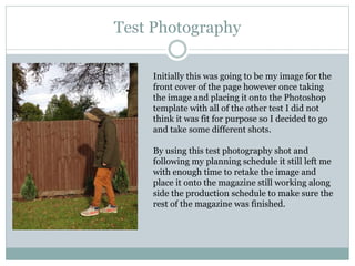
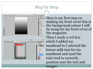
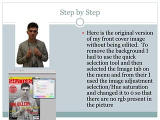
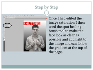
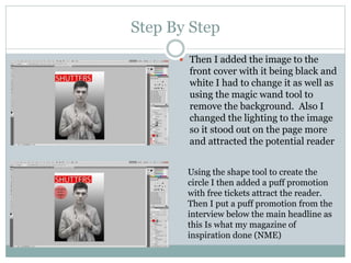
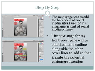
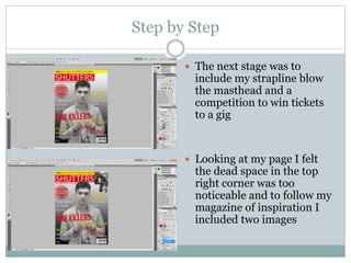
This document contains planning materials for a student magazine project, including:
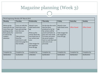
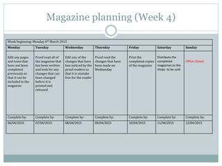
1) Schedules and plans for taking photos, editing images, and laying out the magazine over four weeks.
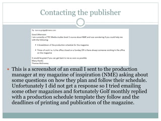
2) Draft emails to publishers about production questions and getting feedback.
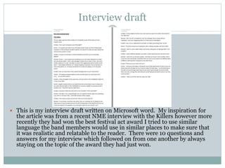
3) A draft band interview in Word.
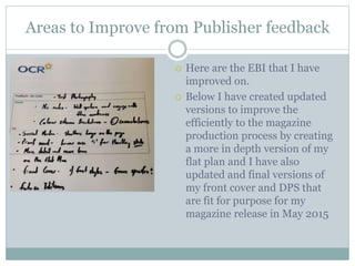
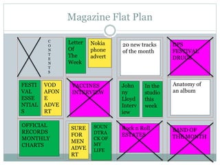
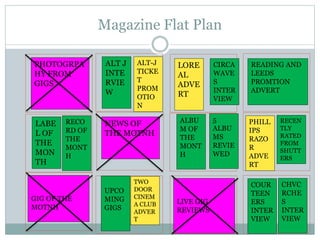
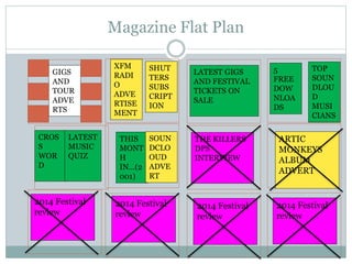
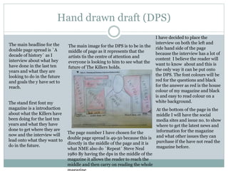
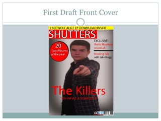
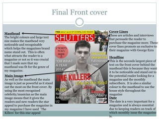
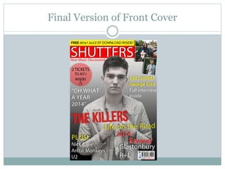
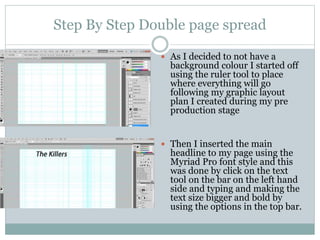
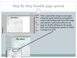
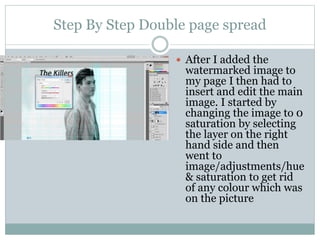
4) Notes on improving the magazine based on publisher feedback, including updated flat plan, front cover, and double page spread drafts.