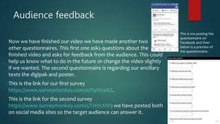
Question 1
WHAT HAVE YOU LEARNED FROM YOUR AUDIENCE FEEDBACK?
JACK RICHARDS
Audience Questionnaires
Before we filmed the video we send out some questionnaires to the
target audience as we wanted to know what they wanted in the video.
The opinions of the target audience was very important as they would
be the ones watching the video so there input was valid to us. The
feedback came back and gave us some decisions to make. One answer
The feedback was useful and helped us make some decisions
regarding the video.
came back with a much higher percentage than
we expected as a lot of people wanted the
video on stage. This was one of the factors in us
filming on a staged location. Also the feedback
came back showing that the audience wanted a
performance based video which wasn’t what
we expected.
Audience Questionnaires
Here are results from two questions we asked in our audience questionnaires.
For the choice of costumes in our video we was very
unsure. We looked at indie rock music videos to see what
the artists were wearing in these. There wasn’t really a set
costume in the videos there was a mix of all three that’s
why we asked the audience what they wanted. As the
feedback came back that the majority wanted too see
typical indie wear in the video that’s what we decided too
choose as the viewers would prefer it and as it was such a
majority then we couldn’t really go against it.
Again with this question the audience questionnaire really
helped the group make a big decision on the location. We had
to find a suitable location but with no budget and that was
hard. After we got back the questionnaires the feedback helped
us decide on the location. This helped us decide on the city even
though in the end this location didn’t workout we still tried tao
incorporate it. After we decided to opt against the city location
we looked back at the feedback and saw that having the video
on stage was more popular than we though so we went for this
choice with the help of the audience questionnaires.
What we learned?
 From the preliminary audience feedback I learned that even though we asked
people who follow the same bands, like the same things and would be classed as
on group in our case indie rock they still all prefer and want to see different things.
I though because we were asking the same group of people then they would all
vote for the same things in general. However this was very wrong and it is clear
that people like different things. I also learned the importance of a audience
questionnaire before filming. I though that producers would get an idea and just
go on to peruse this plan. However now I realise that asking your audience is very
important as if they don’t like it then it wont sell and the money in the disliked
video will have been a waste. If you ask your audience then they can give there
opinions and then you can decide if to change your plan depending on what the
feedback said.
Audience feedback
Now we have finished our video we have made another two
other questionnaires. This first one asks questions about the
finished video and asks for feedback from the audience. This could
help us know what to do in the future or change the video slightly
if we wanted. The second questionnaire is regarding our ancillary
texts the digipak and poster.
This is the link for our first survey
https://www.surveymonkey.com/s/P9XH3MZ.
This is the link for the second survey
https://www.surveymonkey.com/s/THV5XW9 we have posted both
on social media sites so the target audience can answer it.
This is me posting the
questionnaire on
Facebook and then
below is a preview of
the questionnaire.
Responses
 Now the questionaries' have been filled in by ten people of the target audience I
now need to evaluate the answers to see what people thought of the three
products and what they liked, disliked and what they would change. I asked a
variety of questions so I should get some good responses.
 First I will look at the Music Video feedback then I will look at the ancillary texts
feedback.
Stuart Hall’s Audience Theory
 Stuart Hall’s theory was about how audience perceive media texts. He
said most people don’t passively watch or read a text and that the
audience are always interpreting texts. He goes on to say that even one
message is usually sent out that more than one are perceived.
 This theory could be apparent in the video we made. We tried to portray
a message that went with the lyrics. We tried to make the character look
lonely and isolated by having none else in the video, and placing him in
two empty locations. We also used a dead tree and empty stage to
further show his depression. Most of the audience got this but some may
have perceived the video in another way and would have got a different
message.
Music Video
Questionnaire Evaluation
1. What are your opinions on the music video?
The first question was ‘What are your opinions on the music video?’. I asked this first as I wanted to get an
general idea of people thoughts and ideas of the video were. Most people answered saying that they
thought the video was good but there was room for improvement. Most people picked up on things that
could have been improved or things that were poor. This was good as it tells us what wasn’t liked in the video
but that if we did it again we would know what to improve. However saying this some did really like the
video saying it was really good, looking very professional. One response was ‘I really liked it. I went well with
the lyrics and song’. This was pleasing for us as people liked what we did. However there was one negative
response that read ‘I didn't really like it to be honest. It looked very amateur and nothing like a real music
video’. This was disappointing but only one negative comment out of ten wasn’t too bad.
What are your opinions on the Music Video?
• I really liked the video. It was simple but still followed the song and had appropriate locations and costumes.
• The video is good as it follows the theme of the song.
• The video is good but contains mistakes which take the edge of the video.
• It is good, it links to the genre characteristics and the location and costume are appropriate too.
• I really liked it. I went well with the lyrics and song.
• I didn't really like it to be honest. It looked very amateur and nothing like a real music video.
• The video is good, the locations are nice and the costume fits in with the genre. However the shots are a bit too long so the cut rate could be quicker.
• The video is really great, it looks really good.
• It is very good as it represents and conforms to the genre characteristics.
• The video is good. The two locations are good but I would have liked to have seen maybe another.
2. What did you like about the video?
A lot of people answered this by saying they liked the locations especially the park location. They said things
such as they liked the way the locations are meant to be fun and sociable areas but have been shown as
quiet, isolated and depressing locations to match the mood of the artist and lyrics. Many responses came
back saying that they liked the costume of the artist too. I think the reason why many people liked both the
locations and the costume was because they were asked about in the preliminary questionnaire and we used
the opinions of the target audience. This shows with a more extensive and in-depth preliminary
questionnaire there would have been much more that the audience liked. People also said they liked thinks
such as the cut rate, the 360 degree shot and the narrative.
What did you like about the video?
• I liked the two locations. They were both lonely places which went with song.
• I liked the locations, the narrative and the 360 degree shot.
• I did like the locations as they suited the songs meanings. I also liked the costume and the acting of the character.
• I liked the way the lyrics were portrayed in the acting and the lonely locations. I also liked the slow cut rate as it went with the beat and the mood.
• I really liked the slow cut rate as it went with the beat and the mood of the song. I also liked the costume, shot types and locations.
• I did like the leader singer. He portrayed the lyrics well in his acting by looking depressed and lost.
• The two locations were good as they fitted in with the lyrics as they portrayed the loneliness. The smart casual costume looked great too.
• The video is set in a really nice location and the costume looks good too.
• I liked the two location, the outfit and the narrative.
• I liked the way the video shows a lonely person on stage and on a stage which matches the lyrics. I also like two locations and what the person is wearing.
3. What did you dislike about the video?
This questions shows that everyone is different as people said they didn’t like the location and the costume
whereas the majority said they liked it in the previous question. One of the responses that said they didn’t
like the costume said they would have rather seen a suit being worn by the artist. Overall there wasn’t
anything that a lot of people didn’t like there was a lot of thinks different people didn’t like. Responses came
back saying that they didn't like the shot types saying there wasn’t a big enough variety or enough close ups.
Other answers didn’t like the ending not getting the relevance or meaning of the rewind at the end.
What did you dislike about the video?
• On the other hand I didn't like the costume. I feel it would be much more appropriate if the artist was wearing a suit.
• I didn't like the costume, I know it was smart casual and this is part of indie rock but I just didn't personally like the outfit. I though the stage location should have
been used more too.
• I though there was many mistakes as there was the school logo on the stage, the houses and park in the background of the park and wobbly camera at some
points.
• I didn't like the rewind at the end as I didn't know the relevance of it. I also didn't like the way the play area and houses were in the background of the park as it
looked amateur.
• I didn't like the ending when the artist was in reverse back on to the tree truck.
• I didn't like the two locations. The park had a playground and houses in the background while the stage footage wasn't too clear and had a school logo in the
background which looked bad.
• I though the shots were too long and the cut rate should of been quicker.
• I don't like the shot types as there isn't much of a variety.
• I didn't really like the on stage section.
• I didn't like lack of shot types as there was much of a variety. I also though a third location would have been better maybe in a studio.
4. What would you change in the video?
Most people answered this question by saying they would change whatever they disliked. People said they
would like too see a third location or another location replacing one of the two I used. People also replied
saying they would change the ending to something better as they though it was a poor ending to a good
video. Other responses came in saying they would change the shot choice and cut rate, changing the
costume and removing some mistakes.
What would you change in the video?
• I would change the costume. I would also change the video so that other people were in it to highlight his loneliness.
• I would have changed the costume and shown more of the stage location.
• I would personally eradicate all the mistakes and maybe add a new location.
• I would find a way to film in the park without the play area and the houses. I would also add some close up shots.
• I would change the ending for something more meaningful as the rest of the video was great.
• I would change the locations. I think the idea of a park and stage were good but they weren't executed well. The park would look good without the play area
and the houses. Also if a different staged was used that would look great.
• I would make the cut rate quicker as it was too slow for a music video. I would also add in more variety of shots such as more close ups and extreme close ups.
• I would add a wider variety of shots
• Change the on stage section for a city or studio location.
• I would add a variety of more shot types especially close ups and extreme close ups. I would also have added a third location preferably in a recording studio.
Finally I would have had more people in the video.
5. Did you like the costume? and why?
The majority of people answered this question positively saying that they liked the costume as it was typical
indie wear and was smart casual which was most appropriate. People liked the shirt, jeans and boot
combination. Out of the ten responses on two were negative which wasn’t too bad. In the two negative
responses one said ‘No I didn't like the like the outfit. It was just not too my liking’ this looks like they didn’t
like that outfit personally but liked the smart casual idea. The other response was ’ I thought it was ok but I
would have preferred a suit as I feel it would suit the narrative better’. This again is just personal opinion but
we didn’t think a suit would have looked too good. One reason why people liked the costume was because
we asked about it in our first questionnaire and we took into account what people said.
Did you like the costume? and why?
• I thought it was ok but I would have preferred a suit as I feel it would suit the narrative better.
• No I didn't like the like the outfit. It was just not too my liking.
• The costume is good, it's smart but casual as well and is a typical indie outfit.
• Yes the costume fitted into the indie rock genre and looked good in the video.
• The costume suited the genre and song well.
• I did like the costume as it looked smart but casual and fitted in with the genre well.
• The smart casual costume looked great and also was in keeping with the indie rock codes and conventions.
• Yes the costume looks great as it is typical indie wear and it looks good.
• I like the shirt, jeans and boots as this is a typical indie look.
• Yes I though the costume was great as it is typical indie wear and conformed to the genre conventions.
6. Did you like the location? and why?
The majority of people liked the park location. They said they liked they way we took a lively, loud, sociable
location and portrayed it as a lonely, quiet depressing location for the video. However some did say it didn’t
look as good in the shots that had houses and the play area in the background. On the other location there
was mixed reactions. Some liked the stage as again there was no one else on stage or watching again
highlighting the theme of loneliness. However others said they didn’t like this location and would of
preferred some where else.
Did you like the location? and why?
• I really liked both locations as they are meant to be lively sociable locations however they are lonely locations because of the song which is great.
• I liked both locations. They both represented the loneliness in the song. A park is meant to be a fun place but this park was quiet and lonely and the stage had
no audience.
• The locations are good as they are usually social places but they are empty and have been made lonely.
• I did like the park but I didn't like the houses and play area in the background. I liked the dead tree that the artist was sitting on however. The stage location was
good though.
• I loved both of the locations as they represented the theme on loneness.
• As I said before I would change the locations however I though they were good ideas. I think the idea of a park and stage were good but they weren't
executed well. The park would look good without the play area and the houses. Also if a different staged was used that would look great.
• The park location was good as it showed of the lonely theme as there was nobody else around. The stage also did this as there was nobody watching. I though
the stage could have been used more.
• Both locations are good especially the park location.
• I liked the park location but not the on stage location. I'm not exactly sure why I didn't like it I just would prefer somewhere else.
• Yes I liked both locations. The stage location is good as it shows the loneliness as there is nobody watching. The second location is quite good as it is again
empty but he park and houses in the background don't look to great.
7. Do you believe the video has a narrative? and if so do you like it?
Most people said there was a narrative in the video. People liked the narrative as it was in line with the lyrics
as it showed the loneliness and depress of the character. I think using just one character was a good way of
doing this. Some felt there was more of a narrative than others with some thinking that there was a small
narrative while others thought the whole video was narrative based. A couple of answers said they didn’t
think there was much of a narrative and that there wasn’t much of a story.
Do you believe the video has a narrative? and if so do you like it?
• There is a narrative as the whole video shows the loneliness of the artist.
• There was a great narrative in my opinion. The video showed the depression and loneliness of the artist.
• There isn't much of a narrative but it does show the loneliness which is just as good.
• There is a good narrative in my opinion. Nothing much really happens but this is showing the loneliness which the song is about.
• There was a small narrative but I liked it like his however the ending didn't make any sense to me.
• There is a narrative and I did like it. It shows the depression and the loneliness of the character which links to the song.
• There is a strong narrative as the loneliness in the lyrics is depicted all song.
• There is a small narrative with the loneliness aspect. I do like it but it could be implemented better.
• Yh the lonely Morrissey goes with the lyrics so this is a good narrative.
• I do like the mix between narrative and performance. There is a basic narrative but I would have liked to have seen a bit more of a story.
8. Would you have liked to seen more people in the video?
This was the only question in this questionnaire that was a closed question. I used a lot of open questions as
people can write exactly what they want and give there opinions, which you can’t do by ticking a box. With
this question I asked weather the audience would have liked to have seen more characters. 70% said they
wouldn’t have liked another person in the video. I think this was as just having the one person really
highlighted there loneliness. People wrote in other sections that other people could have been used to
highlight the loneliness by completely ignoring the main figure.
9. Would you have liked to seen an extra location? and if so where?
Seven people said they liked the two locations as they were and wouldn’t have changed them. Some of them
said they would have liked a third location in addition while most said they liked the two as it is. People who
said they wanted another location wrote that they wanted somewhere such as a studio or a city location.
Most people liked the locations because of the way we made them appear lonely and depressing locations
which juxtapose there normal characteristics.
Would you have liked to seen an extra location? and if so where?
• No I liked the two locations as it is.
• No I liked the two that were used.
• Yes I would have liked another location maybe a studio or the artist in a club on there own.
• No the two was enough and were appropriate.
• No I liked the two locations as it is.
• No I think two locations was a good idea but they should of been planned better.
• No the two locations were good but the stage should of been shown more in my opinion.
• No I liked the two locations and I feel three would have been too many.
• Over the stage I would prefer a city or studio location.
• As I said I would have liked a third location preferably in a recording studio or maybe with something on a green screen done too. A city location could have
worked too as well.
10. Do you think the video conforms to the indie genre conventions? and why?
This question was very important as it was an Indie rock video and it had to appear like that to people
watching the video for the first time. The responses were very clear as every response said they thought it
was an Indie rock video and that is great. They said the choice of location and costume really made it look
like a typical Indie rock video. Things such as the narrative and cut rate also made it clear to some of the
target audience. If ten out of ten could tell it was a Indie rock video then we must have conformed to many
of the codes and conventions.
Do you think the video conforms to the indie genre conventions? and why?
• The video definitely follows the genre characteristics with the acting, locations and the general feeling of the video.
• The video definitely fits into the indie category.
• The video does look like many other indie video and conforms well to the characteristics.
• Yes the video goes with the genre conventions as the costume is appropriate and the location is also very indie.
• Yes the costume, location and general mood of the video was suited to the genre.
• The video is very in keeping with the indie rock genre characteristics because of the costume and the mood that is set.
• Yes the video does by using the costume and locations of a typical indie genre video.
• It does conform the genre conventions with the costume especially.
• Yes the locations and outfit give the video a indie rock look.
• I feel it is clear it is a Indie video because of the costume the locations and the mood created by the video.
Ancillary texts
Questionnaire Evaluation
1. What genre do you think the digipak and poster are associated with?
I asked this question first on this questionnaire as if people knew what genre the two products were then
this meant we had done well conforming to the codes and conventions. Out of ten responses nine ticked to
say they thought it was a Indie rock digipak and poster, this meant we did a good job in targeting our target
audience and meeting the genre codes and conventions. One person ticked to say they thought it was a Pop
digipak and poster but this is quite understandable as there is three pictures of the male artist which is
something you would see in the Pop genre characteristics. Nine out of ten was good and this shows that me
met the genre codes and conventions as the target audience knew it was Indie rock products.
2. Do you like the Digipak? and why?
The opinions I received from this question were very mixed. Some said they really liked the digipak with
answers such as ‘Yes I do like the digipak. There are more images of the main artist but the band are also
there which fans want too see’. It is great that I pleased people with the digipak and out of the ten responses
I got I would say five were really positive responses which is ok but I would have wanted more. Three
responses came back with the idea that the digipak was ok and that they liked parts but didn't like others.
This isn't too bad as they didn’t dislike it but didn’t like it either which is what I was aiming to do. Finally
there was to answers that came back saying they didn’t like the digipak. One response read ‘The digipak in
my opinion wasn't the best. The pictures are poor quality and there isn't any information about the album or
band. This wasn’t good and I hoped to please people and not have any responses like that. However people
didn’t like the design and in the next question they will say exactly what they didn’t like which will help in the
future.
Do you like the Digipak? and why?
• I thought the digipak was ok, but there could have been improvements.
• I liked the digipak as it had a lot if images which fans want then it had the track list which is essential too.
• The digipak in my opinion wasn't the best. The pictures are poor quality and there isn't any information about the album or band.
• The digipak is ok. The pictures are good but no the best quality.
• The digipak is nice. It shows the band but the lead artist more which is common in bands. It also has the track list which looks good in front of a good picture.
• I though the digipak was ok I thought it was the weakest of the three items.
• Yes I do like the digipak. There are more images of the main artist but the band are also there which fans want too see.
• The digipak was ok but the images wasn't be best quality and the text was in a poor font.
• It's good but I would like a bit more text such as information on the band.
• Yes I like it is shows the artist a lot which is what people want to see.
3. What do you think was good and bad about the digipak?
This question was important as if some of the target audience wasn't happy with the digipak then this will
help me know what they liked and what they didn’t. Many of the responders said they didn’t like the quality
of the pictures and though it they were of a higher quality it would have looked much better. Furthermore
some though that there should have been a wider variety of pictures wear as others liked the variety of
pictures so it just shows it was a matter of opinion. The target audience also though that there should have
been a brief summary or blurb on the album as a couple included this in there response. Also there was the
idea of a fold out digipak mentioned a couple of times. Some said they would have liked too have seen it
where as others didn’t like that design. People did tend to like that the band is shown but the emphasis is on
the lead singer.
What do you think was good and bad about the digipak?
• The basic layout was good as I don't like the digipaks that fold out. However the pictures were all similar and I would have preferred a variety.
• I liked the pictures and the way it was designed. I would have liked too see a fold out digipak as its more interactive and fun.
• The digipak pictures are poor quality and I would have liked a short summary on the album. I do like the consistency of the band name font.
• I like the layout and design but I don't think it has been executed well as the pictures are poor quality.
• The design and layout is great and the picture are good too. However I would have preferred a close up picture.
• I thought the pictures were of a poor quality and that a fold out digipak could have been made.
• There is a good variety of pictures and there is a clear track list with a great background. However the pictures aren't the best quality and there could be more
information on the album.
• The pictures and choice of font wasn't the best and I didn't like them. However the design was good as it showed the artist which is what people want.
• The picture are good angles and positions but not the best quality. I like the text for the digipak.
• I like that it has the main artist more than the other members but that it still features them too. However I think there could be more text about the band and the
album like a blurb.
4. What do you think should be improved on the digipak?
This question linked into the previous one as most people just said what they disliked to be improved or
changed. As of this a lot people talked about pictures saying they wanted a higher quality of pictures as the
ones we used were poor quality. Others said the style of pictures should be changed but this goes against
what others liked. Also people said they would like to see a fold out digipak which again juxtaposes what
others said before. If we changed it or made another we could do a preliminary questionnaire to see what
pictures people wanted and if they wanted a fold out digipak or not. Then we would please the majority.
Finally people said they would have liked to seen a blurb or a short summary on the band/album possibly on
the back with the track listing.
What do you think should be improved on the digipak?
• Just a variety of different pictures would please me.
• I would just changed it into a fold out digipak with more pages.
• I would have liked one on the fold out digipaks as its more interactive and better for buyers of the album.
• Better quality images would improve the album.
• I think a close up image should replace one of the mid/long shots.
• I think the pictures should be of higher quality, there could have been a paragraph about the album and a fold out digipak would have been nice too.
• I think there should be a small summary on the album and the pictures should be of a higher quality.
• Different images should be used as they aren't the best quality.
• The quality of the images.
• I think that a blurb of some sort should be added.
5. Do you like the poster? And why?
Now I asked the same questions that I asked about the digipak but regarding the album poster we made.
Again with the poster the responses were fairly mixed but were overall more positive that those on the
digipak. Nobody said they didn’t like the poster which is a positive as I haven’t disappointed any of my target
audience. However some just though the poster was ok which isn't what I was aiming for I wanted to please
as many as I can. Answers such as ‘The poster again has a good idea but it isn't executed that well’ and ‘I
preferred the poster but again it could have been better’. These answers show that people wasn’t too
satisfied with it. The rest of the answers were along of the lines that it was good but there is still room for
improvement and it wasn’t amazing.
Do you like the poster? and why?
• I preferred the poster but again it could have been better.
• Yes I did. It was fairly simple but not boring.
• The poster is better but still could be better. The small details are good but the picture again is poor quality.
• Yes the poster is better but still could be improved. The layout is nice but there could be more to make it interesting.
• I do like the poster too as it is simple yet effective.
• I did like the poster but I though it could have been a lot better.
• Yes I think the poster is fairly simple but effective.
• The poster again has a good idea but it isn't executed that well.
• It's fairly good as it shows the two other members of the band who aren't seen much.
• The poster is nice as it is simple yet effective.
6. What do you think was good and bad about the poster?
A lot of people liked the simple layout and design of the poster. They liked that the picture was the main
feature of the of the poster and the is was simple while still looking interesting. People also liked the font
consistency as it made the band look real and gave them an identity. However the majority of people said
the picture was well planned and a good idea but it was taken poorly reducing the overall look of the poster.
Other comments included the fonts were boring, the stars looked good and the top banner was boring and
could have been used more creatively.
What do you think was good and bad about the poster?
• The picture was a great idea the way the three are standing and the use of lighting and costume is great. However the picture didn't look good as its a poor
quality. I did like the star ratings and the simplicity of the poster.
• I liked the design and they layout. However a better picture would improve the poster.
• The consistency between the two products is good and there are a lot of small details but are well done. However the picture is a good idea and well thought
out but is poorly taken.
• The image is good idea with the main artist at the front and the other band members behind less prominent. I also like the suits but again the quality is poor. The
banner at the top is a waste in my opinion.
• I like the start ratings and the simplicity. However I don't like the picture as the suits don't go with the genre for me. I also think the plain banner at the top is a
waste and something more creative could have been put there.
• The fonts for the album date is very boring and simple and the picture which is very prominent is poor in my opinion. However all the little features such as the
stars are great and the band name is the same as the digipak which makes it look professional.
• I like the simplicity but if it is done then like this then you need a really strong picture and the chosen image is poor quality. However I like the consistency
between the poster and digipak.
• The idea of the picture was a good idea but it was taken very well as its quite dark. The way the fonts have been used consistently through the poster and
digipak is really good as it gives the band an identity.
• Showing three was good but the picture isn't good quality.
• It shows the band which people want however the picture could be better.
7. What do you think should be improved on the poster?
The final question was again regarding what could be improved. The majority of people again said that if the
quality of the picture was improved then it would be a great overall poster. This is annoying as we got a good
costume sorted, got some good lighting and a good angle and position with the lead artist slightly in front of
the other band members. However the picture was just poor quality for whatever reason which let the
poster down as well as the digipak. Other things people wanting changing was the banner at the top to be
more creative, the poster in a whole to be more creative and someone said a different costume.
What do you think should be improved on the poster?
• Just a better quality image but in the same style.
• Just a better picture really.
• The picture is letting it down and if it is improved it will improve the whole poster.
• I feel there could be more creativity on the poster and that the top banner is boring and pointless.
• I think something more creative on the top and a different costume would improve the poster.
• A new main image and a better font for the album release data would make the poster great.
• I feel a better quality image will really improve the poster.
• I feel a much better picture would really improve the poster.
• A better image even though the look is good with the suits and the lighting.
• A better picture could be chosen.
Conclusion
What have you learned from your audience feedback?
The audience feedback taught me may things and gave me and idea of what people liked and didn’t
like. When you look at your own products you look at them in a very narrow minded way as you have
been a big part of there construction and as you have been happy with the finished product you must
have liked them a lot.
I also learnt that we should of done a preliminary questionnaire regarding the digipak and poster. We
did one for the music video and we pleased people as we included what they wanted as we listened to
what they said. If we would have done this for the ancillary texts then we would have had a better
idea of what the target audience wanted to see in them meaning they would have been more satisfied
with them.
Another thing I learnt was how important audience feedback is. The target audience are the once who
watch, rate, review and share the video so if they have had an input then they are a lot more likely to
like the finished product.

Question 3

  • 1.
    Question 1 WHAT HAVEYOU LEARNED FROM YOUR AUDIENCE FEEDBACK? JACK RICHARDS
  • 2.
    Audience Questionnaires Before wefilmed the video we send out some questionnaires to the target audience as we wanted to know what they wanted in the video. The opinions of the target audience was very important as they would be the ones watching the video so there input was valid to us. The feedback came back and gave us some decisions to make. One answer The feedback was useful and helped us make some decisions regarding the video. came back with a much higher percentage than we expected as a lot of people wanted the video on stage. This was one of the factors in us filming on a staged location. Also the feedback came back showing that the audience wanted a performance based video which wasn’t what we expected.
  • 3.
    Audience Questionnaires Here areresults from two questions we asked in our audience questionnaires. For the choice of costumes in our video we was very unsure. We looked at indie rock music videos to see what the artists were wearing in these. There wasn’t really a set costume in the videos there was a mix of all three that’s why we asked the audience what they wanted. As the feedback came back that the majority wanted too see typical indie wear in the video that’s what we decided too choose as the viewers would prefer it and as it was such a majority then we couldn’t really go against it. Again with this question the audience questionnaire really helped the group make a big decision on the location. We had to find a suitable location but with no budget and that was hard. After we got back the questionnaires the feedback helped us decide on the location. This helped us decide on the city even though in the end this location didn’t workout we still tried tao incorporate it. After we decided to opt against the city location we looked back at the feedback and saw that having the video on stage was more popular than we though so we went for this choice with the help of the audience questionnaires.
  • 4.
    What we learned? From the preliminary audience feedback I learned that even though we asked people who follow the same bands, like the same things and would be classed as on group in our case indie rock they still all prefer and want to see different things. I though because we were asking the same group of people then they would all vote for the same things in general. However this was very wrong and it is clear that people like different things. I also learned the importance of a audience questionnaire before filming. I though that producers would get an idea and just go on to peruse this plan. However now I realise that asking your audience is very important as if they don’t like it then it wont sell and the money in the disliked video will have been a waste. If you ask your audience then they can give there opinions and then you can decide if to change your plan depending on what the feedback said.
  • 5.
    Audience feedback Now wehave finished our video we have made another two other questionnaires. This first one asks questions about the finished video and asks for feedback from the audience. This could help us know what to do in the future or change the video slightly if we wanted. The second questionnaire is regarding our ancillary texts the digipak and poster. This is the link for our first survey https://www.surveymonkey.com/s/P9XH3MZ. This is the link for the second survey https://www.surveymonkey.com/s/THV5XW9 we have posted both on social media sites so the target audience can answer it. This is me posting the questionnaire on Facebook and then below is a preview of the questionnaire.
  • 6.
    Responses  Now thequestionaries' have been filled in by ten people of the target audience I now need to evaluate the answers to see what people thought of the three products and what they liked, disliked and what they would change. I asked a variety of questions so I should get some good responses.  First I will look at the Music Video feedback then I will look at the ancillary texts feedback.
  • 7.
    Stuart Hall’s AudienceTheory  Stuart Hall’s theory was about how audience perceive media texts. He said most people don’t passively watch or read a text and that the audience are always interpreting texts. He goes on to say that even one message is usually sent out that more than one are perceived.  This theory could be apparent in the video we made. We tried to portray a message that went with the lyrics. We tried to make the character look lonely and isolated by having none else in the video, and placing him in two empty locations. We also used a dead tree and empty stage to further show his depression. Most of the audience got this but some may have perceived the video in another way and would have got a different message.
  • 8.
  • 9.
    1. What areyour opinions on the music video? The first question was ‘What are your opinions on the music video?’. I asked this first as I wanted to get an general idea of people thoughts and ideas of the video were. Most people answered saying that they thought the video was good but there was room for improvement. Most people picked up on things that could have been improved or things that were poor. This was good as it tells us what wasn’t liked in the video but that if we did it again we would know what to improve. However saying this some did really like the video saying it was really good, looking very professional. One response was ‘I really liked it. I went well with the lyrics and song’. This was pleasing for us as people liked what we did. However there was one negative response that read ‘I didn't really like it to be honest. It looked very amateur and nothing like a real music video’. This was disappointing but only one negative comment out of ten wasn’t too bad. What are your opinions on the Music Video? • I really liked the video. It was simple but still followed the song and had appropriate locations and costumes. • The video is good as it follows the theme of the song. • The video is good but contains mistakes which take the edge of the video. • It is good, it links to the genre characteristics and the location and costume are appropriate too. • I really liked it. I went well with the lyrics and song. • I didn't really like it to be honest. It looked very amateur and nothing like a real music video. • The video is good, the locations are nice and the costume fits in with the genre. However the shots are a bit too long so the cut rate could be quicker. • The video is really great, it looks really good. • It is very good as it represents and conforms to the genre characteristics. • The video is good. The two locations are good but I would have liked to have seen maybe another.
  • 10.
    2. What didyou like about the video? A lot of people answered this by saying they liked the locations especially the park location. They said things such as they liked the way the locations are meant to be fun and sociable areas but have been shown as quiet, isolated and depressing locations to match the mood of the artist and lyrics. Many responses came back saying that they liked the costume of the artist too. I think the reason why many people liked both the locations and the costume was because they were asked about in the preliminary questionnaire and we used the opinions of the target audience. This shows with a more extensive and in-depth preliminary questionnaire there would have been much more that the audience liked. People also said they liked thinks such as the cut rate, the 360 degree shot and the narrative. What did you like about the video? • I liked the two locations. They were both lonely places which went with song. • I liked the locations, the narrative and the 360 degree shot. • I did like the locations as they suited the songs meanings. I also liked the costume and the acting of the character. • I liked the way the lyrics were portrayed in the acting and the lonely locations. I also liked the slow cut rate as it went with the beat and the mood. • I really liked the slow cut rate as it went with the beat and the mood of the song. I also liked the costume, shot types and locations. • I did like the leader singer. He portrayed the lyrics well in his acting by looking depressed and lost. • The two locations were good as they fitted in with the lyrics as they portrayed the loneliness. The smart casual costume looked great too. • The video is set in a really nice location and the costume looks good too. • I liked the two location, the outfit and the narrative. • I liked the way the video shows a lonely person on stage and on a stage which matches the lyrics. I also like two locations and what the person is wearing.
  • 11.
    3. What didyou dislike about the video? This questions shows that everyone is different as people said they didn’t like the location and the costume whereas the majority said they liked it in the previous question. One of the responses that said they didn’t like the costume said they would have rather seen a suit being worn by the artist. Overall there wasn’t anything that a lot of people didn’t like there was a lot of thinks different people didn’t like. Responses came back saying that they didn't like the shot types saying there wasn’t a big enough variety or enough close ups. Other answers didn’t like the ending not getting the relevance or meaning of the rewind at the end. What did you dislike about the video? • On the other hand I didn't like the costume. I feel it would be much more appropriate if the artist was wearing a suit. • I didn't like the costume, I know it was smart casual and this is part of indie rock but I just didn't personally like the outfit. I though the stage location should have been used more too. • I though there was many mistakes as there was the school logo on the stage, the houses and park in the background of the park and wobbly camera at some points. • I didn't like the rewind at the end as I didn't know the relevance of it. I also didn't like the way the play area and houses were in the background of the park as it looked amateur. • I didn't like the ending when the artist was in reverse back on to the tree truck. • I didn't like the two locations. The park had a playground and houses in the background while the stage footage wasn't too clear and had a school logo in the background which looked bad. • I though the shots were too long and the cut rate should of been quicker. • I don't like the shot types as there isn't much of a variety. • I didn't really like the on stage section. • I didn't like lack of shot types as there was much of a variety. I also though a third location would have been better maybe in a studio.
  • 12.
    4. What wouldyou change in the video? Most people answered this question by saying they would change whatever they disliked. People said they would like too see a third location or another location replacing one of the two I used. People also replied saying they would change the ending to something better as they though it was a poor ending to a good video. Other responses came in saying they would change the shot choice and cut rate, changing the costume and removing some mistakes. What would you change in the video? • I would change the costume. I would also change the video so that other people were in it to highlight his loneliness. • I would have changed the costume and shown more of the stage location. • I would personally eradicate all the mistakes and maybe add a new location. • I would find a way to film in the park without the play area and the houses. I would also add some close up shots. • I would change the ending for something more meaningful as the rest of the video was great. • I would change the locations. I think the idea of a park and stage were good but they weren't executed well. The park would look good without the play area and the houses. Also if a different staged was used that would look great. • I would make the cut rate quicker as it was too slow for a music video. I would also add in more variety of shots such as more close ups and extreme close ups. • I would add a wider variety of shots • Change the on stage section for a city or studio location. • I would add a variety of more shot types especially close ups and extreme close ups. I would also have added a third location preferably in a recording studio. Finally I would have had more people in the video.
  • 13.
    5. Did youlike the costume? and why? The majority of people answered this question positively saying that they liked the costume as it was typical indie wear and was smart casual which was most appropriate. People liked the shirt, jeans and boot combination. Out of the ten responses on two were negative which wasn’t too bad. In the two negative responses one said ‘No I didn't like the like the outfit. It was just not too my liking’ this looks like they didn’t like that outfit personally but liked the smart casual idea. The other response was ’ I thought it was ok but I would have preferred a suit as I feel it would suit the narrative better’. This again is just personal opinion but we didn’t think a suit would have looked too good. One reason why people liked the costume was because we asked about it in our first questionnaire and we took into account what people said. Did you like the costume? and why? • I thought it was ok but I would have preferred a suit as I feel it would suit the narrative better. • No I didn't like the like the outfit. It was just not too my liking. • The costume is good, it's smart but casual as well and is a typical indie outfit. • Yes the costume fitted into the indie rock genre and looked good in the video. • The costume suited the genre and song well. • I did like the costume as it looked smart but casual and fitted in with the genre well. • The smart casual costume looked great and also was in keeping with the indie rock codes and conventions. • Yes the costume looks great as it is typical indie wear and it looks good. • I like the shirt, jeans and boots as this is a typical indie look. • Yes I though the costume was great as it is typical indie wear and conformed to the genre conventions.
  • 14.
    6. Did youlike the location? and why? The majority of people liked the park location. They said they liked they way we took a lively, loud, sociable location and portrayed it as a lonely, quiet depressing location for the video. However some did say it didn’t look as good in the shots that had houses and the play area in the background. On the other location there was mixed reactions. Some liked the stage as again there was no one else on stage or watching again highlighting the theme of loneliness. However others said they didn’t like this location and would of preferred some where else. Did you like the location? and why? • I really liked both locations as they are meant to be lively sociable locations however they are lonely locations because of the song which is great. • I liked both locations. They both represented the loneliness in the song. A park is meant to be a fun place but this park was quiet and lonely and the stage had no audience. • The locations are good as they are usually social places but they are empty and have been made lonely. • I did like the park but I didn't like the houses and play area in the background. I liked the dead tree that the artist was sitting on however. The stage location was good though. • I loved both of the locations as they represented the theme on loneness. • As I said before I would change the locations however I though they were good ideas. I think the idea of a park and stage were good but they weren't executed well. The park would look good without the play area and the houses. Also if a different staged was used that would look great. • The park location was good as it showed of the lonely theme as there was nobody else around. The stage also did this as there was nobody watching. I though the stage could have been used more. • Both locations are good especially the park location. • I liked the park location but not the on stage location. I'm not exactly sure why I didn't like it I just would prefer somewhere else. • Yes I liked both locations. The stage location is good as it shows the loneliness as there is nobody watching. The second location is quite good as it is again empty but he park and houses in the background don't look to great.
  • 15.
    7. Do youbelieve the video has a narrative? and if so do you like it? Most people said there was a narrative in the video. People liked the narrative as it was in line with the lyrics as it showed the loneliness and depress of the character. I think using just one character was a good way of doing this. Some felt there was more of a narrative than others with some thinking that there was a small narrative while others thought the whole video was narrative based. A couple of answers said they didn’t think there was much of a narrative and that there wasn’t much of a story. Do you believe the video has a narrative? and if so do you like it? • There is a narrative as the whole video shows the loneliness of the artist. • There was a great narrative in my opinion. The video showed the depression and loneliness of the artist. • There isn't much of a narrative but it does show the loneliness which is just as good. • There is a good narrative in my opinion. Nothing much really happens but this is showing the loneliness which the song is about. • There was a small narrative but I liked it like his however the ending didn't make any sense to me. • There is a narrative and I did like it. It shows the depression and the loneliness of the character which links to the song. • There is a strong narrative as the loneliness in the lyrics is depicted all song. • There is a small narrative with the loneliness aspect. I do like it but it could be implemented better. • Yh the lonely Morrissey goes with the lyrics so this is a good narrative. • I do like the mix between narrative and performance. There is a basic narrative but I would have liked to have seen a bit more of a story.
  • 16.
    8. Would youhave liked to seen more people in the video? This was the only question in this questionnaire that was a closed question. I used a lot of open questions as people can write exactly what they want and give there opinions, which you can’t do by ticking a box. With this question I asked weather the audience would have liked to have seen more characters. 70% said they wouldn’t have liked another person in the video. I think this was as just having the one person really highlighted there loneliness. People wrote in other sections that other people could have been used to highlight the loneliness by completely ignoring the main figure.
  • 17.
    9. Would youhave liked to seen an extra location? and if so where? Seven people said they liked the two locations as they were and wouldn’t have changed them. Some of them said they would have liked a third location in addition while most said they liked the two as it is. People who said they wanted another location wrote that they wanted somewhere such as a studio or a city location. Most people liked the locations because of the way we made them appear lonely and depressing locations which juxtapose there normal characteristics. Would you have liked to seen an extra location? and if so where? • No I liked the two locations as it is. • No I liked the two that were used. • Yes I would have liked another location maybe a studio or the artist in a club on there own. • No the two was enough and were appropriate. • No I liked the two locations as it is. • No I think two locations was a good idea but they should of been planned better. • No the two locations were good but the stage should of been shown more in my opinion. • No I liked the two locations and I feel three would have been too many. • Over the stage I would prefer a city or studio location. • As I said I would have liked a third location preferably in a recording studio or maybe with something on a green screen done too. A city location could have worked too as well.
  • 18.
    10. Do youthink the video conforms to the indie genre conventions? and why? This question was very important as it was an Indie rock video and it had to appear like that to people watching the video for the first time. The responses were very clear as every response said they thought it was an Indie rock video and that is great. They said the choice of location and costume really made it look like a typical Indie rock video. Things such as the narrative and cut rate also made it clear to some of the target audience. If ten out of ten could tell it was a Indie rock video then we must have conformed to many of the codes and conventions. Do you think the video conforms to the indie genre conventions? and why? • The video definitely follows the genre characteristics with the acting, locations and the general feeling of the video. • The video definitely fits into the indie category. • The video does look like many other indie video and conforms well to the characteristics. • Yes the video goes with the genre conventions as the costume is appropriate and the location is also very indie. • Yes the costume, location and general mood of the video was suited to the genre. • The video is very in keeping with the indie rock genre characteristics because of the costume and the mood that is set. • Yes the video does by using the costume and locations of a typical indie genre video. • It does conform the genre conventions with the costume especially. • Yes the locations and outfit give the video a indie rock look. • I feel it is clear it is a Indie video because of the costume the locations and the mood created by the video.
  • 19.
  • 20.
    1. What genredo you think the digipak and poster are associated with? I asked this question first on this questionnaire as if people knew what genre the two products were then this meant we had done well conforming to the codes and conventions. Out of ten responses nine ticked to say they thought it was a Indie rock digipak and poster, this meant we did a good job in targeting our target audience and meeting the genre codes and conventions. One person ticked to say they thought it was a Pop digipak and poster but this is quite understandable as there is three pictures of the male artist which is something you would see in the Pop genre characteristics. Nine out of ten was good and this shows that me met the genre codes and conventions as the target audience knew it was Indie rock products.
  • 21.
    2. Do youlike the Digipak? and why? The opinions I received from this question were very mixed. Some said they really liked the digipak with answers such as ‘Yes I do like the digipak. There are more images of the main artist but the band are also there which fans want too see’. It is great that I pleased people with the digipak and out of the ten responses I got I would say five were really positive responses which is ok but I would have wanted more. Three responses came back with the idea that the digipak was ok and that they liked parts but didn't like others. This isn't too bad as they didn’t dislike it but didn’t like it either which is what I was aiming to do. Finally there was to answers that came back saying they didn’t like the digipak. One response read ‘The digipak in my opinion wasn't the best. The pictures are poor quality and there isn't any information about the album or band. This wasn’t good and I hoped to please people and not have any responses like that. However people didn’t like the design and in the next question they will say exactly what they didn’t like which will help in the future. Do you like the Digipak? and why? • I thought the digipak was ok, but there could have been improvements. • I liked the digipak as it had a lot if images which fans want then it had the track list which is essential too. • The digipak in my opinion wasn't the best. The pictures are poor quality and there isn't any information about the album or band. • The digipak is ok. The pictures are good but no the best quality. • The digipak is nice. It shows the band but the lead artist more which is common in bands. It also has the track list which looks good in front of a good picture. • I though the digipak was ok I thought it was the weakest of the three items. • Yes I do like the digipak. There are more images of the main artist but the band are also there which fans want too see. • The digipak was ok but the images wasn't be best quality and the text was in a poor font. • It's good but I would like a bit more text such as information on the band. • Yes I like it is shows the artist a lot which is what people want to see.
  • 22.
    3. What doyou think was good and bad about the digipak? This question was important as if some of the target audience wasn't happy with the digipak then this will help me know what they liked and what they didn’t. Many of the responders said they didn’t like the quality of the pictures and though it they were of a higher quality it would have looked much better. Furthermore some though that there should have been a wider variety of pictures wear as others liked the variety of pictures so it just shows it was a matter of opinion. The target audience also though that there should have been a brief summary or blurb on the album as a couple included this in there response. Also there was the idea of a fold out digipak mentioned a couple of times. Some said they would have liked too have seen it where as others didn’t like that design. People did tend to like that the band is shown but the emphasis is on the lead singer. What do you think was good and bad about the digipak? • The basic layout was good as I don't like the digipaks that fold out. However the pictures were all similar and I would have preferred a variety. • I liked the pictures and the way it was designed. I would have liked too see a fold out digipak as its more interactive and fun. • The digipak pictures are poor quality and I would have liked a short summary on the album. I do like the consistency of the band name font. • I like the layout and design but I don't think it has been executed well as the pictures are poor quality. • The design and layout is great and the picture are good too. However I would have preferred a close up picture. • I thought the pictures were of a poor quality and that a fold out digipak could have been made. • There is a good variety of pictures and there is a clear track list with a great background. However the pictures aren't the best quality and there could be more information on the album. • The pictures and choice of font wasn't the best and I didn't like them. However the design was good as it showed the artist which is what people want. • The picture are good angles and positions but not the best quality. I like the text for the digipak. • I like that it has the main artist more than the other members but that it still features them too. However I think there could be more text about the band and the album like a blurb.
  • 23.
    4. What doyou think should be improved on the digipak? This question linked into the previous one as most people just said what they disliked to be improved or changed. As of this a lot people talked about pictures saying they wanted a higher quality of pictures as the ones we used were poor quality. Others said the style of pictures should be changed but this goes against what others liked. Also people said they would like to see a fold out digipak which again juxtaposes what others said before. If we changed it or made another we could do a preliminary questionnaire to see what pictures people wanted and if they wanted a fold out digipak or not. Then we would please the majority. Finally people said they would have liked to seen a blurb or a short summary on the band/album possibly on the back with the track listing. What do you think should be improved on the digipak? • Just a variety of different pictures would please me. • I would just changed it into a fold out digipak with more pages. • I would have liked one on the fold out digipaks as its more interactive and better for buyers of the album. • Better quality images would improve the album. • I think a close up image should replace one of the mid/long shots. • I think the pictures should be of higher quality, there could have been a paragraph about the album and a fold out digipak would have been nice too. • I think there should be a small summary on the album and the pictures should be of a higher quality. • Different images should be used as they aren't the best quality. • The quality of the images. • I think that a blurb of some sort should be added.
  • 24.
    5. Do youlike the poster? And why? Now I asked the same questions that I asked about the digipak but regarding the album poster we made. Again with the poster the responses were fairly mixed but were overall more positive that those on the digipak. Nobody said they didn’t like the poster which is a positive as I haven’t disappointed any of my target audience. However some just though the poster was ok which isn't what I was aiming for I wanted to please as many as I can. Answers such as ‘The poster again has a good idea but it isn't executed that well’ and ‘I preferred the poster but again it could have been better’. These answers show that people wasn’t too satisfied with it. The rest of the answers were along of the lines that it was good but there is still room for improvement and it wasn’t amazing. Do you like the poster? and why? • I preferred the poster but again it could have been better. • Yes I did. It was fairly simple but not boring. • The poster is better but still could be better. The small details are good but the picture again is poor quality. • Yes the poster is better but still could be improved. The layout is nice but there could be more to make it interesting. • I do like the poster too as it is simple yet effective. • I did like the poster but I though it could have been a lot better. • Yes I think the poster is fairly simple but effective. • The poster again has a good idea but it isn't executed that well. • It's fairly good as it shows the two other members of the band who aren't seen much. • The poster is nice as it is simple yet effective.
  • 25.
    6. What doyou think was good and bad about the poster? A lot of people liked the simple layout and design of the poster. They liked that the picture was the main feature of the of the poster and the is was simple while still looking interesting. People also liked the font consistency as it made the band look real and gave them an identity. However the majority of people said the picture was well planned and a good idea but it was taken poorly reducing the overall look of the poster. Other comments included the fonts were boring, the stars looked good and the top banner was boring and could have been used more creatively. What do you think was good and bad about the poster? • The picture was a great idea the way the three are standing and the use of lighting and costume is great. However the picture didn't look good as its a poor quality. I did like the star ratings and the simplicity of the poster. • I liked the design and they layout. However a better picture would improve the poster. • The consistency between the two products is good and there are a lot of small details but are well done. However the picture is a good idea and well thought out but is poorly taken. • The image is good idea with the main artist at the front and the other band members behind less prominent. I also like the suits but again the quality is poor. The banner at the top is a waste in my opinion. • I like the start ratings and the simplicity. However I don't like the picture as the suits don't go with the genre for me. I also think the plain banner at the top is a waste and something more creative could have been put there. • The fonts for the album date is very boring and simple and the picture which is very prominent is poor in my opinion. However all the little features such as the stars are great and the band name is the same as the digipak which makes it look professional. • I like the simplicity but if it is done then like this then you need a really strong picture and the chosen image is poor quality. However I like the consistency between the poster and digipak. • The idea of the picture was a good idea but it was taken very well as its quite dark. The way the fonts have been used consistently through the poster and digipak is really good as it gives the band an identity. • Showing three was good but the picture isn't good quality. • It shows the band which people want however the picture could be better.
  • 26.
    7. What doyou think should be improved on the poster? The final question was again regarding what could be improved. The majority of people again said that if the quality of the picture was improved then it would be a great overall poster. This is annoying as we got a good costume sorted, got some good lighting and a good angle and position with the lead artist slightly in front of the other band members. However the picture was just poor quality for whatever reason which let the poster down as well as the digipak. Other things people wanting changing was the banner at the top to be more creative, the poster in a whole to be more creative and someone said a different costume. What do you think should be improved on the poster? • Just a better quality image but in the same style. • Just a better picture really. • The picture is letting it down and if it is improved it will improve the whole poster. • I feel there could be more creativity on the poster and that the top banner is boring and pointless. • I think something more creative on the top and a different costume would improve the poster. • A new main image and a better font for the album release data would make the poster great. • I feel a better quality image will really improve the poster. • I feel a much better picture would really improve the poster. • A better image even though the look is good with the suits and the lighting. • A better picture could be chosen.
  • 27.
    Conclusion What have youlearned from your audience feedback? The audience feedback taught me may things and gave me and idea of what people liked and didn’t like. When you look at your own products you look at them in a very narrow minded way as you have been a big part of there construction and as you have been happy with the finished product you must have liked them a lot. I also learnt that we should of done a preliminary questionnaire regarding the digipak and poster. We did one for the music video and we pleased people as we included what they wanted as we listened to what they said. If we would have done this for the ancillary texts then we would have had a better idea of what the target audience wanted to see in them meaning they would have been more satisfied with them. Another thing I learnt was how important audience feedback is. The target audience are the once who watch, rate, review and share the video so if they have had an input then they are a lot more likely to like the finished product.