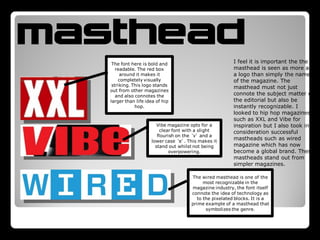
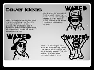
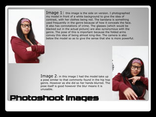
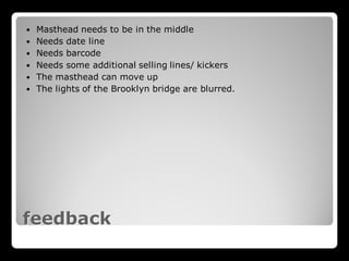
MUSIC
MAGAZINE
The making of…
INITIAL IDEAS


         EP:                         Mix Tape:
         The name EP                 Mix tape is another
         stands for                  hip hop term which
         ‘extended play’ it          refers to a trial record
         is often used in            released to test
         the music                   weather an artist will
         industry but I              make the big time.
         believe it also             They are associated
         could be used to            with being at the
         mean more than              center of the genre
         music.                      and often credited
         The masthead                with being artist’s
         would be in the             best work.
         familiar left               The masthead would
         corner and it               be quite dominant
         would be a pop              and the magazine
         centered                    would be styled to
         magazine.                   look gritty and
                                     homemade.

         WAVED:
         Waved is a hip hop
         slang word meaning          HOVE:
         enjoyment or                Hove is a term used in
         intoxication. It features   the hip hop genre,
         in numerous rap songs       coined by Jay-Z. Hove
         and I feel connects the     is a shortened version
         magazine to the rap         of Jewish god Jehovah
         genre.                      and has come to
         The masthead would be       mean a type of


INITIAL IDEAS (scan in)
         traditionally across the    modern day demigod.
         whole magazine and          The masthead would
         there would be few          be vertical down the
         kickers with the model      side leaving more
         being a major selling       room for the models
         point.                      and kickers.
CHOSEN
                                    IDEA:
          Classical masthead,
         spreading across the
         entire magazine. The
      masthead should have an
                                    WAVED
                                    MAGAZINE
      individual look about it so
           it can be instantly
       recognizable, and should
        feature a hip hop font.
                                     I elected to go with the
                                     waved magazine idea
                                     because I feel it can be
   Central image of model            turned into an entire
 focusing on mainly the top          brand. The title, though
   half. The model should            connoting hip hop, is
  have a ‘snapback’ hat on           not directly linked to
   because they are very
symbolic of the genre itself.
                                     the genre and allows
                                     for a broader topic
                                     area. In my survey I
                                     found that more people
                                     wanted an interview
         One central kicker          and review based
       relating to the model.        magazine and so I felt
       The magazine’s main           that this layout implied
        selling point should         a magazine that was
        be the model and so          more focused around
          the kicker should          personality that purely
           relate the that.          music.
masthead                                                 I feel it is important the the
    The font here is bold and
      readable. The red box                              masthead is seen as more as
        around it makes it                               a logo than simply the name
       completely visually                               of the magazine. The
    striking. This logo stands                           masthead must not just
   out from other magazines
      and also connotes the                              connote the subject matter of
   larger than life idea of hip                          the editorial but also be
               hop.                                      instantly recognizable. I
                                                         looked to hip hop magazines
                                                         such as XXL and Vibe for
                         Vibe magazine opts for a        inspiration but I also took into
                          clear font with a slight       consideration successful
                         flourish on the ‘v’ and a
                      lower case ‘e’. This makes it
                                                         mastheads such as wired
                        stand out whilst not being       magazine which has now
                              overpowering.              become a global brand. These
                                                         mastheads stand out from
                                                         simpler magazines.

                                       The wired masthead is one of the
                                             most recognizable in the
                                       magazine industry, the font itself
                                       connote the idea of technology as
                                          to the pixelated blocks. It is a
                                       prime example of a masthead that
                                              symbolizes the genre.
MY MASTHEAD


I chose this masthead because I particularly like how it stands out.
The letters are readable but altered, and altered in such a way that
it makes the magazine stand out from other music magazines. I
wanted to establish a brand image and I particularly liked the idea of
persona within the hip hop genre. Artists often use pseudonyms and
wear accessories that hide their eves or face and so I wanted to
convey this idea of concealing identity in my masthead hence the
filled in letters.
Cover Ideas                                 Idea 1: the front on model. I
                                            like this idea because it gives
                                            the model quite a lot of power.
                                            The fact that the model is
Idea 2: In this picture the model would     staring directly at the reader
be at an angle facing away from the         creates this domineering
camera, with the camera looking             persona.
upwards. This creates this idea of
importance and dismissal by the model.
The upwards shot makes the model
seem larger than life.


                                          Idea 3: in this image I would
                                          have the model striking a pose.
                                          The idea of this is to show the
                                          artist working a crowd. There is
                                          also an almost king like
                                          connotation to this pose.
Image 1:       this image is the side on version. I photographed
         my model in front of a white background to give the idea of
         contrast, with her clothes being red. The bandana is something
         used frequently in the genre because of how it conceals the face.
         It also has connotations of crime. The glasses (which would be
         blacked out in the actual picture) are also synonymous with the
         genre. The pose of this is important because the folded arms
         convey this idea of being almost king-like. The camera is also
         below the model so as to give the sense that she is more powerful.


     Image 2: in this image I had the model take up
     a pose similar to that commonly found in the hip hop
     genre. However as she did so her hands blurred. The
     pose itself is good however the blur means it is
     unusable.


Photoshoot images
The mise en scene is appropriate with the model
 wearing the genre appropriate ‘snapback’ hat
 and ray ban glasses. There is a great degree of
 persona within the rap genre with stage names
and that is personified by the clothes they wear.


     The downward angle of the shot makes
      the model seem more powerful, this is
      commonly found on the cover of music
     magazines. This again relates to the idea
        that these hip hop figureheads are
               almost religious icons.


                The pose of the shot is
              important because it again
              connotes power. The slight
             angle makes the image more
               interesting and gives the
             model more of a persona and
                    an individuality.


             The dark colours are again important
            because the genre plays upon the idea
               of darkness. As Rap started in the
            Bronx in new york as a means for the
            African American community to gain a
              larger social stance the colour black
             became synonymous with the genre
                and still is worn by almost every
                               artist.


       CHOSEN IMAGE
Illustrated covers
                 For my front cover I wanted to make it a real art piece
                 more than a traditional photograph of a model. Guitar
                 world often features covers with illustrations behind
                 artists or even fully illustrated covers. Independent movie
                 magazine ‘little white lies’ is famous for it’s beautifully
                 illustrated covers which have become a selling point for
                 the magazine. I wanted to perhaps experiment with a
                 partially illustrated cover.
FIRST DRAFT
   Masthead needs to be in the middle
   Needs date line
   Needs barcode
   Needs some additional selling lines/ kickers
   The masthead can move up
   The lights of the Brooklyn bridge are blurred.


feedback
FINAL DRAFT
I chose to do a relatively barren cover in terms of kickers
and badges. Though music magazine covers are often busy
I found that ones with a particularly influential cover model
didn’t feel the need to put as man y kickers. For example if
you look at the Nme cover featuring Jay-Z it had a small bit
of text and the picture of Jay-Z. I wanted to create this idea
of my model being almost like a king and so I felt that by
having her as the only subject of the cover allowed that to
happen. As I have stated the idea of persona and
appearance is key to the hip hop genre, with a large
emphasis put on stage names and presence. This is why I
chose to put al of the objects exploding out from behind my
model. I wanted it to seem as is she was at the heart of this
life style. Money, weapons and cars are staples of the genre
as well as New York, so in this picture I combined all of
these in just the background. I crushed the blacks so the
model’s hat and glasses became even more dark. Rappers
often choose to hide their eyes and mask their identity,
hence why I have chosen to do so here. The aloof pose is
also very symbolic of genre and the larger than life
personality. Because we are seeing up at the model we feel
as if we are below her. Similarly it implies she is larger than
the magazine. The kicker itself goes back to these
connotations of royalty within the music industry with the
word ‘queen’ made to stand out from the rest.

DPS commentary

  • 1.
  • 2.
    INITIAL IDEAS EP: Mix Tape: The name EP Mix tape is another stands for hip hop term which ‘extended play’ it refers to a trial record is often used in released to test the music weather an artist will industry but I make the big time. believe it also They are associated could be used to with being at the mean more than center of the genre music. and often credited The masthead with being artist’s would be in the best work. familiar left The masthead would corner and it be quite dominant would be a pop and the magazine centered would be styled to magazine. look gritty and homemade. WAVED: Waved is a hip hop slang word meaning HOVE: enjoyment or Hove is a term used in intoxication. It features the hip hop genre, in numerous rap songs coined by Jay-Z. Hove and I feel connects the is a shortened version magazine to the rap of Jewish god Jehovah genre. and has come to The masthead would be mean a type of INITIAL IDEAS (scan in) traditionally across the modern day demigod. whole magazine and The masthead would there would be few be vertical down the kickers with the model side leaving more being a major selling room for the models point. and kickers.
  • 3.
    CHOSEN IDEA: Classical masthead, spreading across the entire magazine. The masthead should have an WAVED MAGAZINE individual look about it so it can be instantly recognizable, and should feature a hip hop font. I elected to go with the waved magazine idea because I feel it can be Central image of model turned into an entire focusing on mainly the top brand. The title, though half. The model should connoting hip hop, is have a ‘snapback’ hat on not directly linked to because they are very symbolic of the genre itself. the genre and allows for a broader topic area. In my survey I found that more people wanted an interview One central kicker and review based relating to the model. magazine and so I felt The magazine’s main that this layout implied selling point should a magazine that was be the model and so more focused around the kicker should personality that purely relate the that. music.
  • 4.
    masthead I feel it is important the the The font here is bold and readable. The red box masthead is seen as more as around it makes it a logo than simply the name completely visually of the magazine. The striking. This logo stands masthead must not just out from other magazines and also connotes the connote the subject matter of larger than life idea of hip the editorial but also be hop. instantly recognizable. I looked to hip hop magazines such as XXL and Vibe for Vibe magazine opts for a inspiration but I also took into clear font with a slight consideration successful flourish on the ‘v’ and a lower case ‘e’. This makes it mastheads such as wired stand out whilst not being magazine which has now overpowering. become a global brand. These mastheads stand out from simpler magazines. The wired masthead is one of the most recognizable in the magazine industry, the font itself connote the idea of technology as to the pixelated blocks. It is a prime example of a masthead that symbolizes the genre.
  • 5.
    MY MASTHEAD I chosethis masthead because I particularly like how it stands out. The letters are readable but altered, and altered in such a way that it makes the magazine stand out from other music magazines. I wanted to establish a brand image and I particularly liked the idea of persona within the hip hop genre. Artists often use pseudonyms and wear accessories that hide their eves or face and so I wanted to convey this idea of concealing identity in my masthead hence the filled in letters.
  • 6.
    Cover Ideas Idea 1: the front on model. I like this idea because it gives the model quite a lot of power. The fact that the model is Idea 2: In this picture the model would staring directly at the reader be at an angle facing away from the creates this domineering camera, with the camera looking persona. upwards. This creates this idea of importance and dismissal by the model. The upwards shot makes the model seem larger than life. Idea 3: in this image I would have the model striking a pose. The idea of this is to show the artist working a crowd. There is also an almost king like connotation to this pose.
  • 7.
    Image 1: this image is the side on version. I photographed my model in front of a white background to give the idea of contrast, with her clothes being red. The bandana is something used frequently in the genre because of how it conceals the face. It also has connotations of crime. The glasses (which would be blacked out in the actual picture) are also synonymous with the genre. The pose of this is important because the folded arms convey this idea of being almost king-like. The camera is also below the model so as to give the sense that she is more powerful. Image 2: in this image I had the model take up a pose similar to that commonly found in the hip hop genre. However as she did so her hands blurred. The pose itself is good however the blur means it is unusable. Photoshoot images
  • 8.
    The mise enscene is appropriate with the model wearing the genre appropriate ‘snapback’ hat and ray ban glasses. There is a great degree of persona within the rap genre with stage names and that is personified by the clothes they wear. The downward angle of the shot makes the model seem more powerful, this is commonly found on the cover of music magazines. This again relates to the idea that these hip hop figureheads are almost religious icons. The pose of the shot is important because it again connotes power. The slight angle makes the image more interesting and gives the model more of a persona and an individuality. The dark colours are again important because the genre plays upon the idea of darkness. As Rap started in the Bronx in new york as a means for the African American community to gain a larger social stance the colour black became synonymous with the genre and still is worn by almost every artist. CHOSEN IMAGE
  • 9.
    Illustrated covers For my front cover I wanted to make it a real art piece more than a traditional photograph of a model. Guitar world often features covers with illustrations behind artists or even fully illustrated covers. Independent movie magazine ‘little white lies’ is famous for it’s beautifully illustrated covers which have become a selling point for the magazine. I wanted to perhaps experiment with a partially illustrated cover.
  • 10.
  • 11.
    Masthead needs to be in the middle  Needs date line  Needs barcode  Needs some additional selling lines/ kickers  The masthead can move up  The lights of the Brooklyn bridge are blurred. feedback
  • 12.
  • 13.
    I chose todo a relatively barren cover in terms of kickers and badges. Though music magazine covers are often busy I found that ones with a particularly influential cover model didn’t feel the need to put as man y kickers. For example if you look at the Nme cover featuring Jay-Z it had a small bit of text and the picture of Jay-Z. I wanted to create this idea of my model being almost like a king and so I felt that by having her as the only subject of the cover allowed that to happen. As I have stated the idea of persona and appearance is key to the hip hop genre, with a large emphasis put on stage names and presence. This is why I chose to put al of the objects exploding out from behind my model. I wanted it to seem as is she was at the heart of this life style. Money, weapons and cars are staples of the genre as well as New York, so in this picture I combined all of these in just the background. I crushed the blacks so the model’s hat and glasses became even more dark. Rappers often choose to hide their eyes and mask their identity, hence why I have chosen to do so here. The aloof pose is also very symbolic of genre and the larger than life personality. Because we are seeing up at the model we feel as if we are below her. Similarly it implies she is larger than the magazine. The kicker itself goes back to these connotations of royalty within the music industry with the word ‘queen’ made to stand out from the rest.