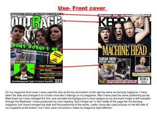
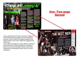
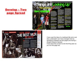
The document discusses the design choices made for various pages of a magazine created by the author. For the front cover, the author took inspiration from the layout and design elements of the Kerrang magazine but made modifications to make it unique. For the contents page, the author again drew from the Kerrang magazine layout while changing aspects like the organization of stories and inclusion of colored strips. For the two-page spread, dominant images are used on the left with a masthead title spanning both pages to draw the reader in. Throughout, the goal was to create a magazine that captured the style of Kerrang but with its own distinguishing characteristics.