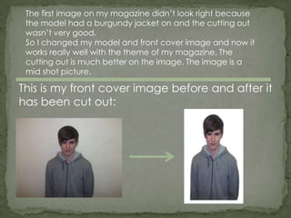
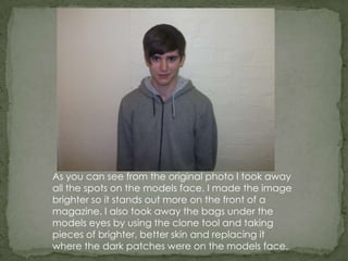
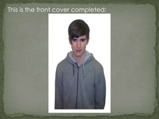
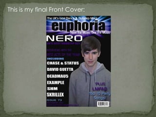
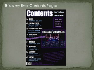
In what ways does your
   media product use,
  develop or challenge
 forms and conventions
     of real media
       products?
As my preliminary task, I designed a school magazine. It
was really basic and didn’t look very good because my
skills on Photoshop were not good at all because I had
never used it before.

The cutting out on my photo was really bad and it was
a very basic layout with not much on it because I didn’t
know how to layer things or make writing colourful,
change the background colour other than the default
basic one or edit the text once I had written it. I also did
a contents page which was again a very basic layout
and the colour of the background was completely
different to the front cover so it looked really bad.

The magazine looked really unprofessional and didn’t
look good. Since then, my Photoshop skills have got
much better and I now know how to work Photoshop. I
have produced my final music magazine with front
cover, contents page and double page spread.
My magazine is called ‘euphoria’ and target audience
for my magazine is 15+. It is for both a male and female
audience.

I created my masthead at first just using a basic
Photoshop text effect and I didn’t think it looked good
so I followed instructions from a website to create a
much more advanced masthead to really help my
masthead stand out. I got the instructions from this
website.
http://www.photoshopessentials.com/photoshop-
text/text-effects/light-burst/

The theme of my background colour is black. This is
because this looked the best with my masthead
because it is very bright and it looks good with a dark
background. My masthead is at the top of my
magazine in the centre.
This is my mast head:
The first image on my magazine didn’t look right because
 the model had a burgundy jacket on and the cutting out
 wasn’t very good.
 So I changed my model and front cover image and now it
 works really well with the theme of my magazine. The
 cutting out is much better on the image. The image is a
 mid shot picture.

This is my front cover image before and after it
has been cut out:
As you can see from the original photo I took away
all the spots on the models face. I made the image
brighter so it stands out more on the front of a
magazine. I also took away the bags under the
models eyes by using the clone tool and taking
pieces of brighter, better skin and replacing it
where the dark patches were on the models face.
This is the front cover completed:
The colours of my masthead on the effect is blue and
purple so I have used these colours and white throughout
my magazine to keep a style so it all works together. I have
done the same with the fonts on my magazine front cover
and used it in my contents page and double page spread
so the magazine keeps a style. The fonts I used throughout
the magazine are ‘impact’ ‘National First Font Dotted’
‘Prisoner SF’ ‘Zolano Sans BTN’. Tomorrow tommorrow
This is my final Front Cover:
This is my final Contents Page:
This is my final Double Page Spread:
As you can see there is a theme with my
  magazine front cover, contents page and
double page spread. The colours throughout
the magazine are the same, and I have used
the same fonts throughout too. There is also a
 similar layout design to help it all fit together.
  All of this creates the theme throughout the
                     magazine.

Media question 1

  • 1.
    In what waysdoes your media product use, develop or challenge forms and conventions of real media products?
  • 2.
    As my preliminarytask, I designed a school magazine. It was really basic and didn’t look very good because my skills on Photoshop were not good at all because I had never used it before. The cutting out on my photo was really bad and it was a very basic layout with not much on it because I didn’t know how to layer things or make writing colourful, change the background colour other than the default basic one or edit the text once I had written it. I also did a contents page which was again a very basic layout and the colour of the background was completely different to the front cover so it looked really bad. The magazine looked really unprofessional and didn’t look good. Since then, my Photoshop skills have got much better and I now know how to work Photoshop. I have produced my final music magazine with front cover, contents page and double page spread.
  • 3.
    My magazine iscalled ‘euphoria’ and target audience for my magazine is 15+. It is for both a male and female audience. I created my masthead at first just using a basic Photoshop text effect and I didn’t think it looked good so I followed instructions from a website to create a much more advanced masthead to really help my masthead stand out. I got the instructions from this website. http://www.photoshopessentials.com/photoshop- text/text-effects/light-burst/ The theme of my background colour is black. This is because this looked the best with my masthead because it is very bright and it looks good with a dark background. My masthead is at the top of my magazine in the centre.
  • 4.
    This is mymast head:
  • 5.
    The first imageon my magazine didn’t look right because the model had a burgundy jacket on and the cutting out wasn’t very good. So I changed my model and front cover image and now it works really well with the theme of my magazine. The cutting out is much better on the image. The image is a mid shot picture. This is my front cover image before and after it has been cut out:
  • 6.
    As you cansee from the original photo I took away all the spots on the models face. I made the image brighter so it stands out more on the front of a magazine. I also took away the bags under the models eyes by using the clone tool and taking pieces of brighter, better skin and replacing it where the dark patches were on the models face.
  • 7.
    This is thefront cover completed:
  • 8.
    The colours ofmy masthead on the effect is blue and purple so I have used these colours and white throughout my magazine to keep a style so it all works together. I have done the same with the fonts on my magazine front cover and used it in my contents page and double page spread so the magazine keeps a style. The fonts I used throughout the magazine are ‘impact’ ‘National First Font Dotted’ ‘Prisoner SF’ ‘Zolano Sans BTN’. Tomorrow tommorrow
  • 9.
    This is myfinal Front Cover:
  • 10.
    This is myfinal Contents Page:
  • 11.
    This is myfinal Double Page Spread:
  • 12.
    As you cansee there is a theme with my magazine front cover, contents page and double page spread. The colours throughout the magazine are the same, and I have used the same fonts throughout too. There is also a similar layout design to help it all fit together. All of this creates the theme throughout the magazine.