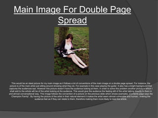
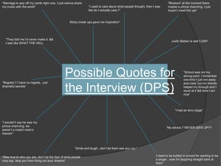
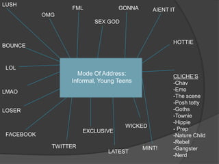
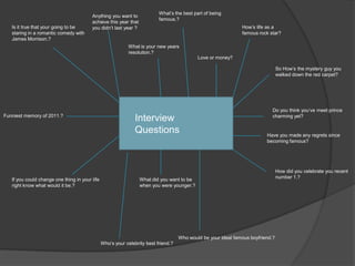
Double Page Spread PrepVictoria Summers
EXAMPLESFor interviews
Mock Up’s Artist Name/ Title Use In One Type Of Font, Clashing Colour Opposed to other colours of the page EG have it in yellow font with a black background Summary of who she is, previous success, latest album, want a bold font , maybe purple with a white outline?Interview, make sure that the text follows the conventions of having the same type of font for both answer and question but a difference of colour of text, to show difference, make sure there is also a “?” at the end .The colour scheme for my magazine is Yellow, purple, black and white. In this case I therefore want the background of the main article to reflect the colour scheme on the front page I therefore I need to have the background black for the double page spread. I can then use all the other colours of white, purple and yellow in various combinations to attract the eyes of the audience. Being as white and yellow are the most eye catching colours I should use them as background colours or outlines in various fonts. Interesting quote, maybe have it in white with a yellow background colour, black outline.? Make sure it’s a different font, want something slick, maybe use Juice?Main Image, makes sure it is colour full to attract the eye. && make sure it is also big. Maybe have an outline of Yellow to bring the audience attracted into it. Smaller picture of the artist, still have a yellow background, maybe one with her standing up? Make sure there is a small clip of who it is, what she is doing etc.Interview, same as above.Iinteresting quote, maybe have it in white with a yellow background colour, black outline.? Make sure it’s a different font, as in this case it would be the title maybe have something big and bold to make it stand out. Easier to make it stand  out by having a darker font colour and a bright outline.Main Image, makes sure it is colour full to attract the eye. && make sure it is also big. Maybe have an outline of Yellow to bring the audience attracted into it. Name of magName of magPageSummary of who she is, previous success, latest album, want a bold font , maybe purple with a white outline?Conventions They follow: Having a “Main image” that fills up the hole of one page, normally one of the artist in big making them seem bigger than life
The article usually has quotes some where on the page, making the audience become curious
There becomes no longer a need for the title. Many music magazines I have researched no longer have a title for it for Example, on the previous example page the article with Lily Allen just has a quote as the title
 a brief summary about who the artist is
Page numbers in the corners often missed out on the page of the main image
The majority of double page spreads have the majority of the page filled up with pictures and only ½ one page actually filled up of text, this has lead me to follow the convention and have the majority of my page imagery, to give of the appearance of the article being less daunting. As well as having the text in columns.  Interview, make sure that the text follows the conventions of having the same type of font for both answer and question but a difference of colour of text, to show difference, make sure there is also a “?” at the end .Page
Main Image For Double Page Spread This would be an ideal picture for my main image as it follows a lot of conventions of the main image on a double page spread. For instance, the picture is of the main artist just sitting around showing what they do. For example in this case playing the guitar. It also has a bright background that captures the audiences eye. However this picture doesn’t have the audience looking at them, in order to solve this problem another picture in which I shall add to the article will be of the artist looking at the audience. This would give the audience the feeling still of the artist talking directly to them in and almost conversational way. This image follows the convention of a picture on the previous slide which shows examples, (Contents page says the Champion Family”. By having the picture of the artist in their natural element it makes the artist seem almost vulnerable and human,  making the audience feel as if they can relate to them, therefore making them more likely to read the article.
*Blushes* at the moment there maybe a prince charming, I just haven’t meet him yet”“Marriage is way off my cards right now, I just wanna share my music with the world”“I used to care about what people thought, then I was like do I actually care.?”Sticky break ups gave me inspiration”“They told me I’d never make it. && I was like WHAT THE HELLJustin Bieber is well LUSH”Possible Quotes for the Interview (DPS)“School was not my strong point, I remember one time I just ran away and cried, but my friends helped my through and I stuck at it && here I am now”“Regrets.? I have no regrets,  just shameful secrets”“I had an emo stage”“I wouldn’t say he was my prince charming, we weren’t a match mad in heaven”“My advice.? NEVER GIVE UP!?!“Smile and laugh...don’t let them see you cry.”I Used to be bullied in school for wanting to be a singer...now I'm laughing straight back at them”“Stay true to who you are, don’t let the fear of what people may say, stop you from living out your dreams”

Double Page Spread Prep

  • 1.
    Double Page SpreadPrepVictoria Summers
  • 2.
  • 3.
    Mock Up’s ArtistName/ Title Use In One Type Of Font, Clashing Colour Opposed to other colours of the page EG have it in yellow font with a black background Summary of who she is, previous success, latest album, want a bold font , maybe purple with a white outline?Interview, make sure that the text follows the conventions of having the same type of font for both answer and question but a difference of colour of text, to show difference, make sure there is also a “?” at the end .The colour scheme for my magazine is Yellow, purple, black and white. In this case I therefore want the background of the main article to reflect the colour scheme on the front page I therefore I need to have the background black for the double page spread. I can then use all the other colours of white, purple and yellow in various combinations to attract the eyes of the audience. Being as white and yellow are the most eye catching colours I should use them as background colours or outlines in various fonts. Interesting quote, maybe have it in white with a yellow background colour, black outline.? Make sure it’s a different font, want something slick, maybe use Juice?Main Image, makes sure it is colour full to attract the eye. && make sure it is also big. Maybe have an outline of Yellow to bring the audience attracted into it. Smaller picture of the artist, still have a yellow background, maybe one with her standing up? Make sure there is a small clip of who it is, what she is doing etc.Interview, same as above.Iinteresting quote, maybe have it in white with a yellow background colour, black outline.? Make sure it’s a different font, as in this case it would be the title maybe have something big and bold to make it stand out. Easier to make it stand out by having a darker font colour and a bright outline.Main Image, makes sure it is colour full to attract the eye. && make sure it is also big. Maybe have an outline of Yellow to bring the audience attracted into it. Name of magName of magPageSummary of who she is, previous success, latest album, want a bold font , maybe purple with a white outline?Conventions They follow: Having a “Main image” that fills up the hole of one page, normally one of the artist in big making them seem bigger than life
  • 4.
    The article usuallyhas quotes some where on the page, making the audience become curious
  • 5.
    There becomes nolonger a need for the title. Many music magazines I have researched no longer have a title for it for Example, on the previous example page the article with Lily Allen just has a quote as the title
  • 6.
    a briefsummary about who the artist is
  • 7.
    Page numbers inthe corners often missed out on the page of the main image
  • 8.
    The majority ofdouble page spreads have the majority of the page filled up with pictures and only ½ one page actually filled up of text, this has lead me to follow the convention and have the majority of my page imagery, to give of the appearance of the article being less daunting. As well as having the text in columns. Interview, make sure that the text follows the conventions of having the same type of font for both answer and question but a difference of colour of text, to show difference, make sure there is also a “?” at the end .Page
  • 9.
    Main Image ForDouble Page Spread This would be an ideal picture for my main image as it follows a lot of conventions of the main image on a double page spread. For instance, the picture is of the main artist just sitting around showing what they do. For example in this case playing the guitar. It also has a bright background that captures the audiences eye. However this picture doesn’t have the audience looking at them, in order to solve this problem another picture in which I shall add to the article will be of the artist looking at the audience. This would give the audience the feeling still of the artist talking directly to them in and almost conversational way. This image follows the convention of a picture on the previous slide which shows examples, (Contents page says the Champion Family”. By having the picture of the artist in their natural element it makes the artist seem almost vulnerable and human, making the audience feel as if they can relate to them, therefore making them more likely to read the article.
  • 10.
    *Blushes* at themoment there maybe a prince charming, I just haven’t meet him yet”“Marriage is way off my cards right now, I just wanna share my music with the world”“I used to care about what people thought, then I was like do I actually care.?”Sticky break ups gave me inspiration”“They told me I’d never make it. && I was like WHAT THE HELLJustin Bieber is well LUSH”Possible Quotes for the Interview (DPS)“School was not my strong point, I remember one time I just ran away and cried, but my friends helped my through and I stuck at it && here I am now”“Regrets.? I have no regrets, just shameful secrets”“I had an emo stage”“I wouldn’t say he was my prince charming, we weren’t a match mad in heaven”“My advice.? NEVER GIVE UP!?!“Smile and laugh...don’t let them see you cry.”I Used to be bullied in school for wanting to be a singer...now I'm laughing straight back at them”“Stay true to who you are, don’t let the fear of what people may say, stop you from living out your dreams”