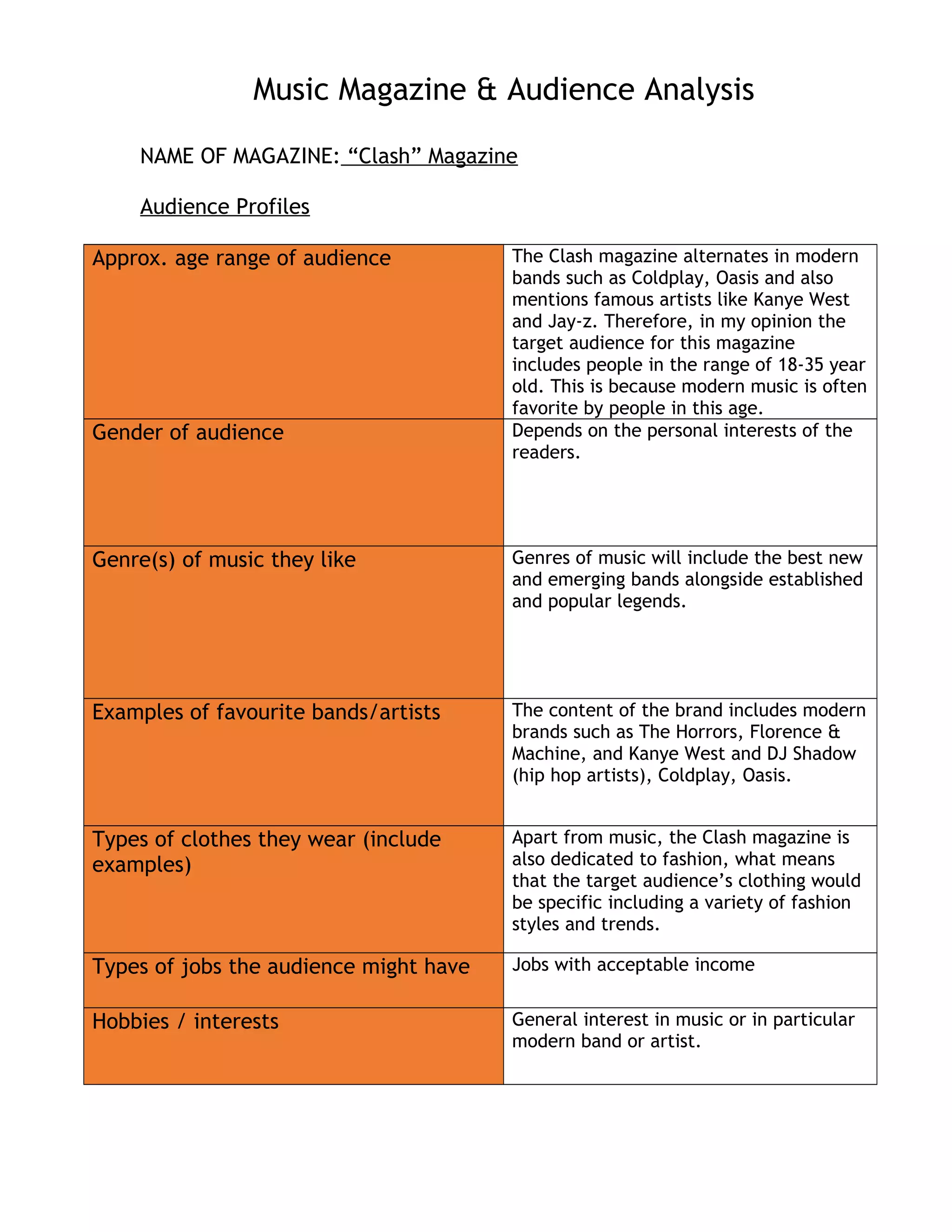
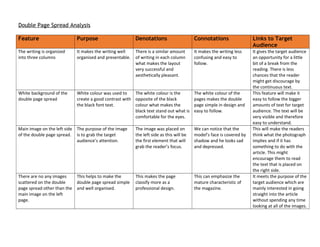
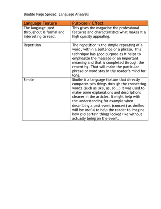
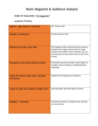
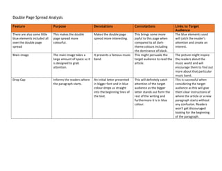
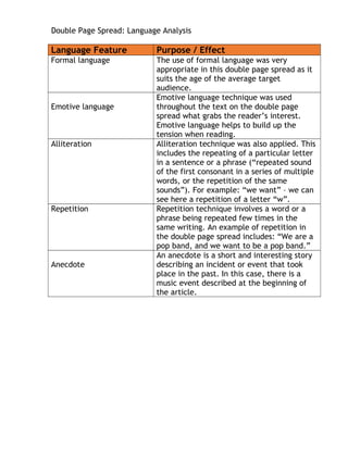
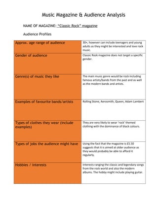
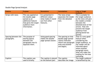
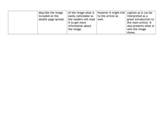
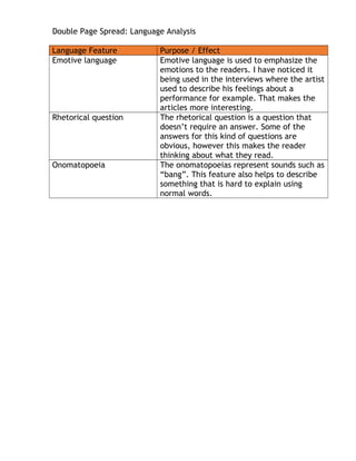
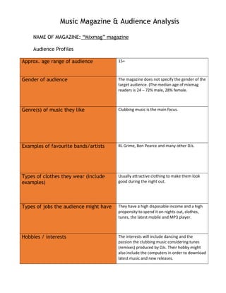
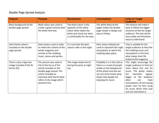
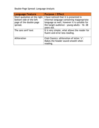
Music Magazine & Audience Analysis
NAME OF MAGAZINE: “Clash” Magazine
Audience Profiles
Approx. age range of audience The Clash magazine alternates in modern
bands such as Coldplay, Oasis and also
mentions famous artists like Kanye West
and Jay-z. Therefore, in my opinion the
target audience for this magazine
includes people in the range of 18-35 year
old. This is because modern music is often
favorite by people in this age.
Gender of audience Depends on the personal interests of the
readers.
Genre(s) of music they like Genres of music will include the best new
and emerging bands alongside established
and popular legends.
Examples of favourite bands/artists The content of the brand includes modern
brands such as The Horrors, Florence &
Machine, and Kanye West and DJ Shadow
(hip hop artists), Coldplay, Oasis.
Types of clothes they wear (include
examples)
Apart from music, the Clash magazine is
also dedicated to fashion, what means
that the target audience’s clothing would
be specific including a variety of fashion
styles and trends.
Types of jobs the audience might have Jobs with acceptable income
Hobbies / interests General interest in music or in particular
modern band or artist.
Double Page Spread Analysis
Feature Purpose Denotations Connotations Links to Target
Audience
The writing is organized
into three columns
It makes the writing well
organised and presentable.
There is a similar amount
of writing in each column
what makes the layout
very successful and
aesthetically pleasant.
It makes the writing less
confusing and easy to
follow.
It gives the target audience
an opportunity for a little
bit of a break from the
reading. There is less
chances that the reader
might get discourage by
the continuous text.
White background of the
double page spread
White colour was used to
create a good contrast with
the black font text.
The white colour is the
opposite of the black
colour what makes the
black text stand out what is
comfortable for the eyes.
The white colour of the
pages makes the double
page simple in design and
easy to follow.
This feature will make it
easy to follow the bigger
amounts of text for target
audience. The text will be
very visible and therefore
easy to understand.
Main image on the left side
of the double page spread.
The purpose of the image
is to grab the target
audience’s attention.
The image was placed on
the left side as this will be
the first element that will
grab the reader’s focus.
We can notice that the
model’s face is covered by
shadow and he looks sad
and depressed.
This will make the readers
think what the photograph
implies and if it has
something to do with the
article. This might
encourage them to read
the text that is placed on
the right side.
There are no any images
scattered on the double
page spread other than the
main image on the left
page.
This helps to make the
double page spread simple
and well organised.
This makes the page
classify more as a
professional design.
This can emphasize the
mature characteristic of
the magazine.
It meets the purpose of the
target audience which are
mainly interested in going
straight into the article
without spending any time
looking at all of the images.
Double Page Spread: Language Analysis
Language Feature Purpose / Effect
The language used
throughout is formal and
interesting to read.
This gives the magazine the professional
features and characteristics what makes it a
high quality appealing.
Repetition The repetition is the simple repeating of a
word, within a sentence or a phrase. This
technique has good purpose as it helps to
emphasize the message or an important
meaning and that is completed through the
repeating. That will make the particular
phrase or word stay in the reader’s mind for
long.
Simile Simile is a language feature that directly
compares two things through the connecting
words (such as like, as, so …) It was used to
make some explanations and descriptions
clearer in the articles. It might help with
the understanding for example when
describing a past event (concert) as similes
will be useful to help the reader to imagine
how did certain things looked like without
actually being on the event.
Music Magazine & Audience Analysis
NAME OF MAGAZINE: “Q magazine”
Audience Profiles
Approx. age range of audience 30 – 40 years old
Gender of audience Aimed mainly at male
Genre(s) of music they like This magazine offers featuring of new releases,
therefore this might indicate that the target
audience like modern music. However, we can
see that they also put some focus on rock music
as well.
Examples of favourite bands/artists The bands and artists include a wide range: U2
to Adele, Oasis to Rihanna, and Radiohead to
Lady Gaga.
Types of clothes they wear (include
examples)
Modern trend clothing and stylisation
Types of jobs the audience might have Generally ABC1 jobs with higher incomes
Hobbies / interests Interested in famous, standard music and also
on new releases.
Double Page Spread Analysis
Feature Purpose Denotations Connotations Links to Target
Audience
There are also some little
blue elements included all
over the double page
spread
This makes the double
page spread more
colourful.
Makes the double page
spread more interesting.
This brings some more
joyful to this page when
compared to all dark-
theme colours including
the dominance of black.
The blue elements used
will catch the reader’s
attention and create an
interest.
Main image The main image takes a
large amount of space so it
is designed to grab
attention.
It presents a famous music
band.
This might persuade the
target audience to read the
article.
The picture might inspire
the readers about the
music world and will
encourage them to find out
more about that particular
music band.
Drop Cap Informs the readers where
the paragraph starts.
An initial letter presented
in bigger font and in blue
colour drops us straight
into the beginning lines of
the text.
This will definitely catch
attention of the target
audience as the bigger
letter stands out form the
rest of the writing and
furthermore it is in blue
colour.
This is successful when
considering the target
audience as this will give
them clear instructions of
where the article or a new
paragraph starts without
any confusion. Readers
won’t get discouraged
looking for the beginning
of the paragraph.
Double Page Spread: Language Analysis
Language Feature Purpose / Effect
Formal language The use of formal language was very
appropriate in this double page spread as it
suits the age of the average target
audience.
Emotive language
Emotive language technique was used
throughout the text on the double page
spread what grabs the reader’s interest.
Emotive language helps to build up the
tension when reading.
Alliteration Alliteration technique was also applied. This
includes the repeating of a particular letter
in a sentence or a phrase (“repeated sound
of the first consonant in a series of multiple
words, or the repetition of the same
sounds”). For example: “we want” – we can
see here a repetition of a letter “w”.
Repetition Repetition technique involves a word or a
phrase being repeated few times in the
same writing. An example of repetition in
the double page spread includes: “We are a
pop band, and we want to be a pop band.”
Anecdote
An anecdote is a short and interesting story
describing an incident or event that took
place in the past. In this case, there is a
music event described at the beginning of
the article.
Music Magazine & Audience Analysis
NAME OF MAGAZINE: “Classic Rock” magazine
Audience Profiles
Approx. age range of audience 30+, however can include teenagers and young
adults as they might be interested and love rock
music.
Gender of audience Classic Rock magazine does not target a specific
gender.
Genre(s) of music they like The main music genre would be rock including
famous artists/bands from the past and as well
as the modern bands and artists.
Examples of favourite bands/artists Rolling Stone, Aerosmith, Queen, Adam Lambert
Types of clothes they wear (include
examples)
They are very likely to wear ‘rock’ themed
clothing with the dominance of black colours.
Types of jobs the audience might have Using the fact that the magazine is £5.50
suggests that it is aimed at older audience as
they would probably be able to afford it
regularly.
Hobbies / interests Interests ranging the classic and legendary songs
from the rock world and also the modern
albums. The hobby might include playing guitar.
Double Page Spread Analysis
Feature Purpose Denotations Connotations Links to Target
Audience
Stripe with news This was applied on
the double page
spread as an
additional feature
that gives the target
audience more
information.
It is presented in
different colour
what makes it stand
out from other
features.
The news stripe
separates the reader
from the detailed
text.
This is suitable for
the target audience
as the news will give
the readers a break
between the
detailed texts of the
article. That will
prevent the target
audience from
getting bored too
quickly.
Spacing between the
paragraphs.
The purpose of
leaving spaces
between the
paragraphs was to
separate them.
Using good spacing
makes the double
page spread clearer.
The spacing on that
double page spread
clearly indicates
where one paragraph
ends and another
one begins.
That is a very good
feature when
considering the
target audience, as
the reader will be
informed about
where another
paragraph starts
what will make the
reading for him less
confusing.
Caption The caption was
used to briefly
The caption is placed
on the bottom part
The caption
describes the image
The target audience
is benefited by the
describe the image
included on the
double page spread.
of the image what is
easily noticeable so
the readers will read
it to get more
information about
the image.
however it might link
to the article as
well.
caption as it can be
interpreted as a
great introduction to
the main article. It
also presents what or
who the image
shows.
Double Page Spread: Language Analysis
Language Feature Purpose / Effect
Emotive language Emotive language is used to emphasize the
emotions to the readers. I have noticed it
being used in the interviews where the artist
used to describe his feelings about a
performance for example. That makes the
articles more interesting.
Rhetorical question The rhetorical question is a question that
doesn’t require an answer. Some of the
answers for this kind of questions are
obvious, however this makes the reader
thinking about what they read.
Onomatopoeia The onomatopoeias represent sounds such as
“bang”. This feature also helps to describe
something that is hard to explain using
normal words.
Music Magazine & Audience Analysis
NAME OF MAGAZINE: “Mixmag” magazine
Audience Profiles
Approx. age range of audience 15+
Gender of audience The magazine does not specify the gender of the
target audience. (The median age of mixmag
readers is 24 – 72% male, 28% female.
Genre(s) of music they like Clubbing music is the main focus.
Examples of favourite bands/artists RL Grime, Ben Pearce and many other DJs.
Types of clothes they wear (include
examples)
Usually attractive clothing to make them look
good during the night out.
Types of jobs the audience might have They have a high disposable income and a high
propensity to spend it on nights out, clothes,
tunes, the latest mobile and MP3 player.
Hobbies / interests The interests will include dancing and the
passion the clubbing music considering tunes
(remixes) produced by DJs. Their hobby might
also include the computers in order to download
latest music and new releases.
Double Page Spread Analysis
Feature Purpose Denotations Connotations Links to Target
Audience
Black background of the
double page spread.
Black colour was used to
create a good contrast with
the white font text.
The black colour is the
opposite of the white
colour what makes the
white text stand out what
is comfortable for the eyes.
The white black of the
pages makes the double
page simple in design and
easy to follow.
This feature will make it
easy to follow the bigger
amounts of text for target
audience. The text will be
very visible and therefore
easy to understand.
Dark theme colours
included on the double
page spread.
Dark colours used in order
to relate the content of the
whole magazine and
articles to the clubbing
music, dance and parties.
It is sure that the dark
colours refer to the night.
Dark colours (black) are
used to represent the night
atmosphere at which the
clubbing takes place.
That is suitable for the
target audience as they like
the clubbing music and
atmosphere in this kind
what makes their life
linked to the magazine.
There is also a big main
image included of the RL
Grime (DJ)
This picture was used to
link to the focus of the
article included on the
double page spread. The
article included an
interview with the DJ what
refers to the image which
presents him.
The image shows the DJ
during the party at night
out.
Probably it is in the club as
there is a crowd of people
visible on the background
of the photo and also we
can see some hands what
shows that people are
enjoying his music.
This might encourage the
target audience to find out
more about him and his
music. The photo makes
the character appear
bigger to the audience
what can have
connotations of him having
power over his fans using
his music which they love
and are interested in.
Double Page Spread: Language Analysis
Language Feature Purpose / Effect
Short quotation at the right
bottom side of the left
page of the double page
spread.
I have noticed that it is presented in
informal language containing inappropriate
language as well, however it is suitable for
the target audience – young adults – 16- 28
years old.
The sans serif text It is very simple, what allows the reader for
fluent and error-less reading.
Alliteration Club Classics: alliteration of letter ‘c’.
Makes the header sound smooth when
reading.

Music magazine analysis grids

  • 1.
    Music Magazine &Audience Analysis NAME OF MAGAZINE: “Clash” Magazine Audience Profiles Approx. age range of audience The Clash magazine alternates in modern bands such as Coldplay, Oasis and also mentions famous artists like Kanye West and Jay-z. Therefore, in my opinion the target audience for this magazine includes people in the range of 18-35 year old. This is because modern music is often favorite by people in this age. Gender of audience Depends on the personal interests of the readers. Genre(s) of music they like Genres of music will include the best new and emerging bands alongside established and popular legends. Examples of favourite bands/artists The content of the brand includes modern brands such as The Horrors, Florence & Machine, and Kanye West and DJ Shadow (hip hop artists), Coldplay, Oasis. Types of clothes they wear (include examples) Apart from music, the Clash magazine is also dedicated to fashion, what means that the target audience’s clothing would be specific including a variety of fashion styles and trends. Types of jobs the audience might have Jobs with acceptable income Hobbies / interests General interest in music or in particular modern band or artist.
  • 2.
    Double Page SpreadAnalysis Feature Purpose Denotations Connotations Links to Target Audience The writing is organized into three columns It makes the writing well organised and presentable. There is a similar amount of writing in each column what makes the layout very successful and aesthetically pleasant. It makes the writing less confusing and easy to follow. It gives the target audience an opportunity for a little bit of a break from the reading. There is less chances that the reader might get discourage by the continuous text. White background of the double page spread White colour was used to create a good contrast with the black font text. The white colour is the opposite of the black colour what makes the black text stand out what is comfortable for the eyes. The white colour of the pages makes the double page simple in design and easy to follow. This feature will make it easy to follow the bigger amounts of text for target audience. The text will be very visible and therefore easy to understand. Main image on the left side of the double page spread. The purpose of the image is to grab the target audience’s attention. The image was placed on the left side as this will be the first element that will grab the reader’s focus. We can notice that the model’s face is covered by shadow and he looks sad and depressed. This will make the readers think what the photograph implies and if it has something to do with the article. This might encourage them to read the text that is placed on the right side. There are no any images scattered on the double page spread other than the main image on the left page. This helps to make the double page spread simple and well organised. This makes the page classify more as a professional design. This can emphasize the mature characteristic of the magazine. It meets the purpose of the target audience which are mainly interested in going straight into the article without spending any time looking at all of the images.
  • 3.
    Double Page Spread:Language Analysis Language Feature Purpose / Effect The language used throughout is formal and interesting to read. This gives the magazine the professional features and characteristics what makes it a high quality appealing. Repetition The repetition is the simple repeating of a word, within a sentence or a phrase. This technique has good purpose as it helps to emphasize the message or an important meaning and that is completed through the repeating. That will make the particular phrase or word stay in the reader’s mind for long. Simile Simile is a language feature that directly compares two things through the connecting words (such as like, as, so …) It was used to make some explanations and descriptions clearer in the articles. It might help with the understanding for example when describing a past event (concert) as similes will be useful to help the reader to imagine how did certain things looked like without actually being on the event.
  • 4.
    Music Magazine &Audience Analysis NAME OF MAGAZINE: “Q magazine” Audience Profiles Approx. age range of audience 30 – 40 years old Gender of audience Aimed mainly at male Genre(s) of music they like This magazine offers featuring of new releases, therefore this might indicate that the target audience like modern music. However, we can see that they also put some focus on rock music as well. Examples of favourite bands/artists The bands and artists include a wide range: U2 to Adele, Oasis to Rihanna, and Radiohead to Lady Gaga. Types of clothes they wear (include examples) Modern trend clothing and stylisation Types of jobs the audience might have Generally ABC1 jobs with higher incomes Hobbies / interests Interested in famous, standard music and also on new releases.
  • 5.
    Double Page SpreadAnalysis Feature Purpose Denotations Connotations Links to Target Audience There are also some little blue elements included all over the double page spread This makes the double page spread more colourful. Makes the double page spread more interesting. This brings some more joyful to this page when compared to all dark- theme colours including the dominance of black. The blue elements used will catch the reader’s attention and create an interest. Main image The main image takes a large amount of space so it is designed to grab attention. It presents a famous music band. This might persuade the target audience to read the article. The picture might inspire the readers about the music world and will encourage them to find out more about that particular music band. Drop Cap Informs the readers where the paragraph starts. An initial letter presented in bigger font and in blue colour drops us straight into the beginning lines of the text. This will definitely catch attention of the target audience as the bigger letter stands out form the rest of the writing and furthermore it is in blue colour. This is successful when considering the target audience as this will give them clear instructions of where the article or a new paragraph starts without any confusion. Readers won’t get discouraged looking for the beginning of the paragraph.
  • 6.
    Double Page Spread:Language Analysis Language Feature Purpose / Effect Formal language The use of formal language was very appropriate in this double page spread as it suits the age of the average target audience. Emotive language Emotive language technique was used throughout the text on the double page spread what grabs the reader’s interest. Emotive language helps to build up the tension when reading. Alliteration Alliteration technique was also applied. This includes the repeating of a particular letter in a sentence or a phrase (“repeated sound of the first consonant in a series of multiple words, or the repetition of the same sounds”). For example: “we want” – we can see here a repetition of a letter “w”. Repetition Repetition technique involves a word or a phrase being repeated few times in the same writing. An example of repetition in the double page spread includes: “We are a pop band, and we want to be a pop band.” Anecdote An anecdote is a short and interesting story describing an incident or event that took place in the past. In this case, there is a music event described at the beginning of the article.
  • 7.
    Music Magazine &Audience Analysis NAME OF MAGAZINE: “Classic Rock” magazine Audience Profiles Approx. age range of audience 30+, however can include teenagers and young adults as they might be interested and love rock music. Gender of audience Classic Rock magazine does not target a specific gender. Genre(s) of music they like The main music genre would be rock including famous artists/bands from the past and as well as the modern bands and artists. Examples of favourite bands/artists Rolling Stone, Aerosmith, Queen, Adam Lambert Types of clothes they wear (include examples) They are very likely to wear ‘rock’ themed clothing with the dominance of black colours. Types of jobs the audience might have Using the fact that the magazine is £5.50 suggests that it is aimed at older audience as they would probably be able to afford it regularly. Hobbies / interests Interests ranging the classic and legendary songs from the rock world and also the modern albums. The hobby might include playing guitar.
  • 8.
    Double Page SpreadAnalysis Feature Purpose Denotations Connotations Links to Target Audience Stripe with news This was applied on the double page spread as an additional feature that gives the target audience more information. It is presented in different colour what makes it stand out from other features. The news stripe separates the reader from the detailed text. This is suitable for the target audience as the news will give the readers a break between the detailed texts of the article. That will prevent the target audience from getting bored too quickly. Spacing between the paragraphs. The purpose of leaving spaces between the paragraphs was to separate them. Using good spacing makes the double page spread clearer. The spacing on that double page spread clearly indicates where one paragraph ends and another one begins. That is a very good feature when considering the target audience, as the reader will be informed about where another paragraph starts what will make the reading for him less confusing. Caption The caption was used to briefly The caption is placed on the bottom part The caption describes the image The target audience is benefited by the
  • 9.
    describe the image includedon the double page spread. of the image what is easily noticeable so the readers will read it to get more information about the image. however it might link to the article as well. caption as it can be interpreted as a great introduction to the main article. It also presents what or who the image shows.
  • 10.
    Double Page Spread:Language Analysis Language Feature Purpose / Effect Emotive language Emotive language is used to emphasize the emotions to the readers. I have noticed it being used in the interviews where the artist used to describe his feelings about a performance for example. That makes the articles more interesting. Rhetorical question The rhetorical question is a question that doesn’t require an answer. Some of the answers for this kind of questions are obvious, however this makes the reader thinking about what they read. Onomatopoeia The onomatopoeias represent sounds such as “bang”. This feature also helps to describe something that is hard to explain using normal words.
  • 11.
    Music Magazine &Audience Analysis NAME OF MAGAZINE: “Mixmag” magazine Audience Profiles Approx. age range of audience 15+ Gender of audience The magazine does not specify the gender of the target audience. (The median age of mixmag readers is 24 – 72% male, 28% female. Genre(s) of music they like Clubbing music is the main focus. Examples of favourite bands/artists RL Grime, Ben Pearce and many other DJs. Types of clothes they wear (include examples) Usually attractive clothing to make them look good during the night out. Types of jobs the audience might have They have a high disposable income and a high propensity to spend it on nights out, clothes, tunes, the latest mobile and MP3 player. Hobbies / interests The interests will include dancing and the passion the clubbing music considering tunes (remixes) produced by DJs. Their hobby might also include the computers in order to download latest music and new releases.
  • 12.
    Double Page SpreadAnalysis Feature Purpose Denotations Connotations Links to Target Audience Black background of the double page spread. Black colour was used to create a good contrast with the white font text. The black colour is the opposite of the white colour what makes the white text stand out what is comfortable for the eyes. The white black of the pages makes the double page simple in design and easy to follow. This feature will make it easy to follow the bigger amounts of text for target audience. The text will be very visible and therefore easy to understand. Dark theme colours included on the double page spread. Dark colours used in order to relate the content of the whole magazine and articles to the clubbing music, dance and parties. It is sure that the dark colours refer to the night. Dark colours (black) are used to represent the night atmosphere at which the clubbing takes place. That is suitable for the target audience as they like the clubbing music and atmosphere in this kind what makes their life linked to the magazine. There is also a big main image included of the RL Grime (DJ) This picture was used to link to the focus of the article included on the double page spread. The article included an interview with the DJ what refers to the image which presents him. The image shows the DJ during the party at night out. Probably it is in the club as there is a crowd of people visible on the background of the photo and also we can see some hands what shows that people are enjoying his music. This might encourage the target audience to find out more about him and his music. The photo makes the character appear bigger to the audience what can have connotations of him having power over his fans using his music which they love and are interested in.
  • 13.
    Double Page Spread:Language Analysis Language Feature Purpose / Effect Short quotation at the right bottom side of the left page of the double page spread. I have noticed that it is presented in informal language containing inappropriate language as well, however it is suitable for the target audience – young adults – 16- 28 years old. The sans serif text It is very simple, what allows the reader for fluent and error-less reading. Alliteration Club Classics: alliteration of letter ‘c’. Makes the header sound smooth when reading.