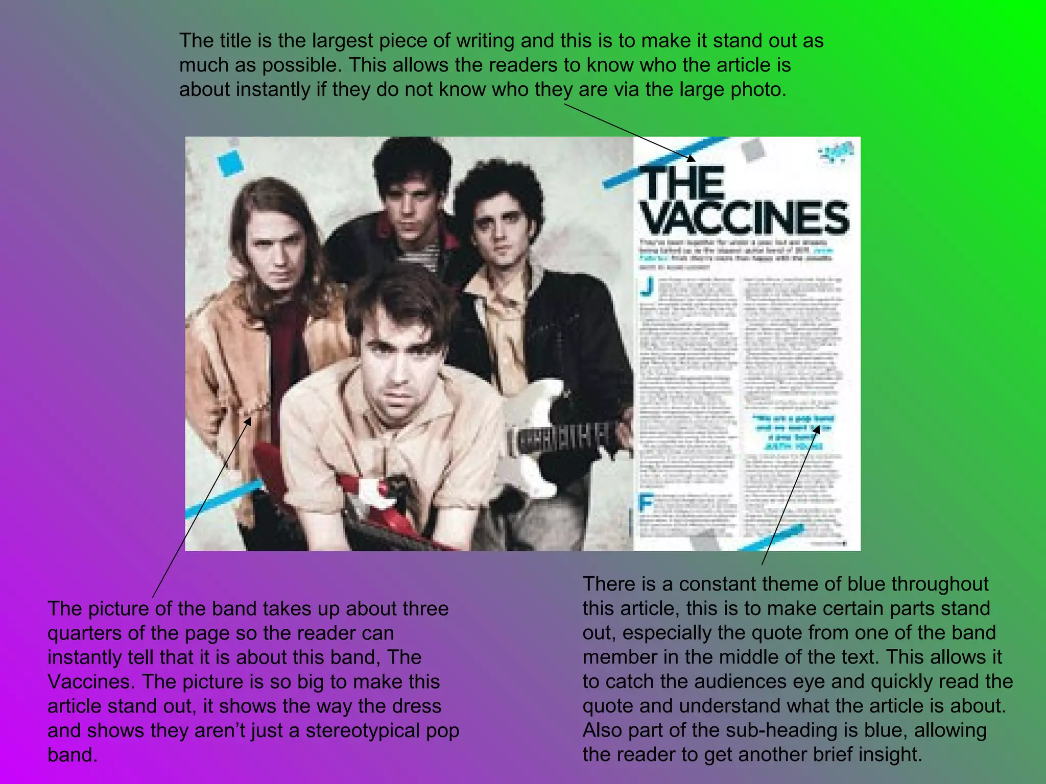
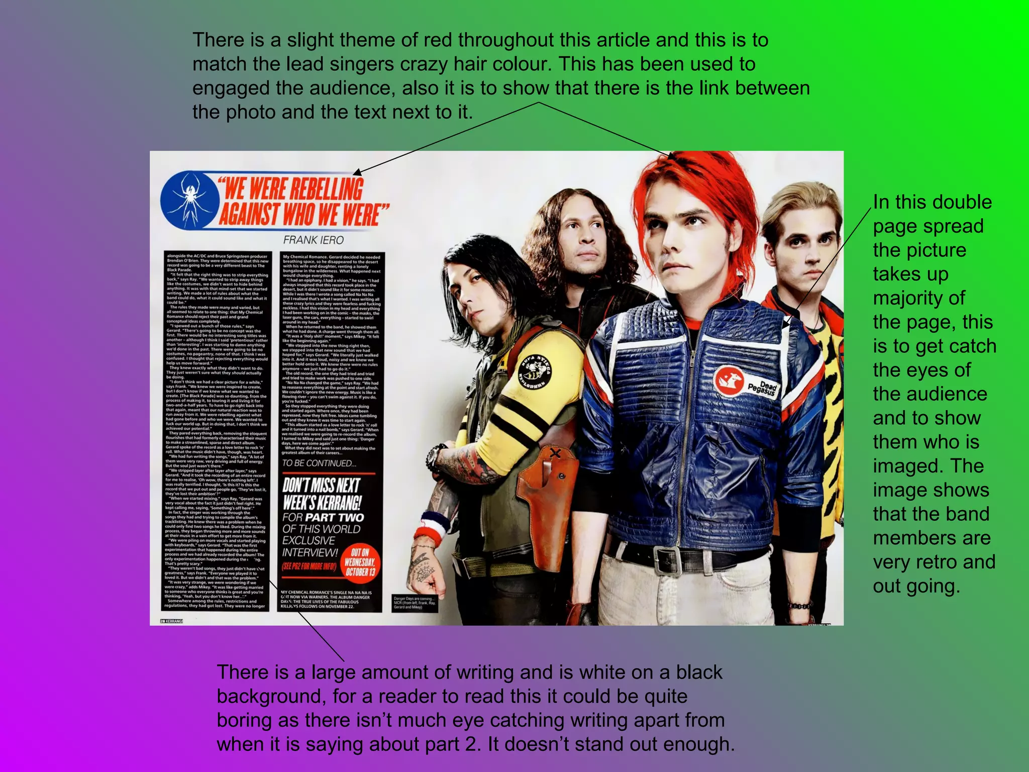
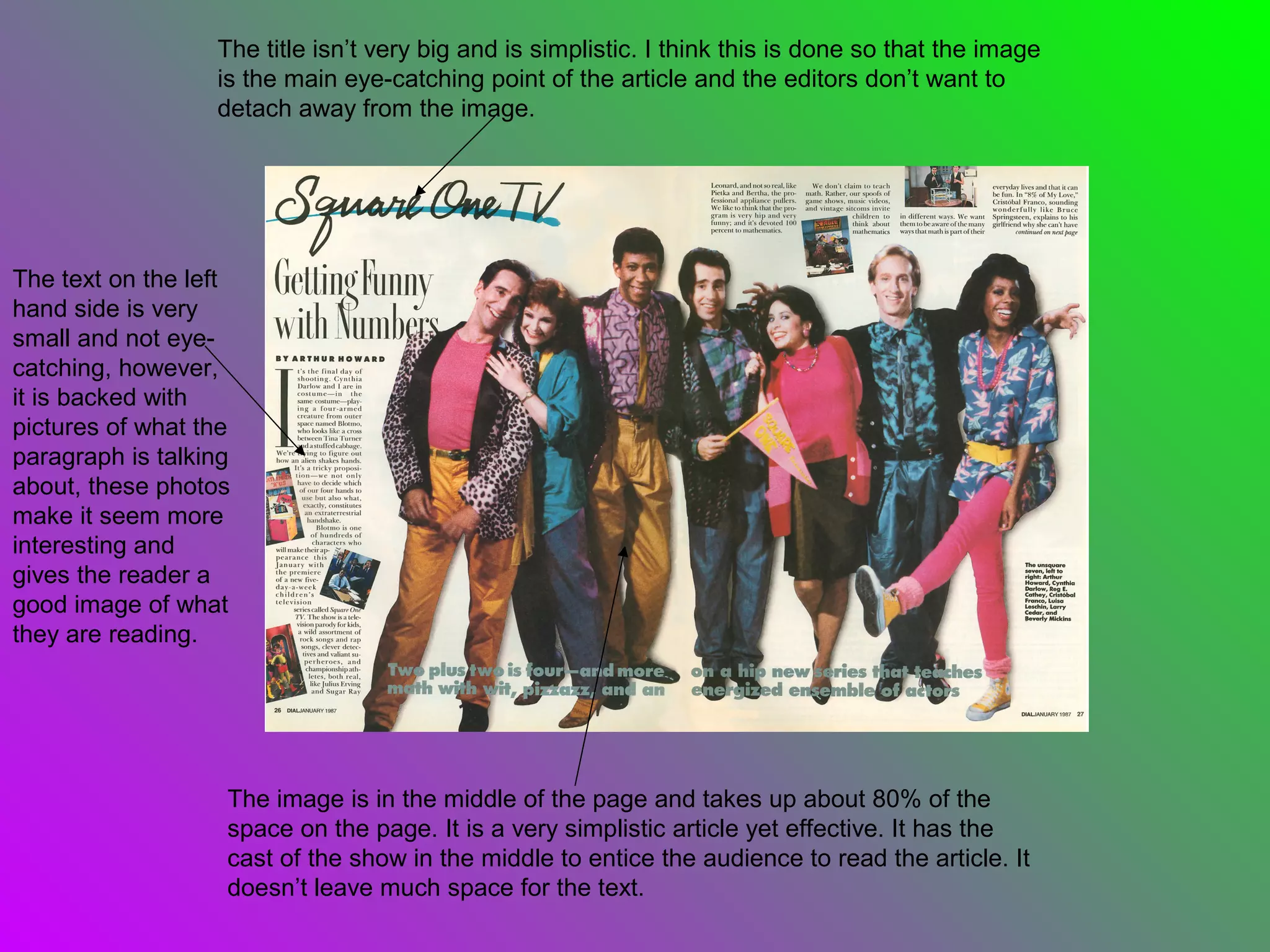
Double Page Spread Analysis

       By Jackson Ghosh
The title is the largest piece of writing and this is to make it stand out as
              much as possible. This allows the readers to know who the article is
              about instantly if they do not know who they are via the large photo.


                                                              There is a constant theme of blue throughout
The picture of the band takes up about three                  this article, this is to make certain parts stand
quarters of the page so the reader can                        out, especially the quote from one of the band
instantly tell that it is about this band, The                member in the middle of the text. This allows it
Vaccines. The picture is so big to make this                  to catch the audiences eye and quickly read the
article stand out, it shows the way the dress                 quote and understand what the article is about.
and shows they aren’t just a stereotypical pop                Also part of the sub-heading is blue, allowing
band.                                                         the reader to get another brief insight.
There is a slight theme of red throughout this article and this is to
match the lead singers crazy hair colour. This has been used to
engaged the audience, also it is to show that there is the link between
the photo and the text next to it.


                                                                          In this double
                                                                          page spread
                                                                          the picture
                                                                          takes up
                                                                          majority of
                                                                          the page, this
                                                                          is to get catch
                                                                          the eyes of
                                                                          the audience
                                                                          and to show
                                                                          them who is
                                                                          imaged. The
                                                                          image shows
                                                                          that the band
                                                                          members are
                                                                          very retro and
                                                                          out going.


  There is a large amount of writing and is white on a black
  background, for a reader to read this it could be quite
  boring as there isn’t much eye catching writing apart from
  when it is saying about part 2. It doesn’t stand out enough.
The title isn’t very big and is simplistic. I think this is done so that the image
                  is the main eye-catching point of the article and the editors don’t want to
                  detach away from the image.


The text on the left
hand side is very
small and not eye-
catching, however,
it is backed with
pictures of what the
paragraph is talking
about, these photos
make it seem more
interesting and
gives the reader a
good image of what
they are reading.


                   The image is in the middle of the page and takes up about 80% of the
                   space on the page. It is a very simplistic article yet effective. It has the
                   cast of the show in the middle to entice the audience to read the article. It
                   doesn’t leave much space for the text.

Double page spread analysis

  • 1.
    Double Page SpreadAnalysis By Jackson Ghosh
  • 2.
    The title isthe largest piece of writing and this is to make it stand out as much as possible. This allows the readers to know who the article is about instantly if they do not know who they are via the large photo. There is a constant theme of blue throughout The picture of the band takes up about three this article, this is to make certain parts stand quarters of the page so the reader can out, especially the quote from one of the band instantly tell that it is about this band, The member in the middle of the text. This allows it Vaccines. The picture is so big to make this to catch the audiences eye and quickly read the article stand out, it shows the way the dress quote and understand what the article is about. and shows they aren’t just a stereotypical pop Also part of the sub-heading is blue, allowing band. the reader to get another brief insight.
  • 3.
    There is aslight theme of red throughout this article and this is to match the lead singers crazy hair colour. This has been used to engaged the audience, also it is to show that there is the link between the photo and the text next to it. In this double page spread the picture takes up majority of the page, this is to get catch the eyes of the audience and to show them who is imaged. The image shows that the band members are very retro and out going. There is a large amount of writing and is white on a black background, for a reader to read this it could be quite boring as there isn’t much eye catching writing apart from when it is saying about part 2. It doesn’t stand out enough.
  • 4.
    The title isn’tvery big and is simplistic. I think this is done so that the image is the main eye-catching point of the article and the editors don’t want to detach away from the image. The text on the left hand side is very small and not eye- catching, however, it is backed with pictures of what the paragraph is talking about, these photos make it seem more interesting and gives the reader a good image of what they are reading. The image is in the middle of the page and takes up about 80% of the space on the page. It is a very simplistic article yet effective. It has the cast of the show in the middle to entice the audience to read the article. It doesn’t leave much space for the text.