
Recommended
More Related Content
What's hot
What's hot (17)
Viewers also liked
Similar to Eye-catching Magazine Cover Design
Similar to Eye-catching Magazine Cover Design (20)
Recently uploaded
Recently uploaded (20)
Eye-catching Magazine Cover Design
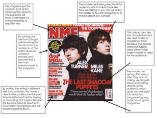
- 1. The models are looking directly at the The magazine put the audience which makes it look like model in front of the they are talking to you. This will entice name, so they assume the reader to buy the magazine as its the audience will making direct eye contact. know what make it is without needing to read the title. The colours used are the connotations that By adding one are used in allot of text box of bright magazines, this is yellow writing this because the colours stands out to the stand out against audience, so the each other which editor obviously make it easier to read wanted it for the audience. noticed and assumes that’s the most important part to the magazine. The models are giving off a serious vibe; they are not smiling, wearing all black and looking directly at the By putting the writing in different audience which text fonts and sizes, this makes it gives you an insight clear to the audience which parts into what the they need to read before buying, magazine is going so by putting “first major interview” to be about, gothic the buyer is going to assume it’s magazines. never been seen before and will be persuaded to buy it.
- 2. By putting the font Singer looking at in capitals and bold reader, to create it makes it stand out eye contact, to the audience, to which makes the try and grab their reader feel as attention. though they are talking directly to you, creates a relationship. He also is reaching his The magazines title is hand out which hidden behind the makes it look like model, which suggests he’s doing it to the that the magazine is so reader to entice well known they don’t them. need to publicise their name, which suggests the audience will already Stating that it is the last ticket persuades know the name without the audience to get the magazine, it’s seeing it fully. almost like blackmail by stating that you need to get the tickets. By putting information in yell0ow writing/boxes it states that this is Colour connotation-red, what they want white and black, which the audience to are the usual colours notice first as it used. Makes it easier for contrasts with the people to read. other 3 colours so it’s the first thing that grabs attention.
- 3. By using different fonts and colours for the writing it helps the reader organise what is By using these 3 important to colours it suggests them, it makes an innocent/love the facts that are kind of feeling trying to grab the about the model, reader’s even though she is attention stand posing how she is out. her hands are crossing herself which shows she is not completely happy with how she’s acting. By using 3 contrasting colours throughout the page, this stands out to the reader as they By putting the title contrast each other so behind the model, this words stand out to each suggests that the reader other. does not need to be reminded what title the magazine is as they will guess it from the words obvious. By the model doing the pose she is it suggesting that she is trying to give of a sexual image, her mouth is closed, her cleavage is on show and her hair is being swept back, which gives an insight into her character and also brings in a different target audience.
- 4. By using these connotations the reader is able to contrast the colours against each other more, which makes the magazine easier to read. By putting the quotation in red and a different font this contrasts to the other box making it obvious to the reader that it needs to stand out. By putting the writing in different fonts it makes the important information stand out to the reader, knowing what parts are quotations and what is text. By putting the whole band in photos you get the idea of who the main signer is, you also get an insight into what type of people they are which may entice the reader more.
- 5. By putting the picture over two sides it gives the reader an insight into the whole By putting the title halfway of the page, image, it doesn’t cut of halfway, it gives with half a letter missing this also suggests a full view into what is happening which that the audience will automatically in this case is a model doing a seductive understand what it is saying, due to the pose. model. By putting the text in different fonts this makes By using these it easier for the connotations it reader to makes it easier understand, as for the reader to they can understand the capture who page, they the model is contrast each straight away other to stand with the blue out more. writing.
- 6. By putting this text in light writing it By putting the text in a different doesn’t want to stand out as By putting this main picture in the font to the rest of the page it gives much as the other text but it is still middle of the page it gives the the assumption that it is more there so that the reader know reader an insight into what the rest important than the rest of the text who the band are without having of the pages are talking about. and that this is what the reader to read the text. needs to look at. All the fonts fit in with each other, so By putting 2 main pictures on the the page looks neat and tidy; all the double page spread it gives the reader colours contrast so each part stands the idea that the magazine is going to out. By putting the writing in the focus mainly on these two pictures and same colour as the pictures come that they are important. across it makes the whole page look formal.