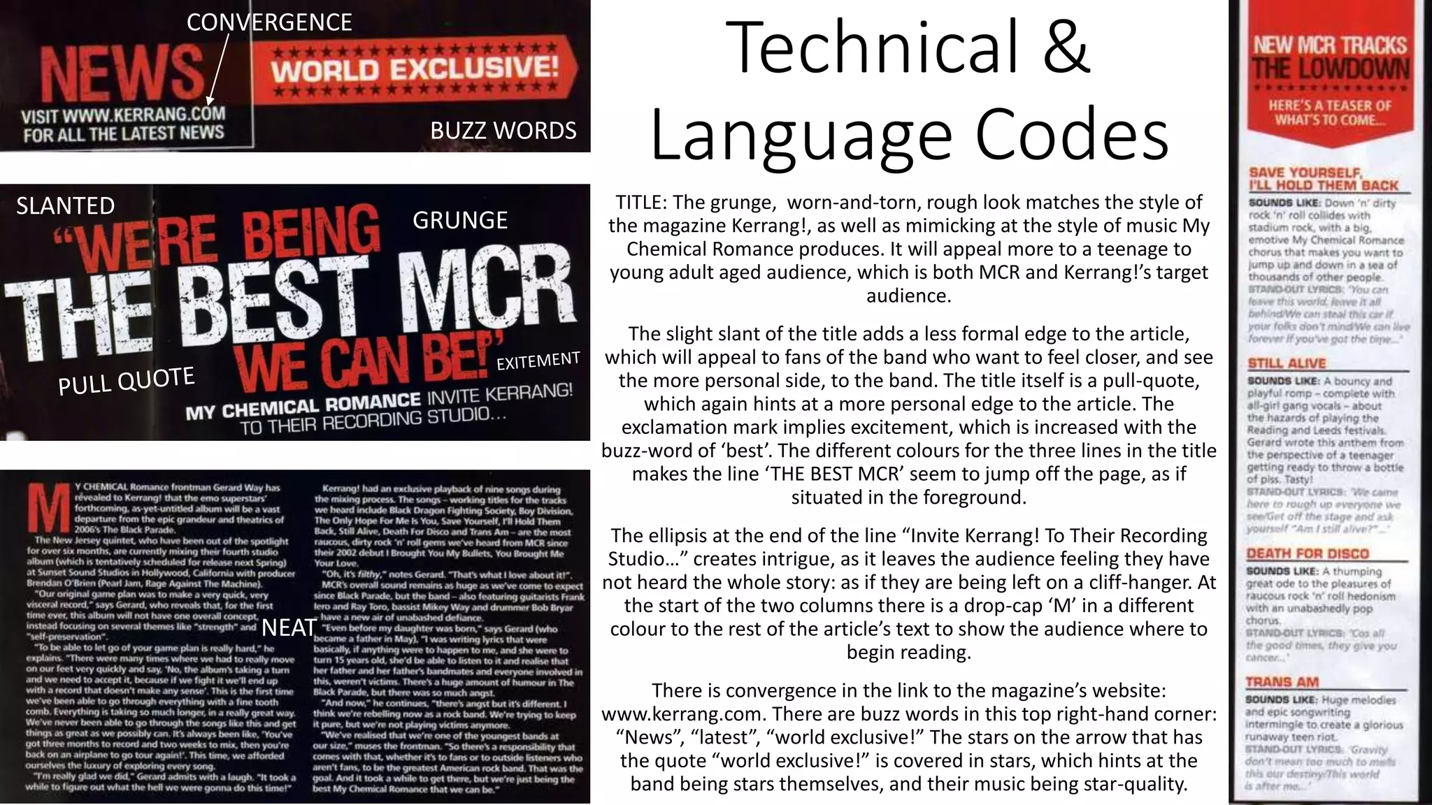
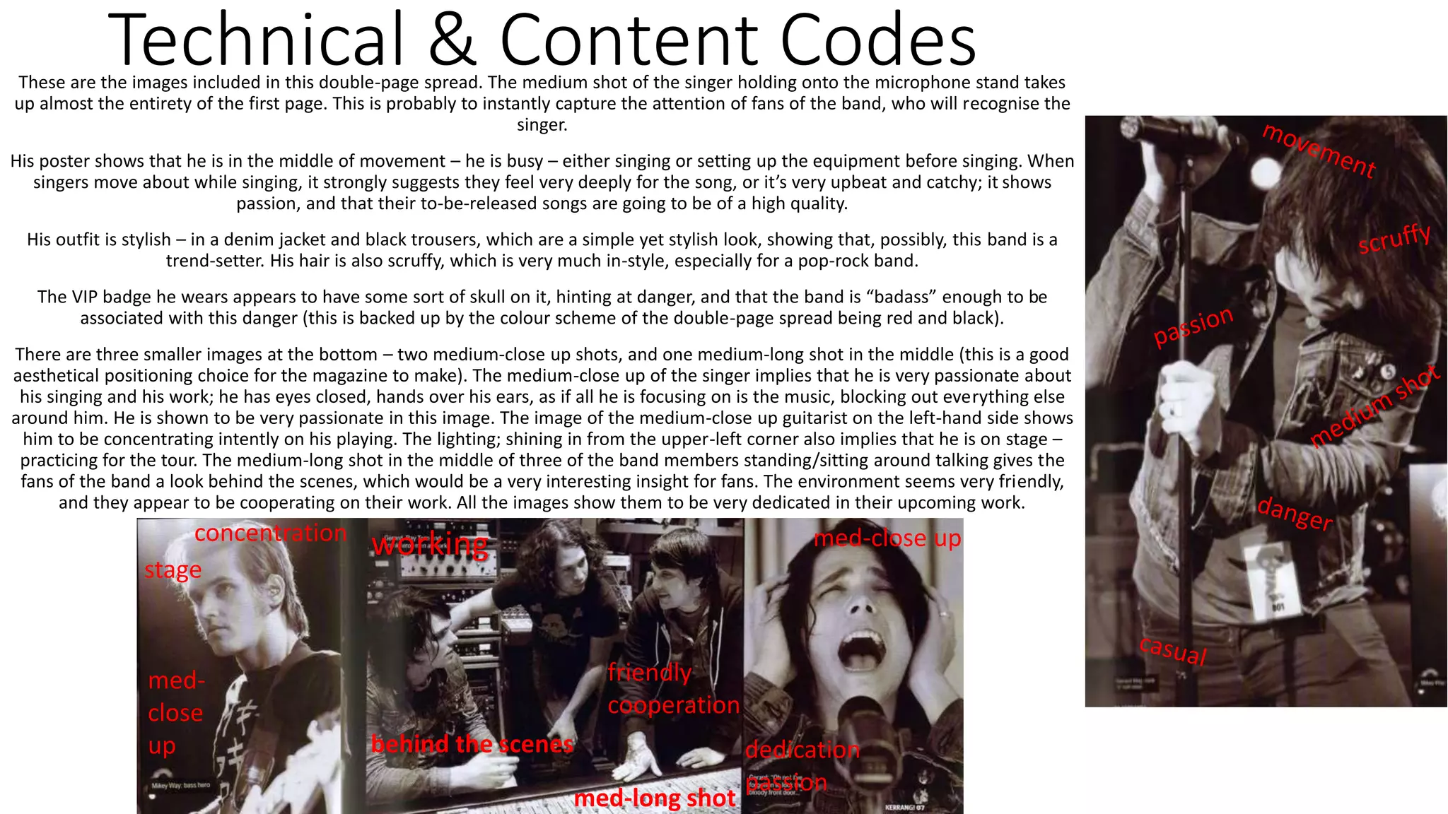
Denotations
On the first page, the bulk of it is the black and white image of the
singer (with a smaller black and white photo in the corner). There is a
small bit of text in the puff in the left-hand corner with the buzz-word
“News”, and beside it a puff reading “World Exclusive!”
On the second page – there is a lot of writing with three small pictures
at the bottom of the page in black and white. The bulk is the title and
the 2 columns, accompanied by a list with a white background at the
side. The second page is much busier than the first page.
The colour scheme is red (the blood of angry men) and black (the dark
of ages past), and white (Joly’s face when he hears someone cough).
The title reads “WE’RE BEING” in red, “THE BEST MCR” in white, “WE
CAN BE!” in red. The font is cracked and aged; a grunge effect.
“My Chemical Romance Invite Kerrang! Into Their Recording Studio…”
the selling line beneath the title, in white, gives the audience some
insight into what is in the article, and sets the scene. ‘My Chemical
Romance’ is bolded.
The ‘M’ at the start of the article is a drop-cap in red (which goes
against the rest of the article being white.
“New MCR Tracks” in white and “The Lowdown” in black are titles in a
red background – an upside down pentagon shaped to look like an
arrowhead, at the top of the list with a white background.
Technical &
Language Codes
TITLE: The grunge, worn-and-torn, rough look matches the style of
the magazine Kerrang!, as well as mimicking at the style of music My
Chemical Romance produces. It will appeal more to a teenage to
young adult aged audience, which is both MCR and Kerrang!’s target
audience.
The slight slant of the title adds a less formal edge to the article,
which will appeal to fans of the band who want to feel closer, and see
the more personal side, to the band. The title itself is a pull-quote,
which again hints at a more personal edge to the article. The
exclamation mark implies excitement, which is increased with the
buzz-word of ‘best’. The different colours for the three lines in the title
makes the line ‘THE BEST MCR’ seem to jump off the page, as if
situated in the foreground.
The ellipsis at the end of the line “Invite Kerrang! To Their Recording
Studio…” creates intrigue, as it leaves the audience feeling they have
not heard the whole story: as if they are being left on a cliff-hanger. At
the start of the two columns there is a drop-cap ‘M’ in a different
colour to the rest of the article’s text to show the audience where to
begin reading.
There is convergence in the link to the magazine’s website:
www.kerrang.com. There are buzz words in this top right-hand corner:
“News”, “latest”, “world exclusive!” The stars on the arrow that has
the quote “world exclusive!” is covered in stars, which hints at the
band being stars themselves, and their music being star-quality.
CONVERGENCE
GRUNGE
NEAT
SLANTED
BUZZ WORDS
Technical & Content CodesThese are the images included in this double-page spread. The medium shot of the singer holding onto the microphone stand takes
up almost the entirety of the first page. This is probably to instantly capture the attention of fans of the band, who will recognise the
singer.
His poster shows that he is in the middle of movement – he is busy – either singing or setting up the equipment before singing. When
singers move about while singing, it strongly suggests they feel very deeply for the song, or it’s very upbeat and catchy; it shows
passion, and that their to-be-released songs are going to be of a high quality.
His outfit is stylish – in a denim jacket and black trousers, which are a simple yet stylish look, showing that, possibly, this band is a
trend-setter. His hair is also scruffy, which is very much in-style, especially for a pop-rock band.
The VIP badge he wears appears to have some sort of skull on it, hinting at danger, and that the band is “badass” enough to be
associated with this danger (this is backed up by the colour scheme of the double-page spread being red and black).
There are three smaller images at the bottom – two medium-close up shots, and one medium-long shot in the middle (this is a good
aesthetical positioning choice for the magazine to make). The medium-close up of the singer implies that he is very passionate about
his singing and his work; he has eyes closed, hands over his ears, as if all he is focusing on is the music, blocking out everything else
around him. He is shown to be very passionate in this image. The image of the medium-close up guitarist on the left-hand side shows
him to be concentrating intently on his playing. The lighting; shining in from the upper-left corner also implies that he is on stage –
practicing for the tour. The medium-long shot in the middle of three of the band members standing/sitting around talking gives the
fans of the band a look behind the scenes, which would be a very interesting insight for fans. The environment seems very friendly,
and they appear to be cooperating on their work. All the images show them to be very dedicated in their upcoming work.
friendly
cooperation
dedication
passion
med-close up
med-long shot
med-
close
up
concentration
working
stage
behind the scenes

Double Page Spread Analysis

  • 2.
    Denotations On the firstpage, the bulk of it is the black and white image of the singer (with a smaller black and white photo in the corner). There is a small bit of text in the puff in the left-hand corner with the buzz-word “News”, and beside it a puff reading “World Exclusive!” On the second page – there is a lot of writing with three small pictures at the bottom of the page in black and white. The bulk is the title and the 2 columns, accompanied by a list with a white background at the side. The second page is much busier than the first page. The colour scheme is red (the blood of angry men) and black (the dark of ages past), and white (Joly’s face when he hears someone cough). The title reads “WE’RE BEING” in red, “THE BEST MCR” in white, “WE CAN BE!” in red. The font is cracked and aged; a grunge effect. “My Chemical Romance Invite Kerrang! Into Their Recording Studio…” the selling line beneath the title, in white, gives the audience some insight into what is in the article, and sets the scene. ‘My Chemical Romance’ is bolded. The ‘M’ at the start of the article is a drop-cap in red (which goes against the rest of the article being white. “New MCR Tracks” in white and “The Lowdown” in black are titles in a red background – an upside down pentagon shaped to look like an arrowhead, at the top of the list with a white background.
  • 3.
    Technical & Language Codes TITLE:The grunge, worn-and-torn, rough look matches the style of the magazine Kerrang!, as well as mimicking at the style of music My Chemical Romance produces. It will appeal more to a teenage to young adult aged audience, which is both MCR and Kerrang!’s target audience. The slight slant of the title adds a less formal edge to the article, which will appeal to fans of the band who want to feel closer, and see the more personal side, to the band. The title itself is a pull-quote, which again hints at a more personal edge to the article. The exclamation mark implies excitement, which is increased with the buzz-word of ‘best’. The different colours for the three lines in the title makes the line ‘THE BEST MCR’ seem to jump off the page, as if situated in the foreground. The ellipsis at the end of the line “Invite Kerrang! To Their Recording Studio…” creates intrigue, as it leaves the audience feeling they have not heard the whole story: as if they are being left on a cliff-hanger. At the start of the two columns there is a drop-cap ‘M’ in a different colour to the rest of the article’s text to show the audience where to begin reading. There is convergence in the link to the magazine’s website: www.kerrang.com. There are buzz words in this top right-hand corner: “News”, “latest”, “world exclusive!” The stars on the arrow that has the quote “world exclusive!” is covered in stars, which hints at the band being stars themselves, and their music being star-quality. CONVERGENCE GRUNGE NEAT SLANTED BUZZ WORDS
  • 4.
    Technical & ContentCodesThese are the images included in this double-page spread. The medium shot of the singer holding onto the microphone stand takes up almost the entirety of the first page. This is probably to instantly capture the attention of fans of the band, who will recognise the singer. His poster shows that he is in the middle of movement – he is busy – either singing or setting up the equipment before singing. When singers move about while singing, it strongly suggests they feel very deeply for the song, or it’s very upbeat and catchy; it shows passion, and that their to-be-released songs are going to be of a high quality. His outfit is stylish – in a denim jacket and black trousers, which are a simple yet stylish look, showing that, possibly, this band is a trend-setter. His hair is also scruffy, which is very much in-style, especially for a pop-rock band. The VIP badge he wears appears to have some sort of skull on it, hinting at danger, and that the band is “badass” enough to be associated with this danger (this is backed up by the colour scheme of the double-page spread being red and black). There are three smaller images at the bottom – two medium-close up shots, and one medium-long shot in the middle (this is a good aesthetical positioning choice for the magazine to make). The medium-close up of the singer implies that he is very passionate about his singing and his work; he has eyes closed, hands over his ears, as if all he is focusing on is the music, blocking out everything else around him. He is shown to be very passionate in this image. The image of the medium-close up guitarist on the left-hand side shows him to be concentrating intently on his playing. The lighting; shining in from the upper-left corner also implies that he is on stage – practicing for the tour. The medium-long shot in the middle of three of the band members standing/sitting around talking gives the fans of the band a look behind the scenes, which would be a very interesting insight for fans. The environment seems very friendly, and they appear to be cooperating on their work. All the images show them to be very dedicated in their upcoming work. friendly cooperation dedication passion med-close up med-long shot med- close up concentration working stage behind the scenes