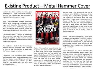
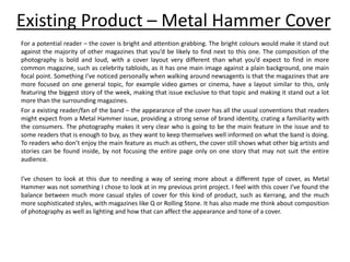
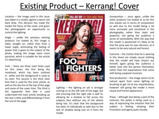
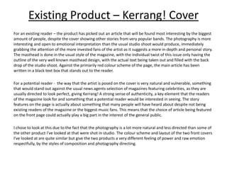
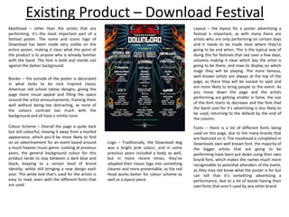
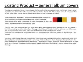
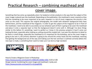
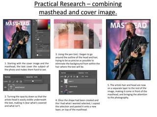
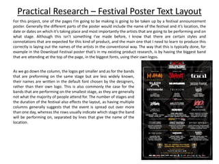
The Metal Hammer cover uses bright colors and bold photography to stand out from other magazines. The photo depicts the band facing the camera at a lower angle to appear powerful. For potential readers, the cover would attract attention, while existing fans and readers would recognize the familiar brand identity. The double page spread uses natural lighting to photograph the band on location, with the lead singer pointing at the camera to directly address readers. The large title and short text make the article easy to read.
The Metal Hammer cover uses bold photography and design to attract readers. The image features the band facing the camera at a lower angle to appear powerful. The bright red backdrop contrasts with black outfits for visibility. The layout focuses attention on the lead singer and main story through composition and font size. This balanced design provides brand familiarity for fans while still highlighting the primary content.
This album cover features an iconic underwater image of a naked baby reaching for a dollar bill on a fishing hook. The controversial image became one of the most famous album covers ever due to the visible male genitalia. The photo was taken in a pool, with lighting from above creating unique patterns on the baby's body from the water's movement. Only the band name and album title are included in text, keeping the design simple and letting the provocative image stand out.
The document provides an analysis of magazine covers and pages. It analyzes design elements like images, headlines, mastheads, color schemes, and their effectiveness. On the cover analyzed, the skyline title is less prominent than the masthead. Some of the masthead is hidden by the large central image. Selling lines and cover lines use appealing red and white colors.
The content page analyzed uses a plain white background to let images stand out more than text. Feature images are larger than others to show importance. Colors, font sizes, and details effectively guide readers to content.
The double page spread analyzed has a small main title but covers one large central image. Text is limited due to the image taking up
The magazine cover summarizes information about films in four key areas:
1) The central image features the main character from the film Inception to represent the main topic of the magazine.
2) Headlines around the edges advertise other films being released at a similar time.
3) Graphics relating to the design of Inception are used in the title layout.
4) The font and lighting of the central image aim to convey the mysterious nature of the film.
The document analyzes the design elements of a magazine cover, including its use of color, fonts, images, and layout to guide the reader's eye flow. Key elements like the masthead, coverlines, and central image of Liam Gallagher are meant to attract attention and tease the magazine's content. Black and white is used for the central image to make the red text pop out, conveying a vintage rock aesthetic that references John Lennon and suggests Gallagher will achieve similar fame and status.
This document analyzes the design elements of a magazine cover, including its use of color, typography, imagery, and layout to guide the reader's eye flow. Key elements like the masthead, coverlines, kickers, and central image of Liam Gallagher are discussed in terms of how they attract attention and tease the magazine's content. While the combination of red, black and white colors is debated, the cover is assessed to have a strong, stylish central image that could inspire the design of other magazine covers.
This document analyzes the design elements of a magazine cover, including its use of color, typography, imagery, and layout to guide the reader's eye flow. Key elements like the masthead, coverlines, and central image of Liam Gallagher are discussed in terms of how they attract attention and convey information to readers. Overall, the cover follows standard design principles but also aims to intrigue readers with its rock star subject and retro black, white, and red color scheme.
The student created a magazine cover design for a film featuring a model with direct eye contact looking serious. Elements were added like headings in red and black, banners listing films, and a bottom banner. Techniques like drop shadows, selective black and white background, and glow were used. Feedback was provided on improvements made between drafts, like removing stray hairs and repositioning the masthead for better impact. The student feels the final design will draw in the target audience and looks professional following magazine conventions.
This document summarizes the design elements and journalistic techniques used in the creation of a music magazine called "Treble". Key points include:
- The title, fonts, and color scheme were chosen to evoke the rock music genre. Impact font and dark colors like black, purple and red were used.
- Design principles like the rule of thirds and Gutenberg's design principles were applied to layout elements like images, headlines and text to guide the reader's eye across the page in an intentional order.
- Photographs used lighting, props and image editing to portray a moody, mysterious tone befitting the rock genre.
- Written articles used an informal, conversational format and tone for interviews
I conducted this research to generate ideas for my magazine ancillary task and to identify the elements of a magazine spread featuring a film review, that create a professional style.
The document provides details on the creation of a media film magazine by the author. It includes planning documents like layout ideas, terminology research, a photoshoot plan, and images from the photoshoot. The author refined their magazine design through further development and editing, comparing their work to publishing trends. Their final magazine design features a colorful masthead, a central cover image using direct address, and consistent formatting in line with house style conventions.
The document provides research on creating an entertainment magazine for an NEA project, including analyzing existing magazines' layouts, typography, color palettes, and conventions. Research was conducted on magazines like Total Film, Empire, and Entertainment Weekly. The target audience is defined as fun-loving 16-25 year olds per the NEA brief. Further research will include developing magazine covers based on movies that would appeal to this demographic, such as Shadowhunters and To All the Boys I've Loved Before. Questions to consider regarding the target audience are also outlined.
This magazine cover features a photograph of an actor at the center. The bold blue title draws the eye, and additional text provides context that the magazine focuses on films. Light colors are used to match the dull tones of the actor's clothing and expression. Smaller text below the actor's name implies he is a more important feature than the specific film. The layout ensures the actor remains the clear focal point.
This magazine cover analysis compares the front covers of two magazines - Empire and Total Film. For Empire, the masthead is bold and prominent, centered around a striking image of James Bond to promote the new film. Additional images and buzzwords create excitement. The price is shown in small print as not the main selling point. Total Film similarly features a bold masthead centered around film. Its color scheme relates to the theme of the promoted film (Hunger Games) and a long shot image shows the protagonist. Both magazines aim to attract audiences with prominent stars and films while de-emphasizing price.
The NME targets young adult males interested in rock and hip-hop music. It has been published since 1952 and shifted its focus from music journalism to associated more with punk rock in the 1970s. Currently, the magazine aims to keep readers informed of new music through ads and articles, with a typical reader being a 23-year old male. Circulation is approximately 23,924 issues.
The magazine uses consistent branding elements like a red, white, and black color scheme throughout to maintain its house style and make the NME easily recognizable. Photos are used prominently on the cover and in articles to appeal to the target audience of younger music fans. Captions, pull quotes, and informal language help hook readers and provide a quick sense of the content in a way that matches the magazine's casual tone.
The NME targets young adult males interested in rock and hip-hop music. It has been published since 1952 and shifted its focus from music journalism to associated with genres like punk rock and hip-hop. The magazine aims to keep its audience informed of new music through ads and articles on up-and-coming artists. The typical reader is male around 23 years old, making up two-thirds of subscribers.
This document provides guidance for a magazine design assignment. It defines common magazine cover terminology like coverlines, masthead, and house style. It instructs students to research magazine genres, analyze cover design techniques, and create mock magazine covers with consistent house styles. Students are advised to plan thoroughly with mood boards and layout sketches before designing their magazine productions. Peer and self-review are also emphasized to refine the final works.
The document summarizes the design choices for the cover of a music magazine featuring musician Robbie Dale. It describes the color palette of red, white and black and how they are used. It explains that the lighting and posture of the model on the cover are meant to portray him as a great and confident musician ready to make his comeback. The broken wall in the background represents his groundbreaking return. Overall, the cover aims to attract young adult readers and showcase Robbie Dale's importance through its use of conventional magazine cover design elements.
The magazine covers analyzed all prominently feature a bold masthead covering part of the main image to draw attention. They use color schemes, fonts, and imagery related to the featured film's genre. Additionally, secondary stories, price, and website are included to provide information and promote the magazine.
This document summarizes the author's research analyzing movie magazine covers and posters to understand conventions and effective design elements. The author examined 6 products over 3 weeks, gaining knowledge about what works well. Key findings included centering prominent images; using anchorage or captions to add meaning; employing graphic features like lighting bolts to engage viewers; and incorporating buzzwords, questions, and calls to action. Understanding these conventions will help the author effectively design their own ancillary materials promoting a movie trailer.
The document provides details on the design elements of magazine covers and contents pages. It explains the purpose of common design features like mastheads, cover lines, images and advertisements. For the skyline magazine cover, it describes the bright masthead coordinated with the featured image, cover lines promoting inside stories, and an exclusive edition for the holiday season. The contents page uses consistent branding, highlights bands and articles, and features advertisements to promote subscriptions. Overall the document discusses how magazine design uses visual elements to attract readers and promote content.
The document provides an in-depth analysis of the design elements of a film magazine cover. It examines the main image featuring the lead actor, use of color schemes, placement of text elements like mastheads and cover lines, and how these stylistic choices work to engage the target audience and communicate the genre of the featured film. Specific techniques discussed include using direct eye contact in images, high contrast colors to draw the eye, bold fonts for important text, and coordinating stylistic elements like fonts and hues across the cover layout. The level of detail in the analysis suggests it was intended to educate on best practices for crafting effective magazine cover designs.
The document provides an evaluation of how a film poster and magazine cover use, develop, or challenge conventions of real media products.
For the film poster: The title, tagline, image, actors' names, billing block, and color scheme generally use conventions seen in real film posters. Some elements like the placement of the tagline and actors' names develop conventions.
For the magazine cover: The skyline, title, image, main cover line, cover lines, puff, barcode, and color scheme largely reinforce conventions seen in real magazine covers. Some aspects like the close-up image develop conventions. Overall, the media products draw from real conventions while putting their own spin in some areas.
This document provides an in-depth analysis of the layout, design elements, and content of the magazine "Total Film". It examines the cover page in detail, analyzing the title, images, text, and other design features and what they aim to convey. It then analyzes the contents page, looking at the categories of articles, layout of individual entries, range of images used, and other elements. Finally, it summarizes a sample feature article, describing its layout as a double-page spread with columns, large heading, main image, and side columns advertising upcoming articles. Overall, the document conducts a thorough semiotic analysis of the visual and textual techniques used across the magazine's cover and interior pages.
The document provides feedback on three draft versions of a magazine front cover created by Evie Theodore. For the first draft, the feedback notes that the use of primary colors and black will create a bright yet balanced color scheme. It suggests considering the model's costume and specifying the background image. For the second draft, the feedback praises the font and color scheme choices, but recommends improving the eye flow by moving coverlines. It also suggests making the main image larger. For the final version, the feedback commends changes like replacing the footbar with a skyline and moving design elements to follow eye flow principles. Overall, the feedback aims to help refine the front cover design through suggestions on colors, images, layout, and conforming to
The document summarizes how the author's media product uses and develops conventions of real magazines. It compares elements of the author's magazine like the cover, contents page, articles, and photographs to existing magazines. Key similarities noted include layouts, styles, and genres. Differences include quality of images and specific design elements. The author aims to emulate conventions of magazines like Kerrang, NME, Q, Rolling Stone, and Vogue while developing a unique style.
This document provides a summary of the design elements and conventions used across multiple pages of a music magazine called Mixmag. The masthead uses a distinctive san-serif font with curves and a stylised dot on the 'I' to create a brand. A small puff below promotes an important article. The main image on the cover is unconventional by using a cartoon instead of a photo of a well-known artist from the dance music scene. Inside pages follow color schemes and include cover lines, artist profiles, and content listings to engage readers. Imagery conveys themes of music and nightlife to match the magazine's focus.
This document provides a summary of the design elements and conventions used across multiple pages of a music magazine called Mixmag. The masthead uses a distinctive san-serif font with curves and a stylised dot on the 'I' to create a brand. A small puff below promotes a featured article. The main image on the cover is unconventional by using a cartoon instead of a photo and depicting a well-known artist in a long shot not facing the camera. Inside pages include a contents listing with page numbers and subheadings, cover lines to entice readers, and a club photo conveying fun through the emotions of those pictured. Color schemes and fonts are consistent to link elements together.
The document provides details on the design elements of magazine covers and pages for different genres of music magazines. It analyzes the use of color schemes, images, text styles and layouts on covers, contents pages, and double page spreads for the rock magazine Kerrang, the metal magazine Metal Hammer, and the indie magazine NME. Across all magazines, the document discusses techniques used to grab readers' attention, convey key information quickly, and appeal to the target audiences for each genre through visual styles that fit genre stereotypes.
The double page spread uses a typical magazine layout with a striking image on the left and article text on the right. The image is an effective medium close-up that conveys the artist's attitude. The article uses conventions like a bold artist quote, columns, a drop cap, and leading sentences to introduce the piece. The spread also includes a caption for context and bleeds the image across both pages to emphasize it.
The double page spread uses a typical magazine layout with a striking image on the left and article text on the right. The image is an effective medium close-up that conveys the artist's attitude and draws readers into the article. Conventions like a bold artist quote, column structure, drop caps, and introductory sentences are also used. The spread contrasts with a previous one analyzed through its color scheme and larger band photo, fitting the band's upbeat style as a new act.
The document describes various design elements of a music magazine cover and contents page. It explains features like the skyline, masthead, cover line, drop caps, barcode, puff, house style, issue number, contents, feature photo, cover photo credit, creator credits, sectioned stories, and headlines. Elements like bold colors, fonts, photos, and short descriptive text are used to attract readers and guide them through the magazine content in a clear and organized manner.
This document summarizes the researcher's analysis of magazine front covers, contents pages, and articles from Kerrang!, Classic Rock, NME, and Mojo magazines. For each magazine element analyzed, the researcher examines design choices like layout, images, colors, text and how these elements work together to engage readers. For example, the Kerrang! front cover uses bold colors and images of bands to attract readers' attention. The NME contents page uses colorful headlines and a small central image to showcase articles. Overall, the analysis provides insights into how magazine publishers design elements to effectively present information and appeal to audiences.
The document provides an analysis of magazines in the heavy metal genre conducted by Abigail Downes to inform the design of their own heavy metal magazine focusing on death metal and slam. Downes analyzes conventions of existing magazines such as layout, cover lines, language used, color schemes, and how bands are presented photographically. This analysis will help Downes understand what makes a successful magazine in the genre so they can design an appealing magazine for the heavy metal community.
The front covers of fanzines are typically eye-catching with vivid colors and edited images related to the topic. Double page spreads feature large eye-catching photos or artwork. Color schemes aim to set the tone and improve appearance, often using black and white. Fonts are simple and easy to read. Images look authentic rather than edited. Content focuses on the topic like a band, football club or video game through articles, reviews and photos.
The document reflects on the learning process from the preliminary task of creating a magazine cover to the final product. For the preliminary cover, the main image was well-focused but there were too many colors making it confusing. However, it helped understand Photoshop tools and research magazine conventions. The final cover addressed these issues by having only 3 colors, positioning the image and details properly. Creating the preliminary contents page similarly helped understand magazine layouts better, but the final version included additional standard elements like an editorial, front cover copy, and website that were missing originally.
The document analyzes the design elements of Kerrang! magazine including colors, images, and layout on the front cover, contents page, and double page spread (DPS). On the front cover, black is used as the main background color with contrasting orange highlights to represent the rock/metal genre. The contents page features a black background image relating to the main story with yellow headings for easy navigation. The DPS image and text work together around the large band photograph to tell the story of the band's origins. Throughout, the design choices effectively target the rock/metal audience and promote stories.
My preliminary task was creating a college magazine cover. This helped me learn important skills for my final music magazine cover project. Specifically, it improved my Photoshop skills for manipulating images. It also taught me the importance of lighting in photography and how to effectively layout magazine features to attract readers. While my preliminary cover had issues like poor lighting and uniform typography, working through that process helped me apply codes, conventions and technical skills much better for my final music magazine cover.
The document analyzes the colors, design, images, and text used in the magazine Kerrang!. On the front cover, orange and black are used to create energy and stand out against white text. The contents page uses red to create danger and white/black text for readability. The double page spread features a dark, mysterious concert photo with blue lighting and white text over it. Throughout, sans serif fonts and varied text sizes are used to draw attention and suggest the magazine's youthful tone. Images of bands represent the readers' aspirations and interests in up-and-coming artists within the genre.
1) The document discusses conventions used in music magazine design such as attention-grabbing covers, prominent mastheads, direct eye contact in photos, and teasers of article contents.
2) It compares conventions between the student's preliminary design and final magazine cover, showing improvement in photo quality, font selection, and background design.
3) The student reflects that undertaking the project improved their skills with technologies like Photoshop and InDesign, but that procrastination left them rushed.
The document reflects on the learning and improvements made by the author in creating a music magazine compared to an earlier school magazine, including gaining skills in photography, layout, fonts, image manipulation, writing style, and considering factors like costumes and styles to portray bands. Techniques learned included using lighting equipment, higher resolution camera settings, photo editing tools, and an informal yet appropriate writing tone. The music magazine featured a simple but effective layout with one main photo, space for additional elements, and section divisions to aid navigation.
This document analyzes the contents page and double page spread (DPS) of a music magazine. It describes the typical layout and design conventions used, including structuring the contents listings around a central image or story, using consistent fonts and colors, and including promotional content. The analysis then identifies specific design elements the author intends to replicate in their own magazine, such as an attention-grabbing main image, column-based article formatting, and placement of page numbers and writer credits.
This document analyzes various elements of an issue of the music magazine NME, including the front cover, contents page, and a double page spread. The summary is as follows:
The front cover features the typical masthead and cover lines to attract readers. It uses a close-up image of a rap artist against a graffiti background to target a young, "rebel" audience. The contents page continues the simple, informal style with one-word section titles and a travel case background image. The double page spread employs a grid layout with many images, including a large photo of artist Dizzee Rascal spray painting, to maintain a visual and chaotic "party" atmosphere through its design.
The document provides details about magazines that served as inspiration for the creator's own magazine. Key features were taken from these "star models" and adapted, such as large eye-catching titles and varied color schemes. The creator analyzed their final product and how it compares to the inspiration magazines. Technologies like Photoshop and InDesign were used to edit photos and design the magazine layout professionally. Feedback was gathered from the target audience to help shape the magazine's content and branding. The end result showed massive development from early versions.
The document discusses the design elements of a music magazine from the 1990s. It analyzes the use of images, headings, fonts, colors and layout on the front cover and contents pages to draw attention from audiences and encourage readers to purchase the magazine. Key design elements that stand out include a red masthead on a white background, large band images and headlines in contrasting colors, and quotes and previews of articles in eye-catching fonts. The document advocates for a clean, sophisticated layout with strategic use of white space and colors like red, black and grey to guide readers through the contents in a relaxed manner.
The document summarizes key characteristics of fanzines from the 1970s-80s that were used as inspiration for the student's own fanzine project. Some of the key characteristics described include:
- Text was done using typewriters, handwritten, or by cutting/pasting individual letters from newspapers due to lack of font options.
- Images came from newspapers, flyers, posters and were of low quality/grainy since there was no way to edit them. Drawings were also used.
- The student tried to emulate the ransom note text style using newspaper clippings for headings, included relevant band imagery, and experimented with black/white vs color.
- One page
The survey gathered responses from 23 people to help inform the development of a new rock music magazine focused on the North of England. Most respondents were younger, between 17-24 years old, and male, reflecting the typical demographics of rock music fans. The survey asked questions about where people get their music information, what magazines they currently engage with, preferred social media and magazine content, topics for artist interviews, and types of advertisements. The responses will help ensure the new magazine appeals to a wide range of ages and includes content relevant to both female and male fans.
This document outlines several theoretical and practical problems the author may face in their photography project. For theoretical problems, it discusses issues like working outdoors and dealing with weather, unwanted noise, relying on models and actors, transportation, locations, finances, production time, and health and safety concerns. For practical problems, it covers equipment needs, researching techniques, storage, power, software skills, and backing up data. The author considers solutions like scouting indoor locations, portable lighting, scheduling photoshoots early, and setting up an automatic social media posting schedule.
1) The document reflects on the first four weeks of the student's Final Major Project to create a music magazine focused on the northern region of England.
2) In the first two weeks, the student drafted a pre-proposal, proposal, and influences presentation, deciding on a style targeting an older audience using photography and typography. Research examined similar existing magazines' social media and content.
3) In week three, the student wrote and distributed a survey to gather audience data on content preferences and where they obtain music information, receiving 23 responses.
4) In week four, the student outlined potential theoretical and practical problems for the project and began planning practical experiments and independent research for problemsolving.
The document discusses research on potential social media strategies for a new rock music magazine focused on the North of England. It examines the Instagram accounts of existing magazines Rock Sound and Metal Hammer. Rock Sound uses memes and relatable content its target youth audience enjoys. Metal Hammer takes a more professional approach with photoshoots, concert videos, and news appropriate for its older readers. The document also analyzes the social media followers and engagement of both magazines, finding Rock Sound has more Instagram followers due to its younger demographic, while Metal Hammer has more established Facebook followers due to its average older reader age.
The document is a reflective diary for a final major project about creating a music magazine. In the first week, the student completed pre-proposals, proposals, and influence presentations. They settled on making a magazine aimed at an older audience with a cleaner, more modern photographic and typographic style. In the second week, the student researched existing music magazines' social media to understand their target audiences and content styles. The research showed differences in following sizes and posted content reflective of each magazine's generational audience.
The document provides details about a proposed final major project (FMP) for graphic design. The project would be a rock music magazine based in northern England, available both digitally online and in physical print formats. Key aspects of the project outlined include magazine covers, articles, interviews, reviews, photography, website and social media content, potential music videos, and vinyl/CD packaging. The proposed style takes inspiration from 1990s magazines like Kerrang but aims for a cleaner, more contemporary look to appeal to an older audience than previous projects. Photography and developing a strong visual identity are identified as major focuses, along with page layout and composition.
This summarizes a document about a punk music fanzine from the 1980s. Some key points:
- Fanzines were self-published magazines created by fans as an independent way to share information about underground music scenes before the internet.
- This particular fanzine focused on hardcore and punk music from the 1980s. It included live concert photos, interviews with bands, and advertisements for other issues of the fanzine.
- The design emulated the DIY aesthetic of punk culture at the time. Content was laid out by hand using typewriters, scissors, glue, and basic printing. Photographs were black and white since editing wasn't possible.
- The fanzine helped
The document outlines a student's final major project idea for a rock music magazine. The student has focused on this genre for the past two years and wants to create a refined product that covers rock music across a website, magazine, and social media. The student was influenced by similar existing magazines and wants to create something that can influence others the way those publications influenced them. Initial research targets include photographers, magazine editors, and pioneering fanzine creators. The goal is to create a feeling of community for readers in a genre that is often ridiculed for younger audiences. The student is deciding between more mature and photography-focused styles compared to their past work and wants to convey the rock genre in a clean, contemporary way.
Alicja Zofia Morawska proposes creating a print guide for York's alternative culture scene. The guide would highlight music venues featuring rock and metal, bars with non-mainstream music, local bands and artists needing more exposure, and businesses catering to alternative tastes. York has a large Viking metal scene and alternative population that is underrepresented in city promotions focusing on history. The guide aims to share what the city offers for those interested in alternative culture and experiences, especially students. It will be evaluated based on a clear train of thought from initial research and plans through production.
The document discusses the target audience for a project promoting alternative culture in York, England. The target audience is 16-25 year olds interested in rock music, skating, tattoo/piercing studios, and vintage/alternative clothing stores. Most of the target audience will be students at York universities and colleges. Research included interviews with 18 and 20-year-olds who enjoy rock music bars and skate parks as alternatives to mainstream clubs. The project aims to inform this alternative subculture in York of relevant events and locations catering to their interests.
1. The student proposes creating a rock music magazine as their graphic design project. They will focus on photography, articles discussing harder topics, and promotional materials like a CD and festival poster.
2. Research will include a questionnaire to music fans, analyzing existing magazines and products, and conducting interviews. The student will pay close attention to details and refer to their research to evaluate the finished project.
3. Over 8 weeks, the student will complete tasks like location photography, layout designs, and production of the magazine pieces. They will evaluate how well the final product appeals to the intended audience and reflects their original proposal and research.
This document outlines Alicja Morawska's initial plans for her FMP project, which is to create a magazine focused on rock music in the style of existing publications like Kerrang, Mojo, and Rolling Stone. The target audience would be 15-30 year olds interested in rock music and related genres. Alicja wants to create this type of project because she is personally invested in rock music and feels comfortable working in this style based on her skills and interests. She provides examples of artists, photographs, and styles that will inspire the tone and visual design of the magazine.
This document provides information on various roles in film production, including producer, director, production manager, art director, casting director, edit producer, graphic artist, and specialist researcher. It also discusses film schools in the UK and the pros and cons of freelance versus permanent work in the media industry. At the end is a short section on primary and secondary research.
The document provides a development diary for an advertising project and advergame creation. It discusses how the advertising group collaborated on an idea for a pro-LGBT advert. It then describes how last minute changes to actors due to class schedules caused rushed preparation. Filming issues included distractions. Editing involved organizing footage, audio levels, and color correction due to changing lighting. The advergame project summary discusses creating an endless runner game inspired by the advert, with layers to create character movement. Challenges included ensuring all elements moved correctly frame to frame. Additional shading and music were added, and mistakes were seen as learning opportunities.
The document provides an analysis of a Real Video advertisement called "New Fella". It summarizes the structures and techniques used in the ad. The ad uses a linear narrative that follows events in a realistic order. It promotes a happy family lifestyle, national pride in Scotland, and the idea of being supportive. The ad shows the father becoming increasingly aggravated by the boyfriend but keeping his cool by drinking Irn Bru.
The document provides information about various roles in film production including producer, director, production manager, art director, casting director, edit producer, graphic artist, and specialist researcher. It also discusses film schools in the UK, noting there are 21 film schools, many located in London to provide access to equipment and opportunities for work experience. The schools offer various film-related courses and are near entertainment companies that can help students and potentially employ graduates.
This document summarizes Alicja Morawska's production diary for a magazine project. It details her process of designing mock CD covers and magazine spreads. For the CD cover, she experimented with layouts, fonts, and background images before settling on an image of a wasp. For the magazine spreads, she conducted a photoshoot and worked on image editing and layout in Photoshop and InDesign. She created double page spreads focused on mental health and tattoos, incorporating photos, text, and graphic elements to complete realistic magazine layouts. Throughout the process, she refined her design choices and worked to establish a consistent style across pages.
1. The voice recording quality was high due to using professional recording equipment, clearly capturing the script without issues.
2. The voice actor was experienced in different voices and tones, helping convey the story's meaning.
3. Music and sound effects were edited to build suspense and match the storyline's pacing.
4. While time management could have been better, initial planning set up a strong production start without last-minute scrambling.
5. The short, suspenseful story with a twist maintains young audiences' interest without being too intense.
The document summarizes the process of creating a CD cover and magazine articles by a student named Alicja Morawska. Some key points:
1) Alicja began by designing the CD cover layout, adding the song list and choosing a title and font. She struggled to find a background image that worked well.
2) For a magazine article, Alicja photographed models and edited the images. She designed double page spreads, adding text, pull quotes and credits.
3) A second article involved photographing tattoos outside. Some images were too dark, so Alicja experimented with filters and layers to improve one image for the spread.
4) Alicja worked
Executive Directors Chat Leveraging AI for Diversity, Equity, and InclusionTechSoup
Let’s explore the intersection of technology and equity in the final session of our DEI series. Discover how AI tools, like ChatGPT, can be used to support and enhance your nonprofit's DEI initiatives. Participants will gain insights into practical AI applications and get tips for leveraging technology to advance their DEI goals.
Main Java[All of the Base Concepts}.docxadhitya5119
This is part 1 of my Java Learning Journey. This Contains Custom methods, classes, constructors, packages, multithreading , try- catch block, finally block and more.
Exploiting Artificial Intelligence for Empowering Researchers and Faculty, In...Dr. Vinod Kumar Kanvaria
Exploiting Artificial Intelligence for Empowering Researchers and Faculty,
International FDP on Fundamentals of Research in Social Sciences
at Integral University, Lucknow, 06.06.2024
By Dr. Vinod Kumar Kanvaria
Strategies for Effective Upskilling is a presentation by Chinwendu Peace in a Your Skill Boost Masterclass organisation by the Excellence Foundation for South Sudan on 08th and 09th June 2024 from 1 PM to 3 PM on each day.
How to Add Chatter in the odoo 17 ERP ModuleCeline George
In Odoo, the chatter is like a chat tool that helps you work together on records. You can leave notes and track things, making it easier to talk with your team and partners. Inside chatter, all communication history, activity, and changes will be displayed.
हिंदी वर्णमाला पीपीटी, hindi alphabet PPT presentation, hindi varnamala PPT, Hindi Varnamala pdf, हिंदी स्वर, हिंदी व्यंजन, sikhiye hindi varnmala, dr. mulla adam ali, hindi language and literature, hindi alphabet with drawing, hindi alphabet pdf, hindi varnamala for childrens, hindi language, hindi varnamala practice for kids, https://www.drmullaadamali.com
বাংলাদেশের অর্থনৈতিক সমীক্ষা ২০২৪ [Bangladesh Economic Review 2024 Bangla.pdf] কম্পিউটার , ট্যাব ও স্মার্ট ফোন ভার্সন সহ সম্পূর্ণ বাংলা ই-বুক বা pdf বই " সুচিপত্র ...বুকমার্ক মেনু 🔖 ও হাইপার লিংক মেনু 📝👆 যুক্ত ..
আমাদের সবার জন্য খুব খুব গুরুত্বপূর্ণ একটি বই ..বিসিএস, ব্যাংক, ইউনিভার্সিটি ভর্তি ও যে কোন প্রতিযোগিতা মূলক পরীক্ষার জন্য এর খুব ইম্পরট্যান্ট একটি বিষয় ...তাছাড়া বাংলাদেশের সাম্প্রতিক যে কোন ডাটা বা তথ্য এই বইতে পাবেন ...
তাই একজন নাগরিক হিসাবে এই তথ্য গুলো আপনার জানা প্রয়োজন ...।
বিসিএস ও ব্যাংক এর লিখিত পরীক্ষা ...+এছাড়া মাধ্যমিক ও উচ্চমাধ্যমিকের স্টুডেন্টদের জন্য অনেক কাজে আসবে ...
This slide is special for master students (MIBS & MIFB) in UUM. Also useful for readers who are interested in the topic of contemporary Islamic banking.
This presentation includes basic of PCOS their pathology and treatment and also Ayurveda correlation of PCOS and Ayurvedic line of treatment mentioned in classics.
2. Existing Product – Metal Hammer Cover
Location – the photo was taken in a studio, giving
the background a bright solid colour, providing a
structure that is easy to add text to that will be
eligible to the reader over the image.
Angle – the way that the band has been shot is
directly facing the camera, from a slightly lower
angle which allows for the subjects to have a
more powerful, more intimidating appearance,
which fits the style of this particular band as well
as being appropriate for the topic of their article.
Effects – there doesn't’t seem to be many effects
that are on the image apart from some possible
shading to brighten up the members from the
waist up and darken their lower halves to bring
the attention upwards.
Post-production – it’s likely that the members of
the band featured underwent some airbrushing
to clear up any imperfections, at least where
they’re more likely to be noticed.
Lighting - the photo was taken in a studio, likely
using a soft box lighting kit. The lighting has been
set up to be on the upper right hand side, to
ensure that the upper halves of the body are
clearly visible, without being straight on and
being able to cast a shadow on the left, giving the
image more depth.
Mise en scene – for location all that can be
mentioned Is the bright red they used for the
backdrop. It’s a good contrast against the band.
The subjects are all wearing what one could
expect from a metal band ; leather and cut off
sleeve, making this a more casual shoot. It’s
important to note that they are all wearing black
and that is what makes the colour scheme
possible, as it would make the text harder to read
if the space behind the cover line was a mixed
group of colours, as well as creates a sense of
unity for the group.
Fonts – The masthead is completed in the
magazines own signature font, as it would be
in every issue. For the cover lines they’ve
used a simple, bold font that stands out
against the background. As for the additional
text surrounding the cover lines, they’ve
used the same font in a much smaller,
thinner size. It makes it clear which text is
more relevant as information about the
issue to the reader, rather than attention
grabbing like the bigger text.
Colour - There are four colours included in this
cover; red, black, white and yellow. This is a very
common scheme in this kind of product as I’ve
found in my previous print project. Red works as
a background that gives colour and contrast.
Black is only there as costume but provides a
good base for the white text that holds the
purpose of being easy to read. The yellow has
been used as an additional accent colour where
the other three would not work due to contrast.
Composition – The way that the group has been
directed for this photo makes it very clear who is
the lead singer, front and centre, setting the
fighting tone for this issue, with the rest of the
band in a row behind him, with much more
serious expressions.
3. Existing Product – Metal Hammer Cover
For a potential reader – the cover is bright and attention grabbing. The bright colours would make it stand out
against the majority of other magazines that you’d be likely to find next to this one. The composition of the
photography is bold and loud, with a cover layout very different than what you’d expect to find in more
common magazine, such as celebrity tabloids, as it has one main image against a plain background, one main
focal point. Something I’ve noticed personally when walking around newsagents is that the magazines that are
more focused on one general topic, for example video games or cinema, have a layout similar to this, only
featuring the biggest story of the week, making that issue exclusive to that topic and making it stand out a lot
more than the surrounding magazines.
For a existing reader/fan of the band – the appearance of the cover has all the usual conventions that readers
might expect from a Metal Hammer issue, providing a strong sense of brand identity, crating a familiarity with
the consumers. The photography makes it very clear who is going to be the main feature in the issue and to
some readers that is enough to buy, as they want to keep themselves well informed on what the band is doing.
To readers who don’t enjoy the main feature as much as others, the cover still shows what other big artists and
stories can be found inside, by not focusing the entire page only on one story that may not suit the entire
audience.
I’ve chosen to look at this due to needing a way of seeing more about a different type of cover, as Metal
Hammer was not something I chose to look at in my previous print project. I feel with this cover I’ve found the
balance between much more casual styles of cover for this kind of product, such as Kerrang, and the much
more sophisticated styles, with magazines like Q or Rolling Stone. It has also made me think about composition
of photography as well as lighting and how that can affect the appearance and tone of a cover.
4. Existing Product - Metal Hammer DPS
Angle – the image is shot from a
lower angle to give the band
members an appearance of power
and is appropriate to the topic of
the article, as it makes the reader
psychologically find them to seem
stronger.
Location – The photography used in
this spread was taken during an on
location shoot in what seems to be
some kind of arid desert field. The
effect is that it gives the models a
more interesting, unique lighting as
well as the opportunity for props.
Post-production - the one thing that I
can see that has been edited in the
image post-production is the colors
behind the text – there has been a red
tint added in the bottom right page to
make the text easier to see, especially
in front of the white t-shirt.
Effects - outside of changing the
lighting levels to make the image
more visible, there doesn't seem to
be many effects that have been
added.
Lighting – the lighting used seems to be mainly
natural, but the shine that is cast across a few of the
groups faces suggests that a reflector was used to
give light to the front of the group, as it seems that
the natural light is coming from behind them.
Composition – the groups pose makes it clear who is
usually the face of the group, and the pose that they
are holding with a finger pointed directly at the
camera, at the reader, gives the page an
accusatory tone.
Mise en scene – what the group is
wearing seems to be just casual day
wear for them. The prop that is used
in this shoot is the bush that
separates the band from the camera,
adding an interesting pattern across
the white background on the top half
of the page. The colors used in the
page have a more earthy tone,
including lots of browns and dark
warm shades.
Font - the article title is in a very big,
bold and blocky font, taking up a large
portion of the left page, done in white
to stand out against the dark
background of the groups attire. The
letters starting the two different parts
of the interview have been made
clearly visible by having them set in a
dark red, bigger font that the rest of
the smaller white article.
5. Existing Product - Metal Hammer DPS
In relation to the photography, what is likely to draw in readers is that the pose that's being held by the main
subject of them, is directly addressing the audience, by pointing straight into the camera. Another important
thing to note is the compostiion of the group, as having the lead singer be in the middle of the page and the
front of the group, it makes the spread more recognizable to readers who are already familiar with the band, as
they are likely to be the main face on the bands own merchandise and advertising. The shoot having taken
place on location give the photos a more natural look than what you might get in a studio.
Looking at the text, the article title takes up over half of a page, making it very eye-catching and hard to miss to
a reader that may not be big fans of the band themselves, but would be intrigued by the title and would like to
learn more. The actual text itself is done in a small, thin white font that is easy to read over the darkened
background and has been spaced and aligned so that it doesn't seem to be taking up too much room on the
page, drawing in more readers who would be willing to read a shorter article than a much more detailed one.
I chose to look at this as I wanted to be able to see how a magazines front cover style might correlate with how
they desgin the inside pages, as well as to find more inspiration for how to produce mine own. I think that
analysing this spread has shown me that the article doesn't have to take up as much room as it has on some of
my previous work and if the photography is interesting enough and has enough to focus on, then the article
that comes alongside it doesn't have to be an entire page of writing.
6. Existing Product – Kerrang! Cover
Location – the image used in this issue
was taken in a studio, against a warm red
back drop. This decision has made the
model the focus of the cover, and given
the photographer an opportunity to
control the lighting.
Angle – unlike the previous existing
products I've looked at, this image is
taken straight on, rather than from a
lower angle, eliminating the feeling of
power that is given to the subject of the
photo, making the image seem more
personal, which is suitable for the article
it's advertising.
Post-production – the image seems to be
natural apart from some lighting air
brushing to get rid of any imperfections,
however still giving the model a more
casual and honest appearance.
Lighting – the lighting on set is stronger
coming on to the left side of the page, but
still ensuring that the right side is well lit,
allowing for a shadow to fall across the
subjects face without any of the details
being lost. It's clear that the background
has been lit individually as well due to the
lack of shadow being cast on it from the
model.
Composition – once again, unlike the
other products I've looked at so far this
one stands out in terms of composition
as well due to the model being a lot
more animated and emotional in the
photography, rather than static and
powerful, not giving the audience a
sense of vulnerability. With the way that
the model is positioned it's likely to be
that the pose was his own decision, as it
seems to be very natural and honest.
Costume – the clothes that he is wearing
in this shoot are simply casual clothing
that the model will have chosen out
himself, again giving the audience a
better look into the person themselves
rather than the expectations that come
with being a popular musician.
Props – although also being a part of the
costume, the jacket is being used as a
way of expressing the emotion that the
subject is feeling, showing their
frustration and agony quite visually.
Font – there are three main fonts used
on this cover, the first being the
masthead, which has been outlined
in white and the background is used as
its color. The second is the thick clear
font that is used for the main article, as
well as the sky line at the top of the page
and some of the cover lines. The third is
the typewriter font that is used
underneath the main article, breaking up
the text a little and differentiating it from
the rest of the page.
7. Existing Product – Kerrang! Cover
For an existing reader – the product has picked out an article that will be found most interesting by the biggest
amount of people, despite the cover showing other stories from very popular bands. The photography is more
interesting and open to emotional interpretation than the usual studio shoot would produce, immediately
grabbing the attention of the more invested fans of the artist as it suggests a more in-depth and personal story.
The masthead is done in the usual style of the magazine, with the individual twist of this issue only having the
outline of the very well known masthead design, with the actual text being taken out and filled with the back
drop of the studio shoot. Against the primarily red colour scheme of the page, the main article has been
written in a black text box that stands out to the reader.
For a potential reader - the way that the artist is posed on the cover is very natural and vulnerable, something
that would stand out against the usual news agents selection of magazines featuring celebrities, as they are
usually directed to look perfect, giving Kerrang! A strong sense of authenticity, a key element that the readers
of the magazine look for and something that a potential reader would be interested in seeing. The story
features on the page is actually about something that many people will have heard about despite not being
existing readers of the magazine or the biggest music fans. This means that the choice of article being featured
on the front page could actually play a big part in the interest of the general public.
I chose to look at this due to the fact that the photography is a lot more natural and less directed than some of
the other product I’ve looked at that were shot in studio. The colour scheme and layout of the two front covers
I’ve looked at are quite similar but give the two products a very different feeling of power and raw emotion
respectfully, by the styles of composition and photography directing.
8. Existing Product – Kerrang! DPS
Location – the main image in this
double page spread is taken during a
concert, making it live performance
photography. Although in studio,
artists can be directed to look a certain
way, I think that the only way to really
capture the energy of a band is during
concert.
Angle – the image has been taken from
a low angle most likely taken from in
front of the barriers by the
photographer hired for the event. It’s
the most common angle found for this
kind of photography as it’s near
impossible to get images this close up
from any other direction.
Effects – the photography here looks
to be entirely authentic, using the un-
edited energy of the live performance
that readers would like to see.
Post-production – there hasn’t been a lot done to this image
except for clearing up the background behind the singer, where
they will have replace the actual background filled with stage
rigs with a plain black that makes the page look much cleaner
and easier to put text over as the solid colour continues on
behind the text on the right page. As for the text, it’s been laid
out so that it fits closely around the main subject of the image,
maximising the space that it can take up without making the
page look untidy.
Lighting – unlike a studio photoshoot, the photographer has no
influence on the lighting. All the lighting whether it come from
spotlights, LEDs or pyrotechnics is there by chance when the
shutter is clicked. What has been captured here is a lot of white
spotlights facing straight on with a turquoise light being cast on
the band members from the left, making the image clear with an
interesting shade to it.
Composition - from looking into one of
my main influences, I know that this
kind of photography is mainly chance
and timing, trying to get a shot that
will look interesting on a page,
something different.
Mise en scene - the location is clearly a
stage, changing the tone of the image to
a much more energetic one than what
one could expect in a studio. Unlike
some bands, Linkin Park doesn’t have a
particular costume they wear on stage
and are wearing what they will be
comfortable in for the duration of the
show. As for props, they’re holding a
guitar and a microphone, giving the
photo more authenticity, something that
is generally more appreciated by the
target audience of this kind of product
than you’d find in other more
mainstream genres.
Colours – the page is overall mostly black
due to the background of the main
image. The yellow has been used as a
strongly contrasting colour that will
stand out against the background. White
has been used for the text as it’s easily
readable over black.
Fonts – the bands logo font has been
used for the cover line, joining the topic
of the article and the design. Above the
cover line is a type writer font that’s big
and easy to read but not so thick that it
blocks out too much of the main image.
9. Existing Product – Kerrang! DPS
The photography featured on this double page spread is likely to draw in readers, live performance
photography I think has more appeal to this kind of audience as its natural, authentic and unfiltered, similar to
the music that these kinds of bands play. Although studio shoots generally work better for posters and detailed
photography, the only way to capture the energy and what the a band is all about is through gig photos, where
you can see the enjoyment, passion and attention that the artist puts into giving their fans a good show.
As for the layout of the text, it’s maximising the empty space without making the page look too overbearing.
The writing has been clearly sectioned out to make it clear which pieces of writing are relevant to one another,
making it easy to read and neat. The purpose of this page is to inform the readers that are interested in what
the band has planned next, in relation to new music and tours. They’ve made sure that it’s easy to understand
what the page is about through the news blob in the corner and the article title.
I chose this double page spread to look at as it gives me a better understanding of how to set up a layout for an
A3 page that makes use of the space for the text, whilst still making the image the visual focus of the page.
Although I’ve done more work on them since the start of the year in the print project, I still worry about my
ability to section out a double page spread proportionally, as I'm used to working on single pages. This page
shows about how much space should be dedicated to each element and I think that will be very useful to me
later on.
10. Existing Product – Download Festival
Masthead – other than the artists that are
performing, it’s the most important part of a
festival poster. The name and iconic logo of
Download has been made very visible on the
entire poster, making it clear what the point of
the product is to anyone who is already familiar
with the band. The font is bold and stands out
against the darker background.
Border – the outside of the poster is decorated
in what looks to be rock inspired classic
American old school tattoo designs, giving the
page more visual appeal and filling the space
around the artist announcements, framing them
well without being too distracting, as none of
the colours contrast too much with the
background and all have a similar tone.
Layout – the layout for a poster advertising a
festival is important, as with many there are
artists who are only performing on certain days
and it needs to be made clear where they’re
going to be and when. This is the typical way of
doing this for festivals that last over a few days,
columns making it clear which day the artist is
going to be there, and rows to display on which
stage they will be playing. The more famous,
well known artists are always at the top of the
page, as there they will be easiest to spot and
are more likely to bring people to the event. As
you move down the page and the artists
performing are getting smaller in fame, the size
of the font starts to decrease and the font that
the band uses for it’s advertising is less likely to
be used, returning to the default by the end of
the column.
Colour Scheme – Overall the page is quite dark
but still colourful, moving it away from a morbid
appearance, which you’d be more likely to find
on an advertisement for an event based around
a much heavier music genre. Looking at previous
years, the general background colour for this
product tends to stay between a dark blue and
black, keeping to a certain level of brand
identity, whilst still bringing a new design each
year. The white text that’s used for the artists is
easy to read, even with the different fonts that
are used.
Fonts – there is a lot of different fonts being
used on this page, due to the many brands that
are featured on it. The masthead is completed in
Downloads own well known font. the majority of
the bigger artists that are going to be
performing have been put down using their own
brand font, which makes the names much more
recognizable to potential attenders of the event,
as they may not know what the poster is for but
can tell that it’s something advertising a
performance, due to a lot of bands having their
own fonts that aren’t used by any other brand.
Logo – Traditionally, the Download dog
was a bright pink colour, and in some
previous years included a body as well,
but in more recent times, they’ve
adapted their classic logo into something
cleaner and more presentable, as the red
head works better for colour scheme as
well as a layout piece.
11. Existing Product – Download Festival
For a potential consumer – to someone who is a fan of rock music but is not familiar with Download, this poster is a really effective way
of getting them informed about the event. It has everything a member of the public needs to know; location, date, and most
importantly the artists that are going to be performing and where. The key thing that makes would make an existing music fan pay
attention to this product is the logos of the biggest artists that are going to be attending, as they have all created their own separate
branding that is famous around the world, and easily recognizable through their logo and font. Seeing the logos of bands such as Guns
N’ Roses or Metallica makes it immediately clear what the purpose of the product is about as well as who it’s consumer is likely to be.
For an established consumer – although the design of the Download dog has changed since the birth of the festival in the early 2000’s,
it’s still as widely known as ever, which is important as the event has built an impressive reputation for itself as one of the best rock
festivals in the UK. It’s a key element of their advertising that would attract an existing fan of the event to come read more about what
this years line up is. Something else that can be used as a form of making the consumer want to prolong their interest in the event is
the line of text at the bottom of the page, ”Plus more bands to follow”, as this tells them that there will be more performances to be
added, possibly engaging them to start following the event on social media, so that if they weren’t already sold on attending by the
bands that were already announced, there’s still an opportunity for their minds to be swayed. Another thing to note is that the clean
layout and design of the poster is something that can be kept after the event as a souvenir, giving the person a poster to commemorate
their experience and show who they got the chance to see perform.
I chose to look at this due to music magazine frequently containing gig and festival announcements as advertising, knowing that the
readers will be interested in the event as it gives them a chance to attend the concerts of the bands their interested in, the bands that
they buy the magazine for. They’re likely to take up an entire page and are probably the most aimed example of advertising in this kind
of product. I want to make one for my project as I know that information about up-coming gigs is a major reason behind why people
buy these magazines, as well as the point I made about being able to use them as posters. It’s also something I’ve never worked on and
would like to look more into how a product like this should be laid out.
12. Existing Product - Nevermind
Image – with an odd origin story of being
conceived after the band watched a
documentary on water births, the album art
for Nirvana’s Nevermind album has become
on the most famous covers. This is mostly
due to the controversy that came with its
release. After not being able to find an
image of a water birth that wasn’t too
graphic for the record company, a
photographer was sent to a baby pool where
this image was captured. The biggest culture
shock that came when the album was
published was rather obviously the visible
genitals of a four month old infant. The lack
of compromise from Cobain is the only
reason this has become one of the most
recognizable album covers in the world.
Location – the image is taken in a pool,
creating very interesting background for the
subject of the photo. Underwater album
covers have been keeping a similar level of
quantity over the years, many saying that
this was the inspiration. The background of
the pool works as a solid colour as the edges
are not visible in the image.
Lighting – the lighting is interesting as it’s all
coming from above the water, leaving a
unique pattern over the body formed by the
movement of the water.
Composition – working with a four month
old infant isn’t going to be a photoshoot with
an expected outcome, however due to the
water, the infant has been made to look like
it’s suspended in air, a position that would
not otherwise be possible.
Props - the US dollar that’s used in the cover
is there to represent the idea that we are
born simply to make money and it’s what
we’re going to be chasing for as long as
we’re alive. The dollar was put on a fishing
line to ensure that it moved correctly to be
in the right place when the pictures were
taken.
Text – The only two pieces of text that are
featured on the cover are the bands name,
and the name of the album, making it very
simplistic.
Font – the band name is written in their
usual font that they used for all of their
work, making it recognizable to an audience.
the name of the album is done in a very
wavy, uneven font, linking it to the location
where the image was taken.
14. Existing Product – general album covers
The album covers collected here are a general group of influences for this project, but the reason that I’ve done this as a part of
my existing product research is to find any common features, to find what the style of bands I’d like to include in my project have
on their album covers. This can help me plan the design for the CD cover I'm going to be making.
Using Adobe Colour, I found which colours from the previous slides group are the
most commonly occurring and hopefully will be able to use it as a general
colour scheme for the design. Quite a lot of the covers I've looked at use only a few
colours, limiting themselves to sometimes only three.
Out of 24 covers, only one has the band itself on the design, whilst seven have some kind of designed character on it to act as a
kind of humanoid representation of the album. This suggests that the use of the actual artists has fallen more out of fashion, as
well as using characters on the covers, as the ones who have them tend to come from older albums.
Some have used computer made designs whilst others have taken photography as the cover, but the use of photography is less
common.
Each of the products shown does have the band name visible on the cover, typically in their standard logo that they use on all of
their products, but some have chosen to create a font or logo that is specific to the album. The designs that do not feature the
name of the album on them tend to be self-titled, making it more likely that it would normally be included in the design. For some
of the covers, the name of the album has been added in as a part of the design rather than as a separate block of text on top of
the image.
15. Research Analysis
• What common features do the researched
products have?
• What aspects of the research will you include
within your own production work?
16. Research Analysis
• What common features do the researched
products have?
• What aspects of the research will you include
within your own production work?
18. Secondary Audience research – Kerrang!
The younger members of the audience for Kerrang are known to be more interested in
the artists whose genres fall more into alternative and emo, buying the magazine to
collect posters so that they can express their music taste. They are very focused on
keeping up to the appearance of being a fan, wanting to fit into the style by purchasing
merchandise. For a fan like this the key elements of Kerrang are the posters, gig
announcements and most likely being able to find discounts on merchandise.
A point that is made here is that the typical way that Kerrang spreads to new consumers
is by word of mouth, from one reader to someone that they feel would also enjoy the
product.
The older members of the audience are more focused on owning the actual music itself
through CD’s and Vinyl's, rather than merchandise and posters. Their interests have
spread more outside of music into other popular culture such as TV and video games.
The genres they enjoy move more towards punk rock and heavy metal, into older and
more well known and respected bands. Their reasons behind buying the product are
learning what the biggest artists are doing, and finding out what shows to go to. It’s very
common for long time readers to become so influenced by this product that they can’t
think of another way of being themselves.
How will my product appeal to this audience?
As Kerrang is my biggest influence for this project, I know what the audience members would expect from a product like this, seeing as I am an
example of a member of the target audience. A lot of the things that have been said in the media pack were what I was already planning on
adding into the project.
• I want to include pages that are from photoshoots, put in as posters that the reader could take out and use. This is what sets the
magazine apart from Kerrang’s other platforms, that the consumer can get something physical from it, rather than using the website,
radio or TV station.
• I’m planning on writing interviews that talk about what the artists are planning to do with their careers next, as well as more personal
ones that revel more about the person behind the microphone.
• From the existing product research, I’ve included that I want to use a page for a festival announcement advertisement, giving the reader a
potential event to attend.
• To appeal to this audiences need for collecting merchandise and music, I’m planning on creating a CD case and design that will come
included with the issue for free.
19. Secondary Audience research – Metal Hammer
This audience profile goes into more depth about the younger members of the
Metal Hammer audience. These readers are likely to be a big part of the
circulation growth for this product, as they have built their social life around
this style of music, going to gigs and events that are based around the culture
that is feature din the magazine, letting the people they know have similar
interests about new artists, places and products that they find. Often times
seen as outcasts due to their personal style and they’re need to stay out of the
mainstream, they use their individuality as a way to find like-minded people.
By attending shows they know that everyone surrounding them is a potential
new friend, as they have some level of the same tastes. This way of life has
spread into work life, as tattoos are easily one of the things that are most seen
as belonging to the rock/metal genres, as well as education, where music and
art give an opportunity for expression.
The statistics for the magazine show an average age that reaches above that of Kerrang, still meaning that a
large majority of their audience members do overlap. The average household income for their audience is
actually about 7k above the national average, putting them in the ABC1 social grade. This leads me to believe
that they have more disposable income that they can use to spend on weekly issues, and buying
merchandise. The age that is shown here also suggests that they would be more interested in the distinctively
important articles rather than reading about things like drama happening whilst on tour.
How will my product appeal to this audience?
From this research I’m now thinking about including;
• Potentially a way of encouraging readers to buy issues consecutively, such as a discount code for popular merchandise that will be revealed if they
purchase so and so many issues.
• Advertisements for big events that may interest the readers that aren’t necessarily linked with music, possibly a tattoo convention.
20. Primary Audience research
• Observation:
• What this says about my audience:
• How will your product appeal to this audience:
21. Primary Audience research
• Observation:
• What this says about my audience:
• How will your product appeal to this audience:
22. Potential Interview Topic - Tattoos
Something that has been a part of rock culture for a long time is tattooing. A lot of the magazines I’ve looked
into like to highlight tattoos and write articles about an artists iconic ink. A way of expressing yourself by
putting art on your own body but seen by other groups as satanic and a way of mutilating your own body. I
want to write an interview that showcases the art and the reasons people get them. My idea for this is to
finding a model that has a couple tattoos that have either a meaningful reason behind it or just a good story,
have an interview with them talking about some of their favourites.
Questions can include;
• Why have you picked that style? Are they all the same style? If not, why?
• Is there a particular artists work that you’d like to get tattooed?
• Is there a story or meaning behind them?
• What made you choose to dedicate a piece of your body to this artwork?
• Is there a reason behind the placement?
I do already have potential models for this article that I’d like to use, one in particular whose tattoos I know
have a both a cultural and family story behind them that I think would be good for this project, as it shows that
it can be used as a form of self-expression as well as a way of carrying a story, meaning or memory with you
every day, and not the stigmas that come with them.
23. Subject Research - Locations
Here I’m going to be collecting potential locations for where my photography can take place. I’m going to look at places inspired by my mood
board that I know will be accessible to me hopefully within the city limits, as that is where it will be easiest for me to plan a photoshoot with the
models. With each location I'm going to take into account what the surroundings are like and how that will effect the appearance of the photo.
Fibbers – live music venue Address: 3-5 Toft Green, York YO1 6JT
Inside of Fibbers I know there is a giant red neon sign donning the phrase “what the fuck have you done”,
which is very popular for people attending gigs to take photos with and is easily one of the most recognizable
things you can find on someone's social media that indicate that they live in York. Neon was something I
featured in my mood board as I wanted to consider this location as well as some other potential signs. The
reason I want to take photos here is due to the very brash and controversial text on the sign, as well as being
interested in what the red neon would look like cast on the model. It’s definitely something I want to consider
working on, however I need to explore further into photography lighting before making a final decision, as I
think it would look very interesting but I'm unsure on how to direct the photo so that the sign is visible and
the model doesn’t get lost in shadow because the light source is coming from behind them.
Train Tracks Micklefield
Between York and Leeds is a village that has a few different tracks doing through its surrounding
forests. Now obviously there is a risk with taking photography here and it would be done in the
hours where there are less services passing through, as well in sight of a signalling light that would
warn of on-coming trains. The reason I'm interested in considering coming here for images, is due
to the area being very picturesque whilst still having a level of authenticity to it, as well as the
clear connotation of danger and recklessness that people expect from rock music fans and artists.
24. Subject Research - Locations
York Minster - largest Gothic cathedral in northern Europe. Deangate, York YO1 7HH
The minster is York's most well known landmark and offers some interesting photo
opportunities with its architecture and design. Being able to have a photoshoot here at night
with the buildings gothic walls as a backdrop could be very interesting. This idea also moves
away from the expectation that the locations used in this kind of product would be a more
urban setting, however the historical appearance of the Minster could be used to used to
highlight some of the more gothic artists that can be featured, as well as the idea of Viking rock
that I have in my mood board.
The Drawing Board – Metal Bar 10-10a New St, York YO1 8RA
I’ve thought about coming here to take photos due to it’s atmosphere as well as
the fact it is a metal bar, playing rock music for the duration of it’s evening hours,
meaning that any people that may be captured in the background will suit the
expected appearance that gets featured in the magazine. the decoration inside is
covered in interesting artwork such as the white line work shown in the left of this
picture, as well as the bar being lit with intense red lighting on a night time, that I
feel could bring something more to the image than the usual warm lights.
27. Subject Research - directing
photography
Something I’ve never done before is directing photography, and it’s going to be important if I want to make sure that on the day of
shooting I get the images to look exactly the way that I want them to.
A lot of the websites I’ve looked at have highlighted the importance of planning a shoot ahead of time, as nothing should come as
a surprise on the day. Key focus should be on scouting locations to make sure that when you get there everything is going to look
exactly like you envisioned it, as well as making sure to cast properly knowing that the model that you use can get the message
across correctly even without the hair, make up and costuming. The model needs to be able to listen to instructions and express
them in the right way.
Another thing that’s been made clear is that knowing how to frame the model is an important piece of the work. A lot of what I
can find online about directing photography is about clothing line shoots, where what the model is wearing is the most important
this and really controls the frame of the picture. But with my project I don’t need what the model is wearing to be the main focus
allowing to try out different angles and ideas that still capture the what I need them to.
The energy during the shoot is another thing that I’ve found is important as it can influence the models movements and poses. It’s
been suggested to use music to set the tempo at which the models move, something really loud and energetic if I want to capture
the movement and atmosphere or a slower style if it’s more of a relaxed and calm image that I'm looking for.
For one of my double page spreads I'm going to be focusing on a model with tattoos and the person I want to use has them only
from the waist up, meaning I can try different positions that will better show off different tattoos. I’m not yet sure in which
direction I want to take the energy of the shoot as something more energetic or personal, as of now I think it will depend on the
interview I write to go with it.
All in all I know that in order for me to be able to do this successfully I'm going to have to plan very carefully ahead of time for
what I want the outcome of each shoot to be, and co-ordinate with the model what I want them to do for me.
29. Practical Research – combining masthead and
cover image.
Something that has come up repeatedly when I’ve looked at similar products is the way that the subject of the
cover image is placed over the masthead. Depending on the publication, the masthead is never covered as they
find the marketing to be more important to be seen, however in a lot of music magazines the priority is the
artist on the cover. This requires the original photography, the model with whatever background they have
behind them, and the masthead of the magazine. in order to get the subject of the magazine to be in front of
the masthead, I need to be able to accurately cut out whatever part of them is going to be cover the masthead
and place it onto a separate layer so that the background doesn’t come with it. Although I’ve done things
similar to this before it’s something I want to perfect as I know in the previous projects it hasn’t come out
looking the best, especially when looking as cutting around the models hair. I just wan the attention to detail to
be there in small things, especially the masthead as it’s important for the branding, and as the cover image is
going to be over it, the primary attention is going to be around the artists head and the masthead, meaning
that getting the background out of the way and making sure the hair and face is outlined correctly before the
new layer is made, is something that I want to make sure I can do to a high standard.
How to Create a Magazine Cover in Photoshop
https://www.youtube.com/watch?v=DB9L2NI-dO0&t=309s 3:20 to 5:00
Design tutorial: Combining the cover image and masthead | lynda.com
https://www.youtube.com/watch?v=vCzjyegB34Q
30. Practical Research – combining
masthead and cover image.
1. Starting with the cover image and the
masthead, the text cover the subject of
the photo and makes them hard to see.
2. Turning the opacity down so that the
artists head is easily visible underneath
the text, making it clear what’s covered
and what isn’t.
3. Using the pen tool, I began to go
around the outline of the head and hair,
trying to be as precise as possible to
eliminate the background from within the
hair where the text will be.
4. Once the shape had been created and
the I had what I wanted selected, I copied
the selection and pasted it onto a new
layer, on top of the masthead.
5. The artists hair and head are now
on a separate layer to the rest of the
image, making it come in front of the
masthead, and bringing the attention
to the photography.
31. Practical Research – Festival Poster Text Layout
For this project, one of the pages I’m going to be making is going to be taken up by a festival announcement
poster. Generally the different parts of the poster would include the name of the festival and it’s location, the
date or dates on which it’s taking place and most importantly the artists that are going to be performing and on
what stage. Although this isn’t something I’ve made before, I know that there are certain styles and
connotations that are expected for this kind of product, and the main one that I need to learn to produce this
correctly is laying out the names of the artists in the conventional way. The way that this is typically done, for
example in the Download Festival poster that’s in my existing product research, is by having the biggest band
that are attending at the top of the page, in the biggest fonts, using their own logos.
As we go down the column, the logos get smaller and as for the bands
that are preforming on the same stage but are less widely known,
their names are written in the default font chosen by the designers,
rather than their own logo. This is also commonly the case for the
bands that are performing on the smallest stage, as they are generally
not what the majority of people attend for. The number of stages and
the duration of the festival also effects the layout, as having multiple
columns generally suggests that the event is spread out over more
than one day, whereas the rows usually indicate which stage the band
will be performing on, separated by lines that give the name of the
location.
32. Practical Research – Festival Poster Text Layout
1. I started with a list of artists that I’m
going to include on the poster, set in the
centre text paragraph .
2. Selected the text and set it into justify
all paragraph, making the text reach the
edges of the text boxes equally.
3. Changing the font as Green Day was going
to be at the top of the list, allowing it to have
it’s own logo featured. I changed the size of
the text to fit as big as it could be onto it’s
line, as well as altering the tracking for the
text which brings the spaces between the
letters together, eliminating the empty areas.
4. I moved the two bigger bands around as I
thought that it looked better, obviously on a real
poster that wouldn’t be possible but for the sake
of appearance in this experiment. I changed the
text sizes again and tried to get rid of any empty
space between letters, as well as bringing the lines
closer to one another by setting the lead to be
quite big.
5. To separate the bands that come
on one line, I’ve added a period as a
space, and moved it up to be central
with the height of the text.
6. Once the bigger artists have been put in, I
started placing multiple on one line, going back
to the default font, still making sure that the
spaces between each letter are even and take
up the appropriate amount of space on the
line.
7. As this is set in one column, the expectation
it’s taking place in one day, on different stages.
I added locations as separators between the
artists in centre text to avoid the letters being
stretched out to meet the edges of the text
box.
33. Practical Research – Studio Lighting
Although I’m planning to do quite a bit of location photography, I am hoping to take some of the images in the
studio, as it allows for a more intimate and focused photo, as well as much better lighting. I’ve never worked on
studio photography and I knew that something that I’d have to learn how to do to produce the images
properly was setting up studio lighting, in different ways depending on how I wanted to set the tone of the
page.
For example, if the article that accompanied the picture was based a more uplifting, happier story, I’d want the
lighting to be bright and highlight the face, avoiding unnecessary shadows. However for an article that was
maybe about a more emotional topic, the image could be done against a dark background, which requires a
different lighting set up to a bright one, with shadows being cast across the model to add depth and support
the feeling of the story to set a tone for the page.
I got the opportunity to spend some time around the studio lights and try out different angles and brightness
levels to see how they would effect the appearance of the model and what I feel like I could use in my project.
Using the side lamps, I now know that I can adjust how much of the background is lit up and as well as evening
out the lighting that comes from the front lamps, as otherwise the lighting would be too flat from the front.
The front lamps
34. Practical Research – Studio Lighting
This image was taken
using bright lighting
from the front and side
of the left, as well as the
side on the right to
avoid any shadows on
the background, with a
lower setting on the
front right light to
achieve a shadow across
the face to give the
image depth.
The image on the right was
taken in very low lighting
and is likely not something
I’m going to use during
production, as I think it
makes the model look
quite dull. However if the
lighting on the front left
had been strong I feel like I
could have improved the
quality.
The lighting in this is something I
find really interesting and would
definitely consider using in my
project, as I feel the use of the
shadow could be used with a more
emotional, darker article. The thing
that stands out for me the most is
the shadows around the eyes.
Although the lighting in the image isn’t
the most dynamic, I feel it’s a very
simple and honest lighting for the
model, as they are better lit than the
background. I feel like I may use this set
up although with some slight
adjustments to fit the tone of the page it
would be included on.
I really like how this lighting looks against a dark
background, as the light is visible on the back
drop and it really makes the model stand out,
bringing out the colours and shadows that their
face casts. It’s effective and attractive lighting for
the model without being too dramatic and over
the top. Although I fee like I could do with more
time working with the black background I’d
definitely like to use it in my work.
36. Bibliography
1. Your, Name. (2018) Target Audience Research Survey (conducted on DATE)
2. Interviewees, Name. (2018) Target Audience Interviews (conducted on DATE)
3. Kerrang Media Pack (2016) https://www.bauermedia.co.uk/uploads/Kerrang!MediaPack2016.pdf
4. How to Create a Magazine Cover in Photoshop https://www.youtube.com/watch?v=DB9L2NI-
dO0&t=309s
5. Design tutorial: Combining the cover image and masthead | lynda.com
https://www.youtube.com/watch?v=vCzjyegB34Q
6. Ryan Pramik. (September 30, 2016 ). 'Directing Stills': A Look at Directing Photoshoots as a
Photographer. Available: https://fstoppers.com/education/directing-stills-look-directing-photoshoots-
photographer-148056. Last accessed 7th May 2019.
Editor's Notes
Choose a recent product similar to your own and annotate it
Type of image- studio/location, angle, effects, post-production
Use of lighting/composition/mise en scene/costume/props/location/colours/fonts etc.
Audience appeal- how does it make its audience want to buy/watch/play it?
Why have you chosen to look at this? What have you learned that can help you in your project?
Audience appeal- how does it make its audience want to buy/watch/play it?
Why have you chosen to look at this? What have you learned that can help you in your project?
Choose a recent product similar to your own and annotate it
Type of image- studio/location, angle, effects, post-production
Use of lighting/composition/mise en scene/costume/props/location/colours/fonts etc.
Audience appeal- how does it make its audience want to buy/watch/play it?
Why have you chosen to look at this? What have you learned that can help you in your project?
Audience appeal- how does it make its audience want to buy/watch/play it?
Why have you chosen to look at this? What have you learned that can help you in your project?
Choose a recent product similar to your own and annotate it
Type of image- studio/location, angle, effects, post-production
Use of lighting/composition/mise en scene/costume/props/location/colours/fonts etc.
Audience appeal- how does it make its audience want to buy/watch/play it?
Why have you chosen to look at this? What have you learned that can help you in your project?
Use this space to record any secondary audience research you might do. This is finding out about the audience for existing products.
Use this for any primary audience research that you do. Questionnaires, interviews, vox pops, focus groups… whatever you did, record the responses here and note what you have learned and how it will influence your project.
If you do any additional subject research, record that here. This might be most relevant if you are producing a magazine or a documentary but even a fiction trailer might require some additional research in to a particular subject.
Getting some background information on your subject would be a really good idea.
Find some resources, log them, read them and write something about them.
Undertaking practical research is another great way to improve your project. Experimenting with techniques, equipment and processes you might want to use in you project will help you plan for the future.
Think about what you will research. It could be studio photography, or sound recording, or post-production techniques for video or animation techniques for a video game. Tutorials are useful here.
Make something similar but unrelated to your chosen idea.
Do not make it a version of your final product; it is an experiment
Provide a reflection of the processes you used and how it has been useful.
Don’t do something that you already know how to do.
List all products researched in previous sections. Include anything additional you have watched/read in preparation for production. Alphabetise your list.