
Recommended
More Related Content
What's hot
What's hot (20)
Viewers also liked
Viewers also liked (16)
Similar to Music Magazine Contents Page Analysis
Similar to Music Magazine Contents Page Analysis (20)
Recently uploaded
Recently uploaded (20)
Music Magazine Contents Page Analysis
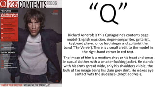
- 1. “Q”Richard Ashcroft is this Q magazine’s contents page model (English musician, singer-songwriter, guitarist, keyboard player, once lead singer and guitarist the band ‘The Verve’). There is a small credit to the model in the right-hand corner in red text. The image of him is a medium shot or his head and torso in casual clothes with a smarter-looking jacket. He stands with his arms spread wide, only his shoulders visible, the bulk of the image being his plain grey shirt. He makes eye contact with the audience (direct address).
- 2. TECHNICAL & CONTENT CODES Colour Scheme Black: Death, danger, intimidation, power, elegance, formality, evil, mystery Red: Fire, danger, energy, war, strength, power, passion and romance, anger, courage. Grey: Neutral, indecisive, neutral, quiet, unemotional, simplistic, mature, calm Navy: Royal, professional, intelligence, stability, power, control His posture, with arms wide open, makes him seem powerful, which is reflected in his navy jacket. His direct address also draws in the audience and makes him seem very much in control of the situation and interaction between himself and the audience. The background being dark grey makes it seem like he is in a mature, or foreboding environment (the maturity may be something to do with the target audience Q Magazine is trying to reach. His top being light grey makes him come across as calm and neutral, and also goes with his eyes. The navy top and trousers, however, imply a regal air; he is important, and powerful, which is reflected in his confident body language, eye contact, and serious expression. However, he is not completely serious; he is in smart-casual clothing with his smart suit top and his denim trousers. And, while his expression is sinister with furrowed eyebrows, his hair is loose and scruffy, not quite reaching down to cover his eyes. He is important and smart, but also casual. The small arrow in the lower-right corner may be encouraging the audience to turn the page and read o Grey Navy Casual Smart Dominance Confident ?
- 3. LANGUAGE CODES The brand logo “Q” is in the corner, beside the title “235 Contents” and the dateline “Feb06” in all-caps. These words are drawn away from the rest of the page with a light grey background that doesn’t match the rest of the page. It doesn’t draw the attention away from the rest of the page. The puff with the red, eye-catching background reads “100 Greatest Albums Ever” in white. Numbers of main pages are in white, and celebrity name-dropping is used in large text (e.g. “Johnny Cash”, “Radiohead”, etc.) This is bellow the cover line with a black background in white text reading “Features”. There is a cover line beneath the red puff with a black background in white text reading “Every Month”. Beneath this, there are smaller cover lines in white with the page numbers beside them in red. There is a break at the bottom of the page in the same grey as the “235 Contents” and dateline background. The text in red reads “‘I Fart in Your Direction.’” and the black beside it reads “Nick Valesnsi, the Strokes p12” in sans serif capitals.