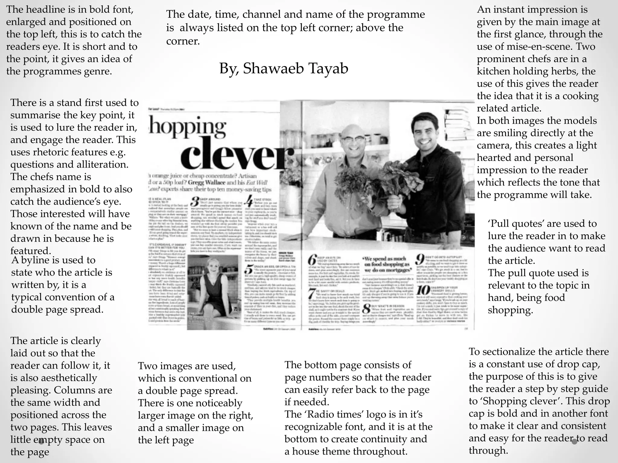
The document summarizes the layout and design elements of a double page spread in a magazine. Key elements included a short, attention-grabbing headline in bold at the top left; a stand first using rhetoric to summarize and engage readers; the emphasis of a chef's name in bold to draw in interested audiences; a byline stating the author; clear column layout with minimal empty space; program details in the top left corner; two images with a larger one on the right and smaller on the left; page numbers on the bottom; and the magazine logo at the bottom for continuity. Images and pull quotes are used to entice readers into the article, and drop caps sectionalize the piece to guide readers step-by-step through