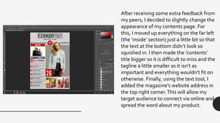
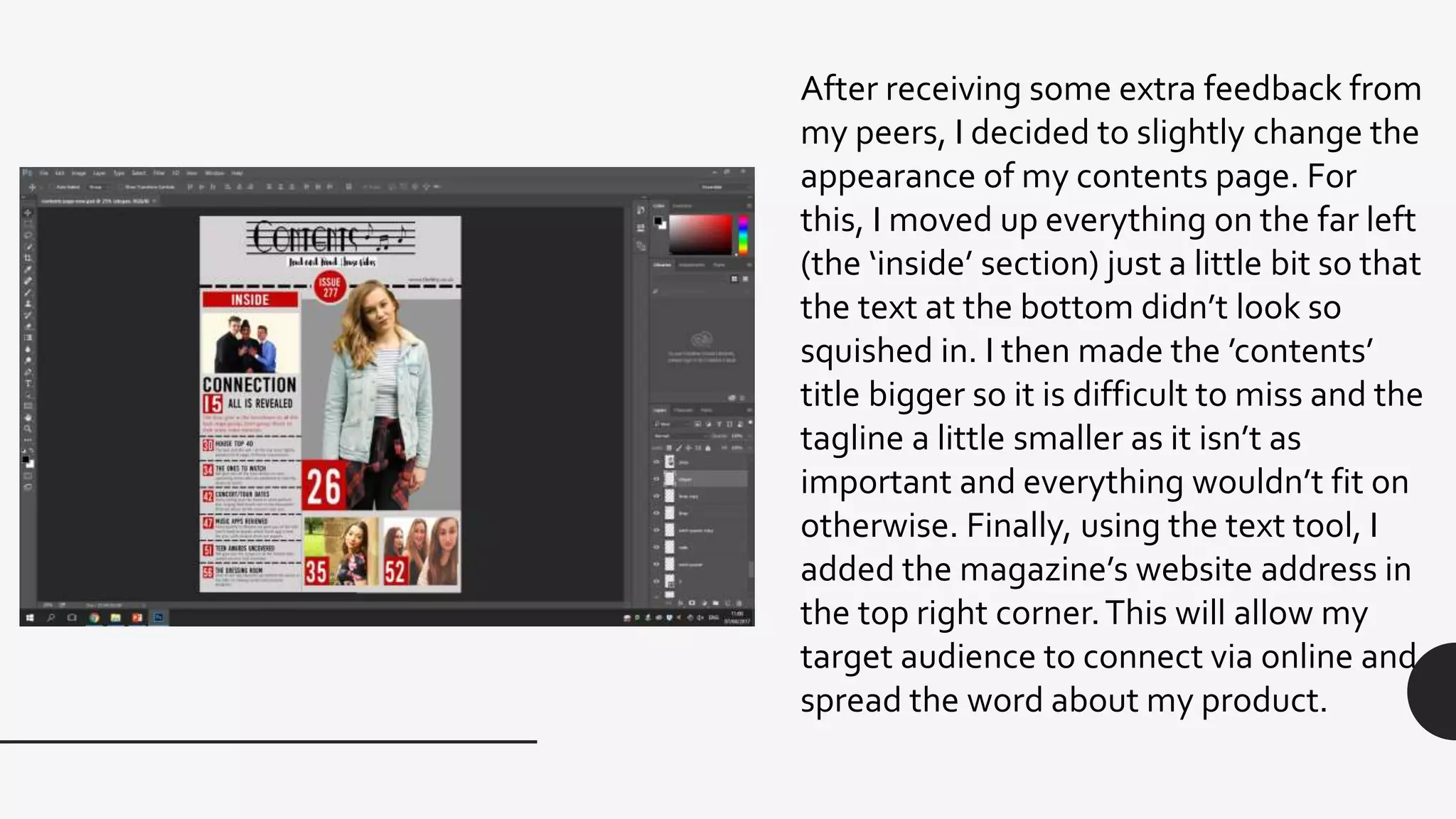
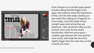
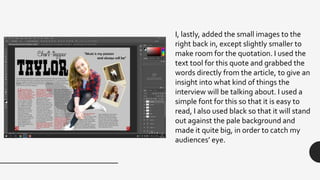
After receiving some extra feedback from
my peers, I decided to slightly change the
appearance of my contents page. For
this, I moved up everything on the far left
(the ‘inside’ section) just a little bit so that
the text at the bottom didn’t look so
squished in. I then made the ’contents’
title bigger so it is difficult to miss and the
tagline a little smaller as it isn’t as
important and everything wouldn’t fit on
otherwise. Finally, using the text tool, I
added the magazine’s website address in
the top right corner.This will allow my
target audience to connect via online and
spread the word about my product.
Final changes to my double-page spread
include making the title bigger, once
again. My audience stress the importance
of this since the title really standing out
just makes the reading of a magazine so
much easier, since the reader knows
straight away what article they are
looking at. I also moved this title up a bit,
to leave more room for the article
introduction. With this extra space, I
created a gap between the intro and the
main article, and made the intro font
slightly bigger than the main text, so that
it stands out more.
I, lastly, added the small images to the
right back in, except slightly smaller to
make room for the quotation. I used the
text tool for this quote and grabbed the
words directly from the article, to give an
insight into what kind of things the
interview will be talking about. I used a
simple font for this so that it is easy to
read, I also used black so that it will stand
out against the pale background and
made it quite big, in order to catch my
audiences’ eye.

Editing final extra

  • 1.
    After receiving someextra feedback from my peers, I decided to slightly change the appearance of my contents page. For this, I moved up everything on the far left (the ‘inside’ section) just a little bit so that the text at the bottom didn’t look so squished in. I then made the ’contents’ title bigger so it is difficult to miss and the tagline a little smaller as it isn’t as important and everything wouldn’t fit on otherwise. Finally, using the text tool, I added the magazine’s website address in the top right corner.This will allow my target audience to connect via online and spread the word about my product.
  • 2.
    Final changes tomy double-page spread include making the title bigger, once again. My audience stress the importance of this since the title really standing out just makes the reading of a magazine so much easier, since the reader knows straight away what article they are looking at. I also moved this title up a bit, to leave more room for the article introduction. With this extra space, I created a gap between the intro and the main article, and made the intro font slightly bigger than the main text, so that it stands out more.
  • 3.
    I, lastly, addedthe small images to the right back in, except slightly smaller to make room for the quotation. I used the text tool for this quote and grabbed the words directly from the article, to give an insight into what kind of things the interview will be talking about. I used a simple font for this so that it is easy to read, I also used black so that it will stand out against the pale background and made it quite big, in order to catch my audiences’ eye.