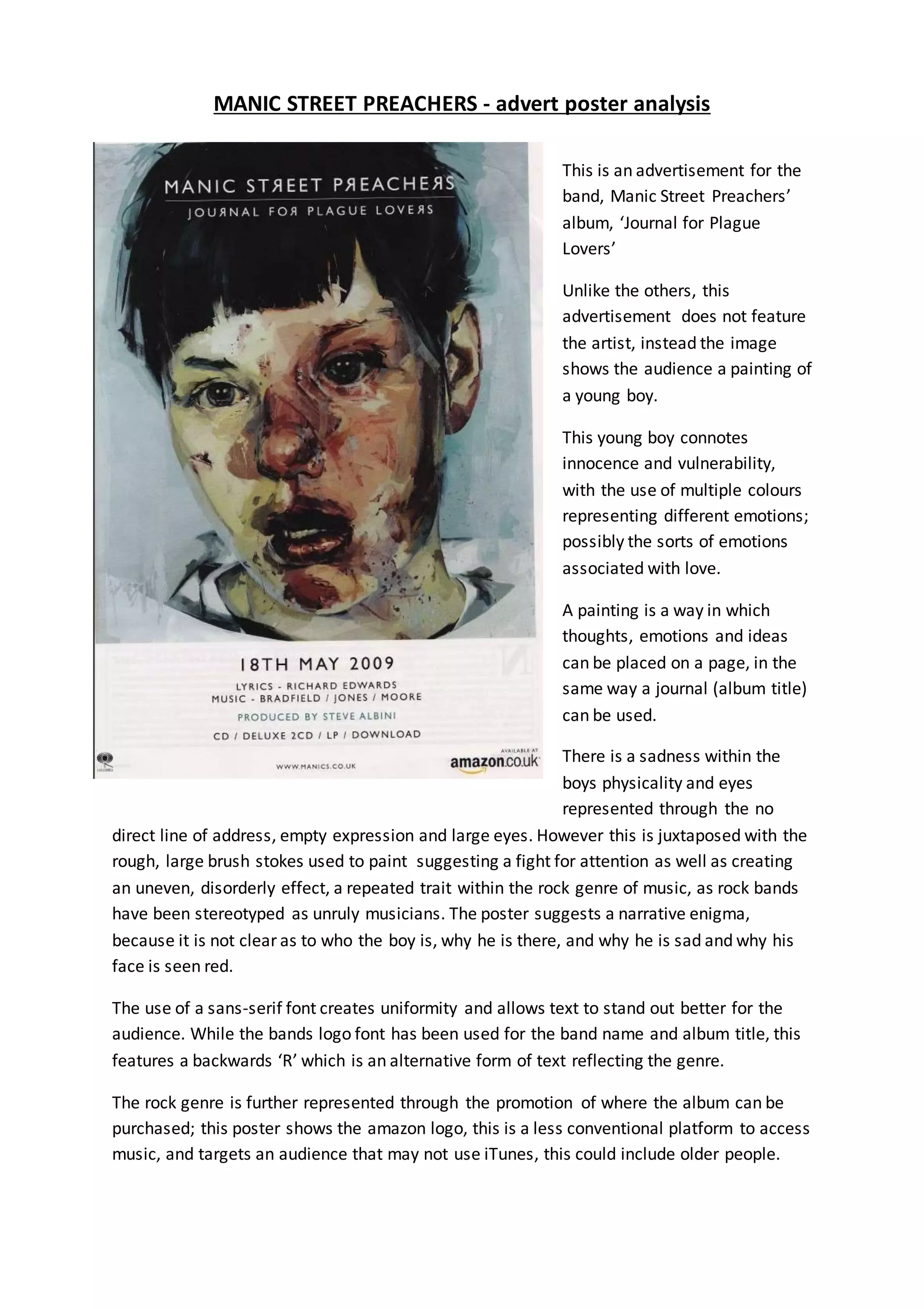
MANIC STREET PREACHERS - advert poster analysis
This is an advertisement for the
band, Manic Street Preachers’
album, ‘Journal for Plague
Lovers’
Unlike the others, this
advertisement does not feature
the artist, instead the image
shows the audience a painting of
a young boy.
This young boy connotes
innocence and vulnerability,
with the use of multiple colours
representing different emotions;
possibly the sorts of emotions
associated with love.
A painting is a way in which
thoughts, emotions and ideas
can be placed on a page, in the
same way a journal (album title)
can be used.
There is a sadness within the
boys physicality and eyes
represented through the no
direct line of address, empty expression and large eyes. However this is juxtaposed with the
rough, large brush stokes used to paint suggesting a fight for attention as well as creating
an uneven, disorderly effect, a repeated trait within the rock genre of music, as rock bands
have been stereotyped as unruly musicians. The poster suggests a narrative enigma,
because it is not clear as to who the boy is, why he is there, and why he is sad and why his
face is seen red.
The use of a sans-serif font creates uniformity and allows text to stand out better for the
audience. While the bands logo font has been used for the band name and album title, this
features a backwards ‘R’ which is an alternative form of text reflecting the genre.
The rock genre is further represented through the promotion of where the album can be
purchased; this poster shows the amazon logo, this is a less conventional platform to access
music, and targets an audience that may not use iTunes, this could include older people.
Advert Poster Analysis - Manic Street Preachers

Advert Poster Analysis - Manic Street Preachers

  • 1.
    MANIC STREET PREACHERS- advert poster analysis This is an advertisement for the band, Manic Street Preachers’ album, ‘Journal for Plague Lovers’ Unlike the others, this advertisement does not feature the artist, instead the image shows the audience a painting of a young boy. This young boy connotes innocence and vulnerability, with the use of multiple colours representing different emotions; possibly the sorts of emotions associated with love. A painting is a way in which thoughts, emotions and ideas can be placed on a page, in the same way a journal (album title) can be used. There is a sadness within the boys physicality and eyes represented through the no direct line of address, empty expression and large eyes. However this is juxtaposed with the rough, large brush stokes used to paint suggesting a fight for attention as well as creating an uneven, disorderly effect, a repeated trait within the rock genre of music, as rock bands have been stereotyped as unruly musicians. The poster suggests a narrative enigma, because it is not clear as to who the boy is, why he is there, and why he is sad and why his face is seen red. The use of a sans-serif font creates uniformity and allows text to stand out better for the audience. While the bands logo font has been used for the band name and album title, this features a backwards ‘R’ which is an alternative form of text reflecting the genre. The rock genre is further represented through the promotion of where the album can be purchased; this poster shows the amazon logo, this is a less conventional platform to access music, and targets an audience that may not use iTunes, this could include older people.