The document summarizes the album covers of three different albums:
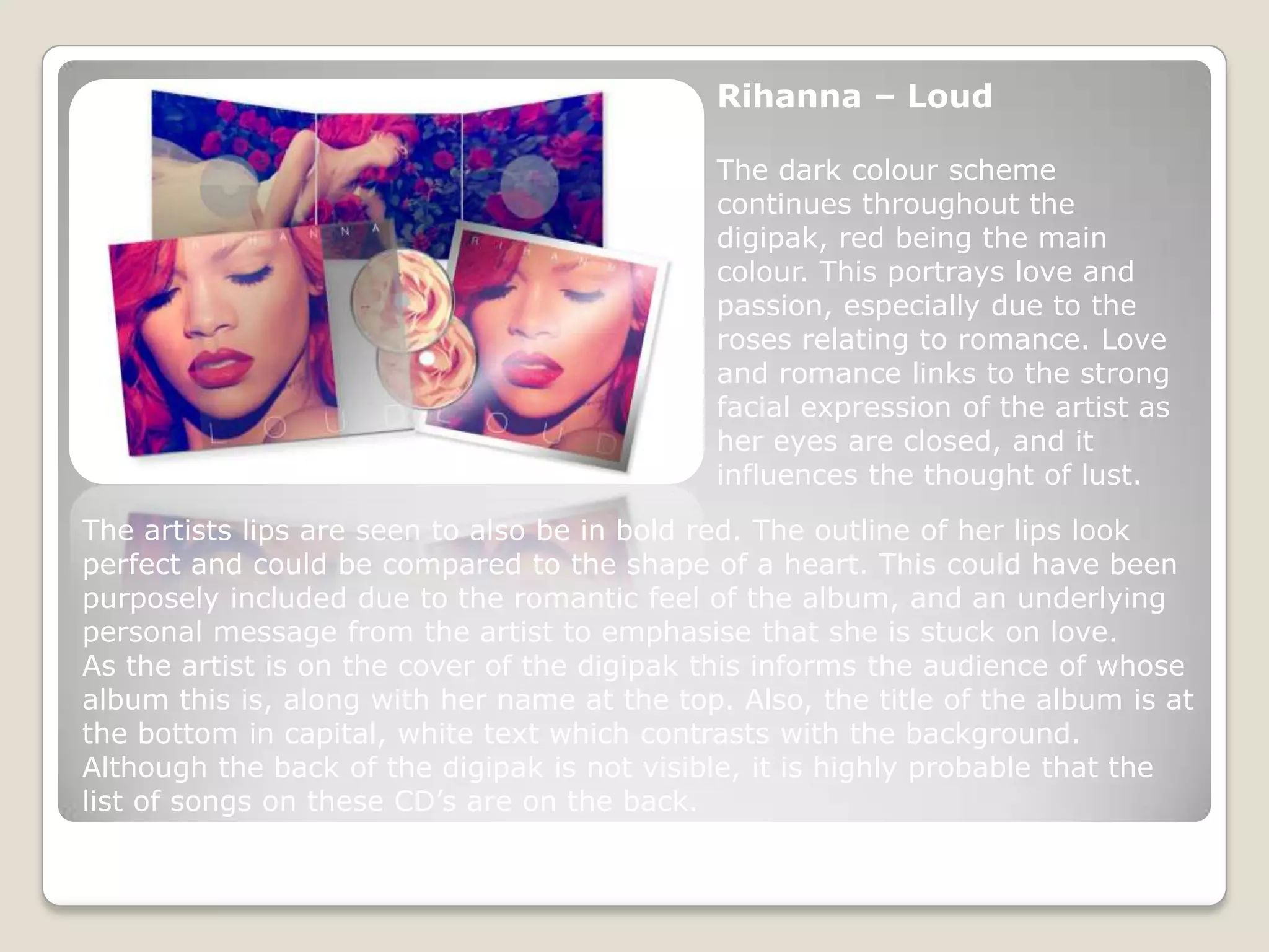
1) Rihanna's "Loud" album cover features dark red colors and roses to portray love and romance, matching Rihanna's facial expression.
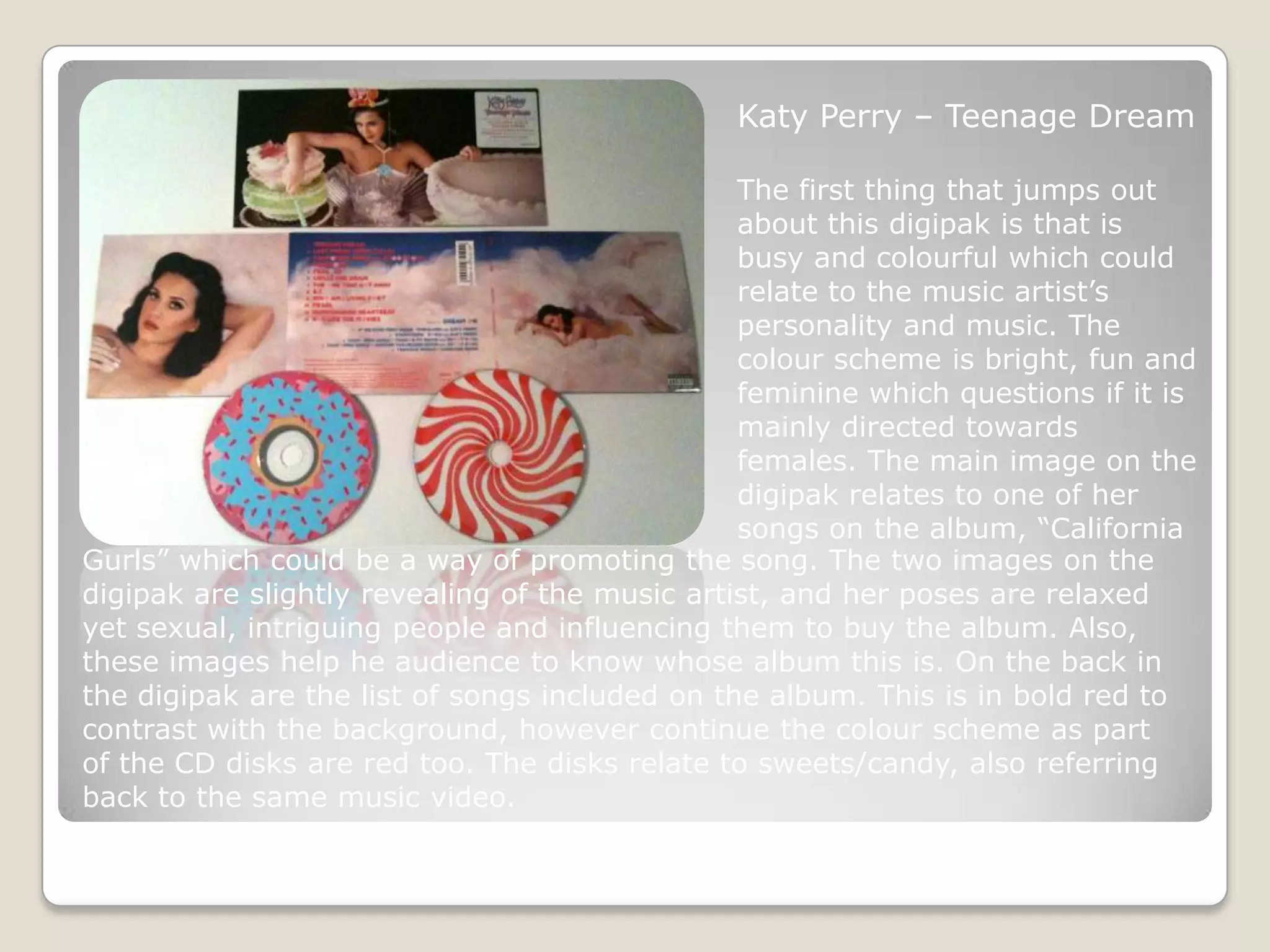
2) Katy Perry's "Teenage Dream" cover is bright and colorful, reflecting her fun personality and targeting females. It features images of Perry promoting her song "California Gurls".
3) Oasis' "Acoustic" cover is simple, featuring an abstract guitar image to represent their music and acoustic style. It clearly displays the band name and album title.