Group 6 created a digipak for a hip hop album. They went through 3 drafts of the front cover based on feedback. The first draft focused on children but feedback said to feature the artists. The second kept the background but changed the central image to the artists. For the final draft, they converged the past childhood theme and present artists to highlight how artists have changed since their youth.
A detailed insight into music artist's digipaks and an analysis of how I may utilise some of these ideas as inspiration for my own A Level piece of digipak artwork. This presentation focuses on the conventions of the reggae genre because the music video I am basing my product on is from this genre.
A detailed insight into music artist's digipaks and an analysis of how I may utilise some of these ideas as inspiration for my own A Level piece of digipak artwork. This presentation focuses on the conventions of the reggae genre because the music video I am basing my product on is from this genre.
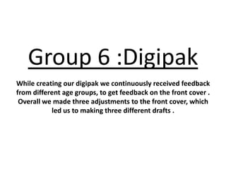
1. Group 6 :Digipak
While creating our digipak we continuously received feedback
from different age groups, to get feedback on the front cover .
Overall we made three adjustments to the front cover, which
led us to making three different drafts .
2. Draft 1
WHEN I WAS A YOUNGSTER
Our first draft was meant to represent the idea of our youth , we designed the
background which are crayons in a pattern and then centred the front cover towards
two little children in fancy dress . However we received comments saying :
• The main picture should focus on the characters in the hip pop video and not
children .
• The two children are spread out to far .
• The front cover is to childish and does not present a CD cover well .
3. Draft 2
Our second draft kept the same background idea as the majority of the
audience liked it . We also kept to the fonts because ‘rizzle kicks’ font is an icon
and we decided the bottom font works well with it .
We made changes to the centre image and thought that having a picture of the
artists is more appropriate.
4. Final
On the final draft we decided to keep the icon writing as it presents a type of
synergy to the audience but changed the bottom font to ‘Bradley hand ict’ because
it matched the font of our magazine cover . Also we were receiving a mix reaction
from our feedback about having the main artists as the centre image or continuing
with the children idea . In the end my group and I thought it was best to converge
them both together to show a journey of past and present , which highlights the
theme of when I was a youngster .
5. YEAH YEAH
Inside
Let's get down with the trumpets,
Let's get down with the trumpets,
Let's get down with the trumpets,
Let's get down with the trumpets .
booklet
WHAT
Let's get down with the down with the, The inside booklet is used as a
Let's get down with the down with the, lyric guide for each song in the
Let's get down with the down with the .
YEAH YEAH album . After researching other
Let's get down with the trumpets digipaks , we thought this was a
good idea as fans love to read
lyrics to memorise the song .
Behind the lyrics is images of the
two artists which are shown in
different locations just like in the
mama do the hump mama do the hump hump, mama
won't you please let me do the hump hump
videos of the songs .
mama do the hump mama do the hump hump, mama
won't you please let me do the hump hump
mama do the hump mama do the hump hump, mama
won't you please let me do the hump hump
mama do the hump mama do the hump hump,
6. Inside
'm in trouble woops I'm in trouble
I'm in trouble Everything was going well and now
I'm in trouble woops I'm in trouble
I'm in trouble could somebody explain just how?
booklet
I'm in trouble woops I'm in trouble
I'm in trouble I just lost my head and i found
I'm in trouble woops I'm in trouble
I'm in trouble pow
Back when I was younger, I wanted to be
everything on the planet (on the, on the, on
the planet) Now that I am older, it seems the
ambition has vanished. (Uh) Yeah, when I was
a youngster, when I was a, When I was a
youngster, youngster, When I was a
youngster. Yeah, and now that I'm older, I
wish I could of been everything that I wanted.
(I'm on it)
7. DISC Spine
The design of the disc is the same theme from the front and back cover of the digipak
and uses the same fonts .
8. Back when I was younger, I
wanted to be everything on the
planet (on the, on the, on the
planet) Now that I am older, it
seems the ambition has vanished.
(Uh) Yeah, when I was a
youngster, when I was a, When
I was a youngster, youngster,
When I was a youngster. Yeah,
and now that I'm older, I wish I
could of been everything that I
wanted. (I'm on it)