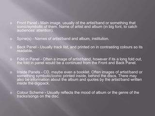
By Pav Dhillon
   Visual image/key to the production

   Band/artist name - allow audience to identify band/artist

   Album title - on main cover and along the spine

   Track list/What's on the CD

   Basic background information of the band/artist

   (occasions reviews from companies e.g. NME, Newspapers etc...)
   Front Panel - Main image, usually of the artist/band or something that
    iconic/symbolic of them. Name of artist and album (in big font, to catch
    audiences' attention).

   Spine(s) - Names of artist/band and album, institution.

   Back Panel - Usually track list, and printed on in contrasting colours so its
    readable.

   Fold in Panel - Often a image of artist/band, however if its a long fold out,
    the fold in panel would be a continued from the Front and Back Panel.

   Inside Panels - CD, maybe even a booklet. Often images of artist/band or
    something symbolic/iconic printed inside, behind the discs. There may
    also be information about the album and quotes by the artist/band written
    inside the digipack.

   Colour Scheme - Usually reflects the mood of album or the genre of the
    tracks/songs on the disc.
   This is Jack Johnson's 4 panel Digipak - In Between
    Dramas. This album has a very distinct and
    recognisable style, even if you'd never listen to the
    artist before you'd be able to denote that the music
    is of an acoustic, folk genre. These hints are given
    to us through the acoustic guitar featuring on the
    front cover and also the silhouette of the tree on the
    main panel.
   There is a obvious colour scheme of a bright yellow,
    black and white. The colour scheme is very
    important on this album as it is what captures the
    audiences attention. The connotations of bright
    yellow that apply to this cover are ideologies of
    happiness, it is also said that yellow enhances
    concentration and can strengthen self confidence
    and encourages optimism, this is a good colour to
    use in this case as it reflects the album and songs
    of the artist
   Rihanna's Album 'Loud' contrasts greatly with that of Jack Johnson's this is
    mainly down to the type of music and target audience which makes
    the ideologies and visual meanings different.

   The main focus of the album is Rihanna, she features on all the panels this is
    because she is her own selling point, she is a star focus. The close up radiates
    confidence and is very typical in R&B and pop albums in addition to this is the
    colour scheme that is used, it is mostly different shades of red, making the album
    very catching and also suggesting passion and danger, making her very
    desirable causing people to by the album think the same may apply if they own
    it.

   On the back cover she is looking away again, it is also a long shot, so we
    can see the whole of her body this gives connotations of two possibilities, the
    first is that she is teasing the audience, it is quite flirtatious.
Digipacks

Digipacks

  • 1.
  • 2.
    Visual image/key to the production  Band/artist name - allow audience to identify band/artist  Album title - on main cover and along the spine  Track list/What's on the CD  Basic background information of the band/artist  (occasions reviews from companies e.g. NME, Newspapers etc...)
  • 3.
    Front Panel - Main image, usually of the artist/band or something that iconic/symbolic of them. Name of artist and album (in big font, to catch audiences' attention).  Spine(s) - Names of artist/band and album, institution.  Back Panel - Usually track list, and printed on in contrasting colours so its readable.  Fold in Panel - Often a image of artist/band, however if its a long fold out, the fold in panel would be a continued from the Front and Back Panel.  Inside Panels - CD, maybe even a booklet. Often images of artist/band or something symbolic/iconic printed inside, behind the discs. There may also be information about the album and quotes by the artist/band written inside the digipack.  Colour Scheme - Usually reflects the mood of album or the genre of the tracks/songs on the disc.
  • 4.
    This is Jack Johnson's 4 panel Digipak - In Between Dramas. This album has a very distinct and recognisable style, even if you'd never listen to the artist before you'd be able to denote that the music is of an acoustic, folk genre. These hints are given to us through the acoustic guitar featuring on the front cover and also the silhouette of the tree on the main panel.  There is a obvious colour scheme of a bright yellow, black and white. The colour scheme is very important on this album as it is what captures the audiences attention. The connotations of bright yellow that apply to this cover are ideologies of happiness, it is also said that yellow enhances concentration and can strengthen self confidence and encourages optimism, this is a good colour to use in this case as it reflects the album and songs of the artist
  • 5.
    Rihanna's Album 'Loud' contrasts greatly with that of Jack Johnson's this is mainly down to the type of music and target audience which makes the ideologies and visual meanings different.  The main focus of the album is Rihanna, she features on all the panels this is because she is her own selling point, she is a star focus. The close up radiates confidence and is very typical in R&B and pop albums in addition to this is the colour scheme that is used, it is mostly different shades of red, making the album very catching and also suggesting passion and danger, making her very desirable causing people to by the album think the same may apply if they own it.  On the back cover she is looking away again, it is also a long shot, so we can see the whole of her body this gives connotations of two possibilities, the first is that she is teasing the audience, it is quite flirtatious.