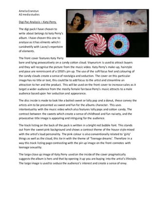
AmeliaCranstun
A2 mediastudies
Digi Pac Analysis – Katy Perry.
The digi pack I have chosen to
write about belongs to katy Perry’s
album. I have chosen this one to
analyse as it has elments which I
canidnetify with Lacey’s repertoire
of elements.
The front cover features Katy Parry
bare and lying provocatively on a candy cotton cloud. Voyeurism is used to attract buyers
and they will recognise the picture from the music video. Katy Perry’s make-up, hairstyle
and pose are reminiscent of a 1950’s pin up. The use of the soft focus feel and colouring of
the candy clouds create a sense of nostalgia and seduction. The cover on this particular
image has no title or text, this could be to add focus to the artist and streamline an
attraction to her and the product. This will be used on the front cover to increase sales as it
target a wider audience from the mostly female fan base Perry’s music attracts to a male
audience based upon her seduction and appearance.
The disc inside is made to look like a boiled sweet or lolly pop and a donut, these convey the
artists aim to be presented as sweet and fun for the albums character. This uses
intertextuality with the music video which also features lolly pops and cotton candy. The
contrast between the sweets which create a sense of childhood and fun naivety, and the
provocative title image is appealing and intriguing for the audience.
The track listing on the back of the pack is written in a bright red bubble font. This stands
out from the sweet pink background and shows a contrast theme of the house style mixed
with the artist’s loud personality. The pink colour is also conventionally related to ‘girly’
things as well as the cloud, this tie in with the theme of ‘Teenage dreams’. Therefore in a
way this track listing page contrasting with the pin up image on the front connotes with
teenage sexuality.
The large close up image of Katy Perry used on the inside of the cover pragmatically
suggests the album is hers and that by opening it up you are buying into the artist’s lifestyle.
The large image is used to seduce the audience’s interest and create a sense of envy.

Digi pac analysis katy pary

  • 1.
    AmeliaCranstun A2 mediastudies Digi PacAnalysis – Katy Perry. The digi pack I have chosen to write about belongs to katy Perry’s album. I have chosen this one to analyse as it has elments which I canidnetify with Lacey’s repertoire of elements. The front cover features Katy Parry bare and lying provocatively on a candy cotton cloud. Voyeurism is used to attract buyers and they will recognise the picture from the music video. Katy Perry’s make-up, hairstyle and pose are reminiscent of a 1950’s pin up. The use of the soft focus feel and colouring of the candy clouds create a sense of nostalgia and seduction. The cover on this particular image has no title or text, this could be to add focus to the artist and streamline an attraction to her and the product. This will be used on the front cover to increase sales as it target a wider audience from the mostly female fan base Perry’s music attracts to a male audience based upon her seduction and appearance. The disc inside is made to look like a boiled sweet or lolly pop and a donut, these convey the artists aim to be presented as sweet and fun for the albums character. This uses intertextuality with the music video which also features lolly pops and cotton candy. The contrast between the sweets which create a sense of childhood and fun naivety, and the provocative title image is appealing and intriguing for the audience. The track listing on the back of the pack is written in a bright red bubble font. This stands out from the sweet pink background and shows a contrast theme of the house style mixed with the artist’s loud personality. The pink colour is also conventionally related to ‘girly’ things as well as the cloud, this tie in with the theme of ‘Teenage dreams’. Therefore in a way this track listing page contrasting with the pin up image on the front connotes with teenage sexuality. The large close up image of Katy Perry used on the inside of the cover pragmatically suggests the album is hers and that by opening it up you are buying into the artist’s lifestyle. The large image is used to seduce the audience’s interest and create a sense of envy.