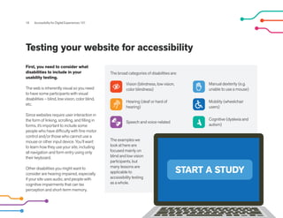
Accessibility testing involves considering a range of disabilities and testing a website with users who have those disabilities. It is important to test with blind or low vision users to understand how they experience the site using a screen reader. Testing helps identify accessibility issues and ensure the site meets guidelines like WCAG. Addressing issues uncovered in testing helps make a site usable for all.
Brief explanation of user experience with a focus on usability and accessibility. Heuristic assessments, WCAG 1.0 checkpoints and how this fits in with real user testing.
Accessibility Buy-In for Inclusive Product WeekKat K. Richards
Get buy-in for accessibility work by knowing your audience and their priorities. With UX and allyship skills, Kat will discuss effective ways to pitch accessibility. Learn how to sell this to internal teams, senior management and even to clients, and be one step closer to building more inclusive solutions.
7 Signs of Maturing in Accessibility and InclusionJonathan Hassell
CSUN 2014 talk by Professor Jonathan Hassell describing models for assessing the maturity of accessibility practice - within organisations and in the field as a whole - discussing how they can be used to measure the maturing of the whole accessibility profession that shows signs of happening around us.
Discussion 1 post responses.Please respond to the followingC.docxcuddietheresa
Discussion 1 post responses.
Please respond to the following:
"Creating an Interface" Please respond to the following:
· Imagine you are managing a design project that will create an interface for automobile mechanics. The interface would be used by the mechanics to look up various fixes and parts for any number of makes or models of automobiles that may come through their garage. Decide what usability measures would be most motivating when designing this interface and describe the unique challenges you would have to plan for when designing an interface for an automotive repair shop. Use supporting evidence to support your response.
· Physical, cognitive, perceptual, personality, and cultural differences introduce challenges when designing universally usable products. Choose one area from the list above and describe why it is the biggest challenge to overcome when creating universally usable designs. Support your response.
MW’s post states the following:Top of Form
Managing a design project that will create an interface for automobile mechanics today will certainly be demanding. The mechanic in the old days had a manual that detected the scenario of the issue and reference a location or page that defined the issue, provided instructions and schematics or diagrams that indicates how to correct the issue. The manual even provided a charge time allowed to correct the issue. The shop then billed the hours assigned to the issue. If you ever worked at an auto part store such as Pepboys or auto zone or even visited the establishment as a customer you will find a user interface for the parts manager/clerk to look up the part being inquired about. The interface would not only provide the part number and location of the part but often provides the customer an abstract on how to diagnose, install or replace the item. There was a time where it was that simple for those that preferred to DIY (Do IT yourself). Today the business demands for data as customer demands increase with the acceptance of the enhancements to modern vehicles and there adaptation of applications, and the communications to SMART Homes, Anominius Cars, Smart Appliances, Smart phones, tablets, buletooth communications, Web sites URL applications, the new RICH WEB applications, Blockchain, serves the development principles and Practices of Artificial Intelligence, to develop of the underlying activity are the driving trends in software development. Software Industry Trends to watch for are Job Polarization, Consumer Micro-Income Streams, Data Policies, Marketplaces, B2B Sharing Economy, Fintech Revolution, Blockchain, Smartphone Evolution, It reminds me of something from the science fiction movies and TV shows such as Star Trek, Quantum Leap, Stargate, Ironman and the like. I have discovered that there are several movements of the National Strategic Computing initiative (NCIS) to further these technologies. It is not only in the private interest but government interest ...
Usability: whats the use? Presented by We are Sigma and PRWDNexer Digital
For websites, good usability is a matter of survival. If a website is difficult to use, people leave. If the homepage fails to clearly state what a company offers and what users can do on the site, people leave. If users get lost on a website, they leave. For intranets and applications the question is one of productivity. In many organisations employees waste inordinate amounts of time searching for and assimilating the information they need to do their jobs. This lost time has a real, tangible value so ROI for designing internal systems with User Experience in mind, and spending some time testing and improving the usability of the system, is pretty compelling.
As people with a strong User Experience focus we don’t need to be convinced of the value of good usability, but for many companies who are thinking of revamping their site, intranet or portal it isn’t quite so clear cut.
Presented by Chris Bush, www.wearesigma.com and
Paul Rouke, www.prwd.co.uk
The Importance of Accessibility in Web Design | Website Design Company | Get ...NileshG12
Discover the pivotal role of accessibility in web design, ensuring inclusivity while bolstering business benefits. Join us in creating a digital space where everyone feels welcome.
Web design goes beyond aesthetics and user experience; it’s also about inclusivity. Imagine browsing your favorite website, but you can’t see the images, or perhaps you can’t hear the videos. For millions, this isn’t a hypothetical scenario but a daily challenge.
Accessibility in web design ensures that everyone, regardless of their abilities or disabilities, can access, understand, and navigate websites. As our world becomes increasingly digitized, making the web more accessible isn’t just a moral obligation, but a necessity.
This article delves deep into the significance of accessibility in web design, highlighting not only its importance but also its impact on businesses and their potential audiences.
The “DON’TS” before your bank goes Digital.pdfMaveric Systems
While we have gone through the necessities of Digital Banking, along with the foundations of making it successful, it is also necessary to avoid some obvious errors that most first-timers end up making.
Discover the power of UX design in driving demand. By prioritizing user needs, UX designers create seamless, intuitive experiences that captivate and engage customers. Exceptional UX enhances customer satisfaction, increases loyalty, and generates positive word-of-mouth, attracting new users. A well-designed interface sets businesses apart from competitors, while streamlined user flows optimize conversion rates. Investing in UX design is crucial for organizations seeking to thrive in today's user-centric market.
This presentation was done as a quick research project based on my interest and curiosity about service design. I would like to integrate this with my personal brand.
Creating your website the right way makes all the difference. Without the right strategy for designing your website your customers just would not be able to connect with your brand or business. Thus it pays to have a website that makes all the right noises in attracting and providing them the right spur to return back to your website.
Starting from the URL that you choose to the user interface that you provide all make a vital difference to how the audience connects with your site. Check out how to create a website that stands out from the crowd by going through this insightful resource now and let your brand visibility grow online.
Design for Good or Evil. World Usability Day & LiminaLimina
When it comes to good user experience, there is good design, unintentionally bad design and then there is evil design. Limina takes a look at what exactly makes design go from bad to evil. Good vs Evil in UX
Digital Transformation and the Marketing ProfessionalMatthew W. Bowers
Defining and understanding digital transformation and the marketing role. How can marketing drive transformation? what are the tasks, strategies and things that can help.
Usability testing is an accepted process from the domain of user experience (UX) to gauge how easy to learn or use a product is. Users are asked to work on typical scenarios or tasks on the product with the goal of trying to identify challenges in the design of the user interface, interaction or content. In this paper I will discuss the benefits of usability testing in conjunction with accessibility testing and how they can work together. In particular, I will review some recent usability testing projects where we had people with disabilities participate and demonstrate how these findings can augment and support accessibility testing efforts.
Book Formatting: Quality Control Checks for DesignersConfidence Ago
This presentation was made to help designers who work in publishing houses or format books for printing ensure quality.
Quality control is vital to every industry. This is why every department in a company need create a method they use in ensuring quality. This, perhaps, will not only improve the quality of products and bring errors to the barest minimum, but take it to a near perfect finish.
It is beyond a moot point that a good book will somewhat be judged by its cover, but the content of the book remains king. No matter how beautiful the cover, if the quality of writing or presentation is off, that will be a reason for readers not to come back to the book or recommend it.
So, this presentation points designers to some important things that may be missed by an editor that they could eventually discover and call the attention of the editor.
Expert Accessory Dwelling Unit (ADU) Drafting ServicesResDraft
Whether you’re looking to create a guest house, a rental unit, or a private retreat, our experienced team will design a space that complements your existing home and maximizes your investment. We provide personalized, comprehensive expert accessory dwelling unit (ADU)drafting solutions tailored to your needs, ensuring a seamless process from concept to completion.
Hello everyone! I am thrilled to present my latest portfolio on LinkedIn, marking the culmination of my architectural journey thus far. Over the span of five years, I've been fortunate to acquire a wealth of knowledge under the guidance of esteemed professors and industry mentors. From rigorous academic pursuits to practical engagements, each experience has contributed to my growth and refinement as an architecture student. This portfolio not only showcases my projects but also underscores my attention to detail and to innovative architecture as a profession.
Between Filth and Fortune- Urban Cattle Foraging Realities by Devi S Nair, An...Mansi Shah
This study examines cattle rearing in urban and rural settings, focusing on milk production and consumption. By exploring a case in Ahmedabad, it highlights the challenges and processes in dairy farming across different environments, emphasising the need for sustainable practices and the essential role of milk in daily consumption.
2. Table of Contents
Introduction .....................................................................................................................................
How to get stakeholders on board with accessibility ..................................................
How to make your digital experience accessible...........................................................
Testing your website for accessibility ..................................................................................
Tips for designing for older users..........................................................................................
Tips for designing for blind or visually impaired people .............................................
Tips for designing for people with dyslexia ......................................................................
Tools and resources for improving online accessibility ..............................................
3
4
9
18
21
23
26
28
2 Accessibility for Digital Experiences 101
Written and compiled by Graham
Charlton, with contributions from
the following UX and accessibility
experts and writers:
Elizabeth Chesters, Senior UX
Researcher and Designer
Paul Crichton, Head of Accessibility and
Inclusion
Abbey Fitzgerald, Senior UX Designer
Caroline Garner, Senior UX Researcher,
UserZoom
Kuldeep Kelkar, SVP UX Research,
UserZoom
Christopher Ratcliff, Digital Content
Manager, UserZoom
John Romadka, Sr. Manager, UX
Research, UserZoom
Rebecca Sentance, Deputy Editor,
Econsultancy
3. 3 Accessibility for Digital Experiences 101
Introduction
Despite this, accessibility tends to be
overlooked when designing online
experiences.
Perhaps businesses feel this adds
unnecessary cost and complexity to
projects--failing to consider the
needs of all their users or to realize
how many users may find their sites
difficult to use.
From a business perspective, the
failure to design for all users comes
with the cost of lost opportunity.
Around one in five potential
customers are being excluded if
accessibility is not considered.
Covid-19 is another key factor that will drive more awareness to
the importance of accessibility. The impact of social distancing
measures and the restrictions or closures imposed on physical
spaces and services is having a profound impact on people with
disabilities.
This restriction of physical spaces has forced people of all
abilities online and to use digital products they've never used
before. This means designers need to develop and improve
digital experiences with accessibility for all at the front of their
minds.
Many of the improvements needed to make websites
more accessible are simply about good UX, which is
essentially designing with the user in mind. Elements such as
readable text, clear labeling and signposting, and pages that
load quickly help every user of a digital product.
In this guide, we'll look at building a business case for
accessibility, and we’ll gather together some practical tips for
designing digital products for users with a range of disabilities.
More than 20% of people in both the UK and US have some
form of disability, and these disabilities often mean that they
are not fully able to use digital products.
Purple refers to the
spending power of disabled
households as the ‘Purple
Pound’ and estimates that,
in the UK, the 4.3m users
who click away from
inaccessible websites
have a combined
spending power of
£11.75 billion.
4.3M Users
£11.75 billion
4. 4 Accessibility for Digital Experiences 101
How to get stakeholders on board with accessibility
Whentheyrealizetheimpactthatkeychangescanhaveonsomeusers,this
cangivethemtheextramotivationneededtodoanyextraworkrequired.
Elizabeth also advises that teams need to change their strategies to
account for accessibility:
Accessibility has been overlooked in the past and can
be an afterthought during product development. One
key step is to get buy-in from key stakeholders so they
understand the importance of accessibility and are
prepared to allocate time and resources to it.
As Elizabeth Chesters explains, many people simply don’t understand
what accessibility means:
Beyond management, it’s also important that everyone working on
digital projects understands the importance of accessibility and the
extra effort that is sometimes required to design for all.
“Without a face to the problem, it's very difficult
to have empathy for something you don't
understand and when everything else is a
priority--monetization, security, feature
parity--then accessibility is usually left to be
tackled once it becomes a problem, not before.”
“I would definitely start tackling the first problem
- break down what accessibility is. Understand
your users: are they mostly keyboard-only users?
Are they mostly deaf users? Tackling every WCAG
guideline at once or every impairment and then
combinations of impairments at once is no easy
task. So, prioritize just like every other piece of
work.”
Here are some recommendations on what to
highlight when talking to stakeholders about
accessibility
5. 5 Accessibility for Digital Experiences 101
People with disabilities represent a large portion of the
potential web audience - around 20% of the
population of the US and UK, with a spending
power that can be measured in the billions.
If your site fails to optimize for these users then you’re
missing out on perhaps one in five potential customers.
In addition, being more accessible than your close rivals
can give you a competitive advantage.
Show the size of
the potential market
1
How to get stakeholders
on board with accessibility
6. 6 Accessibility for Digital Experiences 101
Show the benefits of
accessibility for all
users
Accessibility projects don’t just benefit users with
disabilities, they can improve the user experience
for everyone who uses your products.
Many accessibility improvements will make websites
more usable for all. For example, content in plain
English and readable text will help every visitor find key
information and navigate your site with ease.
OPEN
FOR
ALL
2
How to get stakeholders
on board with accessibility
7. 7 Accessibility for Digital Experiences 101
The more you plan ahead of time to ensure that your
digital product is accessible, the more money you can
save by not having to fix things you thought were great,
but ended up being an accessibility issue.
You want to increase your customer value and save
more money than you spend on retaining those
customers. Since so many sites are inaccessible,
having an accessible site already gives you a
competitive edge.
Proactively building accessibility into your process
means you don’t need to spend time and money
fixing problems after products have launched.
3
Show the ROI of
accessibility
How to get stakeholders
on board with accessibility
8. Show the timeframe
for improvements
If you are still early in the development process,
accessibility can be seamlessly built into your current
roadmap, which shouldn’t add too much extra time.
For larger sites that need accessibility work re-done,
this can be time-consuming. However there are tools
that can help you audit your site quickly, and
some accessibility fixes don’t have to be
complicated. There are about 50 specific ‘success
criteria’ to meet to be AA compliant (the medium level
of accessibility), which is the industry standard
recommendation.
You can take this in stages, reaching the minimum
requirements of level A issues first, before moving on
to the stricter level AA issues to meet industry
standards for best practices.
Once you make your site accessible, you will
have far less work to do in the future and this
helps maintain its accessibility in response to future
changes in tech and research.
8 Accessibility for Digital Experiences 101
4
How to get stakeholders
on board with accessibility
9. 9 Accessibility for Digital Experiences 101
How to make your digital experience accessible
Some disabilities are temporary, others are permanent.
Temporary disabilities may include users who have broken an
arm and have trouble with using a mouse as they normally
would.
Permanent disabilities vary widely. There are auditory, cognitive,
neurological, or physical disabilities that need to be considered,
and they can require different solutions.
Accessibility needs to be included in the planning and
design phase so that it’s considered throughout the
development lifecycle. Mindset is also important, rather than
seeing accessibility as a constraint on creativity when designing,
instead think of it as creating a broader experience that all users
can enjoy.
First of all, it’s important to consider the range of
disabilities that exist, and the different user needs to
account for.
Here are some key considerations to think about
right from the beginning of the design process.
10. 10 Accessibility for Digital Experiences 101
Contrast
Poor color contrast in design is one of the most
common accessibility issues.
Users need to be able to pick out key elements on
pages. For disabled users, certain color schemes and
layouts can make pages harder to understand, so it’s
essential that colors pass the contrast check.
Focus state
A focus state, such as a blue outline on a selected form
field, needs to be noticeable so that users can see
where they are on a page.
This can be designed differently for users, but it’s
important that if you replace the blue outlines, the focus
state needs to stand out clearly.
1 2
Aa
Aa Button
Not on focus
Button
On focus
11. Content hierarchy
It’s important to use semantic HTML5
markup. This may not be in every UX
designer’s job description, but a
working knowledge of this will help
even if you’re not working directly
with the HTML.
When a screen reader scans a web
page, it gets information about the
content and page structure.
JavaScript is often used, but keep in
mind that CSS styling and
JavaScript are ignored by
a screen reader. It’s going
in page order as it reads
to the user.
HTML markup
It can be best to stick to the default HTML tags and headings. When you
inspect web pages, you see tags like <header>, <nav>, <main>,
<article>, <footer>, and more. Tables should contain actual table data,
not used as a way to layout a page.
Using tags improperly will confuse both the user and screen reader
because it follows a particular way to read the elements on a web page.
Headings are very important as well. There are six header tags, and this
range gives the user an idea of the content hierarchy. You may find that
It helps to indicate this in your mockups.
Use just one H1 per
page, which should
mainly match the page
title. This tells the user
what the content is
about. It’s important to be
consistent with heading
levels, so H2 should be
more important than H3,
and so on.
11 Accessibility for Digital Experiences 101
3 4
<header>
<footer>
<nav>
<main>
<article> <article>
<article>
<H1>
<H2>
<H3>
<H4>
<H5>
<H6>
12. 5 6
Tabbing and keyboard navigation
While many users navigate through mouses and
touchpads, by default all actions users may need to
perform on your site should be able to be carried out by
keyboard only.
Users with motor disabilities will navigate with the Tab
key. Links and buttons will be accessed using the Enter
key, which is why the focus state is important - the user
will need to see where they currently are.
ALT text
For visually impaired users, images that are important
to the page need ALT text that explains to the user the
content of the image.
It’s important to note that if there is missing ALT text, the
screen reader will read the image’s URL, which isn't a
good experience.
12 Accessibility for Digital Experiences 101
ALT text
enter
tab
13. 7 8
Accessible video
Users need a way to quickly pause videos and
animations and for those who rely on reading, closed
captioning is necessary for them to get the full
experience. If a transcript is available, that’s a great
feature to have.
Videos that play automatically can be problematic to
some users, so it’s important to give the user controls
for the video.
Animations
Animationscanbedesignedtobeaccessibleandcan
evenenhancetheexperienceandbenefitaccessibility.For
example,theycanhelpconveythatanactionwas
successful,suchasaddingitemstothecart.
Care should be taken when designing animations - it’s
important to think about the relative size of movement
to the screen, across different device sizes. Bold
animations that cover a larger portion of the screen
may be an unpleasant experience for some users.
13 Accessibility for Digital Experiences 101
1
00:00:00 00:00:25 00:01:00
14. 60 1 hour remaining
9 10
Provide text alternatives
There should be a text-based alternative for any visual
content, which means including alt text to describe
images and including transcripts for videos.
This allows users with screen readers to parse through
the information and read what is on the page out loud,
which is essential to visually impaired users. It also
means users can adjust the font size to make it easier to
read or convert text into another format entirely, such
as braille.
Give users time to complete tasks
It takes different people different amounts of time to
complete a task, so let users extend the time limit, or
don’t have a limit at all for time-sensitive content unless
it is absolutely necessary.
Time-sensitive content could be automatic browser
updates, or timers while you book hotels or concert
tickets. Research suggests that providing 10 times the
normal time to respond is enough time for most users.
14 Accessibility for Digital Experiences 101
AA
15. 15 Accessibility for Digital Experiences 101
“If I can't see which text the ‘read more’ refers to, then I have
no idea what I'm reading more about! If I'm a screen reader
user I can navigate a page quickly through a list of links,
meaning I will see a list of ‘read more’ links. Clicking on any of
these is basically a game of link roulette!”
Be careful with
flashing visuals
People can be sensitive to flashing
visuals, even if it’s just for one or two
seconds. The general rule of thumb is
to not introduce visuals that flash
more than three times in a second or
take up a 10-degree angle of viewing.
Reducing the size of the flashing
content can help reduce this, as well
as providing a warning and a way to
control the flashing content before it
starts.
Labeling
The user should be able to tell their location on your website at any
given time. The best way to achieve this is to properly label your code
for page titles, headings, labels, input fields, and to make the purpose of
links clear.
A common problem, as Elizabeth Chesters explains, is that sites often
use the same labels for links, such as ‘click here’ or ‘read more’:
Screen readers go through content
in a linear way, so include a ‘skip to
main content’ link so the user doesn’t
need to hear the entire menu read
out at the top of every page.
11 12
skip to main content
Read More
16. 16 Accessibility for Digital Experiences 101
ZIP Code
Address
13 14
Input modalities
In addition to having your
site accessible by a
keyboard, it should also be
accessible by a pointer
device, like a touch screen
with a stylus.
15
Ensure your site remains
compatible
Technology is always
changing, and you need to try
and keep up with conventions
and standards to ensure your
website remains accessible.
Input assistance
If you’re giving users an error, make sure they know
what it means and how to fix it. Error messages should
be specific, such as ‘Please select a country’ instead of
‘Error submitting form’.
When you highlight the fields that had errors, use visual
cues like icons and written instructions instead of just
color to show where the error was and how to fix it.
Most importantly, if the user does encounter an error,
make sure they can recover from it.
City
Country Please select the country
ZIP Code
Address
City
Country
Error submitting form
17. 17 Accessibility for Digital Experiences 101
Accessibility compliance guidelines
Ready-made accessibility guidelines provide a useful
structure for accessibility improvements and provide a
roadmap towards being truly accessible.
In the US, government and federally
funded websites are required to be
Section 508 Compliant. The rest of the
world follows the Web Content
Accessibility Guidelines (WCAG) 2.1
which is a detailed list of accessibility
issues to look for, and how to fix them.
The WCAG has 13 guidelines,
and three different levels of
accessibility, A, AA, and AAA
compliance, and have a clear
set of goals to aim for.
Many potential issues
can be scanned
automatically, such as
missing alt text on
images, but it’s
important to have
human input and
to test your site
with disabled users
to achieve the
higher levels of
accessibility.
18. START A STUDY
Testing your website for accessibility
18 Accessibility for Digital Experiences 101
First, you need to consider what
disabilities to include in your
usability testing.
The web is inherently visual so you need
to have some participants with visual
disabilities – blind, low vision, color blind,
etc.
Since websites require user interaction in
the form of linking, scrolling, and filling in
forms, it’s important to include some
people who have difficulty with fine motor
control and/or those who cannot use a
mouse or other input device. You’ll want
to learn how they use your site, including
all navigation and form entry using only
their keyboard.
Other disabilities you might want to
consider are hearing impaired, especially
if your site uses audio, and people with
cognitive impairments that can tax
perception and short-term memory.
The examples we
look at here are
focused mainly on
blind and low vision
participants, but
many lessons are
applicable to
accessibility testing
as a whole.
The broad categories of disabilities are:
Vision (blindness, low vision,
color blindness)
Hearing (deaf or hard of
hearing)
Speech and voice-related
Manual dexterity (e.g.
unable to use a mouse)
Mobility (wheelchair
users)
Cognitive (dyslexia and
autism)
19. Remote moderated
accessibility testing
19 Accessibility for Digital Experiences 101
If you can conduct in-person moderated
research with people with disabilities, that’s
great, but this involves logistical challenges.
Navigating the physical world can be difficult
for participants with disabilities and is further
complicated by Covid-19.
This means remote 1:1 sessions, where
participants are using their own
computers and their own assistive
technology, can offer valuable insights.
Remote accessibility task-based studies are
similar to the usual remote studies, but with
some additional considerations.
Here are some best practices
for conducting accessibility tests
20. 20 Accessibility for Digital Experiences 101
Use smaller
sample sizes
Smaller sample sizes are more
cost-effective and efficient. It can also be
difficult to find many people who fit your
test criteria.
Carefully define
your audience
The user profiles or personas you create
for testing also apply to people with
disabilities, but you need to give some
consideration to the types of disabilities
you need to test for (e.g. not all
vision-impaired users are blind).
Get help with
recruiting
Allocate time for
two meetings
It can help to find a recruiting partner that
specializes in recruiting participants with
disabilities, as trying to find participants
through regular channels can be timely
and inefficient.
Allocate budget and project timeline to
include two separate meetings with the
participants: a tech check and the actual
test session. This will reduce the
likelihood that significant technical issues
will occur during the main test session.
Use fewer tasks
It can help to really focus on a few key
tasks, as people who rely on assistive
technologies, such as a screen reader
often require more time to complete the
tasks.
Use a two-person
team
A two-person team helps increase
efficiency and productivity. One person
can act as the moderator whose main
role is to focus on the participant. The
second can act as tech support and
should be someone who understands,
oversees and supports the technology
used during the session.
1 4
5
6
2
3
Best practices for accessibility testing
21. 21 Accessibility for Digital Experiences 101
Tips for designing for older users
According to the World Health Organization, by 2050, nearly two
billion people across the world are expected to be over 60 years
old. Older users haven’t grown up with the internet and web
technology, though many have become regular web adopters.
There isn’t a one size fits all approach since aging is different for
everyone, but there are some common things to design for.
To make sure the experience is as seamless as
possible, make sure that clickable links and
elements have enough padding and have a large
enough minimum size.
Scrollbars can cause issues with users that have a
motor skill impairment so they should be easy to
interact with. The option to click the arrows, click
within the draggable portion of the page or area,
scroll wheel (if applicable), or use the up and down
arrow keys on the keyboard.
Make sure that your content is well understood by
everyone. Certain age groups may not be familiar
with certain terms and acronyms. Be mindful of
unnecessary jargon that could potentially confuse
users.
Content is key
1
Make it click (and scroll)
for your users
2
22. Enjoy the longer attention span
Older users have a long attention span, persistence, and are
thorough when exploring your website or product, so provide
them with the most efficient way to explore the content.
Keep in mind that the pace of completing a task might be
longer. Things like timeouts should be planned out accordingly.
You don’t want to timeout on a user that is actually interacting
with the page content.
3 Color considerations
Color vision changes over time. Because of this, it’s important to
pay attention to contrast ratios with the text color and the
background. Some may find that they have a hard time
distinguishing between similar colors.
Remind your users where they have been. Make sure there is a
clear distinction between links and visited links.
5
Audio considerations
A large proportion of people over 65 have some form of hearing
loss, and there’s wide variability among audio limitations and this
impacts how users consume audio content.
It’s important to think about audio content. If you’re designing a
UI, think about volume control and the settings that go along
with it. Most users with hearing loss know how to accommodate,
but it’s important to provide subtitles/transcripts with your audio
content.
Typography
Text readability will help the web experience. Make sure your
content is broken into shorter sections with whitespace so there
is contrast and so users aren’t overwhelmed. It needs to be
readable and easy to interact with.
Testing how things look on a lower resolution monitor also
helps. Users have different preferences and access, not all will
have the latest and greatest display.
4
22 Accessibility for Digital Experiences 101
6
Tips for designing for older users
23. 23 Accessibility for Digital Experiences 101
Tips for designing for blind or
visually impaired people
The WHO estimates that 253
million people live with vision
impairment across the globe.
36 million are blind and 217
million have moderate to
severe vision impairment.
For visually impaired users, navigating the
online world has its own specific set of
issues that arise not just because of bad
design, but a lack of consideration for how
visually impaired people use their sites,
and the technology they use to help them.
24. 24 Accessibility for Digital Experiences 101
Be aware of assistive technology
Many blind or visually impaired people will use assistive
technology, with the following the most popular according to a
2016 survey:
The survey also found that users are browsing with various
combinations of browsers and assistive technology, so this
presents designers looking to optimize for accessibility with a
range of tools to explore when testing.
1 Understand the common issues
for visually impaired web users
According to Andreas Savva, an accessibility consultant at a
leading charity, the most common issues for blind and partially
sighted people are:
2
Readability
15%
Other
8%
Screen magnifier
(software that enlarges
and enhances anything
users are reading and
interacting)
30%
Screen reader
(an application that turns
on-screen content into
speech or shows it on a
Braille display)
29%
Speech
recognition
18%
Areas not accessible via the screen reader
Page content not structured with headings
Headings do not follow a logical sequence
Images without ALT text
Inputs without associated labels
Links without accessible description
Buttons without accessible description
Interactive elements not properly marked using the
appropriate HTML element
Tips for designing for blind or visually impaired people
25. 25 Accessibility for Digital Experiences 101
Design for people with color
blindness
There are a few approaches that can be used to avoid problems
for people with color blindness on the web.
3
Write content that works best
with screen readers
The same principles that apply to writing clear and concise copy
for the web also apply to writing content that can easily be
translated by a screen reader.
Some issues relate to words that have the same spelling but
different pronunciations. For example, we tie a bow or take a
bow. However, the more you make your content accessible for
people with visual impairments, the less accessible you may be
making it for other people. The key is to write content that works
well for everyone.
Use correct punctuation, spelling, and grammar, use standard
conventions for acronyms and abbreviations, and use words that
are appropriate for your audience.
4
Avoid color combinations that cause avoidable problems
(e.g. green with red).
Ensure that information conveyed by colors is available in
other visual ways
Use high contrast between the background color and text.
Ensure that information conveyed by colors is available in
other visual ways
Interactive elements, such as links, should not be identified
relying on color only
Form messages (success or error) should not rely on color
only
Graphs can be filled using color and texture
Text over background images can be problematic, as part
of the image or the entire image may not have sufficient
contrast in relation to the text color
Required form elements being marked in red can be
problematic. Instead, mark the required field with an
asterisk (*) and have a message at the top of the form
indicating that fields marked with an asterisk are required
Tips for designing for blind or visually impaired people
26. Tips for designing for people with dyslexia
Dyslexia is a condition that affects people’s ability to learn, read,
and spell. There are quite a few aids available to help with
dyslexia, including text-to-speech and screen reader software.
There are also tools to help people with creating documents,
such as voice recognition software.
Here are a few ways to make your website more usable for
people with dyslexia, whether they’re using a digital aid or not.
26 Accessibility for Digital Experiences 101
Structure your website properly
Here are some general tips on structure:
Use a sans serif typeface (such as Arial) as these font types
have fewer squiggly bits to create problems
Text size should be between 12pt and 14pt
Italicsarebestavoided,asthismakeswordsruntogether.Use
boldforemphasisinstead.Useleft-justifiedtext
Aim to have 60-70 characters per line
Ensure the site navigation is easy to use. If your navigation
relies on a search tool, the navigation structure is too
complex
Include a site map as a safety net for people who would
rather not use search
Iconscanbeveryusefulinprovidingcomplementaryvisual
signpostsfortextnavigationandsectionheadings
1
27. 27 Accessibility for Digital Experiences 101
Make your content readable
As we’ve outlined in previous sections of this report, the
formatting and presentation of content help people with
dyslexia, and many other disabilities.
Also, a reader with dyslexia is more likely to recognize the shape
of a familiar word. Double negatives often need a double-take
from everyone and are best avoided when writing with dyslexia
in mind.
2
Choose your color scheme
carefully
Colour schemes can make a big difference for people with
dyslexia. A white background can be too dazzling, so an
off-white, pale blue or cream background is usually
recommended, along with dark-colored text to provide good
contrast.
Everyone has different preferences though. Given that no one
size fits all, providing a style sheet selector tool with several
options can be a tactic to satisfy everyone.
3
Time and motion
It takes longer for a person with dyslexia to decode words and to
understand the content, so the speed they read at is generally
going to be slower. If there is content on a screen that changes
automatically, such as a carousel, then you must allow enough
time for someone to read it. Alternatively, let users change the
display manually when they have had enough time to read the
content.
4
Provide alternative formats
One myth around accessibility is that content needs to be
delivered as plain, boring text with no bells or whistles. That is an
outdated idea, but especially for people with dyslexia, nothing
could be further from the truth.
Given the choice, many would rather have content like audio,
video, or even simple infographics rather than text. If you have
the resources to deliver content in multiple formats, it is
recommended.
5
Tips for designing for people with dyslexia
28. Accessibility guidelines
WCAG 2.0
The Web Content Accessibility Guidelines, published by
W3C, are the most notable and comprehensive set of
web accessibility guidelines. Some countries, including
Canada, Australia and the EU, have a legal requirement
for websites to meet WCAG guidelines. The WCAG 2.0
checklist can help in making sure that your website
meets all of the requirements, and is a useful reference
point.
BS 8878
The British Standard 8878 is an accessibility code of
practice designed to help web developers, project
managers and production teams develop accessible
products.
28 Accessibility for Digital Experiences 101
Tools and resources for improving online
accessibility
Here is a range of useful tools, resources, and guides to help you
understand accessibility issues and improve the accessibility of your
digital product.
29. As a general rule, these tools should be used for a quick, surface-level check, and they are no substitute for proper accessibility
testing with users.
Accessibility spot-check tools
28 Accessibility for Digital Experiences 101
WAVE web accessibility evaluation tool
This tool will detect potential accessibility issues across
your site as a whole, as well as highlighting the areas
where it does well.
WebAIM quick reference
A quick reference list of checklists, tools, and simple
tests you can carry out yourself.
There’s a wide range of automated tools available
online that will help you quickly check specific elements
of your website for accessibility.
Colour contrast check
Check the contrast between any two colors for its
accessibility to visually impaired and color-blind users.
Accessibility viewer
An inspection tool that displays the accessibility API
information that your browser conveys to assistive
technology such as screen readers.
SortSite Desktop
A downloadable website testing tool that will check
your site for issues such as compliance with W3C
standards, accessibility, and usability red flags.
30. Learn more about creating
accessible experiences for
everyone
UserZoom, The UX Insights Company More info at userzoom.com
Get in touch