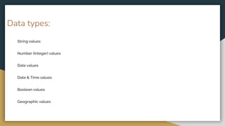
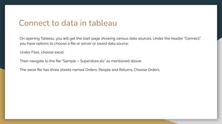
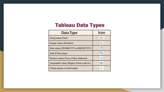
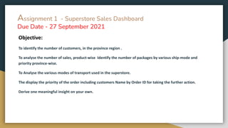
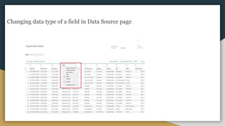
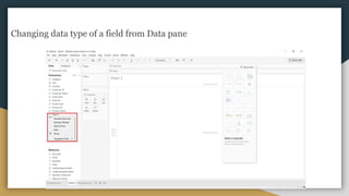
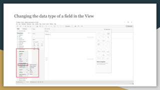
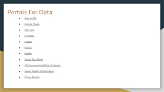
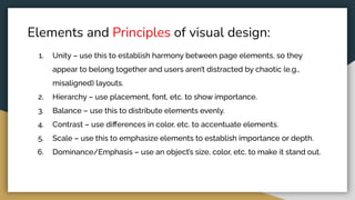
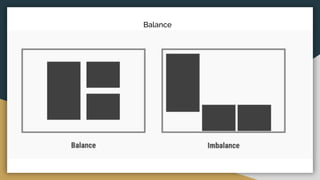
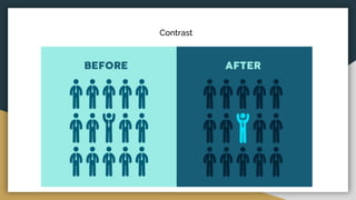
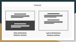
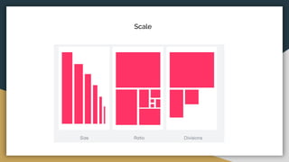
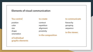
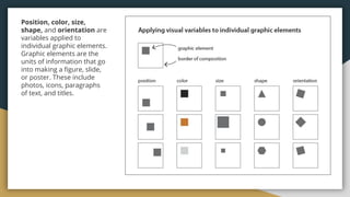
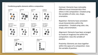
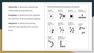
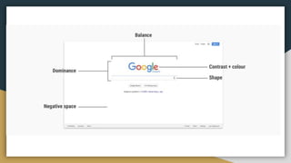
The document discusses various data types including string values, number values, date values, boolean values, and geographic values. It then provides information on connecting to data in Tableau and selecting the "Orders" sheet from the "Sample - Superstore.xls" excel file. The next section provides an objective and instructions for an assignment involving sales data analysis and deriving meaningful insights. Basic visual design principles such as hierarchy, balance, contrast, scale, and dominance/emphasis are then defined in 2-3 sentences each.
This courseware is focused on understanding how PivotTables and PivotCharts work. We'll be working with sample data during the data journalism session in Kumasi to clearly understand how to work with large data sets and summarize them.
This courseware will introduce you to basics in working with Excel Spreadsheets. It'll serve as a compliment to the in-lab sessions that will be held during the data journalism training session - Voter's Count - in Kumasi
Interactivity on Excel Using Pivoting, Dashboards, “Index and Match,” and Glo...Shalin Hai-Jew
Data are not inert, but interpreting summary data from still data visualizations may be somewhat limited. Excel has various built-in enablements for interactive engagements with data, including pivoting, dashboarding, indexing and matching, and global mapping. This work shows some basic setups of data that can enable more interactivity with little effort.
The pivot tables are not created mechanically. In Microsoft excel the user should select the data first for which the pivot table should be created. The pivot table option is available on the insert tab. The user has the option of inserting the pivot table either in the existing sheet or creating the pivot table in the new sheet. Copy the link given below and paste it in new browser window to get more information on Pivot Table:- http://www.transtutors.com/homework-help/statistics/pivot-table.aspx
The Art of Data Visualization in Microsoft Excel for Mac.pdfTEWMAGAZINE
As more people turn to the internet and electronic gadgets for their source of information, you can expect data to increase exponentially daily. Data is a result of sharing, collecting, and transmitting information.
The Course will speak about reporting tool, Architecture and what is the importance of reporting in industry and how we can basically use Tableau to achieve the objective .
A quick reference on designing data visualizations that delight and leverage best practices from the design world to ensure your data is presented in meaningful, usable, fun ways.
Techniques to optimize the pagerank algorithm usually fall in two categories. One is to try reducing the work per iteration, and the other is to try reducing the number of iterations. These goals are often at odds with one another. Skipping computation on vertices which have already converged has the potential to save iteration time. Skipping in-identical vertices, with the same in-links, helps reduce duplicate computations and thus could help reduce iteration time. Road networks often have chains which can be short-circuited before pagerank computation to improve performance. Final ranks of chain nodes can be easily calculated. This could reduce both the iteration time, and the number of iterations. If a graph has no dangling nodes, pagerank of each strongly connected component can be computed in topological order. This could help reduce the iteration time, no. of iterations, and also enable multi-iteration concurrency in pagerank computation. The combination of all of the above methods is the STICD algorithm. [sticd] For dynamic graphs, unchanged components whose ranks are unaffected can be skipped altogether.
Adjusting primitives for graph : SHORT REPORT / NOTESSubhajit Sahu
Graph algorithms, like PageRank Compressed Sparse Row (CSR) is an adjacency-list based graph representation that is
Multiply with different modes (map)
1. Performance of sequential execution based vs OpenMP based vector multiply.
2. Comparing various launch configs for CUDA based vector multiply.
Sum with different storage types (reduce)
1. Performance of vector element sum using float vs bfloat16 as the storage type.
Sum with different modes (reduce)
1. Performance of sequential execution based vs OpenMP based vector element sum.
2. Performance of memcpy vs in-place based CUDA based vector element sum.
3. Comparing various launch configs for CUDA based vector element sum (memcpy).
4. Comparing various launch configs for CUDA based vector element sum (in-place).
Sum with in-place strategies of CUDA mode (reduce)
1. Comparing various launch configs for CUDA based vector element sum (in-place).
Opendatabay - Open Data Marketplace.pptxOpendatabay
Opendatabay.com unlocks the power of data for everyone. Open Data Marketplace fosters a collaborative hub for data enthusiasts to explore, share, and contribute to a vast collection of datasets.
First ever open hub for data enthusiasts to collaborate and innovate. A platform to explore, share, and contribute to a vast collection of datasets. Through robust quality control and innovative technologies like blockchain verification, opendatabay ensures the authenticity and reliability of datasets, empowering users to make data-driven decisions with confidence. Leverage cutting-edge AI technologies to enhance the data exploration, analysis, and discovery experience.
From intelligent search and recommendations to automated data productisation and quotation, Opendatabay AI-driven features streamline the data workflow. Finding the data you need shouldn't be a complex. Opendatabay simplifies the data acquisition process with an intuitive interface and robust search tools. Effortlessly explore, discover, and access the data you need, allowing you to focus on extracting valuable insights. Opendatabay breaks new ground with a dedicated, AI-generated, synthetic datasets.
Leverage these privacy-preserving datasets for training and testing AI models without compromising sensitive information. Opendatabay prioritizes transparency by providing detailed metadata, provenance information, and usage guidelines for each dataset, ensuring users have a comprehensive understanding of the data they're working with. By leveraging a powerful combination of distributed ledger technology and rigorous third-party audits Opendatabay ensures the authenticity and reliability of every dataset. Security is at the core of Opendatabay. Marketplace implements stringent security measures, including encryption, access controls, and regular vulnerability assessments, to safeguard your data and protect your privacy.
Chatty Kathy - UNC Bootcamp Final Project Presentation - Final Version - 5.23...John Andrews
SlideShare Description for "Chatty Kathy - UNC Bootcamp Final Project Presentation"
Title: Chatty Kathy: Enhancing Physical Activity Among Older Adults
Description:
Discover how Chatty Kathy, an innovative project developed at the UNC Bootcamp, aims to tackle the challenge of low physical activity among older adults. Our AI-driven solution uses peer interaction to boost and sustain exercise levels, significantly improving health outcomes. This presentation covers our problem statement, the rationale behind Chatty Kathy, synthetic data and persona creation, model performance metrics, a visual demonstration of the project, and potential future developments. Join us for an insightful Q&A session to explore the potential of this groundbreaking project.
Project Team: Jay Requarth, Jana Avery, John Andrews, Dr. Dick Davis II, Nee Buntoum, Nam Yeongjin & Mat Nicholas
3. Connect to data in tableau
On opening Tableau, you will get the start page showing various data sources. Under the header “Connect”,
you have options to choose a file or server or saved data source.
Under Files, choose excel.
Then navigate to the file “Sample – Superstore.xls” as mentioned above.
The excel file has three sheets named Orders, People and Returns. Choose Orders.
4.
5. Assignment 1 - Superstore Sales Dashboard
Due Date - 27 September 2021
Objective:
To identify the number of customers, in the province region .
To analyse the number of sales, product-wise Identify the number of packages by various ship-mode and
priority province-wise.
To Analyse the various modes of transport used in the superstore.
The display the priority of the order including customers Name by Order ID for taking the further action.
Derive one meaningful insight on your own.
9. Dimensions and Measures, Blue and Green
● Dimensions contain qualitative values (such as names, dates, or geographical data). You can use
dimensions to categorize, segment, and reveal the details in your data. Dimensions affect the level of
detail in the view.
● Measures contain numeric, quantitative values that you can measure. Measures can be aggregated.
When you drag a measure into the view, Tableau applies an aggregation to that measure (by
default).
10. ● data.world
● Data is Plural
● UN Data
● Data.gov
● Kaggle
● NOAA
● Reddit
● World Fact Book
● UN Environmental Data Explorer
● World Health Organization
● Pitney Bowes
Portals For Data:
11. Visual Design Basics
Visual design aims to improve a design’s/product’s aesthetic appeal and usability with suitable
images, typography, space, layout and color. Visual design is about more than aesthetics. Designers
place elements carefully to create interfaces that optimize user experience and drive conversion.
Actually, you use visual design to create and organize elements to
A) lead the user’s eye to an item’s functionality, and
B) make the aesthetics consistent.
12. Elements and Principles of visual design:
1. Lines (straight/curved/geometric/organic) – use these to create divisions, textures and
shapes.
2. Shapes – use lines, different colors, etc. to create enclosed/self-contained areas.
3. Negative space/whitespace – use the blank area around a “positive” shape to create a
figure/ground effect or calm the design overall.
4. Volume – use this to show the rich fullness of all three dimensions of elements on
two-dimensional screens.
5. Value – use this to set the relationship between lightness and darkness, typically through a
light source to create shadows and highlights.
6. Color – use this to set the theme/tone and attract attention.
7. Texture – use this to define an object’s surface.
13.
14. Elements and Principles of visual design:
1. Unity – use this to establish harmony between page elements, so they
appear to belong together and users aren’t distracted by chaotic (e.g.,
misaligned) layouts.
2. Hierarchy – use placement, font, etc. to show importance.
3. Balance – use this to distribute elements evenly.
4. Contrast – use differences in color, etc. to accentuate elements.
5. Scale – use this to emphasize elements to establish importance or depth.
6. Dominance/Emphasis – use an object’s size, color, etc. to make it stand out.
23. Position, color, size,
shape, and orientation are
variables applied to
individual graphic elements.
Graphic elements are the
units of information that go
into making a figure, slide,
or poster. These include
photos, icons, paragraphs
of text, and titles.
24. Contrast: Elements have noticeably
different visual characteristics then
others in the composition. Created using
the variables of color, size, shape,
orientation.
Repetition: Elements have consistent
visual characteristics within the
composition. Created using color, size,
shape, and orientation.
Alignment: Elements have been arranged
to create an imaginary line within the
composition. Uses the variable of
position.
Proximity: Elements are close together
within the space of a composition. Uses
the variable of position.
25. Hierarchy: A dominant-subordinate
relationship among elements.
Grouping: A relationship that specifies
the elements to be associated together.
Sequence: A relationship among
elements that specifies first, second,
third…