Download as PDF, PPTX
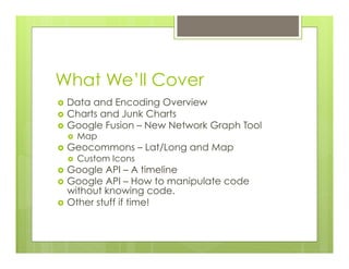
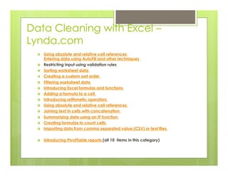
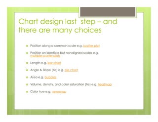
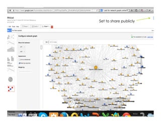
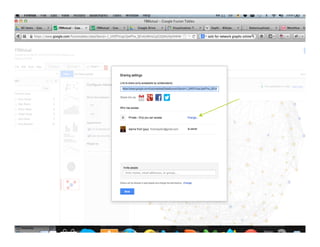
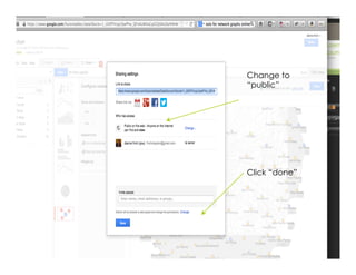
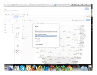


The document outlines a presentation on data visualization techniques and tools for effective storytelling using data, including Google Fusion, GeoCommons, and chart design principles. It emphasizes the importance of data quality, the data-ink ratio, and offers guidelines for cleaning and visualizing data effectively. The session covers creating maps, network graphs, and working with CSV files while ensuring the data is trustworthy.


