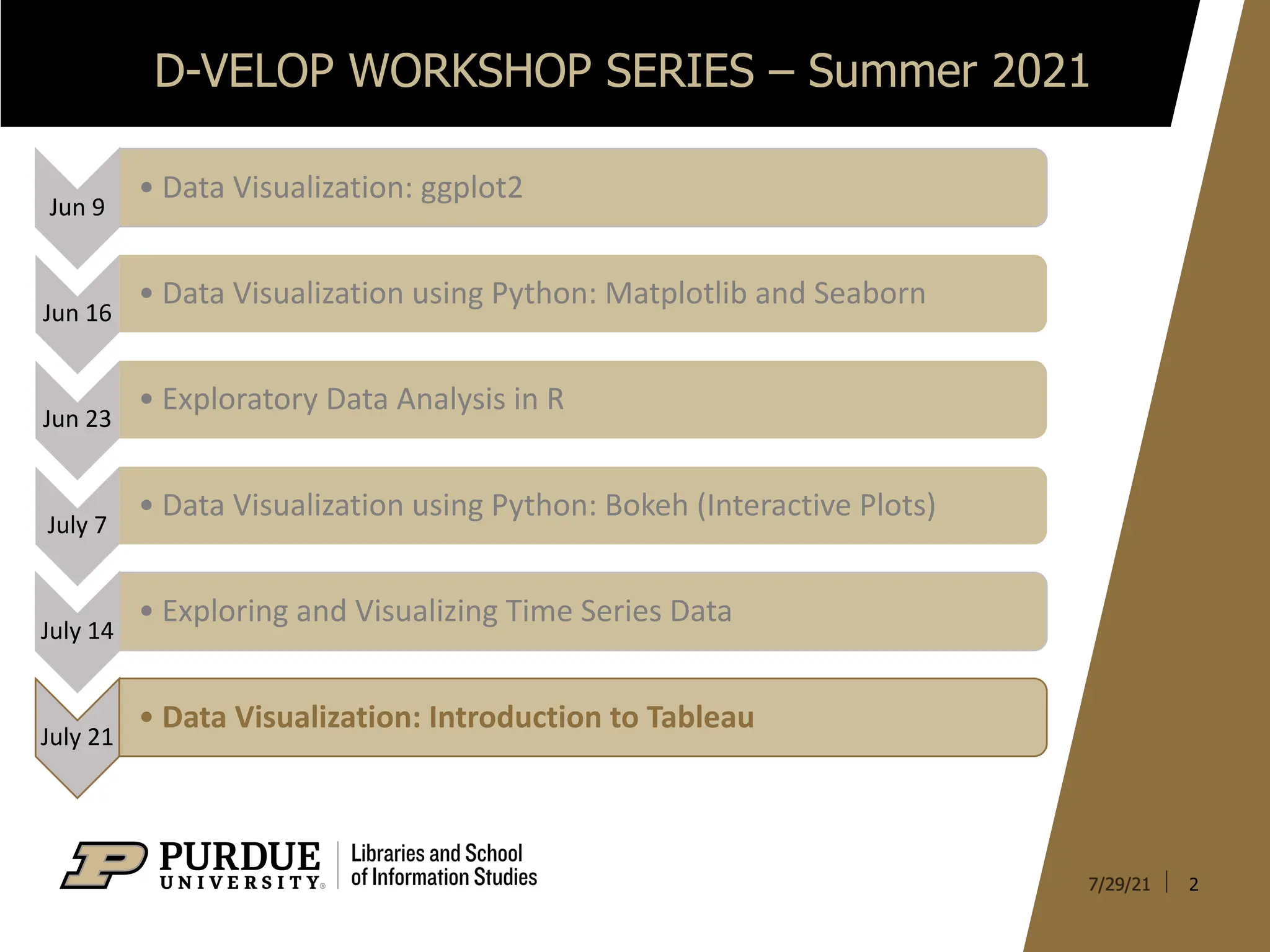
D-VELOP WORKSHOP SERIES– Summer 2021
2
Jun 9
• Data Visualization: ggplot2
Jun 16
• Data Visualization using Python: Matplotlib and Seaborn
Jun 23
• Exploratory Data Analysis in R
July 7
• Data Visualization using Python: Bokeh (Interactive Plots)
July 14
• Exploring and Visualizing Time Series Data
July 21
• Data Visualization: Introduction to Tableau
3.
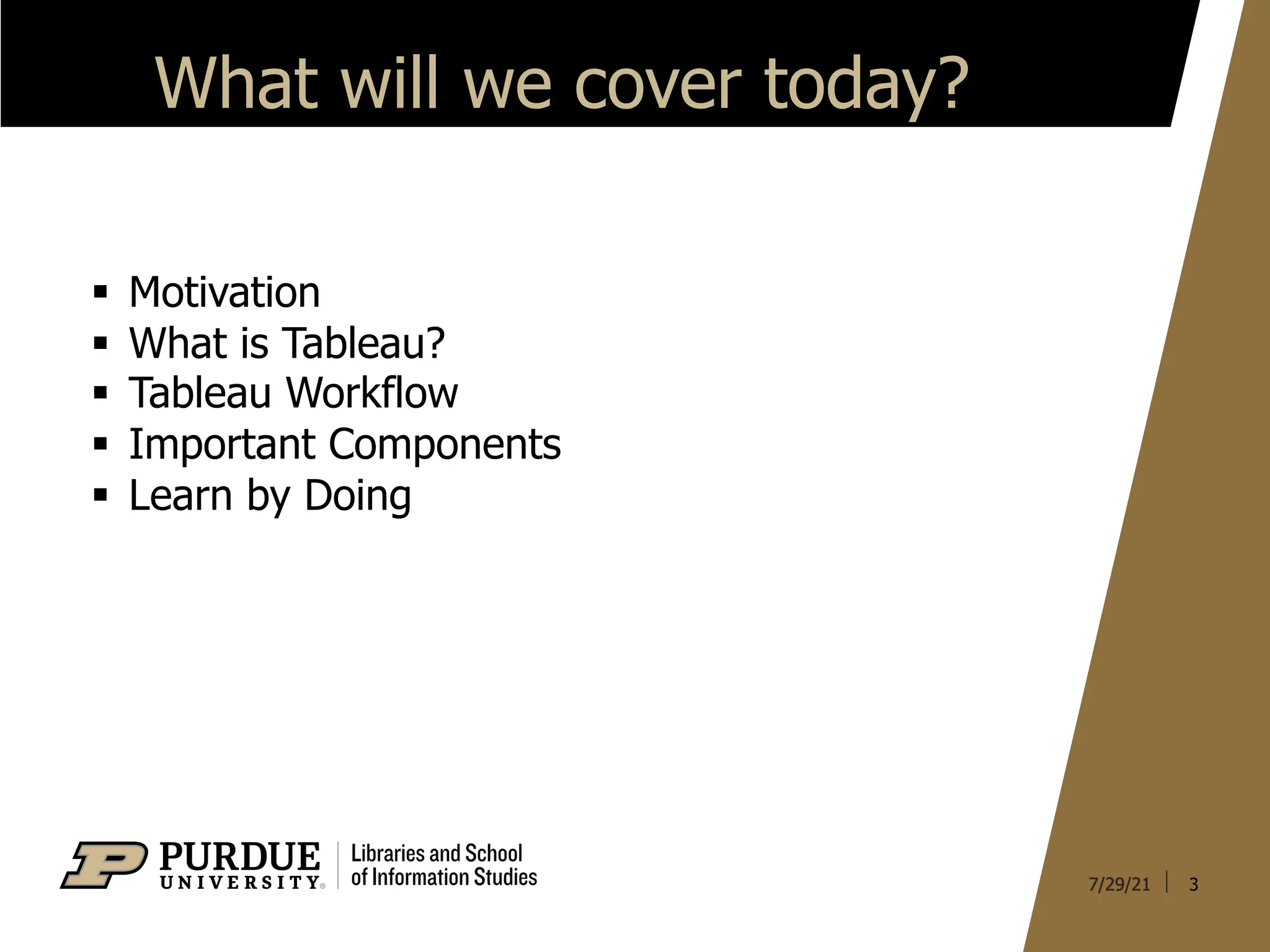
What will wecover today?
§ Motivation
§ What is Tableau?
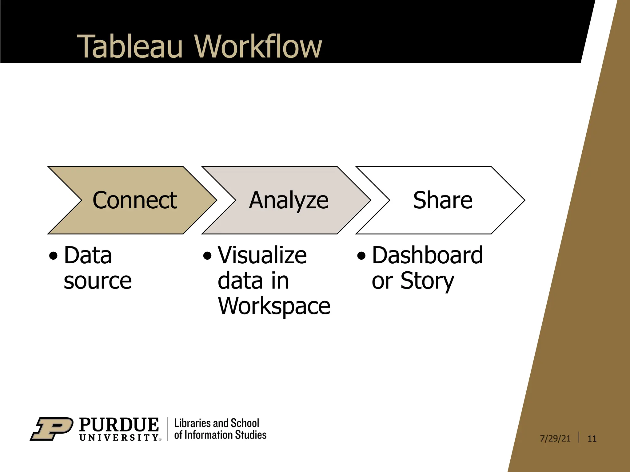
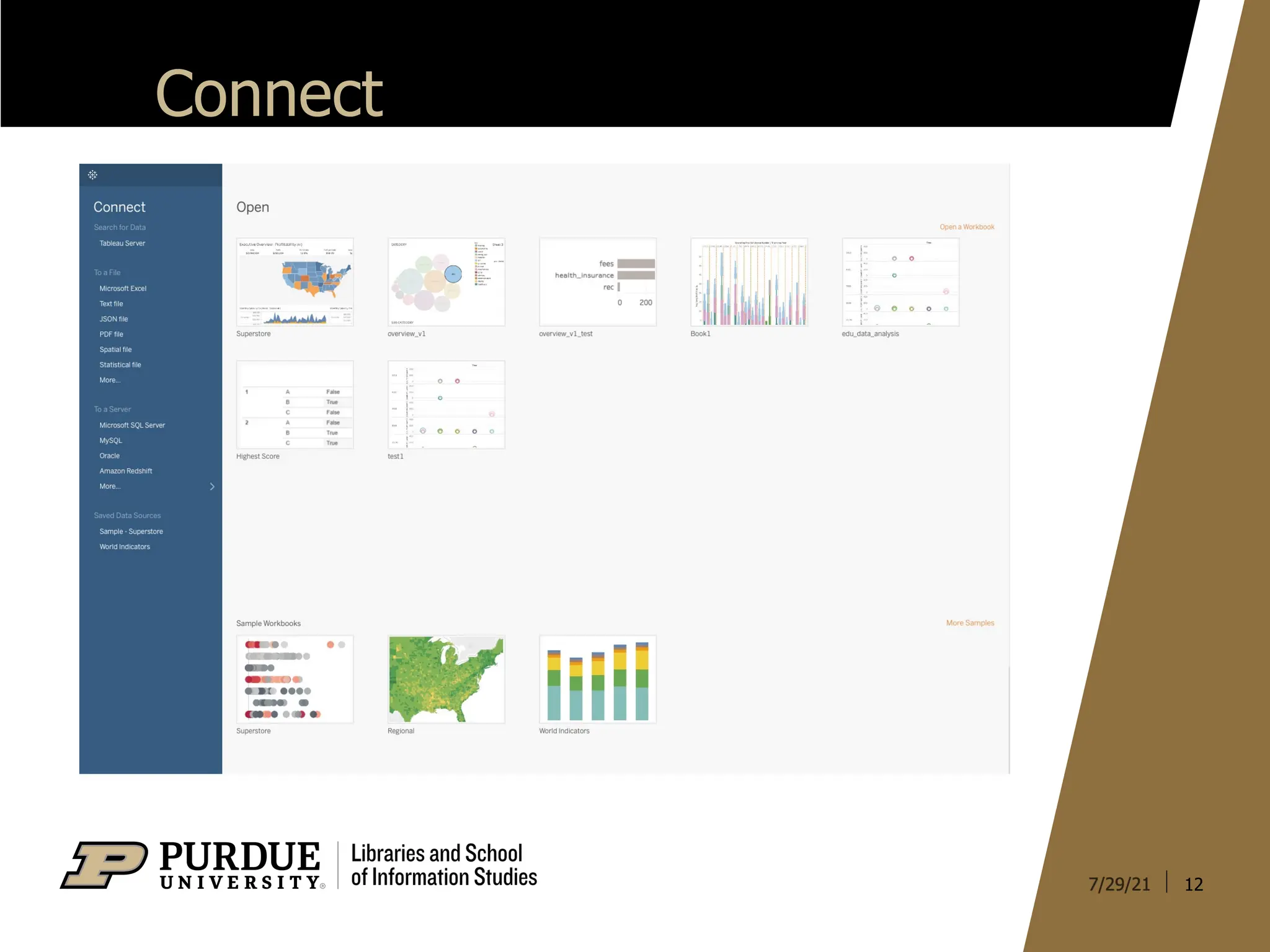
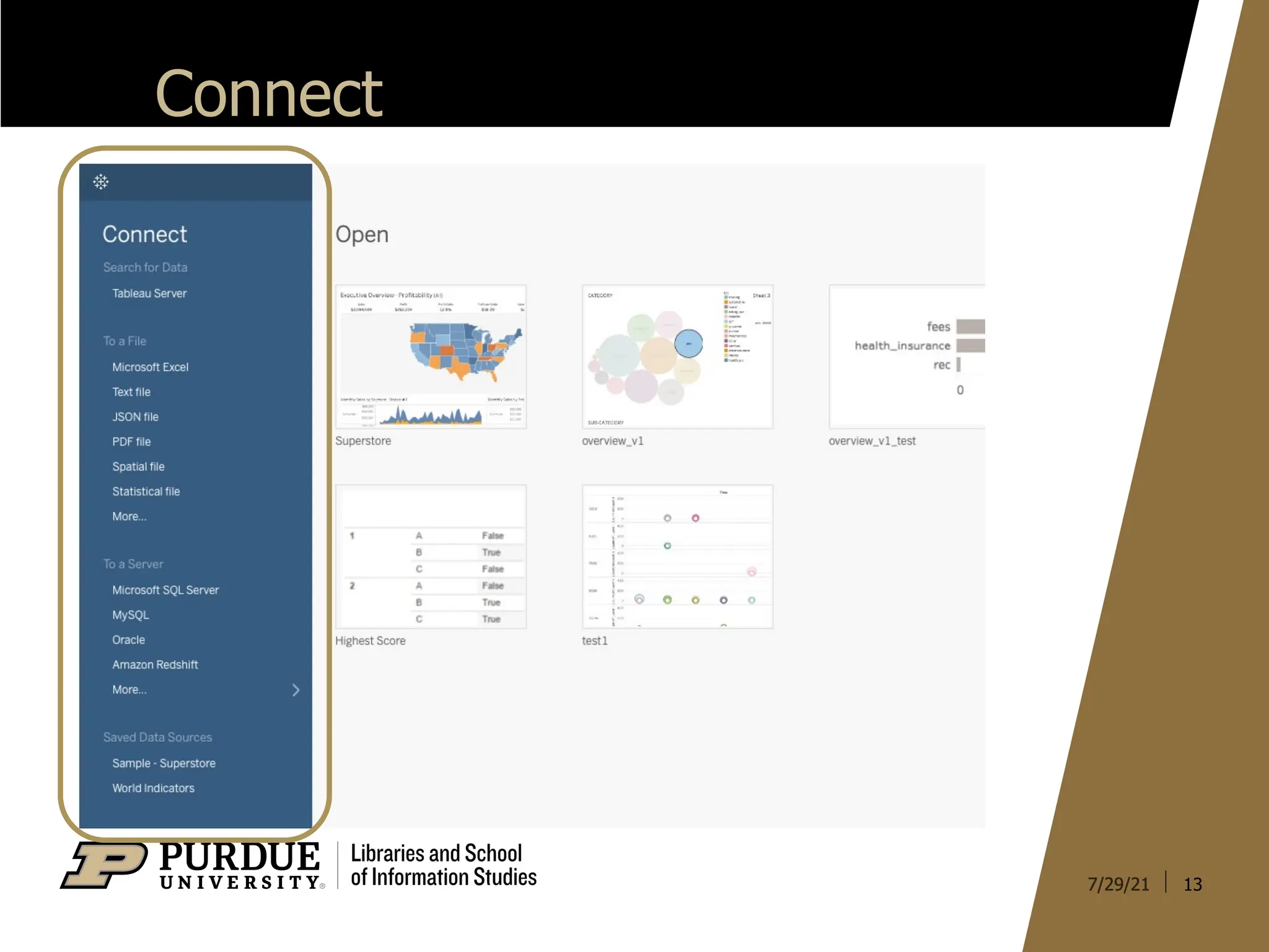
§ Tableau Workflow
§ Important Components
§ Learn by Doing
3
4.
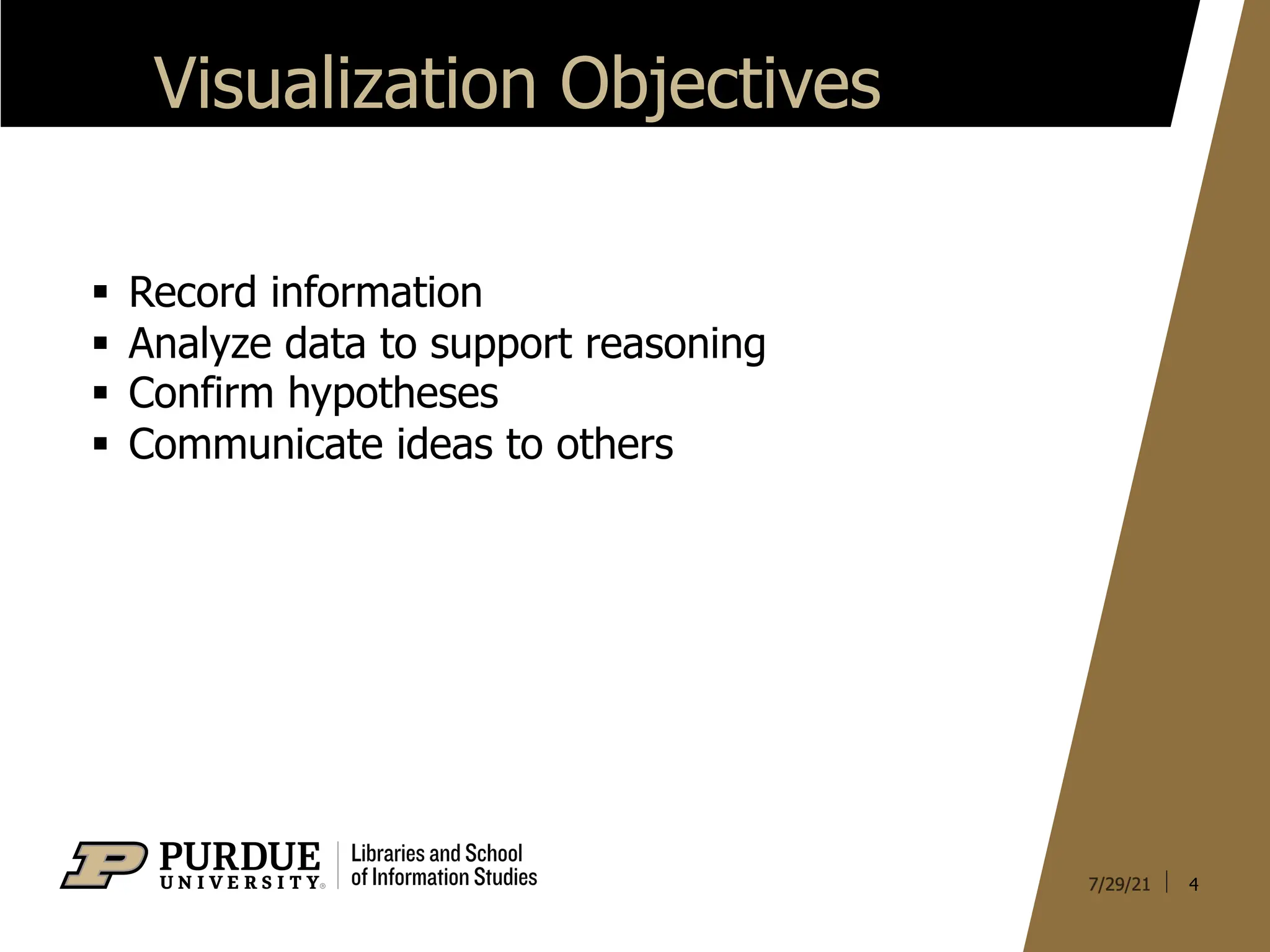
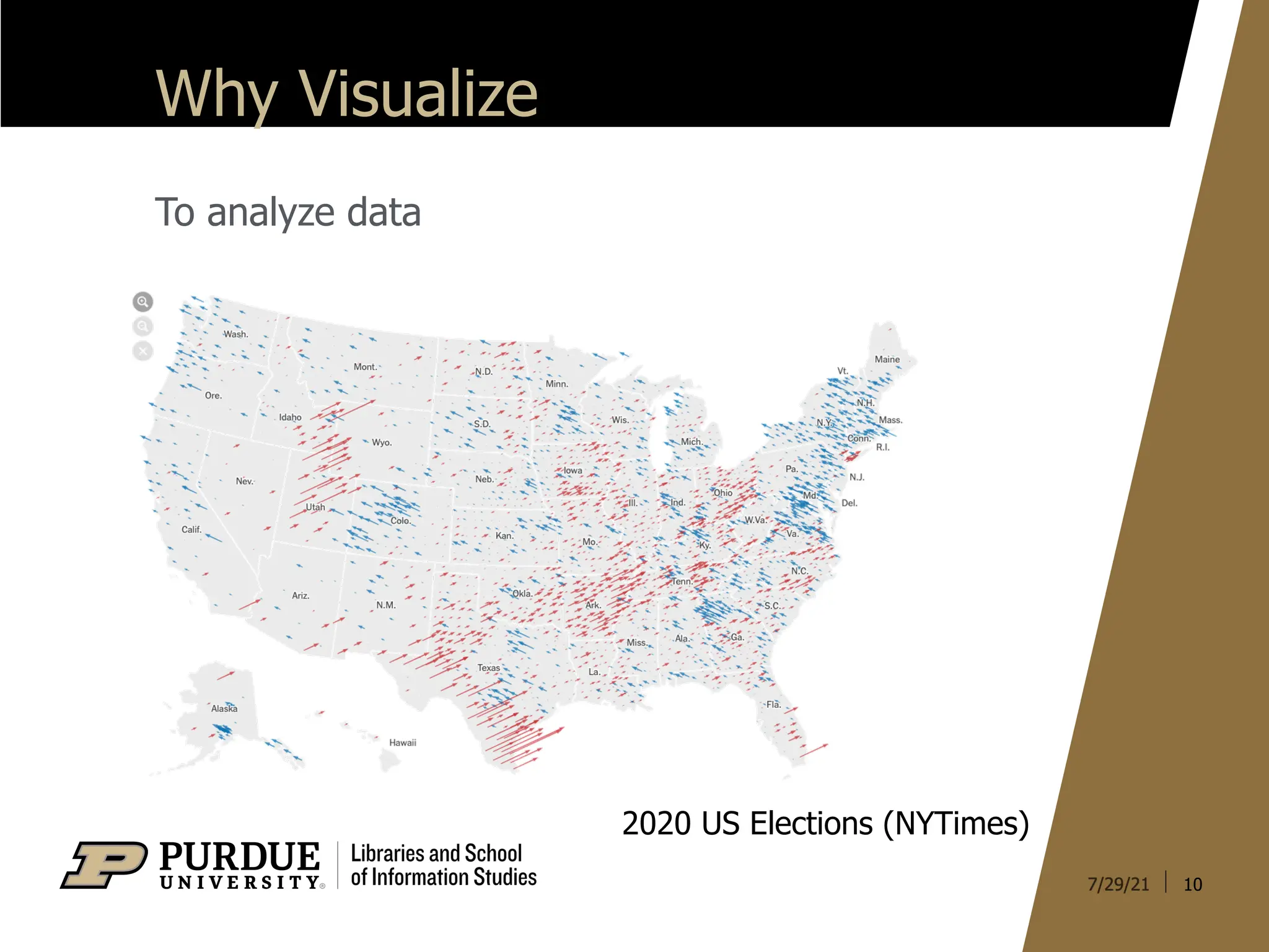
Visualization Objectives
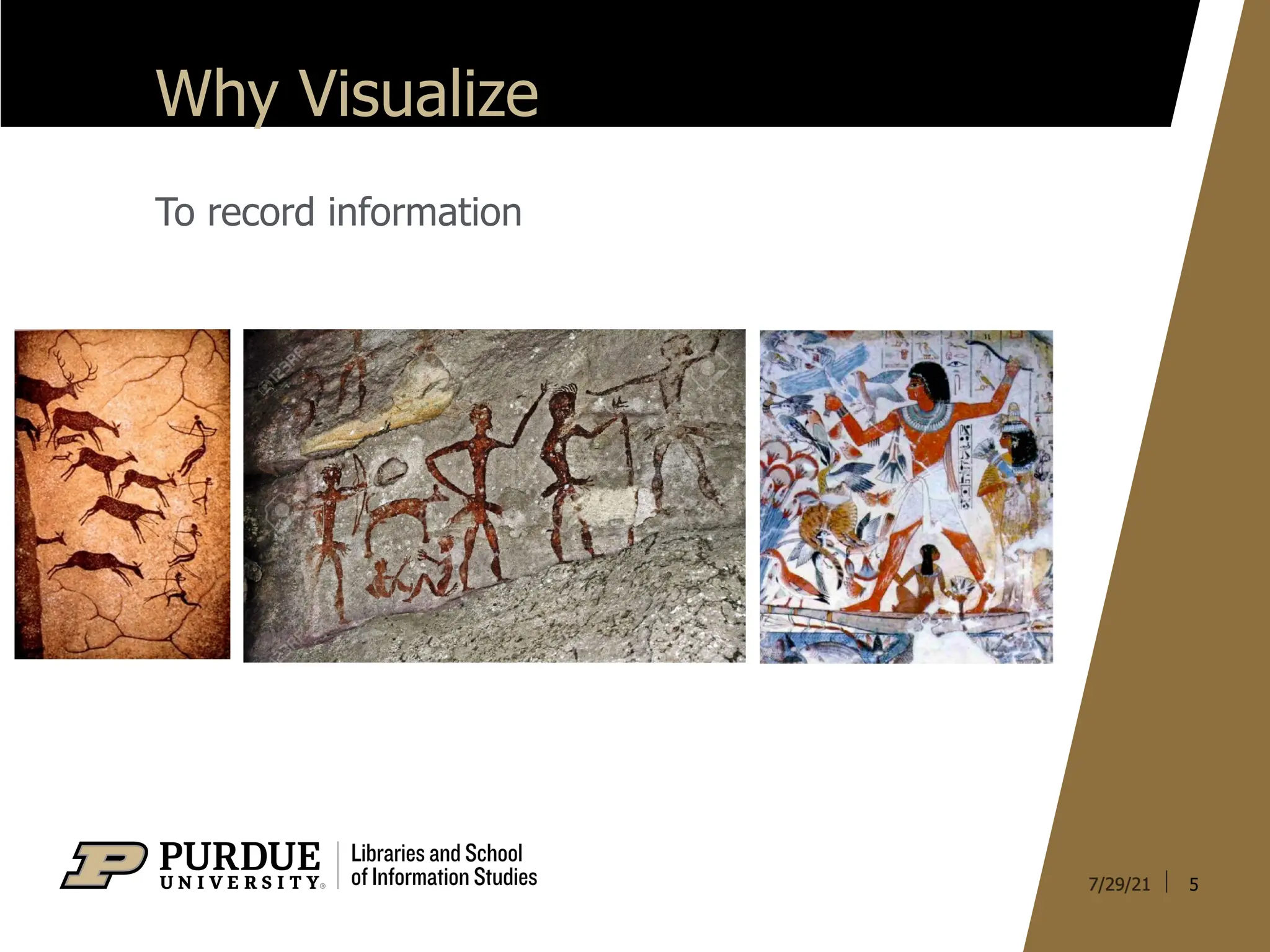
§ Recordinformation
§ Analyze data to support reasoning
§ Confirm hypotheses
§ Communicate ideas to others
4
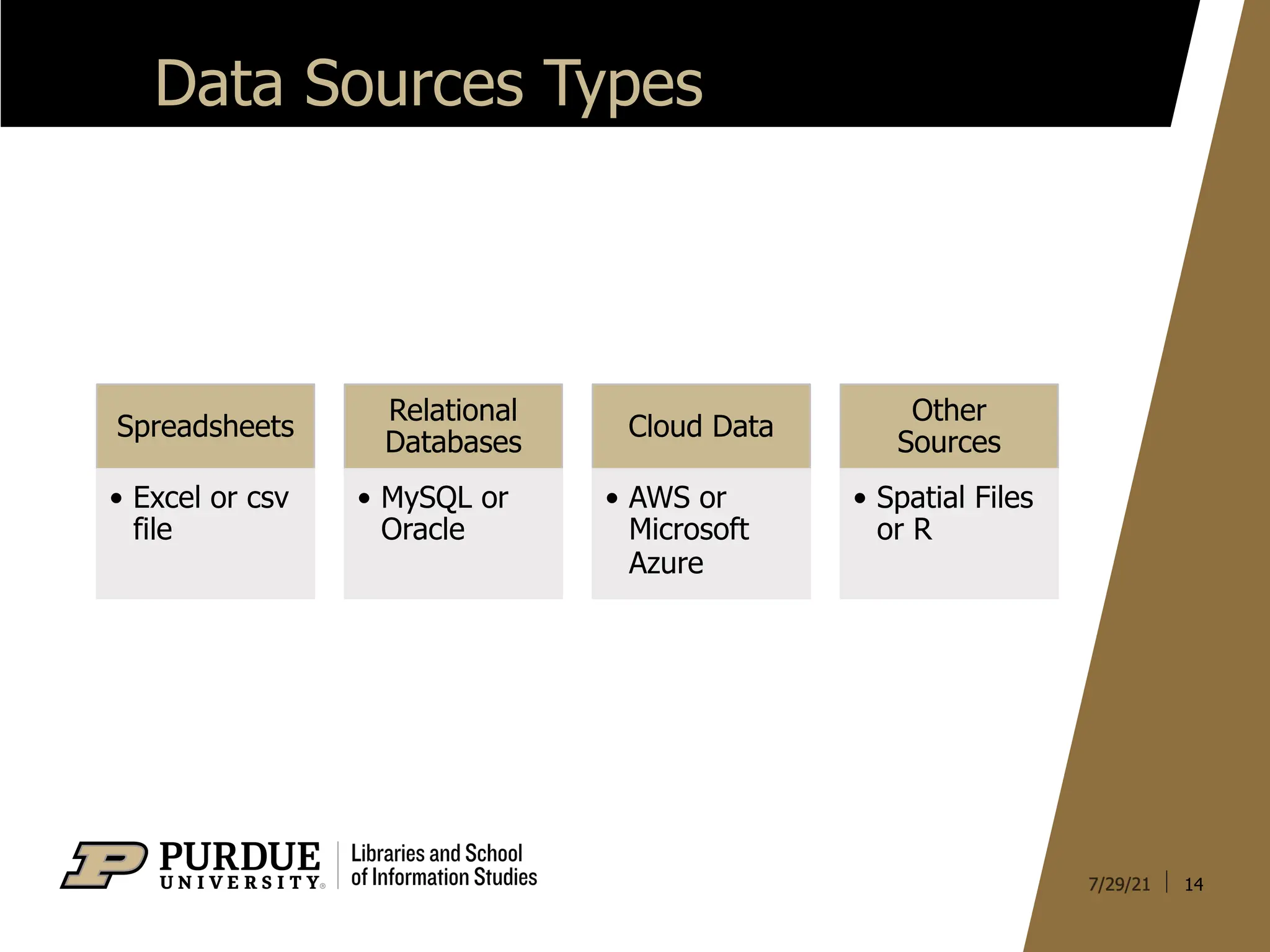
Data Sources Types
14
Spreadsheets
•Excel or csv
file
Relational
Databases
• MySQL or
Oracle
Cloud Data
• AWS or
Microsoft
Azure
Other
Sources
• Spatial Files
or R
15.
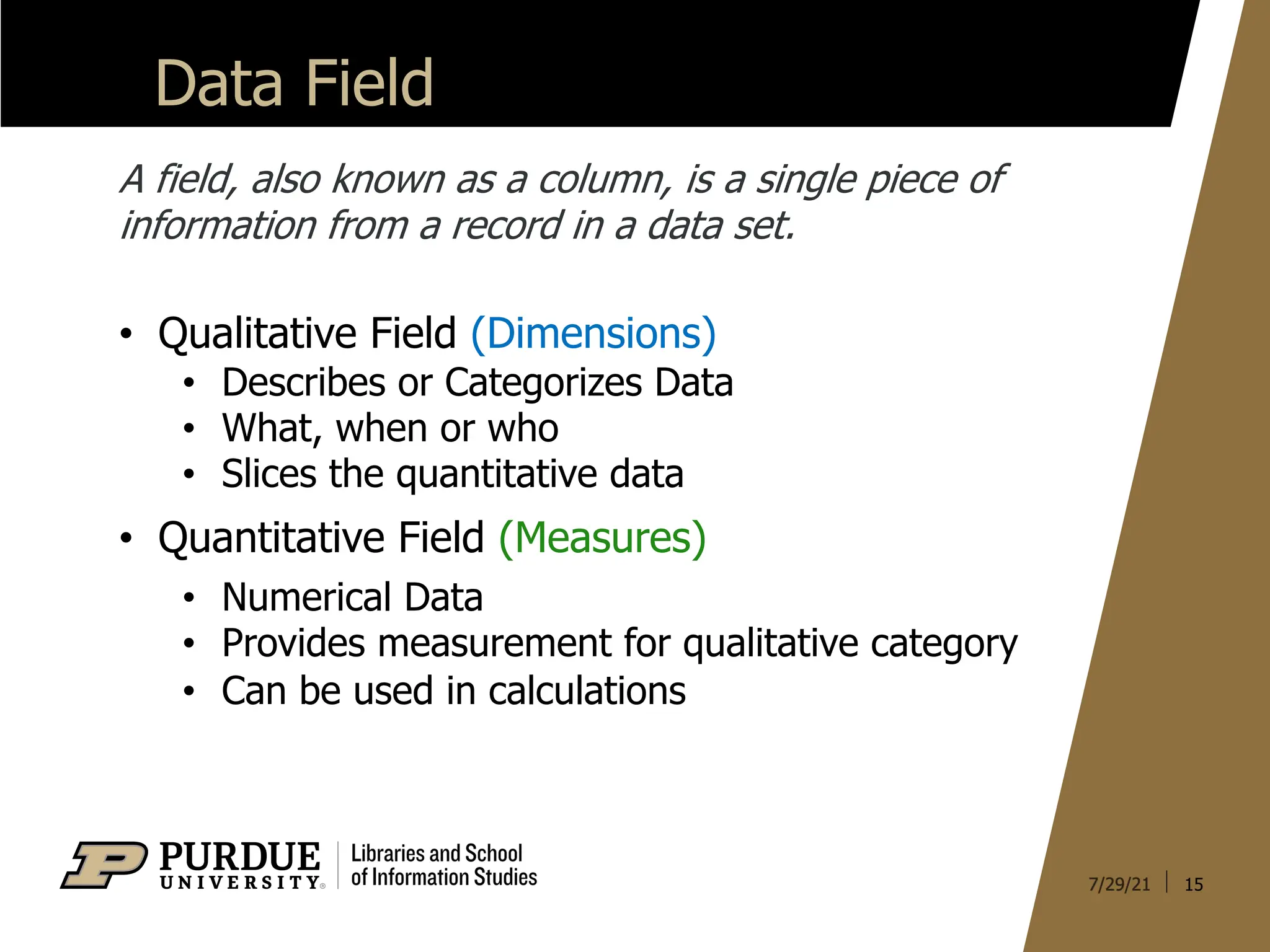
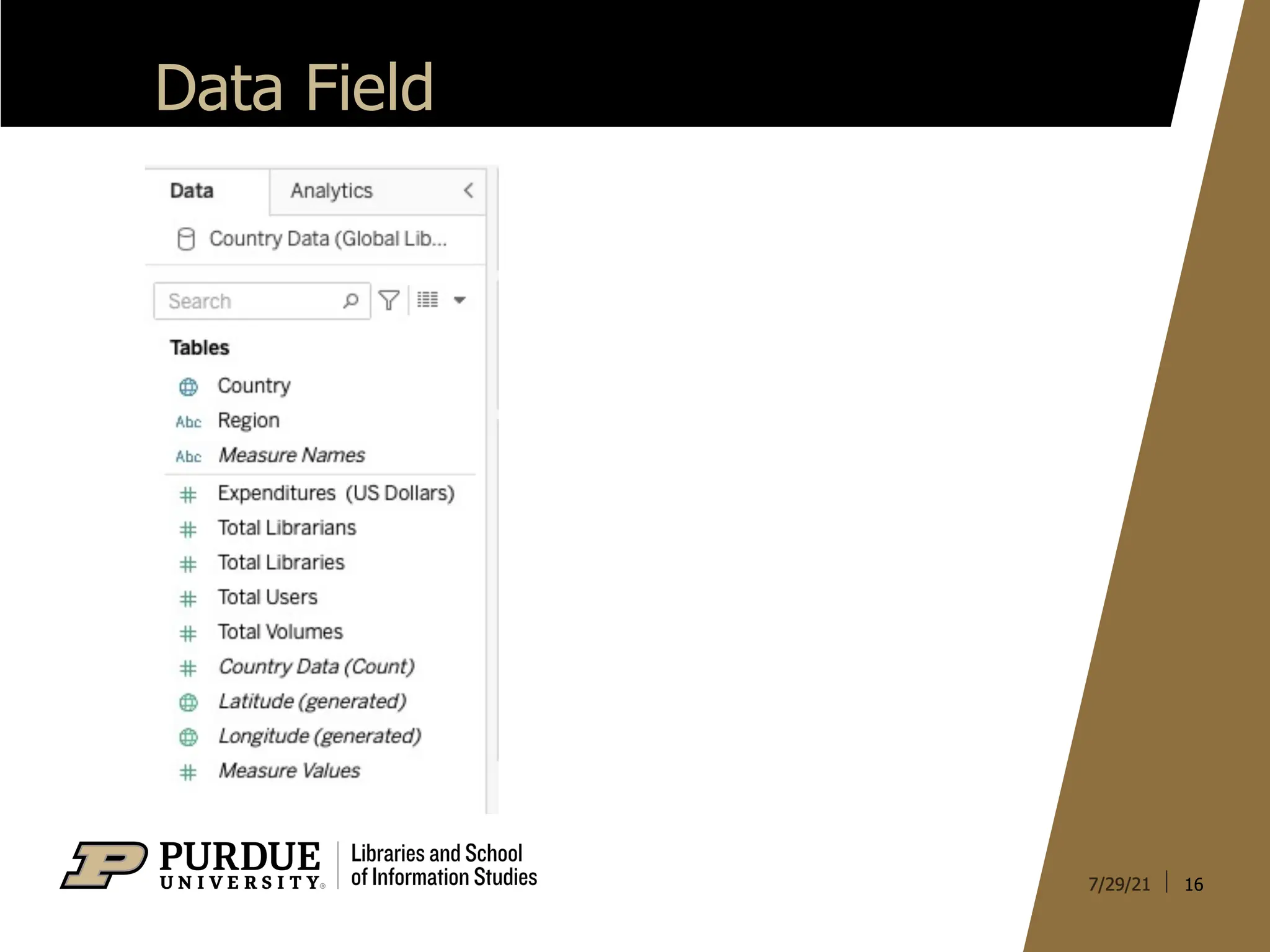
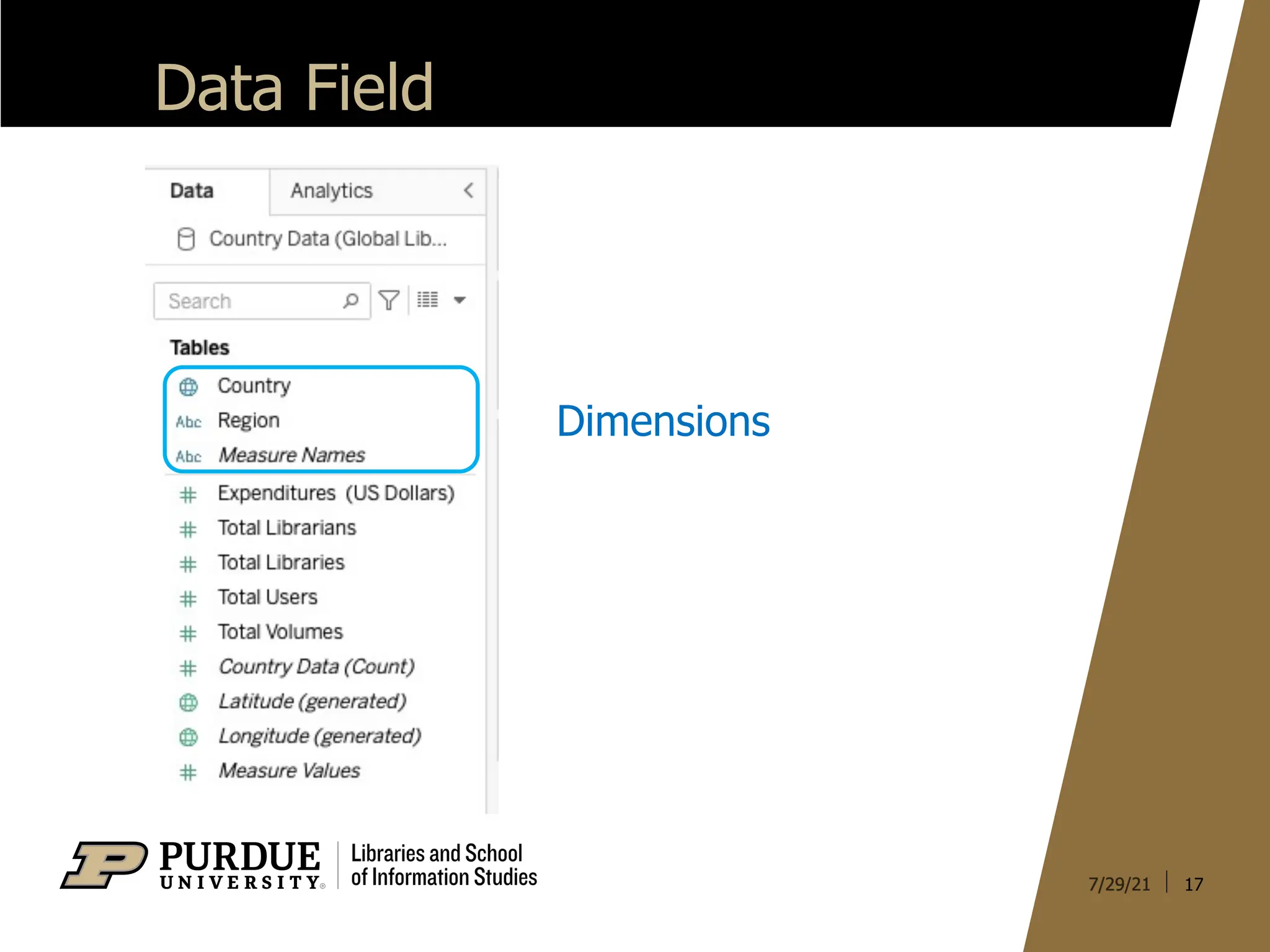
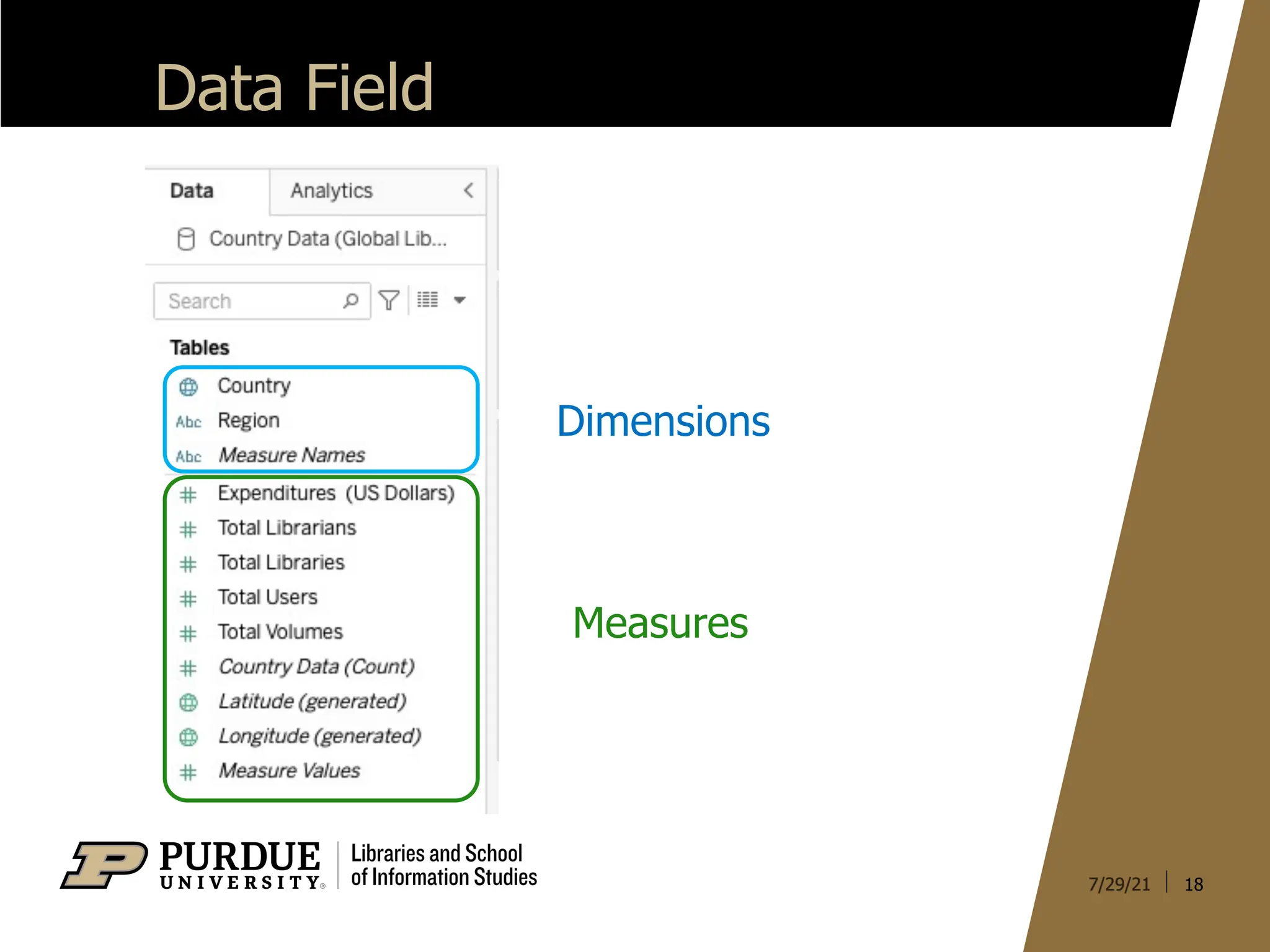
Data Field
15
A field,also known as a column, is a single piece of
information from a record in a data set.
• Qualitative Field (Dimensions)
• Describes or Categorizes Data
• What, when or who
• Slices the quantitative data
• Quantitative Field (Measures)
• Numerical Data
• Provides measurement for qualitative category
• Can be used in calculations
20
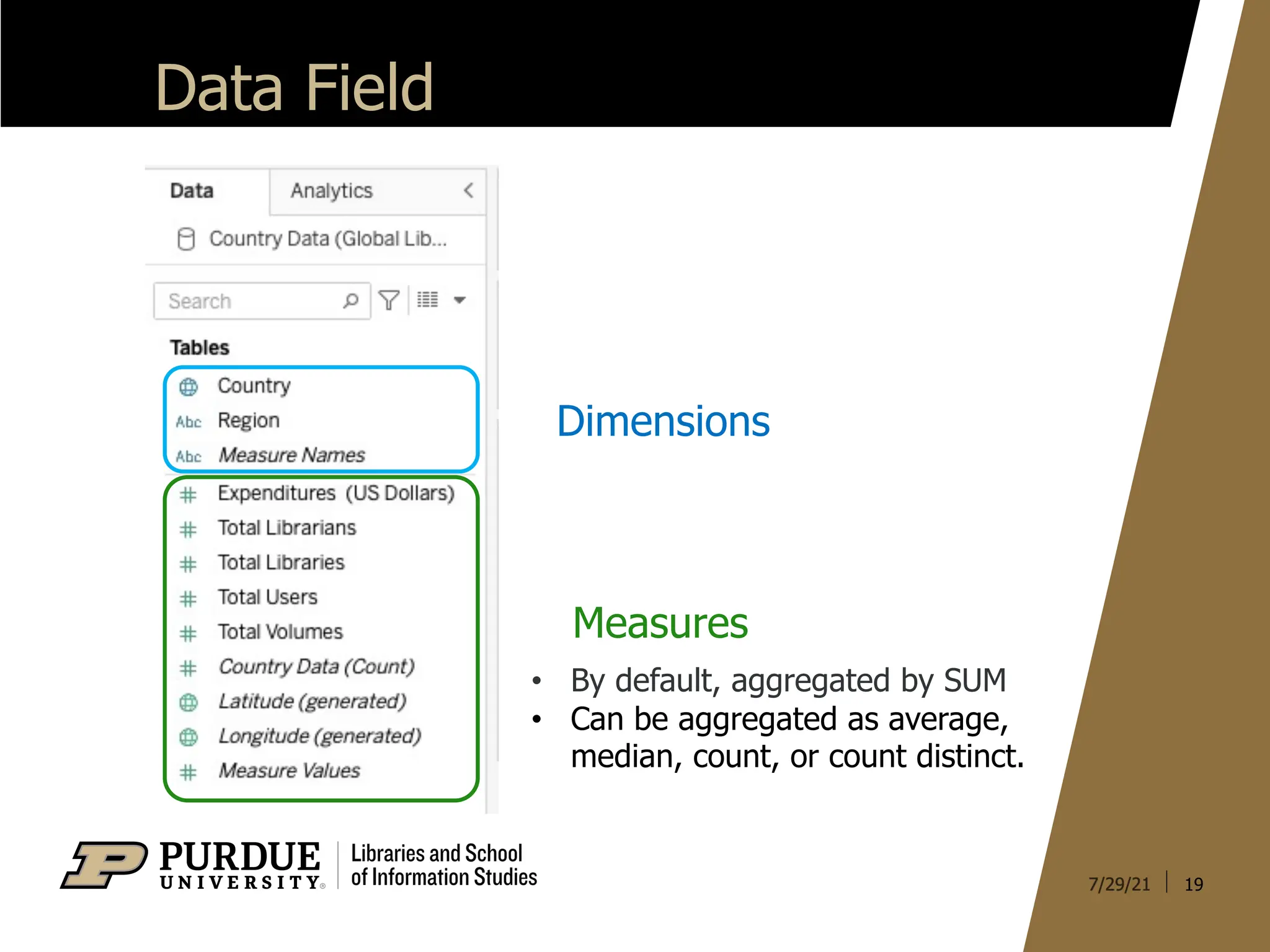
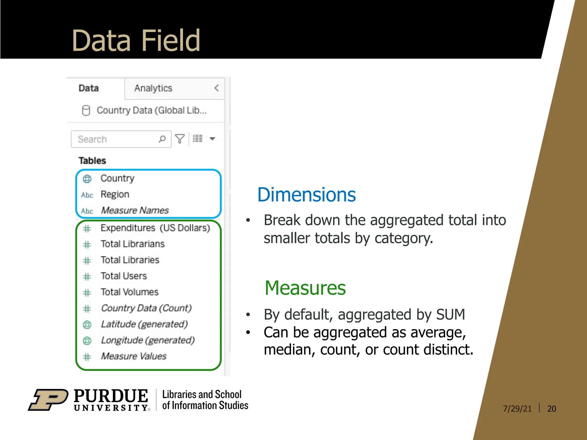
Data Field
Dimensions
Measures
• Bydefault, aggregated by SUM
• Can be aggregated as average,
median, count, or count distinct.
• Break down the aggregated total into
smaller totals by category.
21.
21
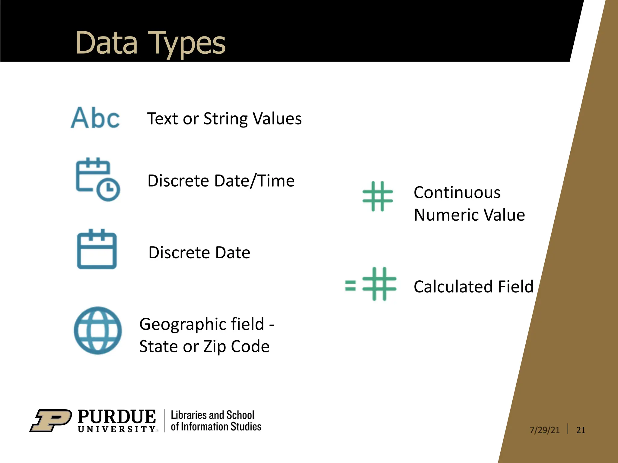
Data Types
Text orString Values
Discrete Date/Time
Discrete Date
Geographic field -
State or Zip Code
Continuous
Numeric Value
Calculated Field
22.
22
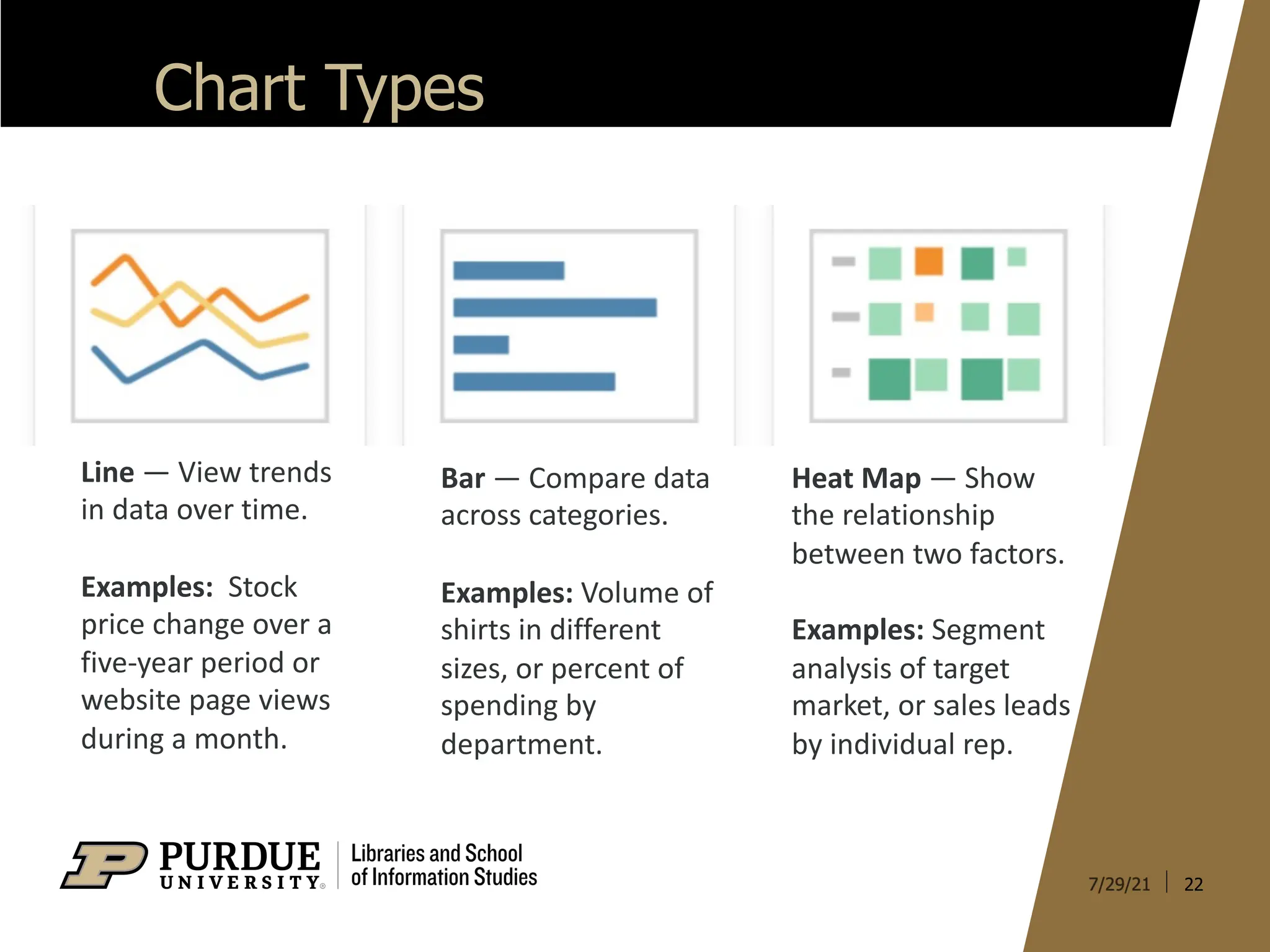
Chart Types
Line —View trends
in data over time.
Examples: Stock
price change over a
five-year period or
website page views
during a month.
Bar — Compare data
across categories.
Examples: Volume of
shirts in different
sizes, or percent of
spending by
department.
Heat Map — Show
the relationship
between two factors.
Examples: Segment
analysis of target
market, or sales leads
by individual rep.
23.
23
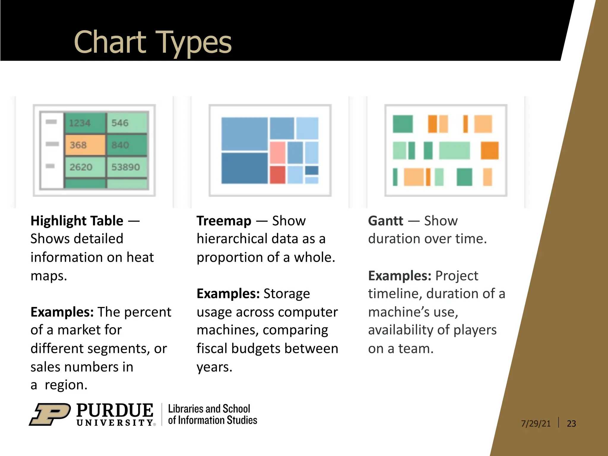
Chart Types
Highlight Table—
Shows detailed
information on heat
maps.
Examples: The percent
of a market for
different segments, or
sales numbers in
a region.
Treemap — Show
hierarchical data as a
proportion of a whole.
Examples: Storage
usage across computer
machines, comparing
fiscal budgets between
years.
Gantt — Show
duration over time.
Examples: Project
timeline, duration of a
machine’s use,
availability of players
on a team.
24.
24
Chart Types
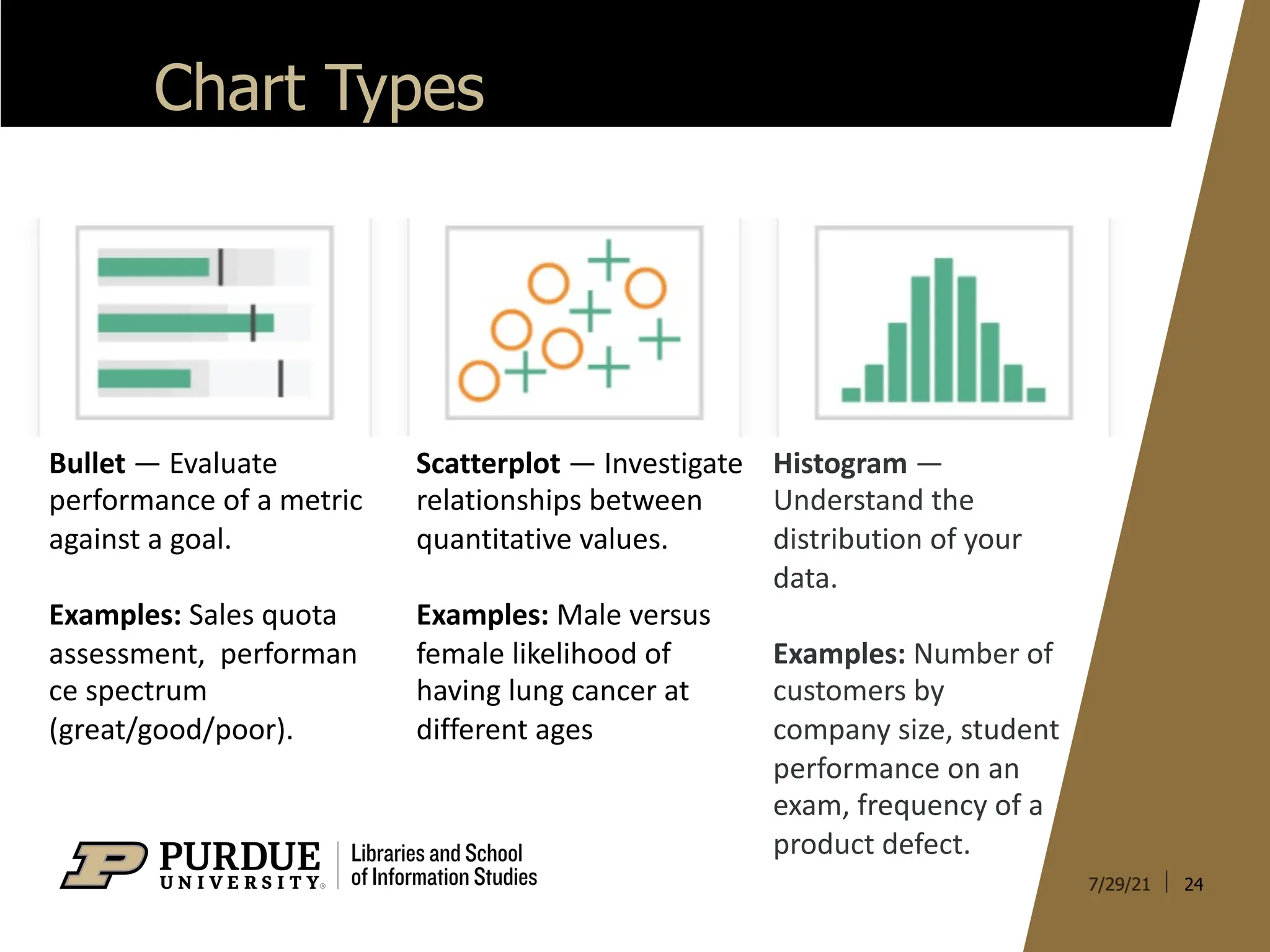
Scatterplot —Investigate
relationships between
quantitative values.
Examples: Male versus
female likelihood of
having lung cancer at
different ages
Bullet — Evaluate
performance of a metric
against a goal.
Examples: Sales quota
assessment, performan
ce spectrum
(great/good/poor).
Histogram —
Understand the
distribution of your
data.
Examples: Number of
customers by
company size, student
performance on an
exam, frequency of a
product defect.
25.
25
Chart Types
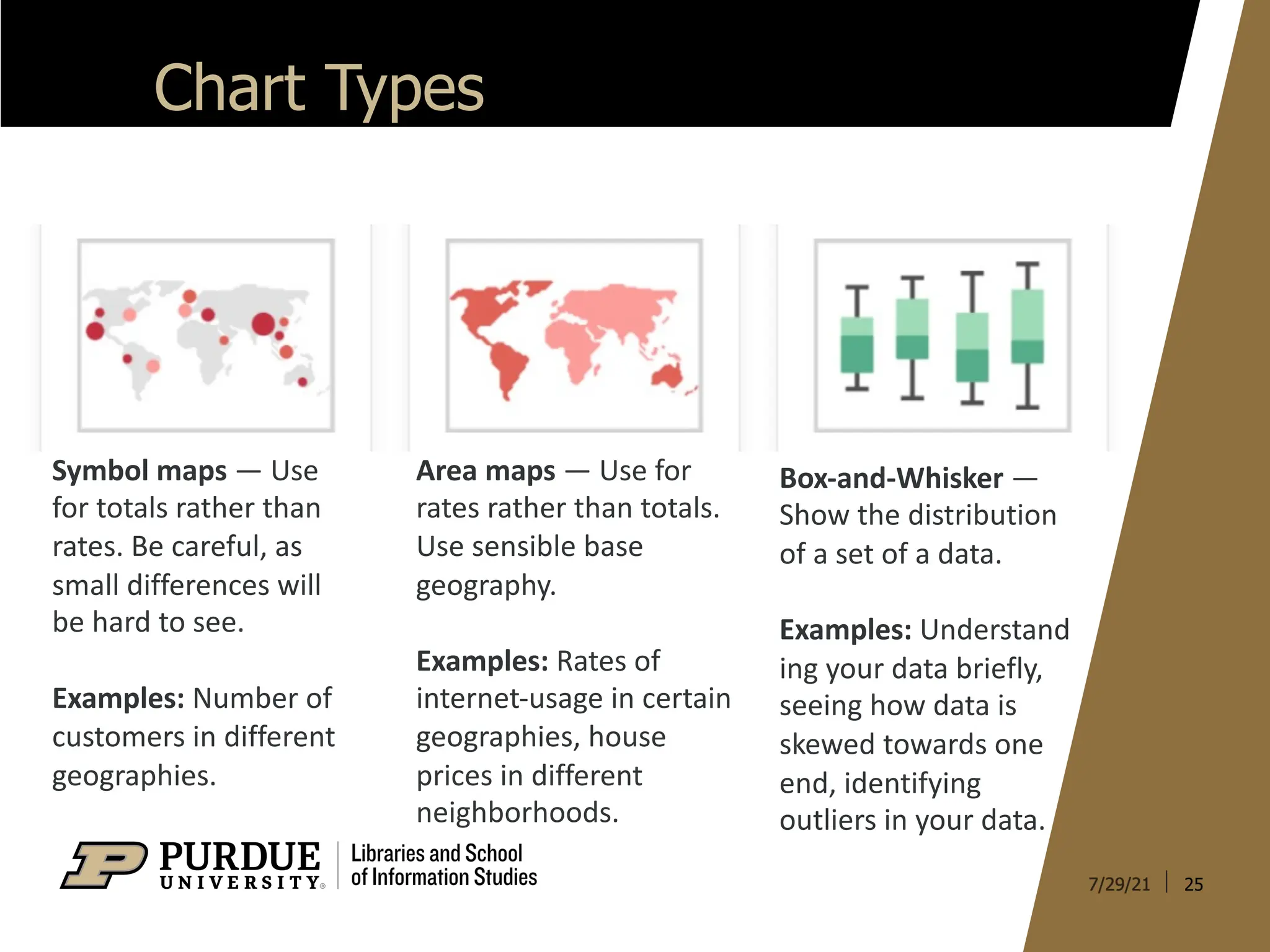
Box-and-Whisker —
Showthe distribution
of a set of a data.
Examples: Understand
ing your data briefly,
seeing how data is
skewed towards one
end, identifying
outliers in your data.
Symbol maps — Use
for totals rather than
rates. Be careful, as
small differences will
be hard to see.
Examples: Number of
customers in different
geographies.
Area maps — Use for
rates rather than totals.
Use sensible base
geography.
Examples: Rates of
internet-usage in certain
geographies, house
prices in different
neighborhoods.