
Recommended
Recommended
More Related Content
What's hot
Similar to Understanding cities
Similar to Understanding cities (20)
Recently uploaded
Recently uploaded (20)
Understanding cities
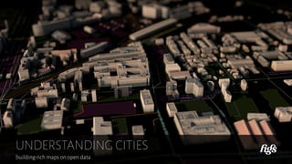
- 1. UNDERSTANDING CITIES building rich maps on open data
- 2. This conference took place at the ESAD Amiens in march 2018, and was addressed to a public of students and free auditors. Since 2011,Figs is a digital design workshop based in Paris,and specialized in the design of user experience and the bespoke user interfaces conception. The workshop conceives interactive digital objects for web services,travelers information,video games, applications or museography,upon varied mediums such as tablets,laptops,specialized mobile terminals, game consoles…
- 3. For 4 years,Figs is in charge of the digital dimension of traveller information for the Grand Paris Express,Paris's next generation subway. 200 km of Subway lines,which increase territory cover through 71 stations.Completion of the construction in 2030. In this mandate,Figs is co-contractor with Integral Ruedi Baur, in charge of the graphic design for the traveller information
- 4. Grand Paris Express is an opportunity to change our perception of what we call in French « la banlieue » meaning the suburbs. Banlieue is a word that express a perception by exclusion : Paris's banlieue is whatever is not Paris intra muros.Though they are cities in the suburbs which have a cultural,industrial history,and they are anonymized by the critical mass of Paris's proximity.
- 5. Grand Paris Express is a subway that will allow people to move easier in the banlieue. Integral Ruedi Baur and Figs put for the proposition that the traveller information could help change our mental picture of the territory. In addition to instructing on how to get from point A to point B,the traveller information could tell why it could be interesting to join one or another nearby suburb neighborhood. Through traveller information,we could learn for example that Issy Les Moulineaux had mushrooms gardens in the past, now used to store wine while big companies headquarters grows as mushrooms downtown.We could also learn that Montreuil had a great industrial and political history, and now homes movie studios…
- 6. In our proposition,this kind of information is delivered through a variety of devices,but in this presentation, we are talking about the neighborhood plans,which are hung on the stations wall,and show travelers how to find their way outside the station. Ruedi Baur's idea for this plans was to have them hand drawn by illustrators. The pictures which has been displayed so far in the presentation are the first studies for this idea. Having illustrated neighborhood plans allows to give a clear and comprehensible view of the city.Illustration is great at explaining,showing off what is remarkable for the humans. « On leaving the station,I turn left,go through high peaks constructions,under the bridge and then pass by the little house with the stairs. »
- 7. « well,the right bank of the river doesn't look so nice, on the other hand the middle island looks like a nice place. » Problem is that today it is very hard to consider neighborhood plans which are not built on geographic databases. The territory around the stations evolves rapidly,buildings are constructed,others are destroyed,so we need a solution to update the plans easily.Calling an illustrator each time the territory changes doesn't seem as a viable and long term solution. So the SGP asked Figs to explore how those plans could be industrialized,while keeping as much as possible of the principles which were established by Integral Ruedi Baur and Figs. For this exploration,we needed to answer two questions : Does the data that allow the creation of those plans exists ? What are the possibilities in matter of map design ? What comes next shows what we found during this exploration.As the work on the plans is still in progress and needs to be validated,we won't display any images it.
- 8. First,the question on the data : which data is available to tell the story about a territory ? Google offers some very advanced interactive maps,based on a huge amount of data.But as we can see on this screen, this is not exactly what we are looking for the Grand Paris Express.How can we see here that the island looks like a nicer place than the construction work ? This statement creates a big concern on the projet,because regarding on data,Google is very powerful.
- 9. Everybody can easily make some simple maps using google. For example,here is a screenshot of Google Trends service, which allow people to visualize the frequency of google search keywords. Frequency results can be visualized in time view but also in geographical view. Here,by choosing a period of time preceding the 2017 total eclipse of the sun in the USA,and looking for the « eclipse » keyword in google searches,we can see the path of the moon shadow on the ground.
- 10. A lot of digital companies produce data.This sounds like evidence today : data is at the heart of the business. Among them,Shazam is an app that gives users the possibility to identify any song thanks to the microphone of the smartphones. Umar Hansa,former engineer at Shazam,has been playing with the data produced by the app.Each time a user identifies a song,he marks his geographical coordinates on a map with a dot.If the user has an Android smartphone,the dot is red, if it's an Apple one,the dot is blue. Notice how people with iPhones live near the major thoroughfares,and how downtown is blue…And what about people having parties on the boats ?
- 11. Some companies share a part of their data.Runkeeper for example is an app dedicated to running lovers. It offers an limited access to its data through an API. André Boekhorst is a developper living in Amsterdam. He designed this map made of 1000 runnings in his city, showing were are the most popular places and routes for this activity. This is interesting but obviously,it raises questions about data continuity and sustainability : what if Runkeeper decides to stop sharing this data ? Or if it changes the API,what would be the impact of the service one would build on this data ?
- 12. To map the world,Google use a device made of 360°cameras paired with a GPS,usually mounted on the famous Google cars. They also mounted these devices on trains,boat in the amazonian jungle,skidoos,and even on camel backs in the Liwa desert,southwest of Abu Dabi. Every months of 2016 and 2017,Justin O'Beirne captured the evolution of Google's cartographic data and made this animation. Using machine learning on the images taken by the Google Cars,Google is able to identify,create and update the commercial signages in the city. This is very impressive,and could be useful as a part of our project.But once again,it's a risky bet for a French institution to rely on the good will of an American company. Moreover,in Google API it is not easy to extract the salient features of the urban environment…
- 13. Yet there is a domain where the salient features of the environment are referenced since decades. What we see here is the Kerdonis lighthouse,and the star on the map is its position on a nautical chart. In French this is called an « amer »,which means a remarkable feature of the coastal landscape,by its height,shape,color etc. This is useful in coastal sailing to take coordinate positions, and locate exactly where the ship is. How can we list the « amer » in our suburban cities,when we are not Google ? And why Google doesn't already do it ?
- 14. Because there is something highly subjective in determining what is remarkable and what is not. At which point should we make subjective maps ? In 1769,William Cook asked Tupaia,a priest from the Raiatea island in Polynesia,to help him map the Polynesian archipelagoes. This was a hard job for Tupaia,since the Polynesian transmitted information exclusively based on oral tradition. Eventually,they managed to produce this map,that Cook used to navigate between the islands. Later,while our knowledge of this part of the world's geography increased,people came to consider this map as wrong : some islands were positioned closer than they actually are,some others islands were farther Thant they should.This map was not geographically accurate. A few years ago,Anne Di Piazza,researcher at the CNRS, demonstrated that this map was actually accurate.Basically it was just not made to reflect the distances,but the time needed to travel between the island,taking in consideration sea currents and the prevailing winds. Should a map necessarily reflect the geography ? Should a map dedicated to pedestrian display areas which people can not reach by foot ?
- 15. After the « in between » map,now here is a map of the void. Fortunately,private companies are not the only data producers.States do data too : for a long time the French cadaster or the census data can be easily consulted,and the list is increasing thanks open data policies. Using data from the 2010 census in the USA,Nikolaus M. Freeman chosed to map the places where no one lives, adopting an opposite view from common cartographers that usually like to show where people live,what they are doing and so on…
- 16. Another example of what can be done on the basis of data published by institutions : This animated wind map from Martin Wattenberg and Fernanda Viegas is based on data from the National Digital Forecast Database. What we see here is a recording of Hurricane Sandy that striked USA in 2012.
- 17. There is another way to collect interesting data : call upon the goodwill of individuals. This is called crowdsourcing,and we found that it can usually be done from two manners : First one is to trade it for a very interesting service. Waze is a well known driving application,and is kind of flagship of this approach.The app find in real time the best (fastest) route based on the speed and position of its connected users.When there is traffic jam,the app knows thanks to its users that are stucked in,and can provided alternate routes to the everybody else.
- 18. The second manner to mobilize the goodwills is to give people the opportunity to contribute to a common good,something that belongs to everybody. This is the encyclopedic spirit that made Wikipedia grow more than 15 years ago,et which gave birth to OpenStreetMap in 2004. OpenStreetMap (OSM in short) is a contributive geographical database,that make possible the creation of copyright free maps of the world. Everybody can contribute,either using GPS application either manually enriching the database. On this picture,each color represent a OSM contributor in Amiens area.
- 19. Everybody can contribute to OSM,even institutions.This is were things become very interesting for our project. SNCF (French national railways) is working on Map Ma Gare, an app that aims to manually localise the indoor equipments in the train stations. This actually a user interface that simplifies the process of updating OSM with new data dedicated to transportation. SNCF plan to give this app to the agents working in the stations,and ask them to map everything they can. Data then go through a quality control check before being stored on OpenStreetMap. It seems to be a virtuous model : an institution uses OSM data, ask its workforce to contribute in creating new data,that will be freely accessible to anyone.
- 20. Géovélo is a French startup,which delivers an app dedicated to urban cyclists.Figs made the design of the user interface. Among others things,it allows users to find bike friendly routes in town. Géovélo takes a portion of its data in OSM : roads,buildings… Another part of its data comes from open data of the cities which signed partnership with the company. At last,the startup arrange frequent crowdsourcing operations,which are called « mapping sessions ». It consists in inviting local bikers to share their knowledge of the territory : why one street is better than another one for cycling ? Where should people park their bikes,how to avoid a steep slope ? Interesting thing is that the STIF (Syndicat des Transports d'Ile de France) the Parisian organizing authority for public transportation,recently signed a deal with Géovélo.The precious data collected by the startup will complete the multimodality of Vianavigo,the official app edited by the Stif. This another kind of virtuous circle : a startup,partly funded through public money (IFPEN invested 600 000 €) ask the public to contribute to the data it owns.Then this data comes back in the public domain.
- 21. So a viable model has been identified,to feed our neighborhood plans with quality data. But what are the data available today ? Here are some examples,found by doing our survey.Not all of them are useful for the project,but it seemed to be interesting to present them in this conference. Here is an isogloss map of the plastic bag in France : where we see how a plastic bag is named depending on which region in France you live in.
- 22. A map showing the shadows casted by the sunset in Europe. (Posted on IMgur,by a user named EarthAutralia)
- 23. Another another shadow map,casted by the building in NYC. by Quoctrung Bui et Jeremy White.
- 24. All the team love this one : the map of all the roads that lead to Rome,by Moovellab
- 25. Vivrou is a real estate online service that allows people to find where to live thanks to an interactive map. Here it shows an isochron map of all the places that are 20mn away from Ménimontant (a métro station in Paris) through public transportation. Vivrou is powered by F4Maps,and runs on an OSM basis.
- 26. Another screenshot from Vivrou : when you zoom in the map, we can see that F4Maps make its best efforts to exploit OSM profusion of data : trees are presents,playgrounds,some roofs are shaped,and the user can interact with the clock on the lower lefthand corner to see where the light comes from at different times of the day. So our first question has an answer : it is possible to find lots of data in OSM,and even if the data we need don't exist,it is always possible to call for the help of people.
- 27. Our second question was about design : what is it possible to do in matter of cartography ? We need to display 3D models of the buildings,we need the street names to keep their legibility,et we want to emphasize remarkable places,like the Saint Maur des Fossés métro station in this picture. The funny thing is that saying this,we don't invent anything. We are just asked to find an industrial process to do something that people have been doing for nearly 500 years…
- 28. Digging through the archives,we found this plan of Paris, created in 1550. We can see that the types of terrain are illlustrated,through illustration we can differentiate between houses,streets (= no houses),fields,woods…
- 29. Another plan of Paris,created in 1615,by Merian. All the building are represented,as realistic as possible.The all map uses perspective which makes it beautiful but also quite hard to read.
- 30. A last plan of Paris,created in 1676 by Bullet. This is a precise map of Paris,which emphasizes remarkable buildings : only the most recognizable constructions are shown,but also some elements like trees,field and gardens, which give a sense of what the territory really looks like. In a certain manner,POI already existed in 1676…
- 31. It is always interesting to see how technology changed the way we represent the world. The balloon map is trend from 18th century,where brave cartographers jumped in a hot air balloon to draw the ground from a brand new perspective. When the drawing was finished,they made giant reproductions on the floor,that were great touristic attraction. As a matter of fact,most people were truly impressed by these representations,because back in these times,most people have never taken this point of view.
- 32. This map of the ocean floor is dated 1968,has made popular the concept of plate tectonics to a large audience. Bruce Heezen et Marie Tharp,the geophysicists,at the origins of the project needed some boats to probe the ocean during more than 15 years.
- 33. Another map from National Geographics,dated 1988,shows the Mount Everest.It needed 4 years of work and a high resolution camera mounted on the Columbia Space Shuttle. In addition,another camera was embed in a Learjet that flown over the Everest 160 times at 30000 feet altitude.
- 34. This map based on lidar records,was made to estimate the time needed to drain the flood that followed the Katrina hurricane that stroke New Orleans in 2005.
- 35. Now it is possible to automate the creation of such beautiful maps as the Bullet map from 1676.It needs technologies able to transform the content of geographical databases into visual shapes. Here is an image from Luis Dilger,who creates posters showing maps of majors cities in 3D,based on OSM data. To achieve this kind of generative maps,we need a computer program which basically goes through 3 steps : —first,collect the data in a geographical database,select them,make them interoperable. —second,create vector graphics on the basis of these data.In other words,put geometry on geography. —finally,render the picture : select the right perspective,set the colors,the intensity of shadows and lights,tectures, typography etc.
- 36. Here is another example of accurate 3D model of a city,given by the WRLD Unity SDK,a plugin for Unity. Unity is a famous software,originally designed to make the creation of video game accessible to nearly everybody.
- 37. Figs has a long experience in designing video games user interfaces,so we just could not ignore this field. Ubisoft recently published Assassin's Creed Origins Discovery Tour,an add-on for the game that invites the player to live a cultural,historical touristic experience in the Antic Egypt. The game features a great map,as well as historical reconstitution of building or pieces of art,all this based on the scientific work of historians. For a long time the video game industry has made some breathtaking maps,often very functional,most of the time with a great consideration for visual quality and understandability.
- 38. The cartograph profession has changed a lot with the digital era. On this photograph taken in 1957 in the National Geographic office,we can see that everything at this time was done by hand. Notice the ruler,the cutter,and the caliper shaped tool that is probably used in reporting distances.
- 39. 1957 seems a very old time now,but here is another interesting document from National Geographics.In 1991 when the Soviet Union was dissolved,90% of the places in Ukraine sax their names change. The individual that worked on this document executed the same tasks that it probably does today with a geometrical database : change to,delete name… So there has been a shift from draughtsman cartographer to the engineer cartographer.The first was using his hand to give shape to the land as the other one uses code to do the same thing.
- 40. Practically,this means that the tools changed,the cartographer tools from the previous times mostly had a direction relation to representation : engraving in 17th century, watercolor in the 18th century's balloon maps,even Adobe Illustrator in a not so far past. Today,to make maps emerge from geomatic databases,we use GIS softwares,that ressembles quite a bit to the tools on this screenshot. Justin Palmer uses open data to find a new house. When he decided to move from Memphis TN to Portland OR, he made a short list of the following criteria for his family's next house : it should be near a grocery and not to far from a public transportation stop.Unfortunately,at this time he couldn't give these criteria to traditional real estate agencies. So he opens his GIS software,import open data from transportation institutions,building positions,and grocery locations.He made himself a tailor-made map to find the best spots for his new house.
- 41. One thing is sure : if those profession acquire some complexity with the digital,they also benefits from its good practices : Today it is not so complicated to design a complex map, especially if we use open-source and often free services found on the web. This map is made with : —Leaflet,a coding library that simplifies the creation of interactive maps, —tangram,a technology that allows to display 3D maps in the browser —Mapzen,a online application which gives the possibility to assemble complex maps with very few lines of code. All of this is open source,free,and powered by a community of people dedicated to make these tools evolve (well most of the time : mapzen shut down earlier this year)
- 42. For a while,we won't totally automate the creation of maps that make the cities intelligible. All the specialists that we interviewed for this mission told us : To allow humans to understand the city,when the computers have finished to compute,we need a human,a designer who checks that everything is legible,understandable,brings no confusion,and eventually make it nice looking. Because our cities conceal such complexities that only the human eyes,brains and hands can solve through representation.
- 43. THANK YOU