Downloaded 29 times


![Information from data. Order from chaos
• “data graphics can do much more than … substitute for
statistical tables…. [They] are instruments for reasoning
about quantitative information ”, Tufte, 1983](https://image.slidesharecdn.com/tomsmith-ocsi-datavisualisation-inetworkemail-120921055630-phpapp01/85/Data-Viz-telling-stories-with-data-5-320.jpg)


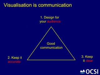


The document discusses the importance of data visualization in effectively communicating stories derived from data, emphasizing that it should influence organizations and services. It outlines key principles such as designing for the audience, maintaining clarity, and accuracy, alongside practical do's and don'ts for data presentation. Additionally, it highlights various resources and examples to aid in improving data visualizations, aiming to enhance public engagement and understanding of data.