Download as PDF, PPTX


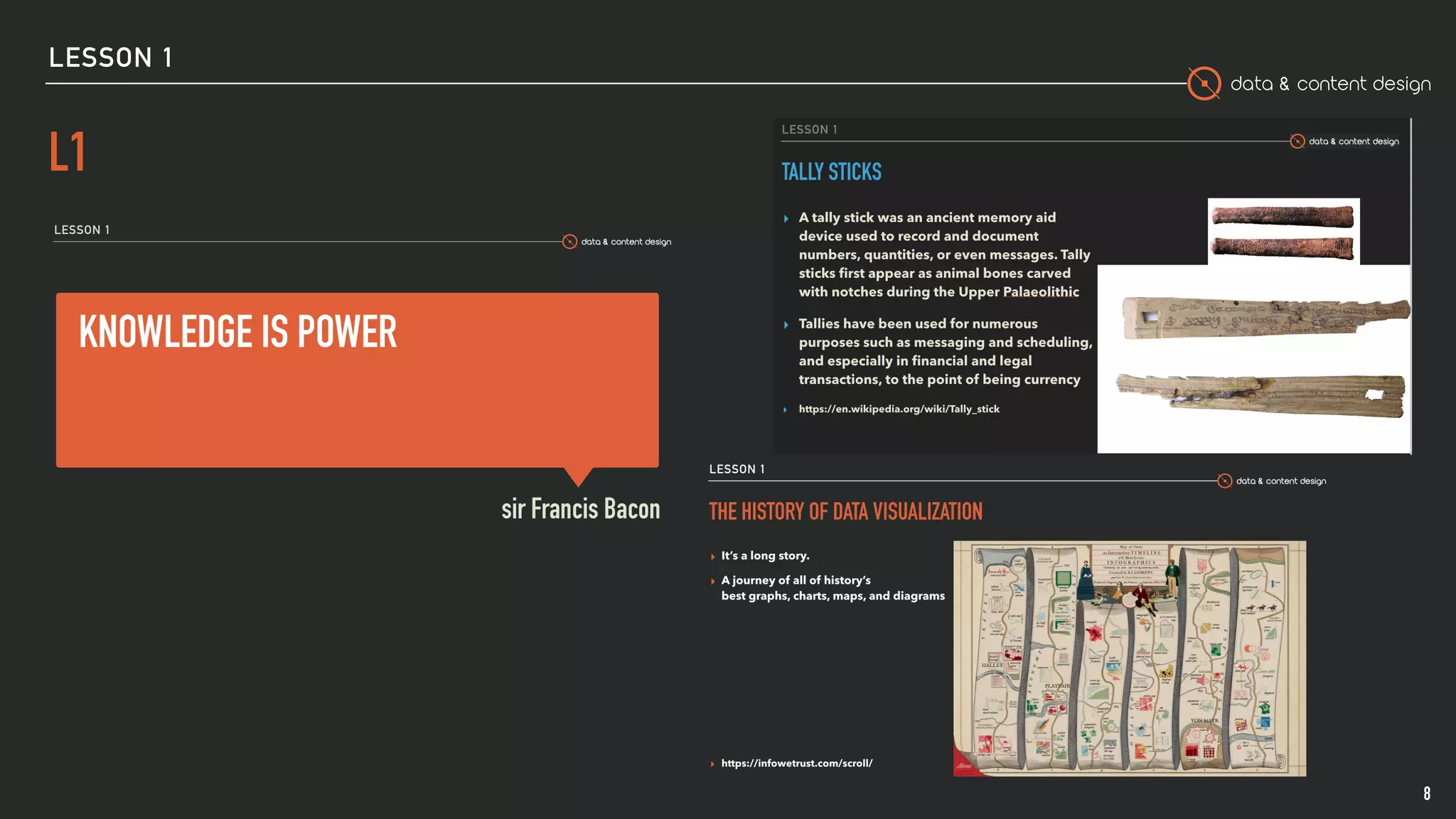
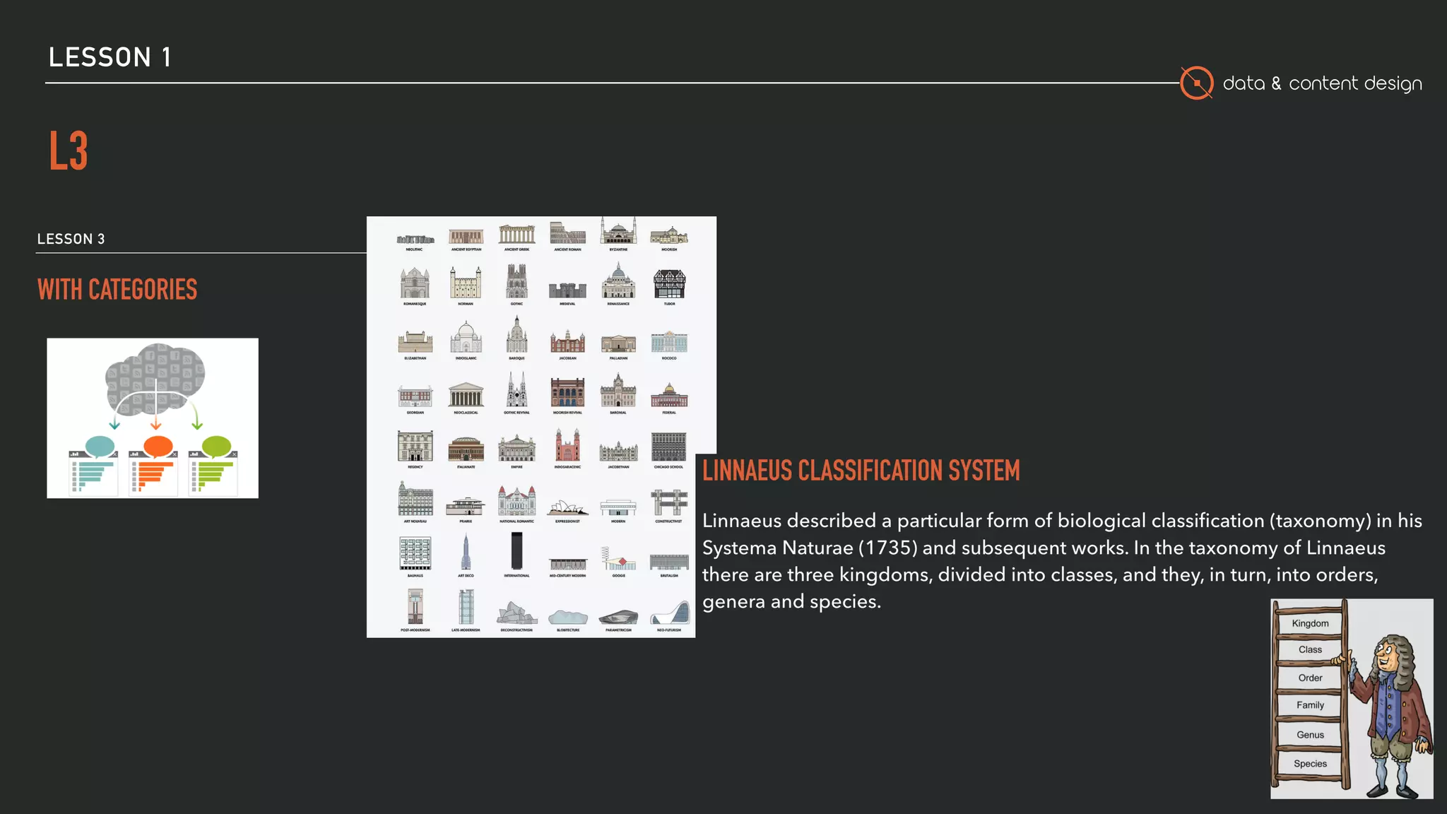

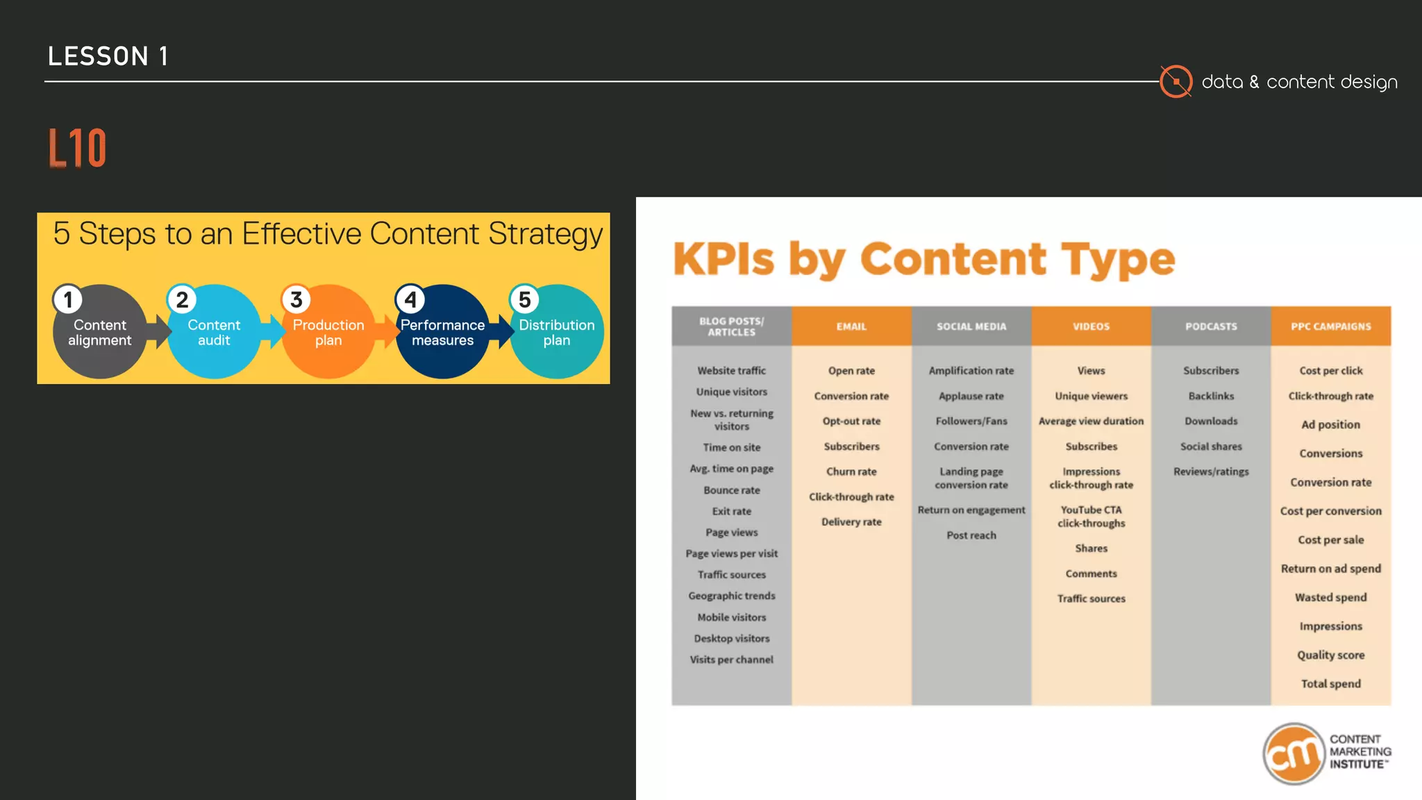
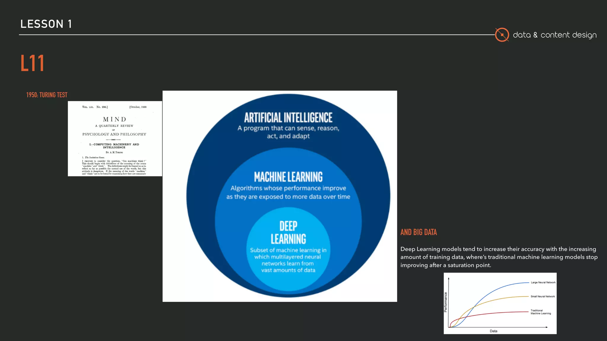
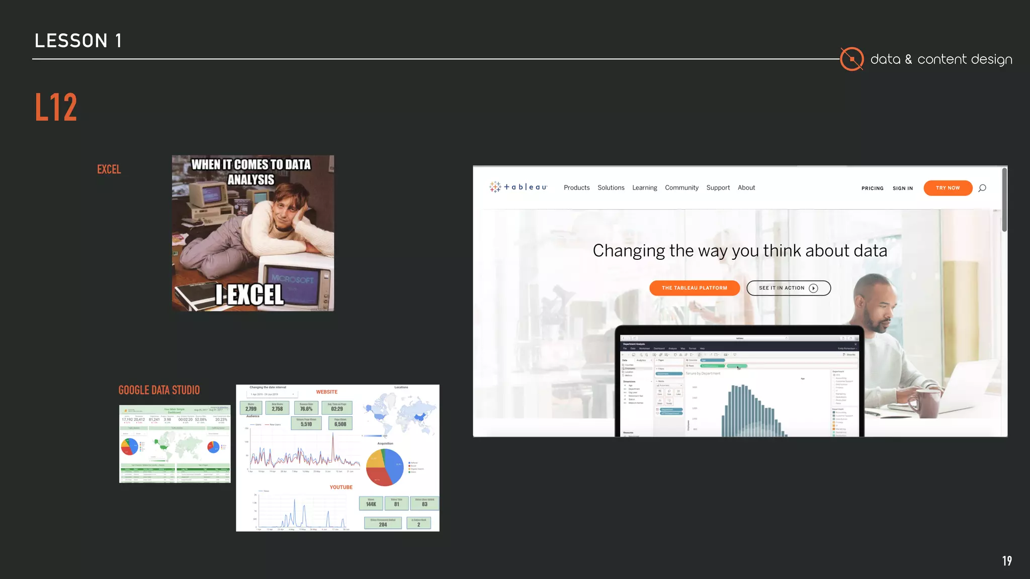


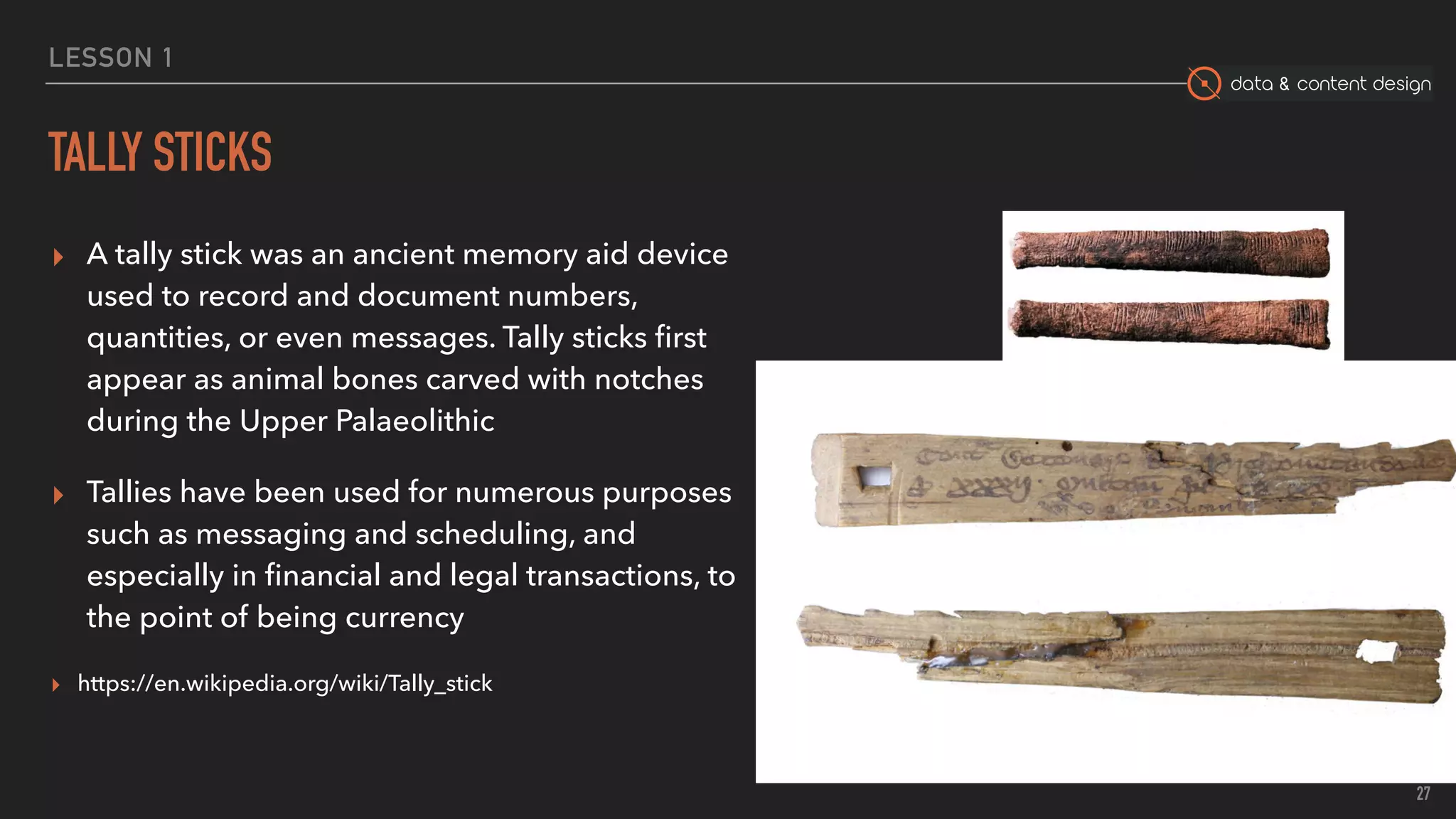
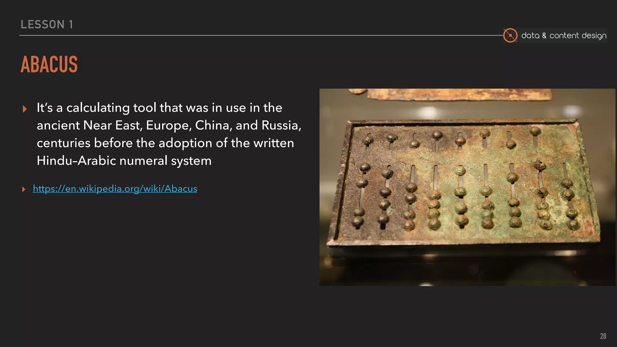
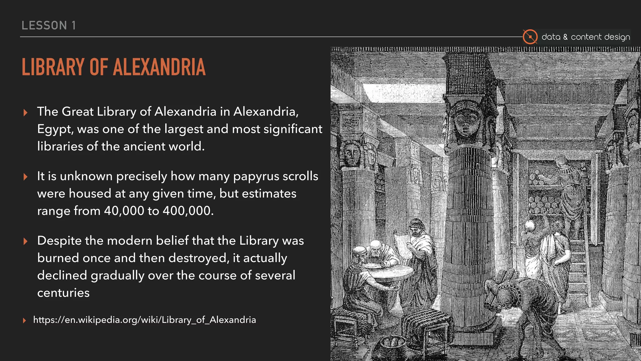
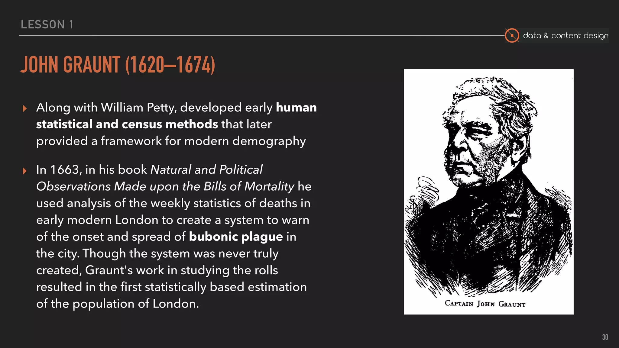
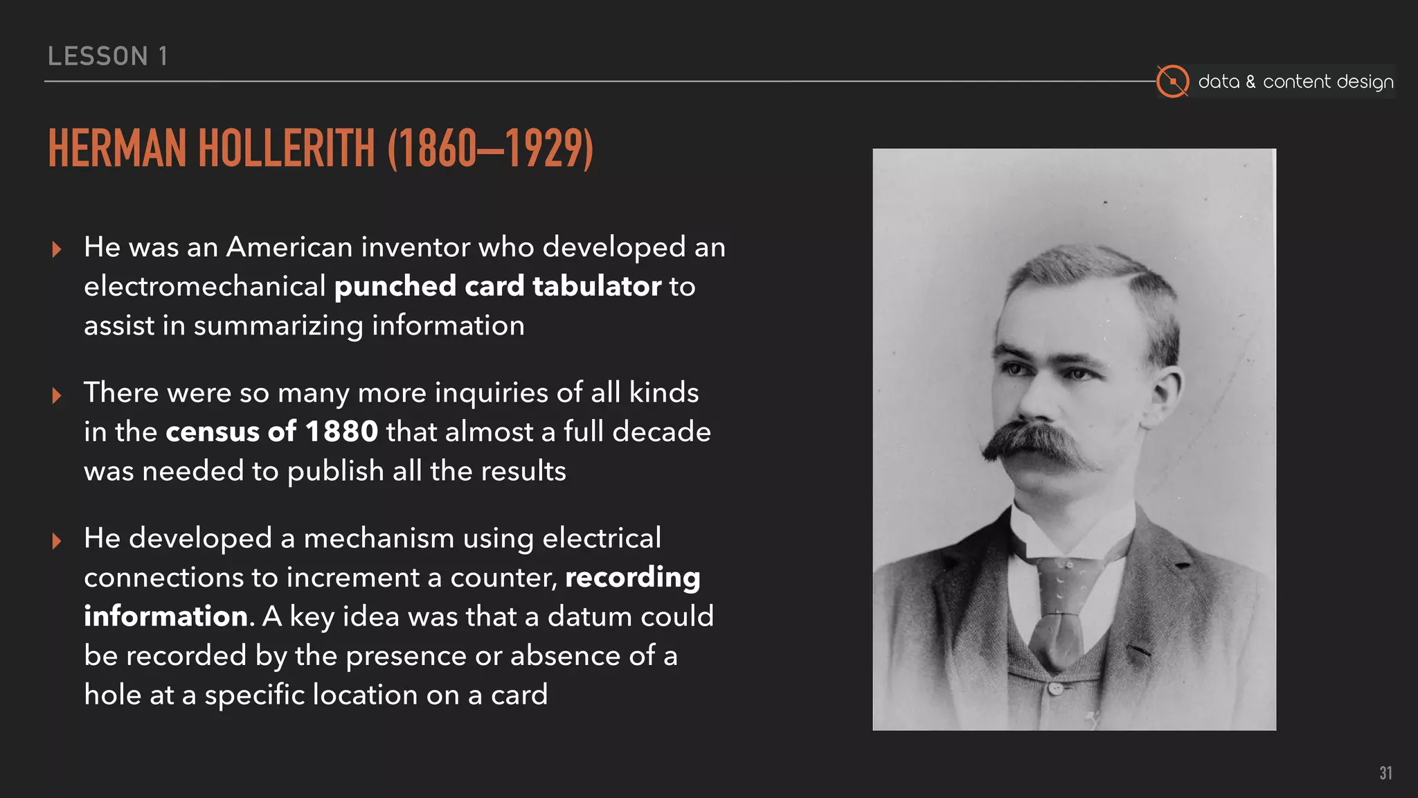

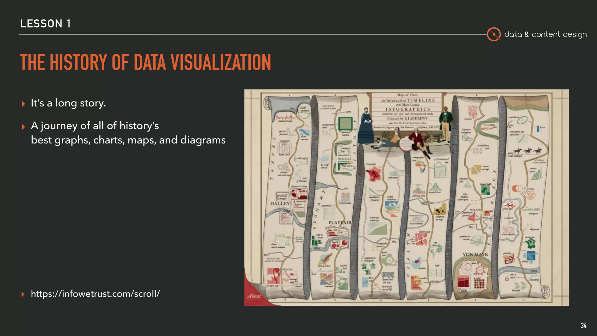
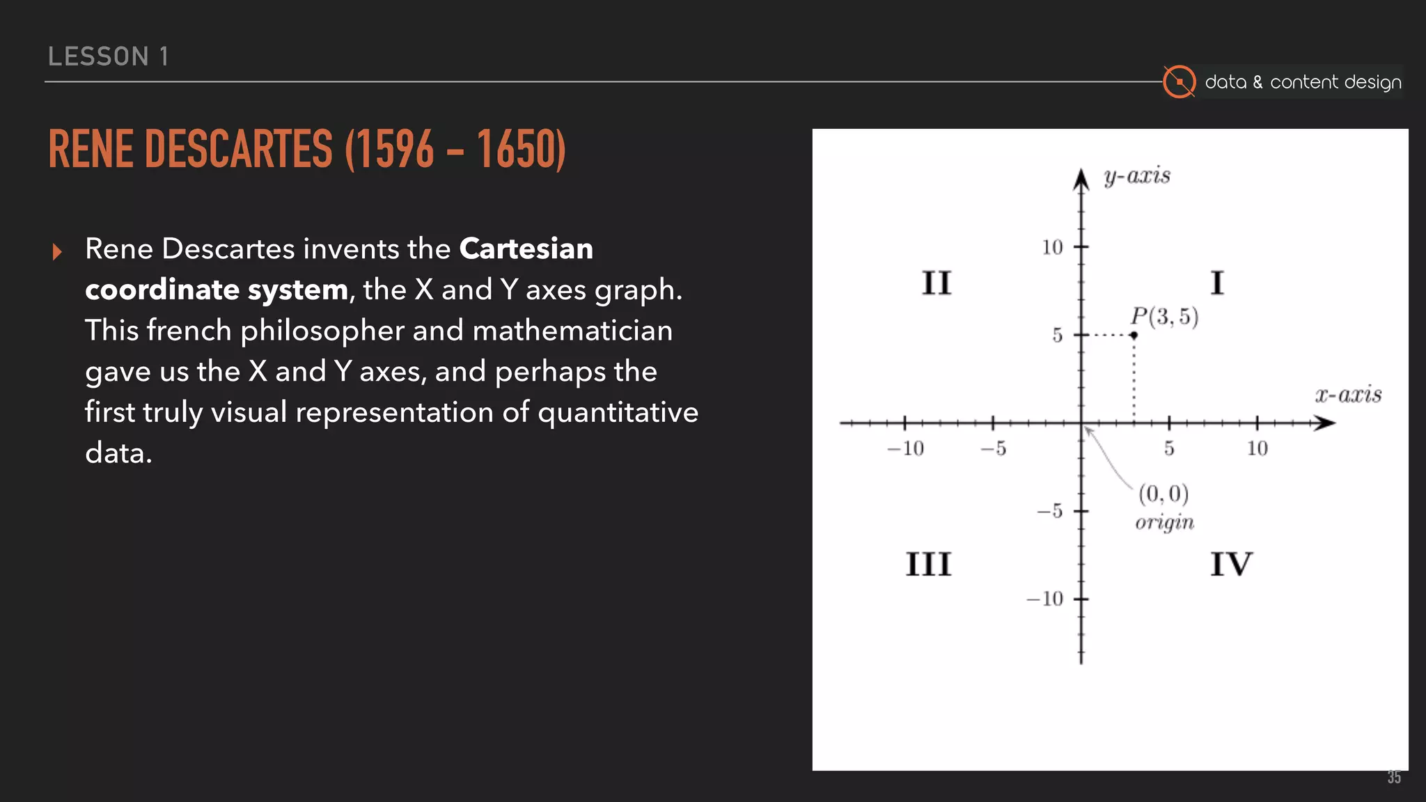
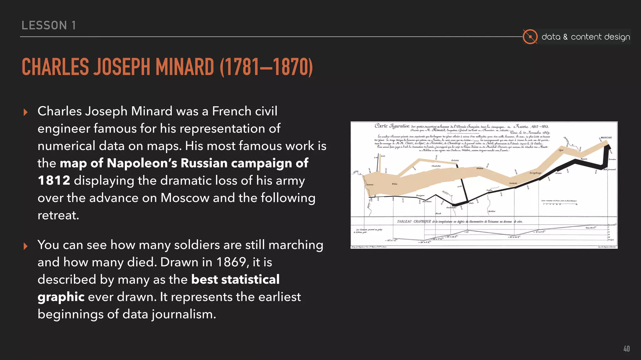
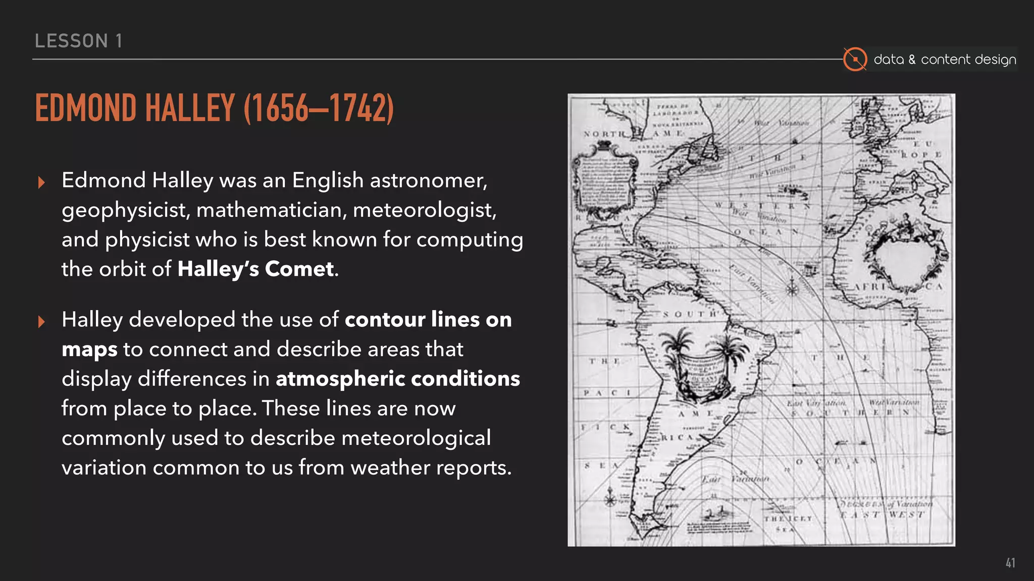
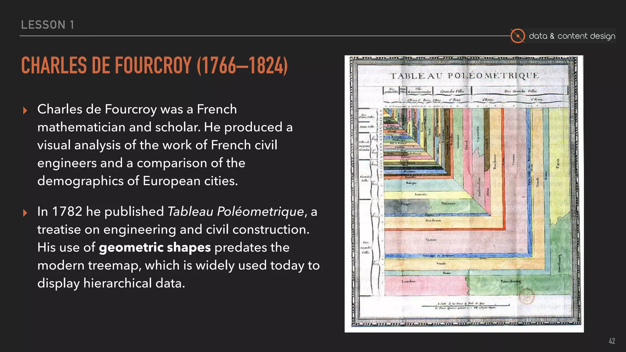
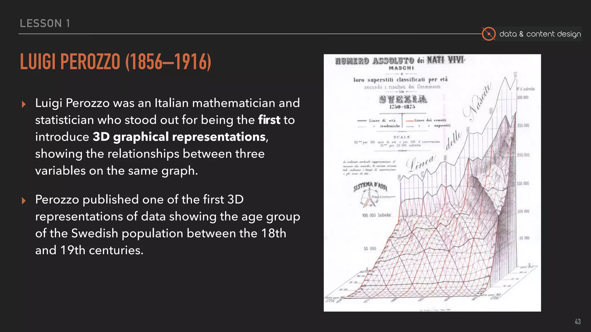

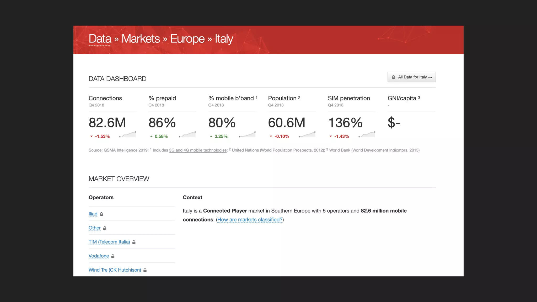

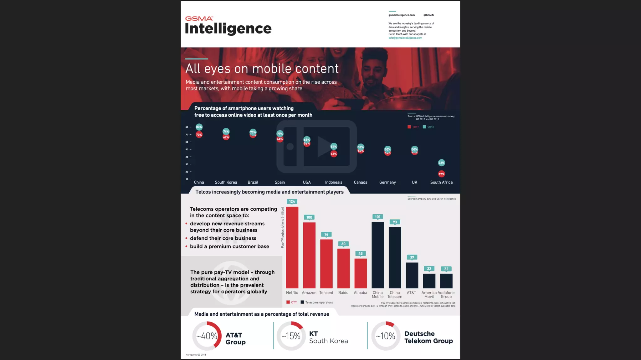
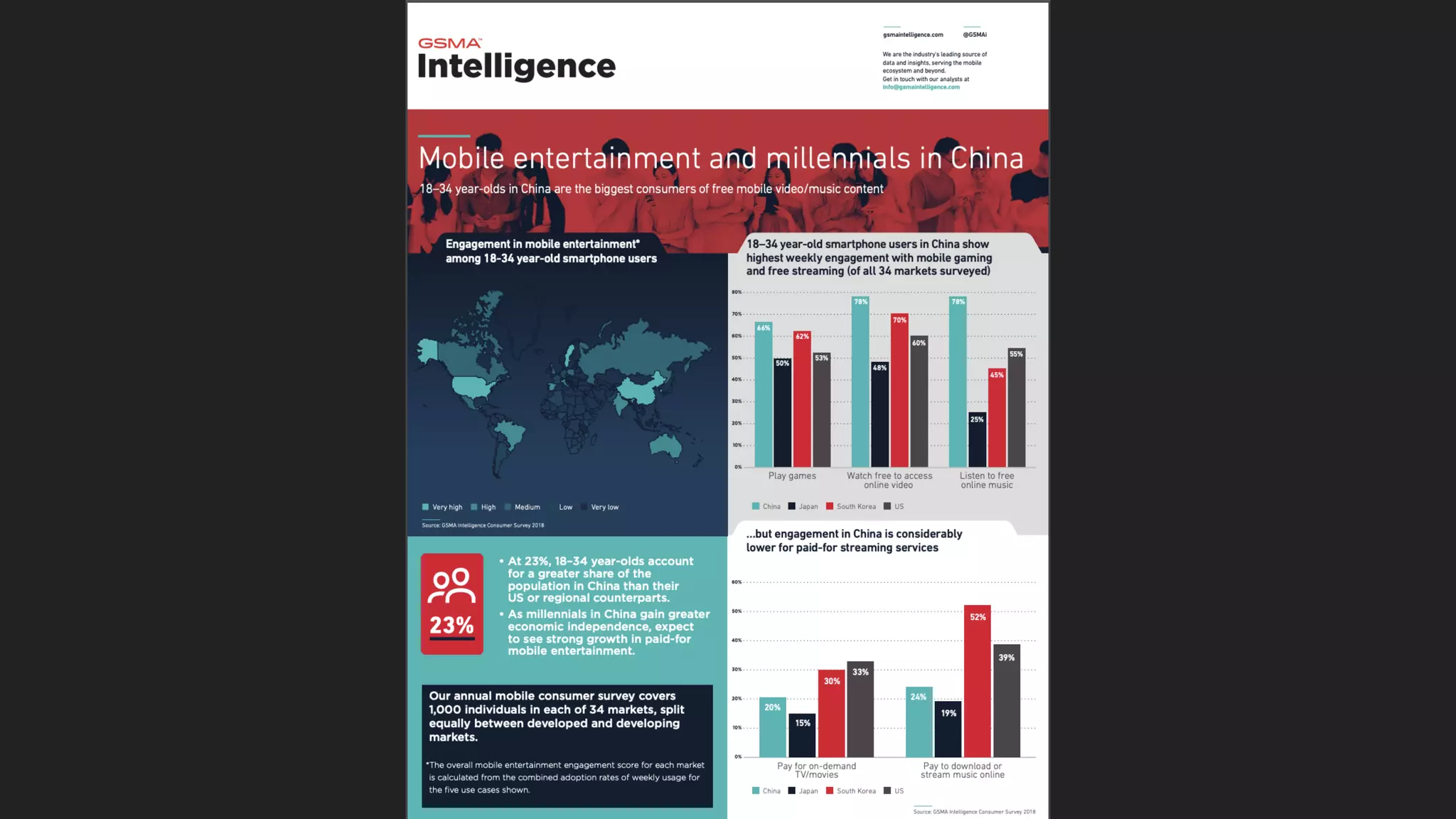
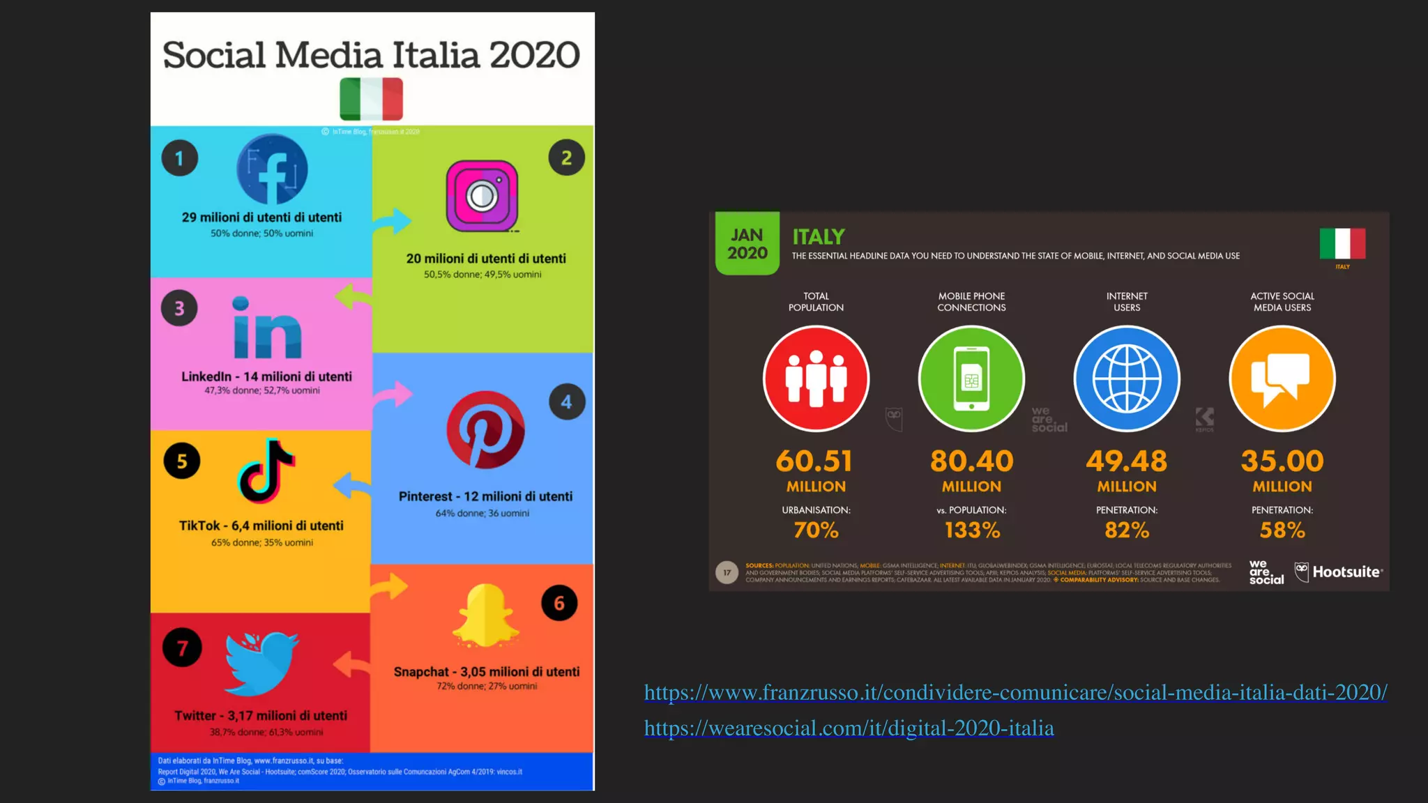


The document outlines the fundamentals of data and content design, highlighting the significance of data as individual units of information which transform into meaningful information through analysis. It covers historical perspectives on data gathering and visualization spanning from ancient tools to modern statistical practices, illustrating developments from tally sticks to contemporary data journalism. Key figures in the evolution of data representation, such as Florence Nightingale and John Snow, are discussed, showcasing their contributions to understanding and presenting data effectively.


