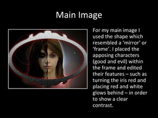
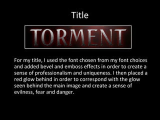
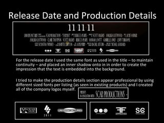
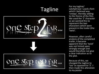
Film Poster Design & Development Scott Hughes
Main Image For my main image I used the shape which resembled a ‘mirror’ or ‘frame’. I placed the apposing characters (good and evil) within the frame and edited their features – such as turning the iris red and placing red and white glows behind – in order to show a clear contrast.
Title For my title, I used the font chosen from my font choices and added bevel and emboss effects in order to create a sense of professionalism and uniqueness. I then placed a red glow behind in order to correspond with the glow seen behind the main image and create a sense of evilness, fear and danger.
Release Date and Production Details For the release date I used the same font as used in the title – to maintain continuity – and placed an inner shadow onto in in order to create the impression that the text is embedded into the background. I tried to make the production details section appear professional by using different sized fonts per listing (as seen in existing products) and I created all of the company logos myself.
Tagline For my tagline/ catchphrase I used a font which I believed was ‘creepy’, thereby adding to the theme of the film. We used the ‘2’ character as we wanted this to represent the two characters which were present in the trailer (the ‘twist’. However, after careful analysis of the completed trailer, it became apparent that the ‘twist’ was not hinted upon strongly enough and would therefore not give a clear indication as to the plot. Because of this, we changed the tagline to ‘too’ as opposed to ‘2’. I then made this alteration to my poster

Film poster design & development

  • 1.
    Film Poster Design& Development Scott Hughes
  • 2.
    Main Image Formy main image I used the shape which resembled a ‘mirror’ or ‘frame’. I placed the apposing characters (good and evil) within the frame and edited their features – such as turning the iris red and placing red and white glows behind – in order to show a clear contrast.
  • 3.
    Title For mytitle, I used the font chosen from my font choices and added bevel and emboss effects in order to create a sense of professionalism and uniqueness. I then placed a red glow behind in order to correspond with the glow seen behind the main image and create a sense of evilness, fear and danger.
  • 4.
    Release Date andProduction Details For the release date I used the same font as used in the title – to maintain continuity – and placed an inner shadow onto in in order to create the impression that the text is embedded into the background. I tried to make the production details section appear professional by using different sized fonts per listing (as seen in existing products) and I created all of the company logos myself.
  • 5.
    Tagline For mytagline/ catchphrase I used a font which I believed was ‘creepy’, thereby adding to the theme of the film. We used the ‘2’ character as we wanted this to represent the two characters which were present in the trailer (the ‘twist’. However, after careful analysis of the completed trailer, it became apparent that the ‘twist’ was not hinted upon strongly enough and would therefore not give a clear indication as to the plot. Because of this, we changed the tagline to ‘too’ as opposed to ‘2’. I then made this alteration to my poster