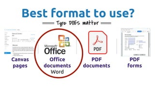
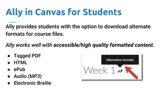
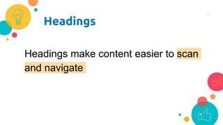
2. Why is it important to create
accessible content?
● Makes content usable by everyone
● Those with disabilities don’t have to wait to have
materials converted
● Promotes an inclusive, user-centered approach
4. Let’s Aim Higher:
Universal Design (UD)
Creating environments that can be used
to the greatest extent possible by anyone,
regardless of their condition.
-- UW DO-IT Center
Learn more about Universal Design
6. Best format to use?
Type DOES matter
Canvas
pages
Office
documents
Word
PDF
documents
PDF
forms
7. Ally in Canvas for Students
Ally provides students with the option to download alternate
formats for course files.
Ally works well with accessible/high quality formatted content.
● Tagged PDF
● HTML
● ePub
● Audio (MP3)
● Electronic Braille
9. How do users of Assistive Technologies
see unstructured content?
Introduction to Physics Course Syllabus Textbook Our sole text for this course will be
Introduction to Physics, Second Edition, authored by the instructor. Course Objectives
to offer students exposure to basic principles of Physics to provide students with
rich, thought-provoking discussions during lecture sessions to provide students with
experiential learning opportunities during laboratory sessions. Class Schedule Week
Topic Reading Assignment 1 Course Introduction Chapter 1 2 Inertia, equilibrium,
kinematics Chapters 2-3 3 Newton’s laws, vectors, momentum, energy Chapters 4-7 4
Matter, elasticity, scaling Chapters 8-10 5 Wave kinematics, sound, electricity,
magnetism, induction Chapter 11-15 6 Light, reflection and refraction, emission
Chapters 15-18 7 Review, final exam Grades Grades will be assigned on a ten point
scale (90 to 100 is an A, 80 to 89 is a B, etc.). Homework, exams, and projects will be
weighted as follows: Homework Exams Projects 1 2 Final 1 2 Final 15% 15% 15% 20%
10% 10% 15%
10. Best Practices
● Use built-in tools
○ Headings
○ Lists
○ Checkers
○ Tables
● Include alt text in images
● Provide descriptive hyperlinks
● Use color wisely
● Avoid empty lines/spaces in content
15. Use headings
● Start with H1
level for the title
● Continue with
H2, H3, etc. on
order for
sections and
subsections
● Use Normal for
paragraph text
● Use underline for
links
16. Using headings example
Before
Introduction to Ecology
Course Syllabus
Fall 2019
Table:
After (more accessible)
Introduction to Ecology
Fall 2019 Course Syllabus
(H1)
Instructor Information (H2)
Name: Ana Thompson (Normal)
Office: LBA 204E (Normal)
Office Hours: MWF 12 – 3 (Normal)
Instructor: Ana Thompson
Office: LBA 204E
Office Hours: MWF 12 – 3
18. This…
Articles
Drugs, Environment, Brain and Behavior
Addiction and Choice
Is addiction a “brain disease”?
Video Resources
Prohibition
How do Drugs Affect the Brain?
Which is easier to understand at a glance?
Or this…
Articles
● Drugs, Environment, Brain and Behavior
● Addiction and Choice
● Is addiction a “brain disease”?
Video Resources
● Prohibition
● How do Drugs Affect the Brain?
22. Use tables for data and format correctly
● Avoid merging cells - It makes them look nice but
disrupts the connection of information in cells to the
column headers.
● Tables should contain a caption
○ This caption explains the purpose of the table
23. How to format tables
Header row should be identified, repeated. Rows should be
forced to not break between pages
● Right-click on table and select Table Properties
● Select Row tab, deselect “Allow row to break…” option
● Select “Repeat as header…” option
Add a caption
● Right-click on table and select Insert Caption...
See the demonstration on the next two slides
26. Alternative (Alt) Text
Alt text provides students disabilities with equal
access and a description to everyone when the
image is not visible
27. Image Alt Text Best Practices
● Alt text should describe the function of the image
in context
● It is not necessary to say “image of” or “picture of”
● Keep alt text to less than 120 characters
● Avoid images with text (as much as possible). But if
used, the alt text should spell out the in-image text
28. Adding alt text in Office
● Right-click (or
Control + click on
Mac) image
● Select Edit Alt
Text...
● Enter alt text in
the field OR mark
image as
decorative
29. Links (URLs)
Full URLs are generally not easy to
say, not pleasant to hear,
and visually ugly
30. Which would you rather say, hear, and
see?
This…
https://docs.google.com/d
ocument/d/1YR8b6pgO13l
qbiAp-hs5gQgCt-
I8qIDtauU7jaTOyu8/edit?us
p=sharing
Or this…
List of common accessibility errors
31. Which list of links would you find more useful?
This…
● Video
● Here
● Video
● Here
● Example
● Example
Or this…
● See sit-and-reach video example
● See how your sit-and-reach results
compare
● See zipper test video example
● See how your zipper test results compare
● See upper body stretch example
● See lower body stretch example
32. ● Reserve the underline option only for links
● http://. or www. are not needed in modern
browsers
● For print: use a link shortener (TinyURL) for
long or complex links
Other URL Recommendations
33. Use of Color
Don’t use color alone to convey meaning, not
all users can perceive color
34. If we add a symbol...
Week Final Project Piece
Week 3* Final Project Proposal
Week 4 Empathizing with Stakeholders
Why–How Ladder
Week 5 Strategy Map
Week 6* Timeline
Week 7* Project Updates
Week 8 Instructional Guide Draft
Week 9 Usability Testing
Week 10 Final Project
*These weeks have additional assignments due.
See plan for the full timeline.
What it looks like to those
who can perceive color
Week Final Project Piece
Week 3* Final Project Proposal
Week 4 Empathizing with Stakeholders
Why–How Ladder
Week 5 Strategy Map
Week 6* Timeline
Week 7* Project Updates
Week 8 Instructional Guide Draft
Week 9 Usability Testing
Week 10 Week 10 Time Log
*These weeks have additional assignments due.
See plan for the full timeline.
What it looks like to those
who cannot perceive color
36. Check color contrast
The minimum requirement for contrast is 4.5:1 according to
WCAG 2.1 Web Accessibility Standards set by the W3C
But you can use the free Colour Contrast Analyser tool by
TPGi. Available for PC or Mac, to test it for you.
Note: If installing on UW computers, you will need to submit
a software request to the Help Desk if you do not have admin
access.
38. Avoid empty lines/spaces in content
● Empty lines/spaces may denote end of content
● Adjust spacing using Line Spacing Options in the Home
ribbon.
○ Add space before or after a paragraph
● Can also modify specific styles so spacing is
consistent throughout
See demonstration on the next slide...
40. Breakout rooms
● Open your syllabus template
● I will be checking with all the
groups
● Can use the Notes Google doc
for notes
● We’ll come back to the main
room at the end
Activity: Make a Syllabus
Template accessible in Word
41. Resources
● UW File conversion tool (tinyurl.com/uw-doc-convert)
● Canvas accessibility checklist (bit.ly/CanvaAccessibility)
● Creating accessible Word documents lesson
● Best Practices: Creating High Quality Scans
42. Thank You!
We Are Ready to help!
Ana Thompson Todd
Conaway
Marc Studer
Digital Learning & Engagement (DLE)
uwbdl@uw.edu, 425-352-3906
Penelope Moon Salem Levesque
Editor's Notes
Creating accessible content is important because,
It makes content usable by everyone
Those with disabilities don’t have to wait to have materials converted
And it saves the institution money because there is less content to remediate
Promotes an inclusive, user-centered approach, consistent with Diversity, Equity and Inclusion
We are going to cover a few areas to make accessible documents: Built-in tools, Links, Color, a little bit about PDFs
Percentage estimates of persons with disabilities in the US.
1 Prevalence of Disabilities and Health Care Access by Disability Status and Type Among Adults (2018, Okoro)
2 Key Findings Disabilities and Inclusion Report by Coqual (2017, Key)
3 Distribution of students enrolled in postsecondary institutions by level, disability status, and selected student characteristics: 2015-16 (NCES)
Let’s think more holistically. Doing so will benefit everyone, including those individuals with disabilities.
DO-IT. (2019). What is universal design? University of Washington. Retrieved from http://washington.edu/doit/what-universal-design-0
Curb cuts or captioning can be useful for anyone, with or without a disability
Real text provides more access, the ability to convert to other formats such as audio or be able to select text to copy and paste it.
Main types of documents used in content are listed here and graded in terms of accessibility and usability.
Canvas, Kentico or WordPress pages (best format) - well-formatted HTML
Microsoft Office documents (latest version, well-formatted - better)
PDF documents and forms (not so good)
For today, we will concentrate on Word documents and best practices to make them accessible
Ally for students was put online fall 2018 quarter.
But if it not formatted correctly, users of assistive technology see this...
We add headings for a reason.
They make content easier to navigate
Rather than looking at a wall of text, when we have headings, we can more easily find what we’re searching
But, what about people who don’t see those headings? For example, people using screen readers to listen to content.
To prep for this talk, I asked some of my friends to show me how they add headings.
Some of them add fake, or untagged, headings.
So they said “Well, I highlight the text I want to make a heading and bold it and increase the font size so it stands out.”
Bolding and changing the font size is not the same as adding a real heading.
How do you add real headings?
The specific process varies by the platform you’re working in, but in virtually any text editor or word processing program, there’ll be a dropdown or button that lets you select a heading level.
These are some screenshots of those dropdowns in several different platforms – sometimes it’s called “styles” or “paragraph styles” or “format,” but it’s always there.
Your job is to find it and start using that to add headings instead of the bolding and font-size changing.
For example, here we are in Microsoft Word.
To add a real, properly tagged heading:
Select the text
Select your heading level from Styles on the Ribbon
For digital content, Heading 1 is the functional title. If I don’t like the default style I can edit it
Remove or add bold
Reduce or increase the text size
Even set the alignment to left instead of center
The heading remains a level one.
The next level is Heading 2 to be applied to main sections. I can again edit it and if I am going to have more sections, I can save the edited style.
Underlined content should be reserved for hyperlinks.
So just like your real headings, you want to use (real) lists when you’re listing items.
Lists are great. They help us understand relationships and provide structured order to content.
Assistive technology allows for similar scanning and navigation abilities, but only if the list is “real,” or properly tagged.
When screen readers come to a tagged list, they will:
Notify the user that there is a list and how many items are in it.
They can also tell users the relative position of each item in the list and
Allow users to use navigation commands like "Go to next list item" and "Go to next list."
So if putting dashes or numbers in front of a paragraph creates fake lists, how do you add real lists?
Just like adding the headings, the specifics differ by the platform you’re working in, but again, the option is always there. The icons look like a bulleted or a numbered list.
Depending on what version of MS Office you are using, the Accessibility Checker location on MS Office is under the Review Tab.
Tables should be used for data, not for layout
Many times we use tables to organize content, instead of working with columns or other built-in ways to organize content.
Many times we use tables when a well-formatted list or columns will do the job.
Next, we’ll talk about alternative or alt text.
Follow the WebAIM rules described in Alternative Text. This article is specific to webpages, but the same rules for alt text content apply to documents and slides.
This demonstration shows the process to add alt text in Office 2019. Once the image is right-clicked, select Edit Alt Text… Enter the alt text or if the image is there only for ornamental purposes, check the “Mark as decorative” box.
See the lesson, Creating accessible Word documents for more information
We’ll talking about creating descriptive hyperlinks.
Users of text recognition technology can go to links by speaking the link text will hearing all the characters
While this may not be an issue for very short, meaningful links, long links like this one here to a Google Doc is quite nasty.
Instead of the full link, hyperlink text that tells you where the link goes
It’s easy to see why meaningful link text would be important in this context.
For example, which list of links would be more useful in helping you understand the page?
Underlined text looks like a clickable link, which is confusing when it’s not
http:// or www. are not needed in modern browsers when typing or pasting
If you are using/sharing a document for print, use a link shortener (TinyURL) for long or complex links to make them cleaner
It’s easy to make this mistake when creating legends and keys for things like tables, graphs, and charts.
Add text, symbols, or patterns to information distinguished by color
Stay away from red (or orange) / green or black / red combinations for font and background
Text color that’s too similar to the background color is hard to read. Use enough contrast
The official minimum contrast (WCAG 2.0 level AA) ratio is 4.5:1 for normal text and 3:1 for large text.
But, great news! You can use a contrast checker tool to make sure
WebAIM Contrast Checker (web only)
Color Contrast Analyzer (web and local files)
Web Content Accessibility Guidelines (WCAG) 2.1 - A W3C Initiative
WebAIM article, Contrast and Color Accessibility
Contrast Checker Emulator
While creating this presentation, I used the CCA tool to check color contrast. This demo shows the eyedropper tool picking up the color of the title font on the slide. Background is white. Once captured, the tool right away let me know the font color did not meet the minimum level of contrast for regular and large text. I replaced the font color with another slightly darker blue which did pass the contrast test.