
Recommended
More Related Content
What's hot
What's hot (18)
Viewers also liked
Similar to Double spread analysis
Similar to Double spread analysis (20)
More from HollyLAsMedia
Recently uploaded
Recently uploaded (20)
Double spread analysis
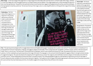
- 1. u Main Image – In the mainimage of thispage there isa large image of U2 where Bono(the mainface of U2 is onthe far right of the image, andthere isa close upof Edge and inthe farbackgroundwe can see AdamClaytonandLarry Mullen.The image backgroundisa streetalludingtothe genre of theirmusicbeingindie/rock.The graffitionthe wallsbehindthemcouldillustrate theirruggedIrishbackgroundandhowtheyusedtobe alludingto themgoingback to howtheyusedto be. The textoverthe top of the image isalsoina style of graffiti whichisinfittingwiththe imageof thembeing on a street. House Style – the house style of Q isreiteratedatthe bottomof the page where theyhave placedthe Q logo inthe signature redstyle. Alsothe small captionat the rightcorner of the page is emphasisingthe house style evenfurther. The designof Q’s double page spreadsare mostlysimilarwithalarge mainimage usuallycovering a page. Guttenberg– The first letterof the magazine isin large fontin the primary optical areaso that the readerusuallylooksthere first.Inthe axisof orientationthere is nothingbuttext.Inthe weakfallowareathere are the Q logo,the date and the page numberalsoin the terminal areathere is part of the image.The readinggravityof the page pullsoureyesdiagonally downthe page readingthe article. Text - The openingsentencebeginswithanexaggeratedsentence andheightenedlanguage“Iamgoingto die ina plane crash withU2” Thiswoulddrawus ininstantlyasit isa strongstatementandmost importantly,intriguing,andsuggestsadegree of informality.There isslangnameslike‘spongebob’achildrenscartoon,whichisinformal andquite chatty.There is a use of a pun“still theyhaven’tfoundwhatthey’re lookingfor’whichisapunrelatedtothe famousU2 song.The purpose of thisstory isto entertainit’s audience.A U2 fan readingthe pull quote layeredoverthe image of the band.The language isinthe semanticfieldof boxingwhichsuggestsof Bono’sstrengthandalternatively hissuggestedarrogance.The quote alsodepictsthe longevityof U2’stogethernessasa band.The magazine article definitely maintainsadegree of informalityevenwithinthe journalise suchas:“furtherbangingaboutquietensthe plane’soccupantsentirely”The initital photographof page one,displaysBonoassignificantashe hashisownpage to himself, whereasthe othermembersof U2 are almostcrammedin together. The headline onthe firstpage of the double page spreadisreflectiveof howU2 have beenaroundfor 20+ yearsandhow theyhave fadedawayovertime,thisheadline suggeststhe stronginfluence theystill have onthe industry. DesignBalance:The balance of thisisunevenas the main image overlapsovertwo pagesand the image covers more space than the text. The fact that there isa large letter‘I’inthe primaryoptical area illustrateshowthe article isimportanthowever not as importantasthe image as that dominates more space.
- 2. Main image – In the image Lana is the central focuswith herface directlyinthe centre. Lana is usingdirectaddress but hasher eyesshut,possibly a depictionof the aura of mysterysurroundingher.Her handsare placedupclose to herneck andshe has sculpturedstiletto nailswhich isin the semanticfieldof knives,possiblyalludingto some of her songlyricsand for example inthisphotoshoot where she hasbloodrunning fromher forehead. House Style – The spread followsthe house styleof Q, mostvisiblybythe red small “Q” logoat the bottomrightof the page and the bottomleftof the otherpage,alsowiththe arrows directingthe readersto the nextpage the infamousredand white colourtheme is present.Atthe bottomof the page more towards the centre there isa clear indicationof the factit’s Q magazine. GuttenbergDesignPrinciple - Lana’s face isin the primary optical areaas she isthe main focusof the article.Onthe secondpage of the double spread isa giantletter“S” symbolising herfemale characterand emphasisingthe text.The letter coversthe primaryoptical area, goesdownintothe axisof orientationanddownintothe weakfallowarea,suggestingthe importance of the text.Inthe strongfallow areathere isalso Lana’s name reinforcingher influenceoverthe article.Inthe terminal areathere issmallertext where the interviewbeginsand there isalsopage numberand logo,suggestingthese isn’t necessarilyimportant. DesignBalance – The designbalance of this spreadisunevenasthe textislargerin one side and the letterSis huge and bold,itcuts behind the text.The huge image on the leftside of the page is contrastingtoan equal page oneach side. At the bottomof the page there isa blank space on bothsides, makingitslightlyevenas it continuesonboth sides. Text: At the start where it says “demonic” that instantly gives us a hint of her darkness and possibly intimidating character.The fact that it starts out in describing what she is wearing shows how she is quite reserved and how she may not be in the spotlight as much as expected. To entertain/provide information. The story is about Lana’s rise to fame and on why she is so good and successful. The article is somewhat formal with hints of informality.The article is mostly serious which shows how Lana is different from what is expected and also alluding to the genre of music she fits into. The article contains long sentences and many commas showing the formality and how there is a lot to say. The shots chosen are dark, especially the one placed on the image above, there is a light hint to the backrground and also a surrealism to it, as the light is reflected on the camera lens, this connotes Lana’s genre of music as her lyrics relate to surrealism. One side of her face is dark and