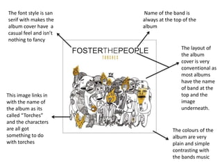
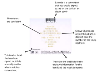
By Liam Lorraine
The font style is san   Name of the band is
serif with makes the    always at the top of the
album cover have a      album
casual feel and isn’t
nothing to fancy
                                         The layout of
                                         the album
                                         cover is very
                                         conventional as
                                         most albums
                                         have the name
                                         of band at the
This image links in                      top and the
with the name of                         image
the album as its                         underneath.
called “Torches”
and the characters
are all got                          The colours of the
something to do                      album are very
with torches                         plain and simple
                                     contrasting with
                                     the bands music
Barcode is a convention
                       that you would expect
                       to see on the back of an
                       album cover

  The colours
  are consistent


                                           Shows what songs
                                           are on the album, it
                                           doesn’t have the
                                           number of the track
                                           next to it.


This is what label
the band are
signed to, this is   These are the websites to see
normally on the      exclusive information for the
album as it is a     band and the music company.
convention.

Research into ancillary task liam lorraine

  • 1.
  • 2.
    The font styleis san Name of the band is serif with makes the always at the top of the album cover have a album casual feel and isn’t nothing to fancy The layout of the album cover is very conventional as most albums have the name of band at the This image links in top and the with the name of image the album as its underneath. called “Torches” and the characters are all got The colours of the something to do album are very with torches plain and simple contrasting with the bands music
  • 3.
    Barcode is aconvention that you would expect to see on the back of an album cover The colours are consistent Shows what songs are on the album, it doesn’t have the number of the track next to it. This is what label the band are signed to, this is These are the websites to see normally on the exclusive information for the album as it is a band and the music company. convention.