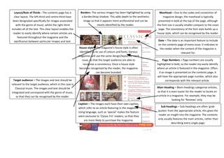
Layout/Rule of Thirds - The contents page has a 
clear layout. The left-third and centre-third have 
been designated specifically for images associated 
with the genre of music; whilst the right-third 
includes all of the text. This clear layout enables the 
reader to easily identify where certain articles are 
featured throughout the magazine and the 
significance between particular images and text. 
House style – The magazine’s house style is often 
identified by its use of colours and fonts. Various 
magazines will use the same design/layout for each 
issue, so that the target audience are able to 
recognise a consistency. Once a house style 
becomes recognised by the reader, the magazine 
can become branded. 
Target audience – The images and text should be 
relevant to the target audience, which in this case is 
Classical music. The images and text should be 
integrated and correspond with the genre of music, 
so that they can be recognised by the reader. 
Borders- The various images has been highlighted by using 
a border/drop shadow. This adds depth to the aesthetics 
image so that it appears more professional and can be 
clearly identified by the reader. 
Masthead – Due to the codes and convention of 
magazine design, the masthead is typically 
presented in bold at the top of the page, although 
the font size is usually smaller compare to the cover 
page. The consistency of the font style builds up a 
house style, which can be recognised by the reader. 
Date – The date is an important feature to include 
on the contents page of every issue. It indicates to 
the reader when the content of the magazine is 
relevant for. 
Caption – The images each have their own caption, 
which refer to an article featuring in the magazine. 
Using language, such as ‘special’ makes the feature 
seem exclusive to ‘Classic Fm’ readers, so that they 
are more likely to purchase the magazine. 
Page Numbers – Page numbers are usually 
highlighted in bold, so the reader my easily identify 
where an article is featured in the magazine. Often, 
if an image is presented on the contents page, it 
will have the appropriate page number, which also 
corresponds with the relevant article. 
Main Heading – Main-headings categorise articles, 
so that it is even easier for the reader to locate an 
article in a magazine. For example, they may be 
looking for ‘Reviews’ only. 
Sub-headings – Sub-headings are often ‘grab-quotes’ 
from the appropriate article, this gives the 
reader an insight into the magazine. The contents 
only usually features the main articles, rather than 
describing every single page.

Contents analysis 2

  • 1.
    Layout/Rule of Thirds- The contents page has a clear layout. The left-third and centre-third have been designated specifically for images associated with the genre of music; whilst the right-third includes all of the text. This clear layout enables the reader to easily identify where certain articles are featured throughout the magazine and the significance between particular images and text. House style – The magazine’s house style is often identified by its use of colours and fonts. Various magazines will use the same design/layout for each issue, so that the target audience are able to recognise a consistency. Once a house style becomes recognised by the reader, the magazine can become branded. Target audience – The images and text should be relevant to the target audience, which in this case is Classical music. The images and text should be integrated and correspond with the genre of music, so that they can be recognised by the reader. Borders- The various images has been highlighted by using a border/drop shadow. This adds depth to the aesthetics image so that it appears more professional and can be clearly identified by the reader. Masthead – Due to the codes and convention of magazine design, the masthead is typically presented in bold at the top of the page, although the font size is usually smaller compare to the cover page. The consistency of the font style builds up a house style, which can be recognised by the reader. Date – The date is an important feature to include on the contents page of every issue. It indicates to the reader when the content of the magazine is relevant for. Caption – The images each have their own caption, which refer to an article featuring in the magazine. Using language, such as ‘special’ makes the feature seem exclusive to ‘Classic Fm’ readers, so that they are more likely to purchase the magazine. Page Numbers – Page numbers are usually highlighted in bold, so the reader my easily identify where an article is featured in the magazine. Often, if an image is presented on the contents page, it will have the appropriate page number, which also corresponds with the relevant article. Main Heading – Main-headings categorise articles, so that it is even easier for the reader to locate an article in a magazine. For example, they may be looking for ‘Reviews’ only. Sub-headings – Sub-headings are often ‘grab-quotes’ from the appropriate article, this gives the reader an insight into the magazine. The contents only usually features the main articles, rather than describing every single page.