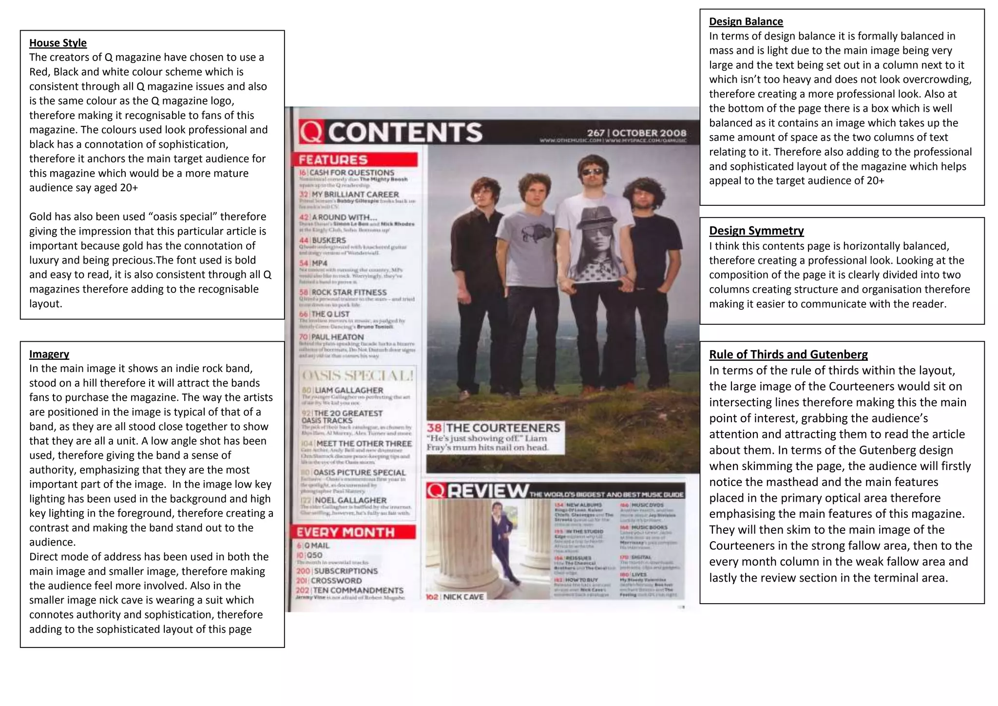
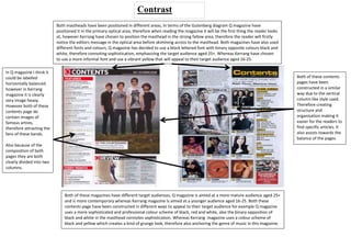
Design Balance
                                                        In terms of design balance it is formally balanced in
House Style
                                                        mass and is light due to the main image being very
The creators of Q magazine have chosen to use a
                                                        large and the text being set out in a column next to it
Red, Black and white colour scheme which is
                                                        which isn’t too heavy and does not look overcrowding,
consistent through all Q magazine issues and also
                                                        therefore creating a more professional look. Also at
is the same colour as the Q magazine logo,
                                                        the bottom of the page there is a box which is well
therefore making it recognisable to fans of this
                                                        balanced as it contains an image which takes up the
magazine. The colours used look professional and
                                                        same amount of space as the two columns of text
black has a connotation of sophistication,
                                                        relating to it. Therefore also adding to the professional
therefore it anchors the main target audience for
                                                        and sophisticated layout of the magazine which helps
this magazine which would be a more mature
                                                        appeal to the target audience of 20+
audience say aged 20+

Gold has also been used “oasis special” therefore
giving the impression that this particular article is   Design Symmetry
important because gold has the connotation of           I think this contents page is horizontally balanced,
luxury and being precious.The font used is bold         therefore creating a professional look. Looking at the
and easy to read, it is also consistent through all Q   composition of the page it is clearly divided into two
magazines therefore adding to the recognisable          columns creating structure and organisation therefore
layout.                                                 making it easier to communicate with the reader.


Imagery                                                 Rule of Thirds and Gutenberg
In the main image it shows an indie rock band,          In terms of the rule of thirds within the layout,
stood on a hill therefore it will attract the bands     the large image of the Courteeners would sit on
fans to purchase the magazine. The way the artists      intersecting lines therefore making this the main
are positioned in the image is typical of that of a
                                                        point of interest, grabbing the audience’s
band, as they are all stood close together to show
that they are all a unit. A low angle shot has been
                                                        attention and attracting them to read the article
used, therefore giving the band a sense of              about them. In terms of the Gutenberg design
authority, emphasizing that they are the most           when skimming the page, the audience will firstly
important part of the image. In the image low key       notice the masthead and the main features
lighting has been used in the background and high       placed in the primary optical area therefore
key lighting in the foreground, therefore creating a    emphasising the main features of this magazine.
contrast and making the band stand out to the           They will then skim to the main image of the
audience.                                               Courteeners in the strong fallow area, then to the
Direct mode of address has been used in both the        every month column in the weak fallow area and
main image and smaller image, therefore making
                                                        lastly the review section in the terminal area.
the audience feel more involved. Also in the
smaller image nick cave is wearing a suit which
connotes authority and sophistication, therefore
adding to the sophisticated layout of this page
House Style                                      Design Balance
This contents page has been constructed          In terms of design balance, this contents
using a black and yellow which is consistent     page is obviously image heavy however this
through all kerrang magazine issues,             works effectively due to the images allowing
therefore making it recognisable to the fans     the reader too easily locate the article of the
of the magazine. The yellow is bold and          bands they are interested in reading about.
therefore contrasts against the black            Vertical columns have been used to create a
backgrounds, catching the audience’s eye.        more organised layout, therefore making it
Also yellow is a less formal colour, which       easier for the audience to read.
anchors the genre of the magazine and also
the target audience which is 16-25 years.
The same font is also used throughout the        Design Symmetry
contents page making it consistent, it is also   This contents page is clearly divided into
simple and easy readable for the audience.       two columns to make create structure and
Also an editor’s message and image of the        organisation, therefore making it a lot easier
cover is placed in the primary optical area,     to communicate with the reader.
therefore automatically grabbing the
audience’s attention.                            Rule of Thirds and Gutenberg
                                                 In terms of the rule of thirds within the
                                                 layout the main image would sit on
Imagery                                          intersecting lines therefore making this the
Various images have been used in this            point of interest for the audience, grabbing
contents page. One image is a lot bigger than    their attention. In terms of the Gutenberg
the other images, which automatically            design when skimming the page, the
catches the audience’s eye, giving the           audience will first notice the editor’s
impression that this article is an important     message in the primary optical area,
feature. Other smaller images are used           therefore making the audience feel more
framing the bigger image which also images       involved as if the editor is talking to them
are relating to the articles in the magazine.    personally. They will then be drawn to the
The images feature other famous artists,         column of articles in the strong fallow area,
therefore attracting there fans to buy the       then the band images in the weak fallow
magazine. The images don’t look very             area and finally the subscription
professional, therefore this adds to the         advertisement in the terminal area.
informal layout, anchoring the genre of this
magazine.
Contrast
                           Both mastheads have been positioned in different areas, In terms of the Gutenberg diagram Q magazine have
                           positioned it in the primary optical area, therefore when reading the magazine it will be the first thing the reader looks
                           at, however Kerrang have chosen to position the masthead in the strong fallow area, therefore the reader will firstly
                           notice the editors message in the optical area before skimming across to the masthead. Both magazines have also used
                           different fonts and colours, Q magazine has decided to use a block lettered font with binary opposite colours black and
                           white, therefore connoting sophistication, emphasizing the target audience aged 25+. Whereas Kerrang have chosen
                           to use a more informal font and use a vibrant yellow that will appeal to their target audience aged 16-25.

In Q magazine I think it
could be labelled                                                                                                                                       Both of these contents
horizontally balanced                                                                                                                                   pages have been
however in Kerrang                                                                                                                                      constructed in a similar
magazine it is clearly                                                                                                                                  way due to the vertical
very image heavy.                                                                                                                                       column like style used.
However both of these                                                                                                                                   Therefore creating
contents page do                                                                                                                                        structure and
contain images of                                                                                                                                       organisation making it
famous artists,                                                                                                                                         easier for the readers to
therefore attracting the                                                                                                                                find specific articles. It
fans of these bands.                                                                                                                                    also assists towards the
                                                                                                                                                        balance of the pages.
Also because of the
composition of both
pages they are both
clearly divided into two
columns.


                               Both of these magazines have different target audiences, Q magazine is aimed at a more mature audience aged 25+
                               and is more contemporary whereas Kerrang magazine is aimed at a younger audience aged 16-25. Both these
                               contents page have been constructed in different ways to appeal to their target audience for example Q magazine
                               uses a more sophisticated and professional colour scheme of black, red and white, also the binary opposition of
                               black and white in the masthead connotes sophistication. Whereas Kerrang magazine uses a colour scheme of
                               black and yellow which creates a kind of grunge look, therefore also anchoring the genre of music in this magazine.

contents page analysis

  • 1.
    Design Balance In terms of design balance it is formally balanced in House Style mass and is light due to the main image being very The creators of Q magazine have chosen to use a large and the text being set out in a column next to it Red, Black and white colour scheme which is which isn’t too heavy and does not look overcrowding, consistent through all Q magazine issues and also therefore creating a more professional look. Also at is the same colour as the Q magazine logo, the bottom of the page there is a box which is well therefore making it recognisable to fans of this balanced as it contains an image which takes up the magazine. The colours used look professional and same amount of space as the two columns of text black has a connotation of sophistication, relating to it. Therefore also adding to the professional therefore it anchors the main target audience for and sophisticated layout of the magazine which helps this magazine which would be a more mature appeal to the target audience of 20+ audience say aged 20+ Gold has also been used “oasis special” therefore giving the impression that this particular article is Design Symmetry important because gold has the connotation of I think this contents page is horizontally balanced, luxury and being precious.The font used is bold therefore creating a professional look. Looking at the and easy to read, it is also consistent through all Q composition of the page it is clearly divided into two magazines therefore adding to the recognisable columns creating structure and organisation therefore layout. making it easier to communicate with the reader. Imagery Rule of Thirds and Gutenberg In the main image it shows an indie rock band, In terms of the rule of thirds within the layout, stood on a hill therefore it will attract the bands the large image of the Courteeners would sit on fans to purchase the magazine. The way the artists intersecting lines therefore making this the main are positioned in the image is typical of that of a point of interest, grabbing the audience’s band, as they are all stood close together to show that they are all a unit. A low angle shot has been attention and attracting them to read the article used, therefore giving the band a sense of about them. In terms of the Gutenberg design authority, emphasizing that they are the most when skimming the page, the audience will firstly important part of the image. In the image low key notice the masthead and the main features lighting has been used in the background and high placed in the primary optical area therefore key lighting in the foreground, therefore creating a emphasising the main features of this magazine. contrast and making the band stand out to the They will then skim to the main image of the audience. Courteeners in the strong fallow area, then to the Direct mode of address has been used in both the every month column in the weak fallow area and main image and smaller image, therefore making lastly the review section in the terminal area. the audience feel more involved. Also in the smaller image nick cave is wearing a suit which connotes authority and sophistication, therefore adding to the sophisticated layout of this page
  • 2.
    House Style Design Balance This contents page has been constructed In terms of design balance, this contents using a black and yellow which is consistent page is obviously image heavy however this through all kerrang magazine issues, works effectively due to the images allowing therefore making it recognisable to the fans the reader too easily locate the article of the of the magazine. The yellow is bold and bands they are interested in reading about. therefore contrasts against the black Vertical columns have been used to create a backgrounds, catching the audience’s eye. more organised layout, therefore making it Also yellow is a less formal colour, which easier for the audience to read. anchors the genre of the magazine and also the target audience which is 16-25 years. The same font is also used throughout the Design Symmetry contents page making it consistent, it is also This contents page is clearly divided into simple and easy readable for the audience. two columns to make create structure and Also an editor’s message and image of the organisation, therefore making it a lot easier cover is placed in the primary optical area, to communicate with the reader. therefore automatically grabbing the audience’s attention. Rule of Thirds and Gutenberg In terms of the rule of thirds within the layout the main image would sit on Imagery intersecting lines therefore making this the Various images have been used in this point of interest for the audience, grabbing contents page. One image is a lot bigger than their attention. In terms of the Gutenberg the other images, which automatically design when skimming the page, the catches the audience’s eye, giving the audience will first notice the editor’s impression that this article is an important message in the primary optical area, feature. Other smaller images are used therefore making the audience feel more framing the bigger image which also images involved as if the editor is talking to them are relating to the articles in the magazine. personally. They will then be drawn to the The images feature other famous artists, column of articles in the strong fallow area, therefore attracting there fans to buy the then the band images in the weak fallow magazine. The images don’t look very area and finally the subscription professional, therefore this adds to the advertisement in the terminal area. informal layout, anchoring the genre of this magazine.
  • 3.
    Contrast Both mastheads have been positioned in different areas, In terms of the Gutenberg diagram Q magazine have positioned it in the primary optical area, therefore when reading the magazine it will be the first thing the reader looks at, however Kerrang have chosen to position the masthead in the strong fallow area, therefore the reader will firstly notice the editors message in the optical area before skimming across to the masthead. Both magazines have also used different fonts and colours, Q magazine has decided to use a block lettered font with binary opposite colours black and white, therefore connoting sophistication, emphasizing the target audience aged 25+. Whereas Kerrang have chosen to use a more informal font and use a vibrant yellow that will appeal to their target audience aged 16-25. In Q magazine I think it could be labelled Both of these contents horizontally balanced pages have been however in Kerrang constructed in a similar magazine it is clearly way due to the vertical very image heavy. column like style used. However both of these Therefore creating contents page do structure and contain images of organisation making it famous artists, easier for the readers to therefore attracting the find specific articles. It fans of these bands. also assists towards the balance of the pages. Also because of the composition of both pages they are both clearly divided into two columns. Both of these magazines have different target audiences, Q magazine is aimed at a more mature audience aged 25+ and is more contemporary whereas Kerrang magazine is aimed at a younger audience aged 16-25. Both these contents page have been constructed in different ways to appeal to their target audience for example Q magazine uses a more sophisticated and professional colour scheme of black, red and white, also the binary opposition of black and white in the masthead connotes sophistication. Whereas Kerrang magazine uses a colour scheme of black and yellow which creates a kind of grunge look, therefore also anchoring the genre of music in this magazine.