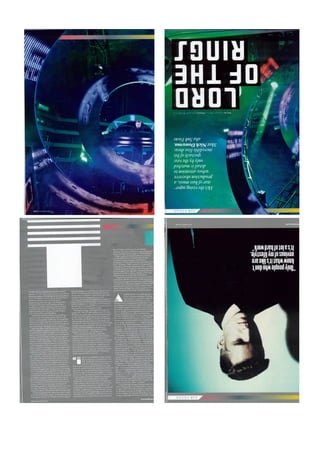
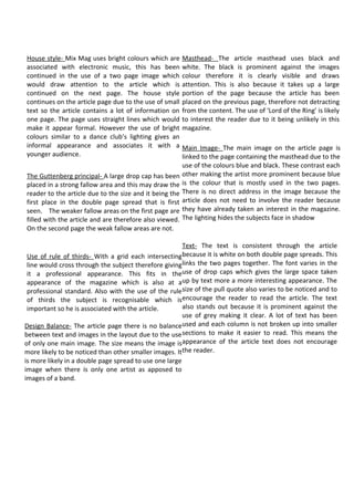
The document discusses the design elements used in a magazine article layout. It describes how the house style uses bright colors associated with electronic music. It also discusses design principles like using a large drop cap to draw the reader's eye, balancing text with a large central image, and using grids and the rule of thirds to compose images professionally. However, the dense blocks of text are difficult to read and do not fully encourage reader engagement.
The document analyzes the design elements of a two-page magazine article spread. It discusses the use of bright colors that connect the pages and relate to electronic music. A large main image spans both pages and draws attention to the featured artist. While the formal layout and professional photographs give a serious tone, informal colors and lighting appeal to a younger audience. The text size and placement of images could be improved to better encourage reading.
The document summarizes the design elements used in a magazine article spread about an electronic music artist. Key design elements include the use of bright colors associated with electronic music to draw attention to the article across two pages. A large drop cap and masthead in black and white contrast against the colorful images. While the design appears formal through straight lines and balanced layout, the bright colors give it an informal feel suited to younger audiences interested in electronic music.
The document analyzes the layout, design elements, and photographic styles of three different magazines: Clash, Loud and Quiet, and Music and Riots. Some key findings include:
- Clash uses a simplistic layout with contrasting light and dark elements. Photographs have an "older" quality.
- Loud and Quiet mixes minimalist and bold styles. It uses neutral colors with dainty text. Photographs seem to be from the 1990s.
- Music and Riots has a bolder style with flecks of images in text. It aims to inspire readers visually rather than provide information.
The document analyzes the layout, design elements, and photographic styles of three different magazines: Clash, Loud and Quiet, and Music and Riots. Some key findings include:
- Clash uses a simplistic layout with contrasting light and dark elements. Photographs have an "older" quality.
- Loud and Quiet mixes minimalist and bold styles. It uses neutral colors with dainty text. Photographs seem to be from the 1990s.
- Music and Riots has a bolder layout with advertisements. It aims more to inspire than inform readers. Photographs are often studio shots with a rustic look.
Both NME and Kerrang magazine double page spreads place the masthead in the top right corner according to Guttenberg's design principle. They use large, bold sans serif fonts to attract attention. Both feature the artist's name and article summary. The magazines use large center images filling half the page for balance. The images are high quality shots of the artist relating to their genre. NME spreads text across both pages while Kerrang groups text together. Both use columns and subheadings to structure the text. The magazines have consistent house styles matching their brands, with NME using pink and Kerrang using red, black, and white.
The color scheme uses contrasting black, white and red. The central image depicts Tupac mysteriously clasping his hands under low lighting, appearing serious yet business-
The document summarizes how the author's media product uses and develops conventions of real music magazines in its design. Specifically:
- The front cover design is based on Fantastic Man magazine but develops conventions by using a border around the central image and positioning text creatively.
- The contents page draws inspiration from layouts in The FADER and Esquire magazines, adopting designs like a rotated "Contents" text but developing it with more information.
- Throughout, the author aims for consistency in fonts, colors and image editing while keeping designs simple yet stylish, drawing from magazine conventions but adapting them for their own magazine's identity.
The document discusses three draft layouts for magazine contents pages and double page spreads. Draft 1 contents page uses blocks of color and images to showcase featured articles in a simple visual design. The double page spread uses a large central image and title to feature a celebrity interview. Draft 2 contents page focuses on pictures over text to clearly show what's included. The double page spread lines up columns of text over a full-width background image. Draft 3 contents page includes more text sections and linear organization, with the double page spread dividing the page into image sections for a photo shoot feel.
This contents page follows the color scheme and layout of the front cover. The masthead, date, and issue number are at the top in the same colors but opposite of the front cover. Article titles and page numbers are listed on the left in red with white text for contrast. A single striking greyscale image in the middle relates to the target audience. The cover stories are included to allow readers to easily find articles that interested them. Overall, the contents page provides a concise yet visually appealing listing of the magazine's contents.
The document provides details on how the student designed their music magazine to follow conventions of existing music magazines. They analyzed magazines like Q and NME to replicate elements like the masthead placement, color schemes, use of images, and layout of the cover, contents page, and double-page spread. The student aimed to create a magazine that looked mature and professional by copying proven designs from popular music publications. They made some small adjustments, like reducing the number of cover lines, to make the design unique while still drawing inspiration from industry standards.
This document discusses the student's work on creating pages for a story using InDesign's 3 column, 3x3 grid, 3x5 grid, and 4x3 grid layouts. For each layout, the student explains their design choices including placement of images, use of fonts, colors and formatting to make elements stand out and create a visually appealing yet readable page. The goal was to experiment with layouts and styles that fit the content of the story.
This document summarizes Raissa Vasconcelos' research and planning for a music magazine project. It includes details on target audience, design choices, and use of Adobe software. Reflections note the magazine cover had too much text and the masthead should be bolder. Revisions included simplifying the cover, adding more subgenres, and ensuring consistent colors across pages to link elements together. Feedback was incorporated to strengthen visual connections between the cover, contents, and double-page spread.
The document provides feedback questions for a student magazine project asking about target audience, design choices, lessons learned using Adobe Photoshop and InDesign, and areas for improvement. It also includes examples of the student's magazine cover, contents page, and double page spread and asks how they link together and achieve the goals of drawing in the reader.
The layout of the double page spread is simple yet effective. It draws the reader's attention to the large main image while also presenting the text in a balanced way. A consistent color theme of blue, black, and sepia tones is used throughout, helping to tie the design together while also making strategic use of color to highlight key elements like the text. Overall, the simple yet cohesive design successfully engages the reader with the image while also communicating the accompanying information in an accessible manner.
This document summarizes revisions made to a magazine cover design. The original design included one main image but feedback suggested adding overlapping photos to promote included posters. The revised design includes three overlapping photos on the bottom and rearranges other elements like cover lines and taglines to make the cover appear more "full" while avoiding overfilling the page. Color choices and font selections were made to appear elegant while complementing photos and appealing to both female and male audiences.
The document provides an evaluation of a school magazine cover design. It describes the design elements used on the front cover including a posed feature photograph with overlaid text, a vintage-style filter, and script fonts for the masthead and cover lines. Issues noted include the poor quality of the amateur feature photograph, an outdated design that may not appeal to students, and difficult to read fonts. The contents page continues the script style but uses a student photo and keeps the background plain white. Overall, the cover is criticized for mixing contradictory design elements and lacking a cohesive theme between the cover and contents page.
Evaluation for contents and front cover pagePariswood
The document provides an evaluation of the contents and design of a magazine cover and first few pages. Key points include:
- The masthead uses a serif font to look formal but the letters are thin and bold for modern look. A subhead is also included.
- The lead image could be improved with a lighter background to make the cover less dull.
- Cover lines use transparent black boxes to stand out against dark colors while maintaining a modern look.
- The contents page mimics the cover design but could have better pictures. Page numbers have creative treatments like circles.
- Comparable magazines like Vogue and Grazia inspired some design elements but with brighter colors. Overall, brighter
The document describes the process of creating a rock music magazine. It discusses influences from existing rock magazines like NME and how conventions from those magazines were utilized. Elements of the cover, contents page, and double page spread are described, highlighting how they appeal to the target 17-24 year old audience. The document also notes the choice of Bauer as the preferred distribution partner due to their experience with rock magazines. Software used to create the magazine, including InDesign, Photoshop, SlideShare, and WordPress are also summarized.
The document describes the process of creating a rock music magazine. It discusses choosing fonts, colors and layouts inspired by existing rock magazines like NME. Key elements included on the cover, contents page and double page spread are described to follow magazine conventions. The intended audience of 17-24 year olds is discussed. Software like InDesign, Photoshop and WordPress were used to design the magazine, with InDesign being the primary tool. The document reflects on the learning experience of understanding magazine design and production.
The document describes the process of creating a rock music magazine. It discusses influences from existing rock magazines like NME and how conventions from those magazines were implemented. Key aspects summarized include the target 17-24 year old audience, use of bold colors and fonts on the cover and contents page to attract younger readers, and inclusion of articles, biographies and images of artists to appeal to rock fans. Software used to design the magazine, like InDesign, Photoshop and WordPress are also mentioned.
The double page spread uses a typical magazine layout with a striking image on the left and article text on the right. The image is an effective medium close-up that conveys the artist's attitude and draws readers into the article. Conventions like a bold artist quote, column structure, drop caps, and introductory sentences are also used. The spread contrasts with a previous one analyzed through its color scheme and larger band photo, fitting the band's upbeat style as a new act.
The document provides details on the design and layout of a student's rock music magazine project. It includes descriptions of the cover page, contents page, and double page spread designed in InDesign. The student analyzed conventions from existing rock magazines and incorporated codes like bold colors and fonts. Feedback is also provided on the software tools used, including learning Photoshop for image editing, InDesign for layouts, and WordPress for blogging the project. The document reflects on improvements from the preliminary work and knowledge gained about magazine design conventions and software skills.
The document summarizes the contents pages of 4 music magazines: Kerrang!, NME, Classic Rock, and Q. It describes elements like the mastheads, images, color schemes, page numbers, and text used on each contents page. The mastheads stand out in color to draw the eye, and images are featured prominently in the center or along the side. Page numbers match the color of surrounding text. Together the design elements follow each magazine's distinctive color brand and make key articles easy to identify.
The document is a student's portfolio for their AS Media Studies foundation project. It includes sections on their preliminary research and planning, a draft cover page and contents page for their music magazine, photographs they took and edited for the project, example layouts they researched, and their draft and final versions of the cover page, contents page, and double-page spread interview for their magazine on the rap music genre titled "Rapster". It reflects on the feedback received and modifications made between drafts.
The document discusses the style elements used in Mix Mag magazine. The house style uses bright colors associated with electronic music. Articles continue across two pages to draw attention. Small text fits more information on each page. Bright colors and straight lines give the pages both a formal and informal feel. The masthead uses black text against colored images to be clearly visible. A large drop cap at the start of articles draws the reader's eye. The main image on one page is linked to the masthead colors on the other page. Text is kept consistent across pages to link them, while varying font sizes make the text more interesting. Images are placed using the rule of thirds for a professional look and to make the subject recognizable.
The document summarizes the design elements used in an article spread from Mix Mag magazine. It notes the use of bright colors associated with electronic music to draw attention to the article across two pages. On the article page, a large main image of the artist is used to make them prominent, along with varied text sizes, drop caps, and pull quotes to engage the reader in the dense block of text about the artist. The layout focuses attention on the main image and article through strategic placement and contrasting of visual elements against the grey background.
The document summarizes the design elements used in an article spread from Mix Mag magazine. It notes the use of bright colors associated with electronic music to draw attention to the article across two pages. On the article page, a large main image of the artist is used to make them prominent, along with varied text sizes, drop caps, and pull quotes to engage the reader in the dense block of text over both pages. The rule of thirds is applied to the main image to give it a professional appearance fitting for the magazine.
The document discusses the design elements used in a magazine article spread about an electronic music artist. Key design elements include the use of bright colors associated with electronic music, a large drop cap to draw attention to the article text, and consistent white text on both pages to link them together. The main image takes up a large portion of one page to make the artist prominent and recognizable in association with the article. While the design uses professional techniques like the rule of thirds, the dense blocks of text without breaks may not optimally encourage readers.
The double page spread uses a typical magazine layout with a striking image on the left and article text on the right. The image is an effective medium close-up that conveys the artist's attitude. The article uses conventions like a bold artist quote, columns, a drop cap, and leading sentences to introduce the piece. The spread also includes a caption for context and bleeds the image across both pages to emphasize it.
The document analyzes the layout and design of several magazine double-page spreads. It notes that the first spread uses a black and white color scheme with gold accents to create an edgy look that matches the article's topic. The main text is situated in a single column for a neat, professional appearance. Images and text are also well-balanced across the two pages. The second spread effectively separates text into columns and uses different fonts and sizes to guide the reader. However, the third spread is less effective with a wide image, small hard-to-read text in multiple columns, and a lack of energy. Based on this analysis, the conclusion is that the first two spreads are better designed with readable text sizes, column
The document analyzes the design of a magazine contents page. It discusses four key aspects:
1) Imagery - The large main image uses dark lighting and costumes to represent the rock genre, while secondary images use brighter lighting to seem less intimidating.
2) Design Principle - The main image is in the primary optical area to get attention, while the masthead and articles are in other areas readers are likely to view.
3) House Style - The color scheme, fonts, and three column layout continue the magazine's style and make the contents easy to read and recognize.
4) Design Balance - The page is evenly balanced with images and text, though there is no clear divide between the
The document summarizes the layout, use of space, fonts, colors, images, and page numbers on a magazine double page spread. It uses a 2-column grid layout with the left column featuring a large main image and the right column containing the headline, subheading, and article in equally sized columns. The layout utilizes nearly all the available space to appear busy and engage the reader. Font sizes are used to distinguish the bold headline from the standard-sized subheading and article text. A variety of colors are used without an apparent scheme, though red stands out on the main image. A single large main image is positioned as important as the article, with smaller supplemental images on the right. The page numbers are omitted as only
The document analyzes the design of a magazine contents page based on several principles:
- The large image of Simon Pegg in the top left draws attention to a main article and reinforces a lighthearted tone through its depiction of him riding a bicycle and drinking tea.
- Placement of articles follows the Guttenberg Design Principle, with new articles in prominent areas and regular monthly features in a less noticed terminal area.
- Colors and fonts continue the magazine's house style from the cover to depict its rock genre and be recognizable to readers.
- While not perfectly balanced, the large image and greater text on the right side provide a reasonable informal balance to engage the reader.
The document analyzes the design elements of four different magazine covers and contents pages. Some key highlights:
- Magazines use contrasting light and dark colors to make text and images stand out. White text on dark backgrounds is a common technique.
- Layouts tend to be simplistic with minimal text and lots of white space. Images are often medium or close-up shots with a retro, rustic quality.
- While text may not be bold, placement over dark areas of images helps visibility. Consistent color schemes and design elements tie covers to interior pages.
- Double page spreads sometimes juxtapose styles but maintain connections through shared colors, fonts, or photo themes between facing pages
The document provides an analysis of the design elements of several magazine covers and contents pages, including Clash, Loud and Quiet, and Music & Riots magazines. Some key highlights noted across the magazines include:
- Using white text on darker backgrounds to make the text stand out
- Employing close-up or medium close-up photographs
- Balancing neat layouts with more rustic, older-looking photographs
- Favoring symmetrical and minimalist designs with ample white space
- Incorporating similar color schemes and design elements across pages
- Not overly relying on bold text or images to convey information
The document analyzes and summarizes several pages from student magazines, including the main cover, content pages, and double pages. Key aspects noted include placement of the masthead, cover lines, images, titles, text, and use of color to make elements stand out. Different magazines employed varying layouts, with some content pages using lists and others a unique presentation without lists. Images were generally used well to make pages more attractive and interesting to readers.
This document discusses several double page spreads from music magazines as examples and inspiration for the student's own article layout. It analyzes the layout, colors, images and text used in spreads from magazines like NME and Q. The student likes how some spreads use simple color palettes and spill images over both pages. Overall, the spreads demonstrate conventions the student wants to incorporate like large central images, headline text and multiple columns to structure the article text.
This document analyzes the layout and design conventions used in magazine articles promoting documentaries. It notes several techniques used effectively, such as placing the main article prominently on the left page with a large illustrative image. It also discusses font choices, use of bolding or drop caps for emphasis, placement of additional related articles, and use of color schemes and image placement to set the appropriate tone for the content. The document considers how these different conventions could be adapted or modified in its own magazine spread promoting a documentary aimed at teenagers and young adults.
This document analyzes the layout and design elements of a magazine's contents page. It notes that more images and colors are used than on the front cover. Headings advertise the magazine's articles at different heading levels. Formal language is used throughout to convey a serious tone. Page numbers allow readers to find their preferred articles. Key elements like the date and issue number are missing, which could confuse the audience. While the masthead matches the front cover, its placement covers part of an image and the fonts used are dull. The inconsistent colors and fonts may turn away the audience.
The document provides a critique of the masthead, typography, layout, and photographs used across three magazine pages. For the first page, the masthead could use a background image and the text color could be adjusted for better readability. The second page has a readable text color scheme but images that are too dark. The third page has large titles that distract from the text below and an underexposed main image, with photographs that do not complement the overall page.
The document analyzes the codes and conventions used in contents pages and double page spreads across four magazines: NME, Q, Mojo, and The Fly. It describes common elements like logos, issue dates, images, titles, and fonts used and how they guide the reader. However, it also notes variations between the magazines, such as Clash using a double-page contents spread instead of a single page and splitting pages into multiple columns. The goal of these design choices is to effectively organize information and draw readers in using visual elements like prominent images and titles.
The document provides an analysis of the cover of Kerrang magazine issue 1536 from September 27, 2014. It examines the main image on the cover, which depicts a musician looking directly at the camera. Several aspects of the image are analyzed, including the lighting, background, and body language displayed. The document also summarizes the layout of the cover, including the prominent placement of the main headline in bold text above the main image, the use of additional smaller images, and how the text and images are positioned around the page to draw attention to the central focal point.
A2 Advanced Portfolio Production Diary 2013-2014kruane95
This document outlines the 14-week production process of creating a short film for an advanced media studies course. It details the weekly progress, including choosing to create a black and white featurette, drafting a film poster, researching other shorts, writing a script, filming on location despite challenges with actors and equipment, and ongoing editing. The goal was to finish interviews, complete the video, and work on the evaluation. Contingency plans were made for potential issues like rescheduling filming.
The poster uses a dark blue-green colour scheme to create an eerie atmosphere. A cloaked figure and dark house in the background instantly associate the poster with the horror genre. The central image features a man with a serious, scared expression highlighted by lighting. Capitalized text is used for the film title and actor's name to draw attention and be read quickly. Elements like the title design, rough lettering, and glowing effect relate it to horror without distracting from the important visual elements.
The document summarizes feedback received on a video featurette created to promote a fictional film called "The Masterpiece". Responses were gathered through questions posted on a private Facebook group. Overall, feedback was positive. Comments praised the contrasting visual styles and "quirky" set design. Viewers enjoyed learning about the fictional film and actors through interviews. While no specific target audience was identified, interest came from those interested in film and younger viewers. All agreed the video had elements of comedy, matching the original research labeling comedy as the most popular genre. The fragmented narrative achieved the goal of enticing viewers to learn more. Suggested improvements included a less abrupt ending and extending an actor interview.
The media product uses and challenges some conventions of documentary-style "making of" films. It conforms to conventions like using locations related to the fictional film's story and time period, and including props and costumes that provide context. However, it challenges conventions by having the film discussed be fictional rather than real, and by mixing timeline shots without a clear narrative. Interviews are included to give background as in real "making of" films but the purpose is partly comedic since the featured film is not real.
A Facebook group was created to get feedback on a short film draft. The group allowed people to view the draft video and respond to questions about it posted on the same page. Questions about the short film were posted to the group and responses from members are shown below.
The document analyzes the results of a questionnaire given to participants about what they would want to see in a short film. It finds that:
1) Respondents ranged widely in age, so the film cannot be directed at a specific age group. Younger people made up the largest group, so the film may include aspects they suggested.
2) More females responded than males, but the film should appeal to both to get the largest audience. Responses will reflect the female perspective more.
3) All watched films occasionally or more, so they would be interested in a "featurette" learning more about a movie.
4) Comedy was the most commonly watched genre, so the film should
The document summarizes a short film production called "The Masterpiece" that will combine elements of silent films from the 1920s with a featurette documenting the production. The silent film is a comedy/mystery about the theft of a painting. The featurette will include interviews and behind-the-scenes footage shot during production. Various film techniques and conventions from genres like documentaries, parodies, and dramas will be used to bring humor to both the silent film and featurette elements.
The document summarizes interview scenes from the film production of "The Masterpiece". It introduces the flamboyant director Paul Watson and the struggling producer Harrison Holloway. It also features interviews with the eccentric cast members who describe their complex characters in grandiose terms or admit to lack of preparation. Holloway comments that Paul was the biggest problem and the amateur production had many issues. In the end, most of the cast and crew claim the film as their own masterpiece.
The layout of the film review uses straight lines and a large central image to conform to magazine styles, though the volume of dense text may discourage some readers. While the title does not stand out, the review provides the key details about the film in a marked section. A pull quote from the review praising the film's insight into humanity's pulse encourages readers to engage with the entertaining and positive tone of the overall analysis.
Film review analysis no strings attached & the ritekruane95
This document analyzes the layout and writing of a film review that discusses two movies, No Strings Attached and The Rite. The layout uses columns and straight lines to present information clearly without appearing cluttered. Important elements like the title are placed in prominent positions following design principles. The writing covers two films in an unconventional short format, including key details about release date, rating, director, cast, run time and plot summary for each that readers expect in a movie review.
The layout of the film review is informal with angled text and images, and wide columns without aligned text. While an large image is used to draw attention, the text is given more importance by being on the left. A positive quote is also included to encourage readers. The writing style is informal and engaging for readers, using inclusive phrasing and questions to involve readers in thinking deeper about the points made. However, key details about the movie's plot, rating, and release date are not immediately provided in a separate box.
The black and white color scheme of the movie poster matches the film and indicates it will be a black and white silent film. The only color is red, which represents love and romance as the genre. Images on the poster clearly show the romantic genre through the poses of the actors facing each other. Their faces are centered using the rule of thirds to draw the audience's eyes. Stylistic elements like 1920s clothing and exaggerated emotions are iconic of silent films and communicate the film's intent to represent that era. The simple and italic title fonts create contrast, with red drawing attention to the title as the only color. Production company logos are lined along the bottom as usual convention.
The poster uses dark colours that conform to mythical adventure movies and shades of green linked to the beanstalk icon. The giant is depicted as large compared to the main character in the central image. The film title uses 3D effects to draw attention after viewing the main image. Key icons like the beanstalk and giant will be associated with the film based on the Jack and the Beanstalk story.
The document analyzes the color scheme, imagery, text design, and other elements of a movie poster for a horror film. The color scheme is dark with a blue-green hue to create an eerie atmosphere. The central image features a cloaked figure and dark house in the background to associate it with the horror genre. The title uses the same blue-green color and glowing effect to stand out and draw the eye, further connecting it to horror. Elements are arranged from most to least prominent to guide the viewer's attention according to conventions.
This photographer increased the brightness and contrast of images of a band member to make her darker clothing stand out more against the background for the album cover. The original photos used a plain white background, so editing the images allowed a similar effect. The edited image will be used for the album cover, so it was made more striking to attract attention.
The document summarizes feedback from a focus group about a music magazine prototype targeted towards people aged 16-25 who enjoy indie and rock music. The focus group, which consisted of people from the target audience, provided positive feedback on the content, images, and design of the magazine. Specifically, they responded positively to the casual writing style, choice of bands featured, high quality images, and the striking color scheme and layout of the front cover. This suggests the prototype successfully appealed to and would attract the intended target audience.
This document discusses how different social groups are represented in a music magazine. It notes that the magazine does not include stereotypes of any social class, as the band members are shown wearing regular, well-kept clothing not associated with any particular class. While the magazine features mainly young adults, it takes a formal visual approach rather than a stereotypical busy style. It also features a female indie rock band, challenging stereotypes of gender in music genres. In general, the magazine aims to represent its subjects positively without negative portrayals of gender or class.
This magazine represents several social groups through the images and articles. The band featured are shown wearing regular clothes that do not align with stereotypes of social class. Both young adults and a range of genders are featured in a neutral, non-stereotypical way. The magazine avoids representing any group negatively through its choice of formal, straightforward visual style and mix of male and female artists.
The document discusses the design elements used in a magazine article spread. It describes how the magazine uses bright colors associated with electronic music. It also discusses specific design choices like the masthead in black and white to stand out, a large drop cap to draw the reader's eye, and a main image linked between pages through color usage. However, it notes the text layout does not encourage reading with large blocks and varying column sizes.
2. House style- Mix Mag uses bright colours which are Masthead- The article masthead uses black and
associated with electronic music, this has been white. The black is prominent against the images
continued in the use of a two page image which colour therefore it is clearly visible and draws
would draw attention to the article which is attention. This is also because it takes up a large
continued on the next page. The house style portion of the page because the article has been
continues on the article page due to the use of small placed on the previous page, therefore not detracting
text so the article contains a lot of information on from the content. The use of ‘Lord of the Ring’ is likely
one page. The page uses straight lines which would to interest the reader due to it being unlikely in this
make it appear formal. However the use of bright magazine.
colours similar to a dance club’s lighting gives an
informal appearance and associates it with a Main Image- The main image on the article page is
younger audience. linked to the page containing the masthead due to the
use of the colours blue and black. These contrast each
The Guttenberg principal- A large drop cap has been other making the artist more prominent because blue
placed in a strong fallow area and this may draw the is the colour that is mostly used in the two pages.
reader to the article due to the size and it being the There is no direct address in the image because the
first place in the double page spread that is first article does not need to involve the reader because
seen. The weaker fallow areas on the first page are they have already taken an interest in the magazine.
filled with the article and are therefore also viewed. The lighting hides the subjects face in shadow
On the second page the weak fallow areas are not.
Text- The text is consistent through the article
Use of rule of thirds- With a grid each intersecting because it is white on both double page spreads. This
line would cross through the subject therefore giving links the two pages together. The font varies in the
it a professional appearance. This fits in theuse of drop caps which gives the large space taken
appearance of the magazine which is also at aup by text more a more interesting appearance. The
professional standard. Also with the use of the rule size of the pull quote also varies to be noticed and to
of thirds the subject is recognisable which isencourage the reader to read the article. The text
important so he is associated with the article. also stands out because it is prominent against the
use of grey making it clear. A lot of text has been
Design Balance- The article page there is no balance used and each column is not broken up into smaller
between text and images in the layout due to the use sections to make it easier to read. This means the
of only one main image. The size means the image is appearance of the article text does not encourage
more likely to be noticed than other smaller images. It the reader.
is more likely in a double page spread to use one large
image when there is only one artist as apposed to
images of a band.
3. House style- Mix Mag uses bright colours which are Masthead- The article masthead uses black and
associated with electronic music, this has been white. The black is prominent against the images
continued in the use of a two page image which colour therefore it is clearly visible and draws
would draw attention to the article which is attention. This is also because it takes up a large
continued on the next page. The house style portion of the page because the article has been
continues on the article page due to the use of small placed on the previous page, therefore not detracting
text so the article contains a lot of information on from the content. The use of ‘Lord of the Ring’ is likely
one page. The page uses straight lines which would to interest the reader due to it being unlikely in this
make it appear formal. However the use of bright magazine.
colours similar to a dance club’s lighting gives an
informal appearance and associates it with a Main Image- The main image on the article page is
younger audience. linked to the page containing the masthead due to the
use of the colours blue and black. These contrast each
The Guttenberg principal- A large drop cap has been other making the artist more prominent because blue
placed in a strong fallow area and this may draw the is the colour that is mostly used in the two pages.
reader to the article due to the size and it being the There is no direct address in the image because the
first place in the double page spread that is first article does not need to involve the reader because
seen. The weaker fallow areas on the first page are they have already taken an interest in the magazine.
filled with the article and are therefore also viewed. The lighting hides the subjects face in shadow
On the second page the weak fallow areas are not.
Text- The text is consistent through the article
Use of rule of thirds- With a grid each intersecting because it is white on both double page spreads. This
line would cross through the subject therefore giving links the two pages together. The font varies in the
it a professional appearance. This fits in theuse of drop caps which gives the large space taken
appearance of the magazine which is also at aup by text more a more interesting appearance. The
professional standard. Also with the use of the rule size of the pull quote also varies to be noticed and to
of thirds the subject is recognisable which isencourage the reader to read the article. The text
important so he is associated with the article. also stands out because it is prominent against the
use of grey making it clear. A lot of text has been
Design Balance- The article page there is no balance used and each column is not broken up into smaller
between text and images in the layout due to the use sections to make it easier to read. This means the
of only one main image. The size means the image is appearance of the article text does not encourage
more likely to be noticed than other smaller images. It the reader.
is more likely in a double page spread to use one large
image when there is only one artist as apposed to
images of a band.
4. House style- Mix Mag uses bright colours which are Masthead- The article masthead uses black and
associated with electronic music, this has been white. The black is prominent against the images
continued in the use of a two page image which colour therefore it is clearly visible and draws
would draw attention to the article which is attention. This is also because it takes up a large
continued on the next page. The house style portion of the page because the article has been
continues on the article page due to the use of small placed on the previous page, therefore not detracting
text so the article contains a lot of information on from the content. The use of ‘Lord of the Ring’ is likely
one page. The page uses straight lines which would to interest the reader due to it being unlikely in this
make it appear formal. However the use of bright magazine.
colours similar to a dance club’s lighting gives an
informal appearance and associates it with a Main Image- The main image on the article page is
younger audience. linked to the page containing the masthead due to the
use of the colours blue and black. These contrast each
The Guttenberg principal- A large drop cap has been other making the artist more prominent because blue
placed in a strong fallow area and this may draw the is the colour that is mostly used in the two pages.
reader to the article due to the size and it being the There is no direct address in the image because the
first place in the double page spread that is first article does not need to involve the reader because
seen. The weaker fallow areas on the first page are they have already taken an interest in the magazine.
filled with the article and are therefore also viewed. The lighting hides the subjects face in shadow
On the second page the weak fallow areas are not.
Text- The text is consistent through the article
Use of rule of thirds- With a grid each intersecting because it is white on both double page spreads. This
line would cross through the subject therefore giving links the two pages together. The font varies in the
it a professional appearance. This fits in theuse of drop caps which gives the large space taken
appearance of the magazine which is also at aup by text more a more interesting appearance. The
professional standard. Also with the use of the rule size of the pull quote also varies to be noticed and to
of thirds the subject is recognisable which isencourage the reader to read the article. The text
important so he is associated with the article. also stands out because it is prominent against the
use of grey making it clear. A lot of text has been
Design Balance- The article page there is no balance used and each column is not broken up into smaller
between text and images in the layout due to the use sections to make it easier to read. This means the
of only one main image. The size means the image is appearance of the article text does not encourage
more likely to be noticed than other smaller images. It the reader.
is more likely in a double page spread to use one large
image when there is only one artist as apposed to
images of a band.
5. House style- Mix Mag uses bright colours which are Masthead- The article masthead uses black and
associated with electronic music, this has been white. The black is prominent against the images
continued in the use of a two page image which colour therefore it is clearly visible and draws
would draw attention to the article which is attention. This is also because it takes up a large
continued on the next page. The house style portion of the page because the article has been
continues on the article page due to the use of small placed on the previous page, therefore not detracting
text so the article contains a lot of information on from the content. The use of ‘Lord of the Ring’ is likely
one page. The page uses straight lines which would to interest the reader due to it being unlikely in this
make it appear formal. However the use of bright magazine.
colours similar to a dance club’s lighting gives an
informal appearance and associates it with a Main Image- The main image on the article page is
younger audience. linked to the page containing the masthead due to the
use of the colours blue and black. These contrast each
The Guttenberg principal- A large drop cap has been other making the artist more prominent because blue
placed in a strong fallow area and this may draw the is the colour that is mostly used in the two pages.
reader to the article due to the size and it being the There is no direct address in the image because the
first place in the double page spread that is first article does not need to involve the reader because
seen. The weaker fallow areas on the first page are they have already taken an interest in the magazine.
filled with the article and are therefore also viewed. The lighting hides the subjects face in shadow
On the second page the weak fallow areas are not.
Text- The text is consistent through the article
Use of rule of thirds- With a grid each intersecting because it is white on both double page spreads. This
line would cross through the subject therefore giving links the two pages together. The font varies in the
it a professional appearance. This fits in theuse of drop caps which gives the large space taken
appearance of the magazine which is also at aup by text more a more interesting appearance. The
professional standard. Also with the use of the rule size of the pull quote also varies to be noticed and to
of thirds the subject is recognisable which isencourage the reader to read the article. The text
important so he is associated with the article. also stands out because it is prominent against the
use of grey making it clear. A lot of text has been
Design Balance- The article page there is no balance used and each column is not broken up into smaller
between text and images in the layout due to the use sections to make it easier to read. This means the
of only one main image. The size means the image is appearance of the article text does not encourage
more likely to be noticed than other smaller images. It the reader.
is more likely in a double page spread to use one large
image when there is only one artist as apposed to
images of a band.