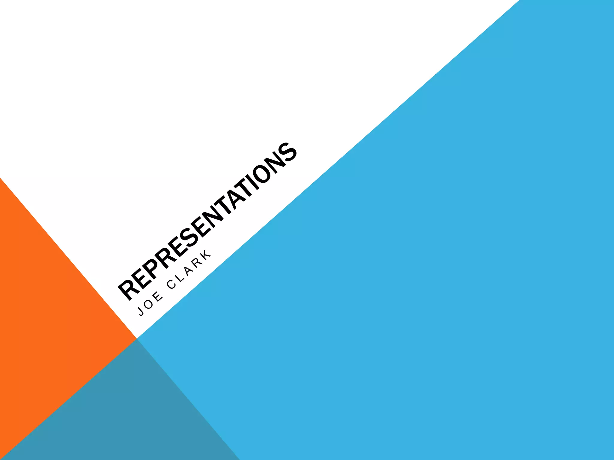
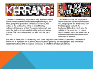
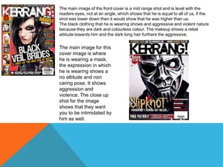
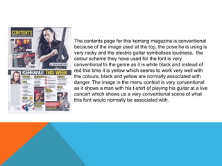
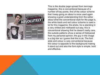
The document discusses various aspects of the design of the Kerrang magazine front cover and contents page that aim to represent the magazine's target audience. The font style uses lines and the colors white, red, and black to symbolize loudness and stand out from the background. Images on the cover and contents page also aim to depict rebellion, aggression, and a rock music lifestyle through poses, clothing, makeup and close-up shots. Across the different elements, the designs use consistent color schemes and styles that are conventional and representative of the genre to convey their intended message to readers.