More Related Content
Similar to Olly murs magazine advert
Similar to Olly murs magazine advert (20)
More from JESUSHASRISEN (20)
Olly murs magazine advert
- 1. ©
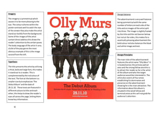
Typefaces
The title presentsthe artistbyutilising
a thick,boldand large font, thismakes
it standout to a reader.This is
complementedbythe redcolourof
the text.The fontat the bottomisa
smallersize butemphasizes‘The
DebutAlbum’ andthe date of
29.11.10. These textsare featuredin
differentcolourstotitle andeach
other,thishelpstodraw the reader’s
eyesall acrossthe page,lettingthem
knowkeyinformation.
DesignPrinciples
The main title of the advertisement
featuresthe artistname “OllyMurs” it
islocatedacross the primaryoptical
area and the strongfallowareathisis
to attract the readeras he isthe artist
of the albumandwho the target
audience wouldbe interestedin.The
artistalso coversall fourareas
establishinghisdominance and
presence onthe advertisement
showinghe isthe mainattraction.The
informationaboutthe albumis
situatedinthe weakfallowand
terminal areasasthis will notgrabthe
audience’sattention.
Imagery
The imageryissymmetrical which
causesit to be more pleasingtothe
eye.The colourscheme withinthe
postercontrastswell tocatch the eye
of the viewertheyalsomake the artist
standout boldlyfromthe background.
Some of the imagesof the artist
containdirectaddressthisdrawsthe
reader’sattentiontothe certainposes.
The body language of the artist it very
cliché of the pop genre the most
obviousexample of thisisthe image
secondfromthe left.
Designbalance
The advertisementisverywell balance
beingsymmetrical withthe same
numberof lettersoneachside of the
title andsix imagesof the artistsplit
intothree. The image isslightlyframed
by the title andthe red bannerbelow
but notat the sides, thismakesfora
asceticallypleasingadvertisementthe
boldcolourredalso balancesthe black
and white image andtext.