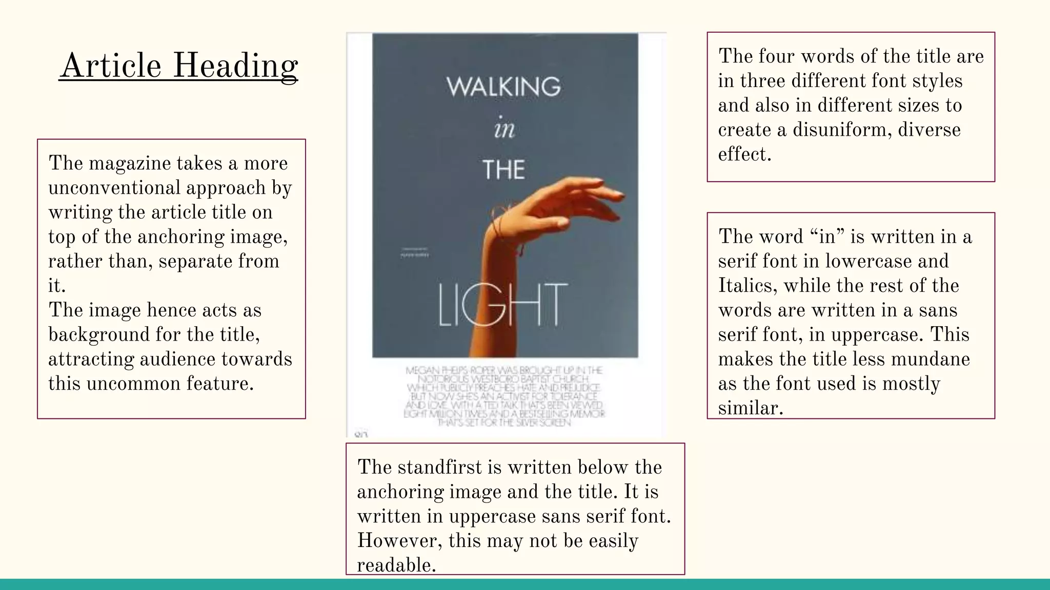
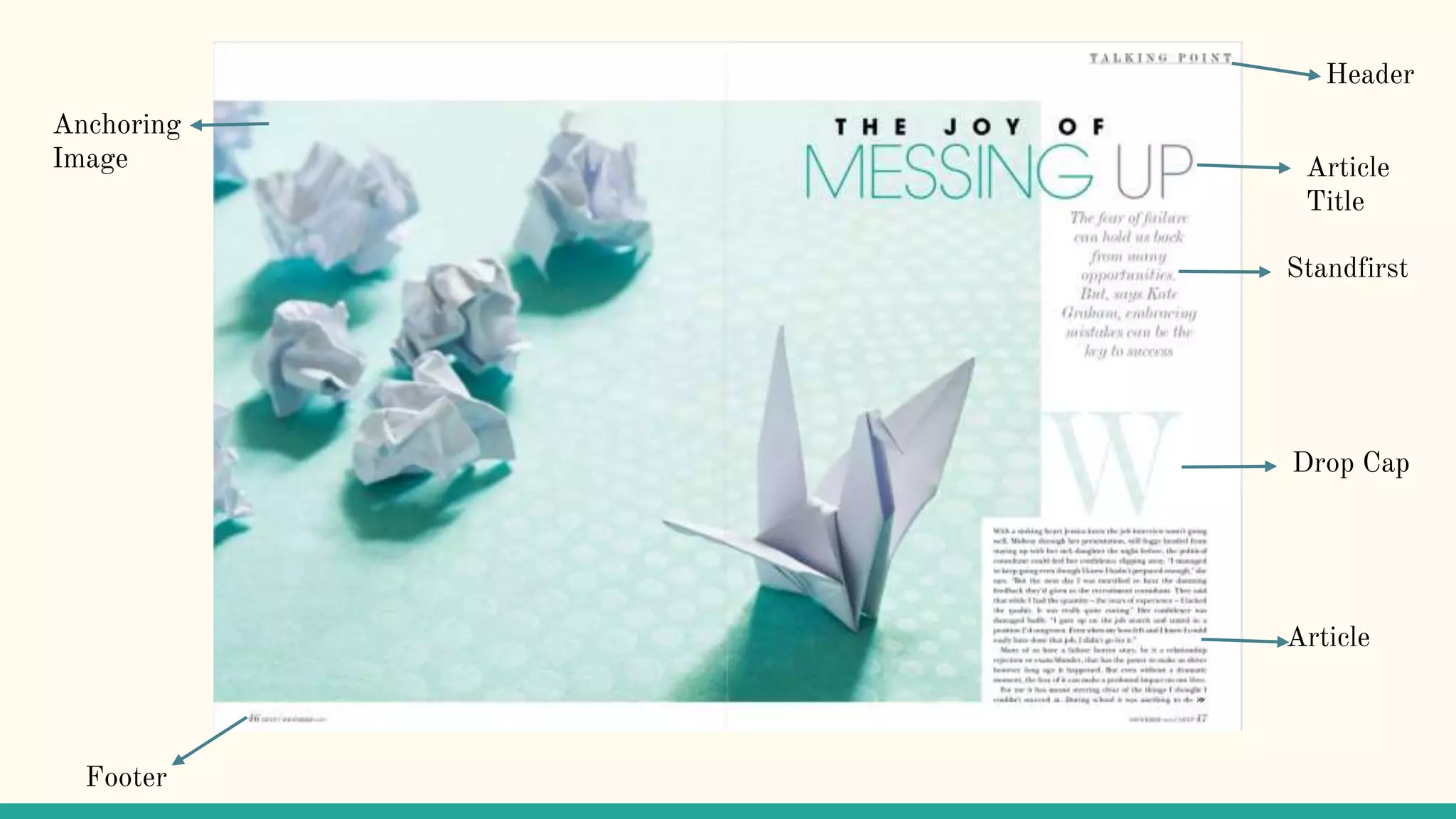
The document describes different design elements used in magazine layouts, including:
- Article headings are written in uppercase in a prominent font to clearly identify the title. Standfirsts below provide a brief description in a smaller, easier to read font.
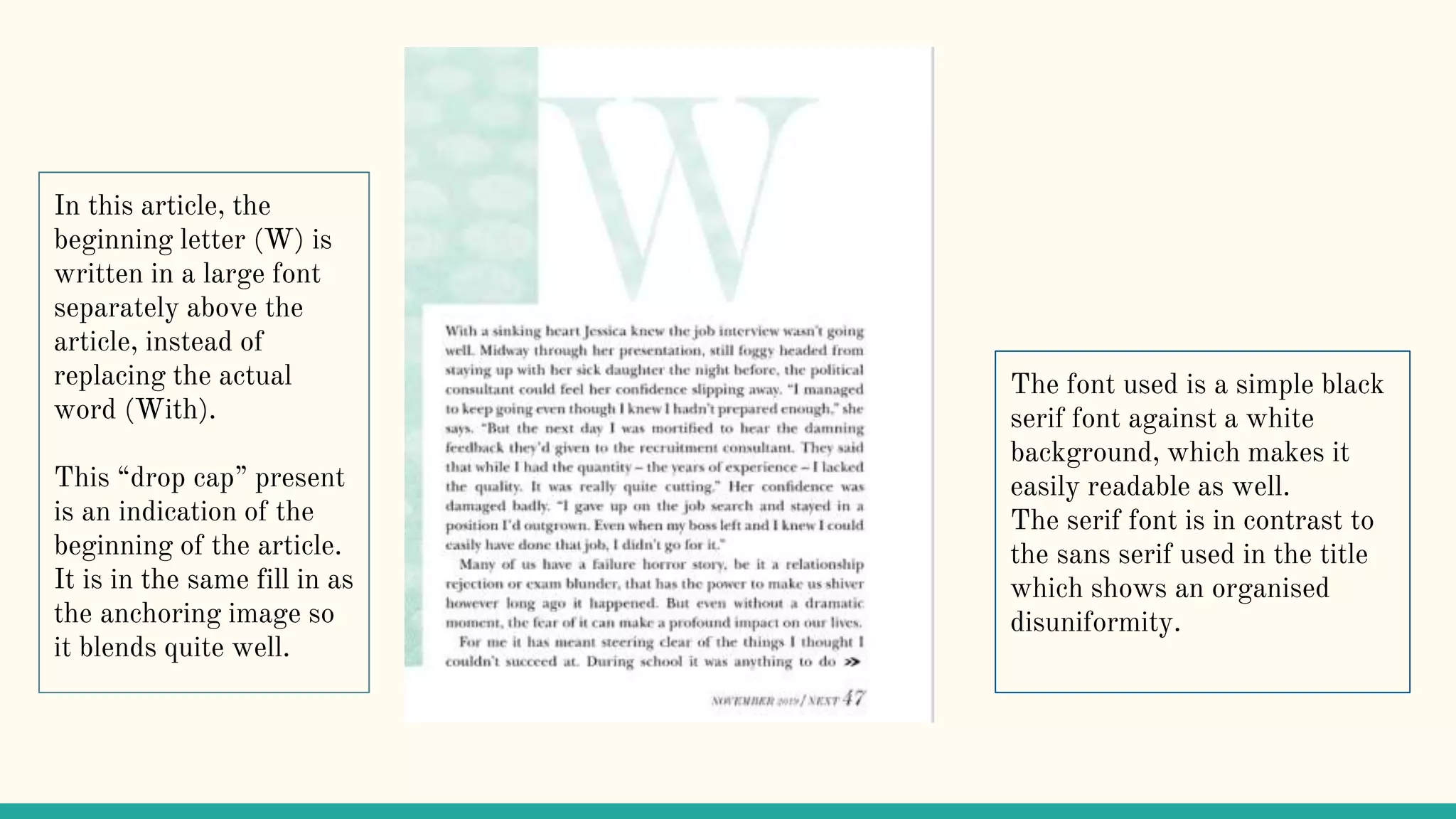
- Body text is formatted into multiple columns for improved readability. Serif fonts are commonly used with a smaller size for the body compared to the title.
- Anchoring images relate to the article topic and take up significant space to highlight their importance. Credits are provided for images and quotes.
- Variations in formatting elements like font, size, style and color are used to make sections like titles and drop caps more distinctive without a uniform,


![Reading Techniques [Autosaved].pptxReading Techniques [Autosaved].pptx](https://cdn.slidesharecdn.com/ss_thumbnails/readingtechniquesautosaved-251211193055-b8821f9d-thumbnail.jpg?width=640&height=640&fit=bounds)


