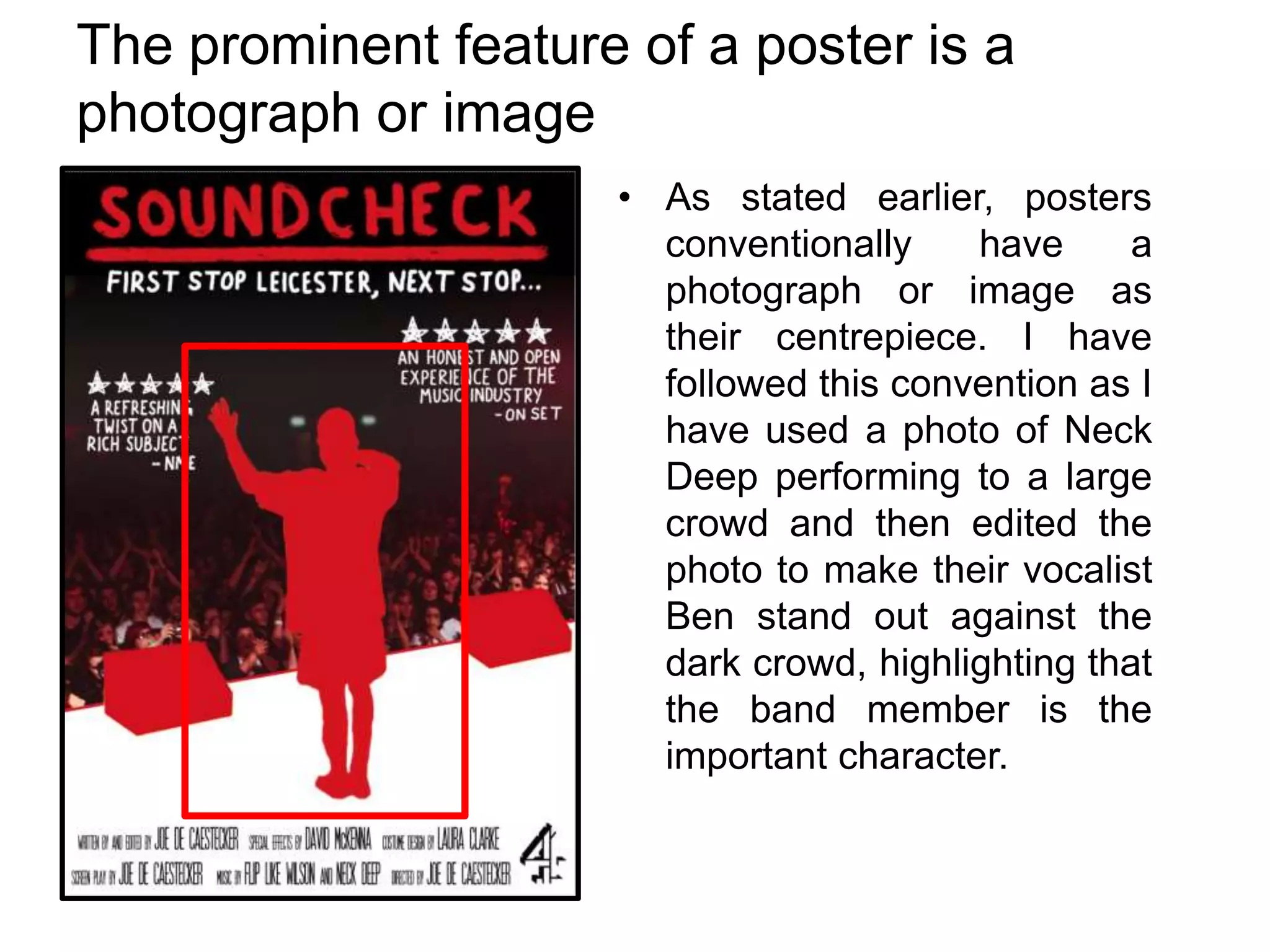
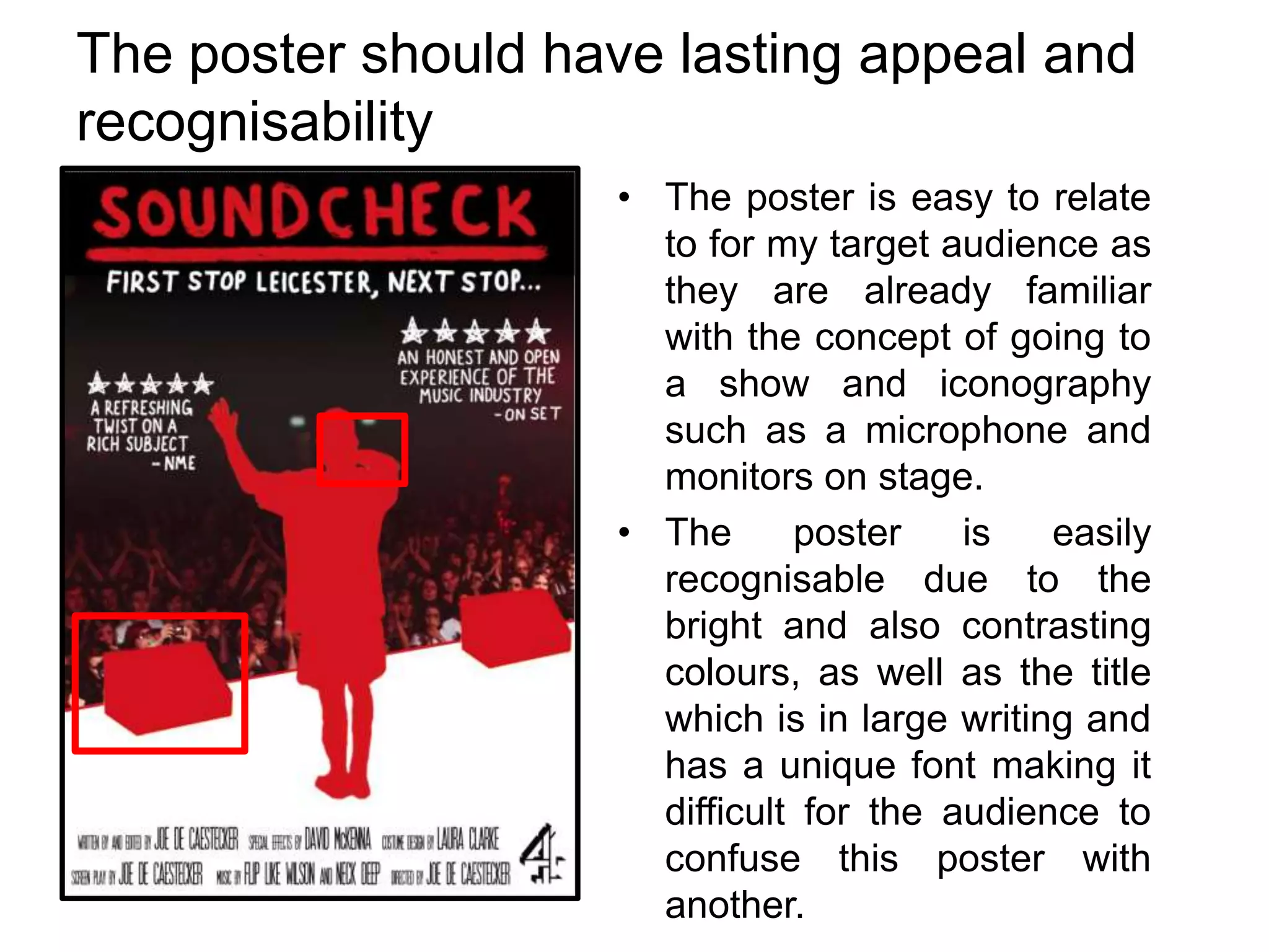
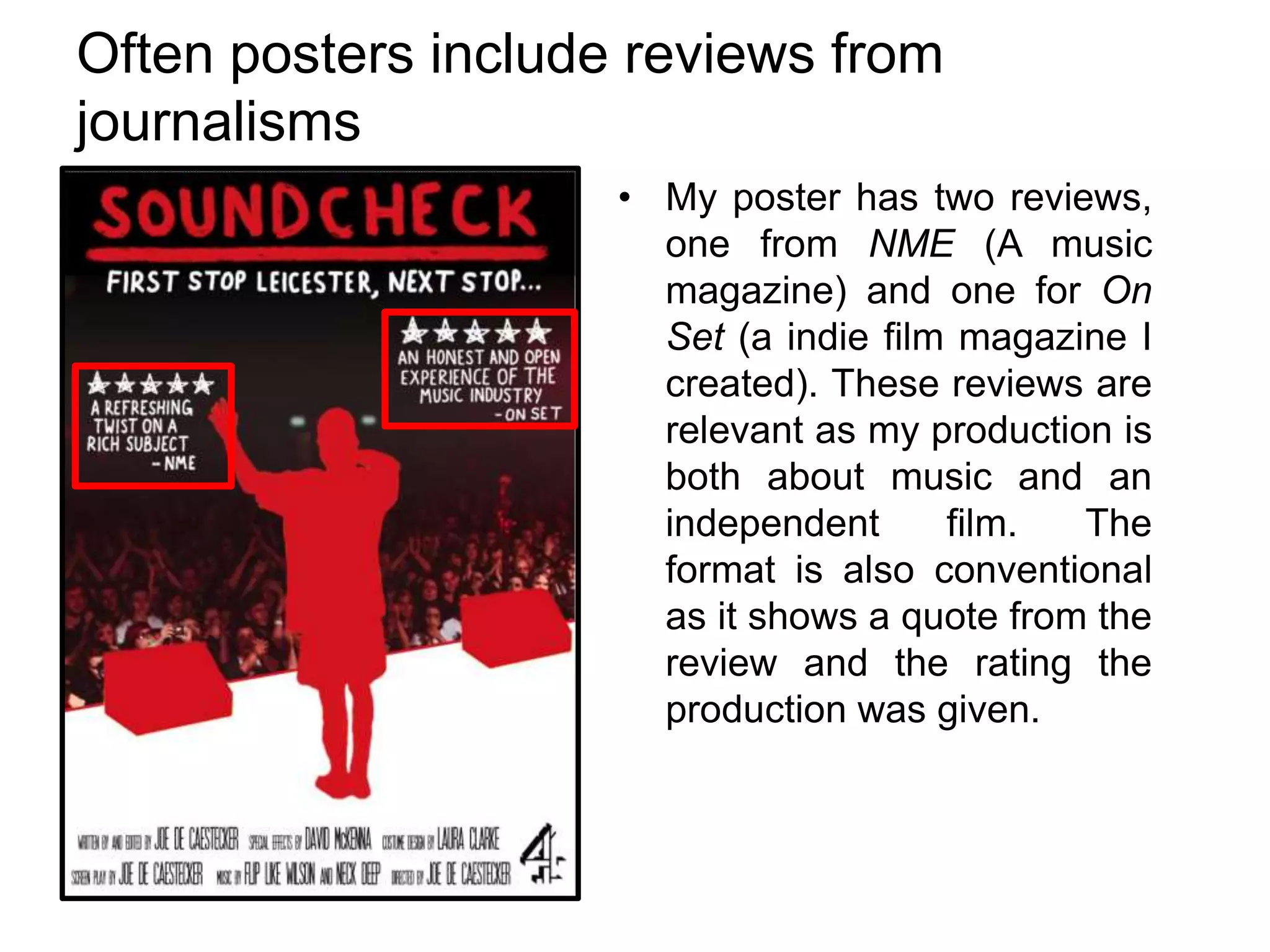
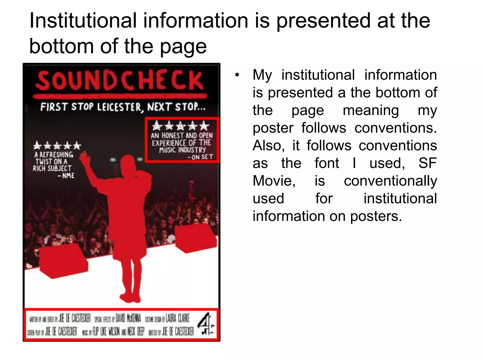
Comparing my poster to
conventional posters
Conventions of Film Posters
• The prominent feature of a poster is a photograph or image.
• The chosen typography can be easily recognised and is
suited not only to the theme of the poster but also the
production.
• The poster should have lasting appeal and recognisability
(e.g. iconic posters such as those for Pulp Fiction and Star
Wars)
• Often posters include reviews from journalisms such as
newspapers or magazines.
• Institutional information (director, producer and those who
worked on the film) is presented at the bottom of the page.
The prominent feature of a poster is a
photograph or image
• As stated earlier, posters
conventionally
have
a
photograph or image as
their centrepiece. I have
followed this convention as I
have used a photo of Neck
Deep performing to a large
crowd and then edited the
photo to make their vocalist
Ben stand out against the
dark crowd, highlighting that
the band member is the
important character.
The chosen typography can be easily
recognised
• I created the typography on
the top half of the poster
myself and wanted to
connote a DIY feel as it
looks as if it has been
written in paint. As I created
it myself, it is in use no
where else and therefore
can only be associated with
my production.
• The text used for the
institutional information at
the bottom is known as ‘SF
Movie’ and is conventionally
used as the font for
institutional information
The poster should have lasting appeal and
recognisability
• The poster is easy to relate
to for my target audience as
they are already familiar
with the concept of going to
a show and iconography
such as a microphone and
monitors on stage.
• The
poster
is
easily
recognisable due to the
bright and also contrasting
colours, as well as the title
which is in large writing and
has a unique font making it
difficult for the audience to
confuse this poster with
another.
Often posters include reviews from
journalisms
• My poster has two reviews,
one from NME (A music
magazine) and one for On
Set (a indie film magazine I
created). These reviews are
relevant as my production is
both about music and an
independent
film.
The
format is also conventional
as it shows a quote from the
review and the rating the
production was given.
Institutional information is presented at the
bottom of the page
• My institutional information
is presented a the bottom of
the page meaning my
poster follows conventions.
Also, it follows conventions
as the font I used, SF
Movie, is conventionally
used
for
institutional
information on posters.

Comparing my poster to conventional posters

  • 1.
    Comparing my posterto conventional posters
  • 2.
    Conventions of FilmPosters • The prominent feature of a poster is a photograph or image. • The chosen typography can be easily recognised and is suited not only to the theme of the poster but also the production. • The poster should have lasting appeal and recognisability (e.g. iconic posters such as those for Pulp Fiction and Star Wars) • Often posters include reviews from journalisms such as newspapers or magazines. • Institutional information (director, producer and those who worked on the film) is presented at the bottom of the page.
  • 3.
    The prominent featureof a poster is a photograph or image • As stated earlier, posters conventionally have a photograph or image as their centrepiece. I have followed this convention as I have used a photo of Neck Deep performing to a large crowd and then edited the photo to make their vocalist Ben stand out against the dark crowd, highlighting that the band member is the important character.
  • 4.
    The chosen typographycan be easily recognised • I created the typography on the top half of the poster myself and wanted to connote a DIY feel as it looks as if it has been written in paint. As I created it myself, it is in use no where else and therefore can only be associated with my production. • The text used for the institutional information at the bottom is known as ‘SF Movie’ and is conventionally used as the font for institutional information
  • 5.
    The poster shouldhave lasting appeal and recognisability • The poster is easy to relate to for my target audience as they are already familiar with the concept of going to a show and iconography such as a microphone and monitors on stage. • The poster is easily recognisable due to the bright and also contrasting colours, as well as the title which is in large writing and has a unique font making it difficult for the audience to confuse this poster with another.
  • 6.
    Often posters includereviews from journalisms • My poster has two reviews, one from NME (A music magazine) and one for On Set (a indie film magazine I created). These reviews are relevant as my production is both about music and an independent film. The format is also conventional as it shows a quote from the review and the rating the production was given.
  • 7.
    Institutional information ispresented at the bottom of the page • My institutional information is presented a the bottom of the page meaning my poster follows conventions. Also, it follows conventions as the font I used, SF Movie, is conventionally used for institutional information on posters.