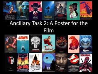
This document provides information about codes and conventions for movie posters, including key elements such as graphics, title, tagline, cast/directors, credits/companies. It discusses conventions like being eye-catching and defining the genre. Research was done on poster genres and target audiences. Composition techniques are described like grid layout, rule of thirds, and Z-layout. A photographic moodboard is presented with the top 3 photos analyzed for their suitability to a post-apocalyptic genre.
Rachel Baker's A2 Media Evaluation, South Essex CollegeRachelBaker1996
My A2 media evaluation addressing the questions:
1. In what ways does your media product use, develop or challenge forms and conventions of real media products?
2. How effective is the combination of your main product and ancillary texts?
3.What have you learned from your audience feedback?
4. How did you use media technologies in the construction and research, planning an evaluation stages?
Welcome to TechSoup New Member Orientation and Q&A (May 2024).pdfTechSoup
In this webinar you will learn how your organization can access TechSoup's wide variety of product discount and donation programs. From hardware to software, we'll give you a tour of the tools available to help your nonprofit with productivity, collaboration, financial management, donor tracking, security, and more.
How to Make a Field invisible in Odoo 17Celine George
It is possible to hide or invisible some fields in odoo. Commonly using “invisible” attribute in the field definition to invisible the fields. This slide will show how to make a field invisible in odoo 17.
The French Revolution, which began in 1789, was a period of radical social and political upheaval in France. It marked the decline of absolute monarchies, the rise of secular and democratic republics, and the eventual rise of Napoleon Bonaparte. This revolutionary period is crucial in understanding the transition from feudalism to modernity in Europe.
For more information, visit-www.vavaclasses.com
2024.06.01 Introducing a competency framework for languag learning materials ...Sandy Millin
http://sandymillin.wordpress.com/iateflwebinar2024
Published classroom materials form the basis of syllabuses, drive teacher professional development, and have a potentially huge influence on learners, teachers and education systems. All teachers also create their own materials, whether a few sentences on a blackboard, a highly-structured fully-realised online course, or anything in between. Despite this, the knowledge and skills needed to create effective language learning materials are rarely part of teacher training, and are mostly learnt by trial and error.
Knowledge and skills frameworks, generally called competency frameworks, for ELT teachers, trainers and managers have existed for a few years now. However, until I created one for my MA dissertation, there wasn’t one drawing together what we need to know and do to be able to effectively produce language learning materials.
This webinar will introduce you to my framework, highlighting the key competencies I identified from my research. It will also show how anybody involved in language teaching (any language, not just English!), teacher training, managing schools or developing language learning materials can benefit from using the framework.
Introduction to AI for Nonprofits with Tapp NetworkTechSoup
Dive into the world of AI! Experts Jon Hill and Tareq Monaur will guide you through AI's role in enhancing nonprofit websites and basic marketing strategies, making it easy to understand and apply.
June 3, 2024 Anti-Semitism Letter Sent to MIT President Kornbluth and MIT Cor...Levi Shapiro
Letter from the Congress of the United States regarding Anti-Semitism sent June 3rd to MIT President Sally Kornbluth, MIT Corp Chair, Mark Gorenberg
Dear Dr. Kornbluth and Mr. Gorenberg,
The US House of Representatives is deeply concerned by ongoing and pervasive acts of antisemitic
harassment and intimidation at the Massachusetts Institute of Technology (MIT). Failing to act decisively to ensure a safe learning environment for all students would be a grave dereliction of your responsibilities as President of MIT and Chair of the MIT Corporation.
This Congress will not stand idly by and allow an environment hostile to Jewish students to persist. The House believes that your institution is in violation of Title VI of the Civil Rights Act, and the inability or
unwillingness to rectify this violation through action requires accountability.
Postsecondary education is a unique opportunity for students to learn and have their ideas and beliefs challenged. However, universities receiving hundreds of millions of federal funds annually have denied
students that opportunity and have been hijacked to become venues for the promotion of terrorism, antisemitic harassment and intimidation, unlawful encampments, and in some cases, assaults and riots.
The House of Representatives will not countenance the use of federal funds to indoctrinate students into hateful, antisemitic, anti-American supporters of terrorism. Investigations into campus antisemitism by the Committee on Education and the Workforce and the Committee on Ways and Means have been expanded into a Congress-wide probe across all relevant jurisdictions to address this national crisis. The undersigned Committees will conduct oversight into the use of federal funds at MIT and its learning environment under authorities granted to each Committee.
• The Committee on Education and the Workforce has been investigating your institution since December 7, 2023. The Committee has broad jurisdiction over postsecondary education, including its compliance with Title VI of the Civil Rights Act, campus safety concerns over disruptions to the learning environment, and the awarding of federal student aid under the Higher Education Act.
• The Committee on Oversight and Accountability is investigating the sources of funding and other support flowing to groups espousing pro-Hamas propaganda and engaged in antisemitic harassment and intimidation of students. The Committee on Oversight and Accountability is the principal oversight committee of the US House of Representatives and has broad authority to investigate “any matter” at “any time” under House Rule X.
• The Committee on Ways and Means has been investigating several universities since November 15, 2023, when the Committee held a hearing entitled From Ivory Towers to Dark Corners: Investigating the Nexus Between Antisemitism, Tax-Exempt Universities, and Terror Financing. The Committee followed the hearing with letters to those institutions on January 10, 202
Unit 8 - Information and Communication Technology (Paper I).pdfThiyagu K
This slides describes the basic concepts of ICT, basics of Email, Emerging Technology and Digital Initiatives in Education. This presentations aligns with the UGC Paper I syllabus.
Macroeconomics- Movie Location
This will be used as part of your Personal Professional Portfolio once graded.
Objective:
Prepare a presentation or a paper using research, basic comparative analysis, data organization and application of economic information. You will make an informed assessment of an economic climate outside of the United States to accomplish an entertainment industry objective.
2. Poster Codes & Conventions Key Terms
Poster Graphics:
The poster uses an
image to set the
scene and draw in
the audience.
Furthermore, the
image is also used
to set the genre.
Movie Title:
The title of the
movie, whether it
be a stand alone
movie or part of a
series.
Tagline:
This is a
catchphrase or
sentence that
people will relate
to the movie.
Cast and
Directors:
This informs the
audience who
the stars are and
who
made/directed
the movie.
Credits and Companies:
This is where the various studios and
companies are mentioned that are
responsible for contributing to the
movie.
3. Conventions Of Movie Posters
• The poster must be eye catching and draw the audience in.
• There must be a focal point (the central image)
• The title is commonly large as it must also draw the
audiences eye.
• The overall poster clearly defines the movie genre.
• The poster has clear indications of when the movie is being
released, either a coming soon or date tagline.
• Information on both companies and Directors are
frequently seen on posters. Commonly referred to as the
billing block.
• Sometimes movie posters include reviews from various
critics about the films success in the box office and how it
was perceived.
5. Poster Genre Research
• Content: All of the movie posters have some key characteristics, these
include, a central picture, a title, a release date and a list of companies
and actors.
• Style: The style of the movie poster will heavily depend upon the genre
of the film. Various picture styles, font types and layouts all effect the style
of the poster.
• Language: Similar to style, the language will depend upon the genre.
However, commonly, all posters include a title, the names of various
companies and actors and sometimes a movie catchphrase. The language
used is simple and sharp, using similar techniques to a newspaper article.
• Layout: The layout of the poster always has the picture in the centre.
The image is the focal point of the poster. The title is then either in the
centre top, middle or bottom and is bold an easily readable. Furthermore,
the directors and actors names are below the main title in small print.
6. Application
• I have learned that all movie posters use a main central
image as a focal point to draw in an audience. I intend
to apply this to my work by using a vast, destroyed
landscape with a main central character within the
centre.
• The layout of most posters also dictates that the title is
at the bottom of the page along with the companies
and directors. I intend to replicate this to make my
poster look conventional.
• Finally, both the font and the title must work together
and avoid clashes. This is another part of the movie
poster conventions that I intend to recreate.
8. Target Audience Research - Inspiration
Louise:
“This poster doesn’t
say much about the
genre, however, the
poster says a lot about
the character as he is
lonely. Finally, the
overall poster looks
very good and all ties
together very well”
Dom:
“The bright colours
are eye catching and
draw in the audience”
Lorna:
“The poster is
mysterious and
entices the audiences
the audience”
Harry:
“The poster
doesn’t give any
inclination
about genre”
9. Target Audience Research - Inspiration
James:
“The poster
shows the genre
(action) and the
destruction the
film entails”
Sophie:
“The background
and colours of the
poster all blend
together very well.
Additionally, the
catchphrase at the
top follows movie
trailer
conventions”
Will:
“The poster has
the character in
the centre which
becomes the
focal point of the
poster”
10. Target Audience Research – Inspiration
Zoe:
“The poster
illustrates the
post apocalyptic
genre very well,
showing the
main character
(Max) in the
baron
landscape”
Dan:
“The use of
broken pieces of
metal and the
Mise En Scene
also helps to
reinforce the
genre”
Jess:
“The poster
only has three
main colours,
black,
grey/silver and
orange. These
colours are used
on almost every
post apocalyptic
film”
11. Target Audience Research – Conclusion
• After looking at my questionnaire and the various comments about
the movie posters, I have decided that I will use this information to
create my own genre specific poster.
• This will be created by using a limited set of colours, similar to the
comments made about the ‘Mad Max’ poster, as well as the
colouring used within the ‘Logan’ poster. Furthermore, The posters
do not have a large amount within the image and are simple
however illustrate the genre really well. I intend to use this as
inspiration for my poster, a main image and simple colours will be
used to set the genre whilst not revealing too much about the film.
• Finally, the production companies and directors name will be at the
bottom of the poster, this gives the poster a professional look whilst
also giving info on release dates and the companies responsible for
the film.
12. Composition - Grid Layout
• This is where the poster is divided into
equally sized rectangles or squares. These
blocks represent the areas where the
different elements of the poster will be
placed. These elements can either be
placed inside the boxes or on the tangent
lines to make the poster have a more
symmetrical look. Simple grid layouts are
normally when a poster is divided into 4
quadrants while more complicated grid
layouts are when the poster is divided
into more than 4 quadrants. Sometimes in
each quadrant can have a different
element or one element can be within all
four quadrants
13. Composition - Rule Of Thirds
• It is a classic and redefined
grid layout. This rule states
that an image can be divided
into 9 equal parts by two
equally-spaced horizontal
lines and two equally-spaced
vertical lines. The four points
where these lines intersect
can be used to focus on the
main elements or the boxes
formed can provide the
spaces for the elements. This
layout is the one that is
constantly used and has been
around for a long time.
14. Composition - Horizon Line Layout
• This layout usually follows
a grid and in itself is not a
particular composition. It
is used to make an
asymmetrical design in an
otherwise symmetrical
layout. In the first image,
the horizon line is just
under the horizontal grid
line while in the second
image, it lies halfway
between the horizontal
grid and the top of the
poster.
15. Composition - Circular or Oval Layout
• This layout takes the
viewers eyes around the
image and often uses
elements that are circular
but since posters are
often rectangular the
circle has more of an oval
shape. It is used to
emphasize and draw focus
to the element that is
often in the centre of the
poster in the shape of a
circle or oval.
16. Composition - The "Z" Layout
• This type of layout focuses on including
the main parts of a film onto the poster
which are film name, stars and the image.
This is where the words are
conventionally placed on the top and
bottom of the poster making the eyes of
the viewer move from top to bottom.
Since, it goes from left to right, this layout
is where the elements on the poster lead
the eyes of the audience going from left
to right and then down the page before
going left to right again at the bottom,
leading the eye down the poster in a 'Z'
formation. The elements first seen by the
audience would be along the top of the Z
then they naturally follow the path of the
Z where the important information should
be placed in the bottom of the Z as it is
the last thing that the audience will read,
making it the thing they would remember.
19. Photo Number 1
This photograph is suitable to
the genre as it shows an
isolated character. Post
apocalyptic universe is lonely
and this thus reflects that.
Furthermore, there are dead
leaves and tress once again
reinforcing the harsh
environment that the
film/movie would bet in.
Finally,. The Mise En Scene of
the shot shows the character is
prepared and thus ready for
what is to come.
The shot also has a variation of
colour e.g. browns and reds
which draw the eye of the
audience.
20. Photo Number 2
This photograph is a good
representation of genre as it is
simple and adds mystery to the
poster. Furthermore, it
reinforces the limitations of
the post apocalyptic universe
as tools are used as weapons.
Finally, the image could be of
anyone's weapon and dog tags
and thus relates to the
audience as it could be them in
that situation.
The shot is an extreme close
up perspective shot looking up
at the weapon.
21. Photo Number 3
Similar to the previous 2
photos this image has an
element of mystery to it.
The character is hidden
and thus could be anybody.
This means that the
audience can relate.
Furthermore, the shot has
a weapon and dog tag inn
it suggesting the character
is dangerous and thus
reflecting the genre.
Finally, the shot is ismple
yet works as the colours
are limited and thus
reflects the other movie
posters in the genre.