
More Related Content
What's hot
What's hot (18)
Viewers also liked
Similar to Colour pallets and fonts x10
Similar to Colour pallets and fonts x10 (20)
Recently uploaded
Recently uploaded (20)
Colour pallets and fonts x10
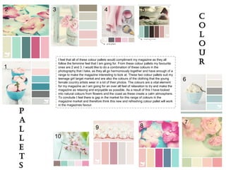
- 1. 1 2 3 4 5 6 7 89 10 I feel that all of these colour pallets would compliment my magazine as they all follow the feminine feel that I am going for. From these colour pallets my favourite ones are 2 and 3. I would like to do a combination of these colours in the photography that I take, as they all go harmoniously together and have enough of a range to make the magazine interesting to look at. These two colour pallets suit my teenage girl target market and are also the colours of the clothing that the young female country artists wear in a lot of their photos. The colours are a vital element for my magazine as I am going for an over all feel of relaxation to try and make the magazine as relaxing and enjoyable as possible. As a result of this I have looked into natural colours from flowers and the coast as these create a calm atmosphere. To conclude I feel there is gap in the market for this range of colours in the magazine market and therefore think this new and refreshing colour pallet will work in the magazines favour. C o l o u r p a l l e t s
- 2. DJB What a Babe MindBlue Rookies Showtimes Good Karma Prisma Moon flower 1942 Report Angelface CGF Locust Resistance Impact Label Font analysis I have looked on DaFont.com and have selected a variety of fonts to analyse. From looking at these fonts I have come to the conclusion that Angelface is my favourite font, as I like the joined up lettering. I would class this font as a feminine font and therefore it matches the teenage girl market that the magazine is to be aimed at. I also like the impact Label font and this helps to bring across the retro/ modern vintage feel that I also want to incorporate into my design. Finally I have decided to use the font Hoedown in the magazine in order to still include the genre of the magazine, as this is a western style font. As like the maverick country magazine I analysed I am going to have a non country syle font as the masthead on the cover but then incorporate stereotypical western style country fonts into the double page spread. When analysing the other fonts I felt that some fonts such as Good Karma, 1942 Report and DJB What a Babe were difficult to read and therefore for a new magazine wouldn’t be a good choice of font as people might not get it right. As for CGF Locust Residence and Prisma I feel these fonts wouldn't suit my style of magazine as they aren't feminine enough or related t the country music genre. Hoedown