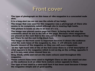
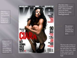
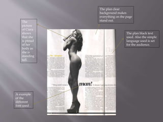
This magazine article features singer Ciara on the cover. She appears naked from the waist up wearing only high heels. The main colors used throughout the magazine are grey, black, white and red to make Ciara stand out on the cover and attract both male and female readers. The clear backgrounds are used so that the photos and text clearly stand out on each page.
La Stratégie de coopération avec les pays ou CCS (de l’anglais Country Cooperation Strategy) représente une vision à moyen terme de l’OMS pour la coopération technique avec un pays donné et définit un cadre d’action stratégique pour l’action dans ce pays. Il s’agit d’un instrument clé pour l’OMS dans le contexte de l’amélioration de l’efficacité de l’aide et de l’harmonisation du programme d’action en matière de santé et de développement. Ce document clarifie les rôles proposés pour l’OMS et la manière dont ses fonctions principales sont appliquées dans l’appui qu’elle fournit aux stratégies et plans nationaux dans le domaine de la santé et du développement.
2. The type of photograph on this issue of vibe magazine is a concealed nude
shot.
It is a long shot (as we can see the whole of her body).
The image that was used for this magazine was a photograph of Ciara who
seems to be completely naked although she is wearing high heels.
This picture is iconic as she is an icon of r n b.
The image was placed centre page but Ciara is facing the left also the
comments about he are to the left of the page. Because when magazines
are placed on the rack that is the only part of the magazine showing so they
put ‘Ciara ‘in red the rest is big black font.
The image on the front cover is important because it shows the audience
what the main issue of the magazine is. Also it will attracts male and
female viewers of the magazine so they can sell more magazines.
on the right hand side of the of the font cover there is a brief description of
what appears in the magazine which is not as big as the writing opposite it
as it is only seen when viewed face on.
Grey, black, white and red are the main colours used throughout this
magazine.
These colours have been used to highlight Ciara so she can stand out also
as the audience is of an older form mature colour appeals to them.
The type of font used is a sans-serif font it has been used because it keeps
the magazine simple and of good quality.
3. The website for the magazine is stated in small font on the bottom
right hand side of the magazine as the publisher knows that
internet new s reading and subscribing are coming common and
trying to help promote anything that they have on website .
The price of this magazine is £3.85.We believe that the magazine is this
price as it is of good quality paper and there is a far bit of advertising
inside the magazine.
We are told the price of the magazine on top of the bar code which is placed
at the bottom right hand side of the page.
The audience for this magazine are people who enjoy hip-hop and r n b
music. People age 18-34 year old. in classes c1 c2 c3
We are told the price of the magazine on top of the bar code which is placed
at the bottom right hand side of the page
The musician Quincy Jones and the company then called Time Warner
created Vibe in 1992.
The magazine closest competitors are the Source and XXL which focus
more narrowly on rap music, or the rock & pop-centric Rolling Stone and
Spin.
As of 2007, Vibe had a circulation of approximately 800,000. Advertisers ran
the gamut from record labels to fashion houses to various cognac brands.
4. The title of the
magazine is in a bold
font . Also it stands
out as its black
lettering on a white
background.
The picture
of Ciara is
appealing to
women and
men.
The barcode is there so
when people purchase
the item they can keep
check of the sales. Also
if they need to print
more if the sales are
high
Ciara is in
red font so it
can be the
main
attraction on
the page and
stand out.
This is a
plan white
back ground
so
everything
on the page
stands out.
5. The word ‘contents’ is in the style and font as on the cover.
The background is plan and uncluttered so the main focus is on the photo of
Ciara.
Ciara is laying down with her legs in the air making a v shape v for vibe.
She is wearing a grey jumper and matching grey high heels, she is wearing a
cream waist belt and her hair is parted to the side going straight back. Her eyes
are looking to the audience which makes her look like she's looking at you.
The word contents is in a big bold white font which makes it stand out in the
right hand corner of the page and there is a outline of the letter v centre page on
top of Ciara.
The sub headings are in bold black font and the rest on the text is just in black,
on this page 4 fonts has been used. The more important information is in bolder
font.
A image of Ciara is used on the magazine as she is the issue used throughout the
magazine. The colours used are the same grey black and white as in the front
cover to stick to the audience appeal.
As the picture is an attractive picture is appeals to the male audience and also to
the female audience as they will look up to her and aspire to be like her.
6. Sub headings are
in bold black and
the rest of the
text are jus plan
black. so people
can jus read the
things they want.
The picture of
Ciara is
important
because she is
the main theme
of the magazine.
Like the front
cover the image
is attractive to
both sexes.
The word
contents is the
biggest
boldest word
on the page.
To clearly
state what the
purpose of the
page.
The outline of
the letter v is
for the word
vibe.
This is visible
because the un
clutter black
and grey back
ground.
7. •The colour theme of this spread is the same throughout the magazine
the background is white with smudges of grey and the txt is not bold
but black.
•The white clear back ground is used so you can see everything clearly
•The head line is in bold black font which is the second thing you notice
on the page.
•The first thing you notice is the attractive picture of Ciara. Which is a
long shot and is placed centre stage.
•The language in the spread is simple and is easily understandable by
the target audience.
•In this double page spread 5 fonts have been used to highlight different
things. For example head line, important words.
•Ciara in this photo represents women that goes through accusations.
As stated beneath her..(they called me a man).
•The content of this targets the audience as it appeals to both men and
women. As it clears up the fact that she is a women and also any
women who are in her same precision can look up to this.
8. The plan black text
used. Also the simple
language used is set
for the audience.
A example
of the
different
font used .
The
picture
of Ciara
shows
that she
is proud
of her
body as
she is
standing
tall.
The plan clear
background makes
everything on the page
stand out.