The importance of a
double page spread is to
Advertise the main story and
main feature of the article, in a
music magazine this usually means
the artist. The reason for a double page
spread is to sell the magazine the best way
it can by making it an important part of the
magazine, a selling point for a particular feature.
The double page spread is a add on from the front
cover created in the same style to further sell the
magazine.
 The main image of a double page spread mainly consists
of a main image taking up half of the page, the image
usually uses direct address as this grabs the readers
attention due to the artist having eye contact with the
reader. Under the image there is usually by-lines to give
credit to the photographer. The image on a double page
spread is particularly large as it is the selling point of the
page, this is why they usually use a popular artist as this
attracts fans, the image must be athletically pleasing. The
image on this page relates to the front cover meaning the
theme of both will be similar using the same artist,
although the image must betaken in a different way this
may include a different angle or position.
 Other images on the page are significantly smaller, there
job is to highlight the main image and add colour to make
the page more pleasing to the eye usually anchoring
surrounding the text.
 The headline is the largest text on the double page
spread, it will state a catchy title/slogan that will attract
the audience. It must summarise the article in a positive
and interesting way. It is bold as it need to grab the
readers attention, to intrigue them and make them want
to read the article. To do this the headline uses a different
type of typography by having different font types and
various colour contrasting with the page.
 The head line is usually placed in the middle or at the top
of the page as according to the conventions this is where
the audience's attention will be drawn.
 The headline of the double page spread will usually relate
to the masthead tying the page together. The headline
that is used for the double page spread are always short
as this makes them catchy and exciting.
 The colour scheme of the double page spread is very important
when attracting the readers attention. The colour scheme helps
to portray the genre and style of the double page spread.
Colours that are used are contrasting colours so that particular
parts of text will stand out against others, this makes certain text
and images easier to see becoming a focal point for the reader.
For example the masthead will be in a colour that appears bold
, standing out within the page so that the reader can see clearly
what they will be reading. Also pull quotes are made to stand
out using a contrasting colour so that you can see the
importance of a persons opinion. The colour scheme also
depends on the images used and the article they are showing,
as the colours used create a mood, deciding how the viewer
should feel before they have even read anything. The colours
used will be the same as ones used on the front cover and as this
is the most important article so it needs to tie in. by doing this it
shows order making it look professional.
 A pull quote is to show an important opinion drawn from the
article, it is used to attract the reader as this could be a
controversial part of the article. They are written in a different
font to the rest of the text, usually using a different colour so that
they stand out making the double page spread look interesting.
It also allows the long text of the article to be broken up, this
makes the page more appealing to the reader as they do not
feel as if they are reading such a long bit of text, this also stops
them from loosing interest. Readers can look over the page and
simply read pull quotes as they are made to stand out and
capture the attention of the reader as they are important. The
quotes are usually something of a shock statement or something
that can incise the reader and this gives the article a sense of
excitement, in a way it is selling the article. A pull quote mustn't
be a very long piece of text but usually it is still several words as it
must be a reasonable piece of information.
 The double page spread is one for many different types of
typography as it uses this to make certain text jump out on
the page. For example the masthead would be of a
different style and colour as this is the most important part
of the page as it is telling the reader what they are about
to be reading. Also the pull quotes will be opposite to the
other text, usually in an italic text as it is what someone has
said. The text is laid out in a random way as it adds to the
mood of interest. A double page spread uses lots of
various typography as it makes the page interesting and
appealing to the reader as it is a page involving the main
article it must be a focal point. This makes the magazine
appear professional and creative attracting the target
audience needed.
 A stand first on a double page spread is the
introduction to the article explaining briefly
what the article is going to consist of usually
explaining the artist and focal point,
meaning the reason for this article, it is
positioned bellow the masthead and
above the body text. A stand first can also
be used to attract readers is they are
skimming the page.
 The main body text is simply the main text in the
article. It is usually set out into 2-4 columns on one
side of the double page spread this creates a
structured magazine, with the main image being on
the other page. The main body text is are
paragraphs that can relate to the main image and
header, this will be made sure to be appealing to the
reader. The main body text can consist of many
different thing such as quotes, interviews said by the
artist the article is about, or maybe opinions from and
outsider. The main body text is very informative
although it tries to be as shown as an easy read,
written in informal mode of address this makes sure
the reader does not get bored making sure they finish
reading the article.
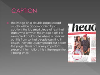
 The image on a double page spread
usually will be accompanied by a
caption, this is a small piece of text that
states who or what the image is off. For
example it could state where a persons
outfit is from so that people can find it
easier. They are usually spread out across
the page. This is not a very important
piece of information, this is the reason for
it being small.
 A drop capital is used when starting an article or
when starting a new paragraph, depending on the
style the magazine wishes to portray. It is an
important part of starting a article as it makes it
look professional, giving it an interesting style. It is
usually very large when used in the first paragraph,
a drop capital can be up to the same size as 9 lines
of the article.
 The gutter is the space between the various
columns, its purpose is to separate the lines of text
so that it is clear for the reader to understand.
Usually to do this a thin vertical line is used, this way
it is also athletically pleasing making the magazine
look professional and sophisticated allowing the
divide.

Double page spread conventions

  • 1.
    The importance ofa double page spread is to Advertise the main story and main feature of the article, in a music magazine this usually means the artist. The reason for a double page spread is to sell the magazine the best way it can by making it an important part of the magazine, a selling point for a particular feature. The double page spread is a add on from the front cover created in the same style to further sell the magazine.
  • 2.
     The mainimage of a double page spread mainly consists of a main image taking up half of the page, the image usually uses direct address as this grabs the readers attention due to the artist having eye contact with the reader. Under the image there is usually by-lines to give credit to the photographer. The image on a double page spread is particularly large as it is the selling point of the page, this is why they usually use a popular artist as this attracts fans, the image must be athletically pleasing. The image on this page relates to the front cover meaning the theme of both will be similar using the same artist, although the image must betaken in a different way this may include a different angle or position.  Other images on the page are significantly smaller, there job is to highlight the main image and add colour to make the page more pleasing to the eye usually anchoring surrounding the text.
  • 3.
     The headlineis the largest text on the double page spread, it will state a catchy title/slogan that will attract the audience. It must summarise the article in a positive and interesting way. It is bold as it need to grab the readers attention, to intrigue them and make them want to read the article. To do this the headline uses a different type of typography by having different font types and various colour contrasting with the page.  The head line is usually placed in the middle or at the top of the page as according to the conventions this is where the audience's attention will be drawn.  The headline of the double page spread will usually relate to the masthead tying the page together. The headline that is used for the double page spread are always short as this makes them catchy and exciting.
  • 4.
     The colourscheme of the double page spread is very important when attracting the readers attention. The colour scheme helps to portray the genre and style of the double page spread. Colours that are used are contrasting colours so that particular parts of text will stand out against others, this makes certain text and images easier to see becoming a focal point for the reader. For example the masthead will be in a colour that appears bold , standing out within the page so that the reader can see clearly what they will be reading. Also pull quotes are made to stand out using a contrasting colour so that you can see the importance of a persons opinion. The colour scheme also depends on the images used and the article they are showing, as the colours used create a mood, deciding how the viewer should feel before they have even read anything. The colours used will be the same as ones used on the front cover and as this is the most important article so it needs to tie in. by doing this it shows order making it look professional.
  • 5.
     A pullquote is to show an important opinion drawn from the article, it is used to attract the reader as this could be a controversial part of the article. They are written in a different font to the rest of the text, usually using a different colour so that they stand out making the double page spread look interesting. It also allows the long text of the article to be broken up, this makes the page more appealing to the reader as they do not feel as if they are reading such a long bit of text, this also stops them from loosing interest. Readers can look over the page and simply read pull quotes as they are made to stand out and capture the attention of the reader as they are important. The quotes are usually something of a shock statement or something that can incise the reader and this gives the article a sense of excitement, in a way it is selling the article. A pull quote mustn't be a very long piece of text but usually it is still several words as it must be a reasonable piece of information.
  • 6.
     The doublepage spread is one for many different types of typography as it uses this to make certain text jump out on the page. For example the masthead would be of a different style and colour as this is the most important part of the page as it is telling the reader what they are about to be reading. Also the pull quotes will be opposite to the other text, usually in an italic text as it is what someone has said. The text is laid out in a random way as it adds to the mood of interest. A double page spread uses lots of various typography as it makes the page interesting and appealing to the reader as it is a page involving the main article it must be a focal point. This makes the magazine appear professional and creative attracting the target audience needed.
  • 7.
     A standfirst on a double page spread is the introduction to the article explaining briefly what the article is going to consist of usually explaining the artist and focal point, meaning the reason for this article, it is positioned bellow the masthead and above the body text. A stand first can also be used to attract readers is they are skimming the page.
  • 8.
     The mainbody text is simply the main text in the article. It is usually set out into 2-4 columns on one side of the double page spread this creates a structured magazine, with the main image being on the other page. The main body text is are paragraphs that can relate to the main image and header, this will be made sure to be appealing to the reader. The main body text can consist of many different thing such as quotes, interviews said by the artist the article is about, or maybe opinions from and outsider. The main body text is very informative although it tries to be as shown as an easy read, written in informal mode of address this makes sure the reader does not get bored making sure they finish reading the article.
  • 9.
     The imageon a double page spread usually will be accompanied by a caption, this is a small piece of text that states who or what the image is off. For example it could state where a persons outfit is from so that people can find it easier. They are usually spread out across the page. This is not a very important piece of information, this is the reason for it being small.
  • 10.
     A dropcapital is used when starting an article or when starting a new paragraph, depending on the style the magazine wishes to portray. It is an important part of starting a article as it makes it look professional, giving it an interesting style. It is usually very large when used in the first paragraph, a drop capital can be up to the same size as 9 lines of the article.
  • 11.
     The gutteris the space between the various columns, its purpose is to separate the lines of text so that it is clear for the reader to understand. Usually to do this a thin vertical line is used, this way it is also athletically pleasing making the magazine look professional and sophisticated allowing the divide.