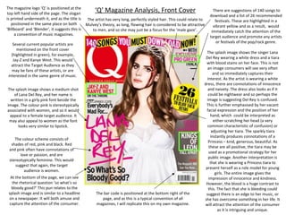
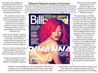
The document analyzes the front covers of three music magazines: Q Magazine, Blender Magazine, and Billboard Magazine. Some key points of similarity across the magazines include:
1) The magazine logo is positioned at the top left of the cover with the artist's image placed in front of the logo to direct attention.
2) Contact information like websites are advertised to encourage interaction.
3) Fonts, sizing, and placement of text are consistent across covers to make information easily readable.
4) Color schemes and artist images are used to target younger female audiences by appealing to stereotypes around gender.