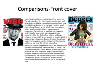
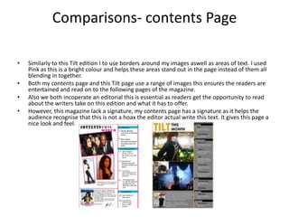
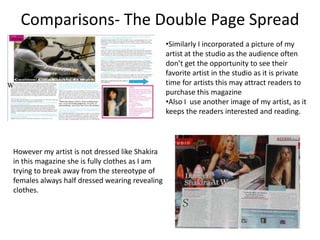
This document compares and contrasts the magazine "Deuces" to other real music magazines such as Vibe, Rap Up, and Kerrang.
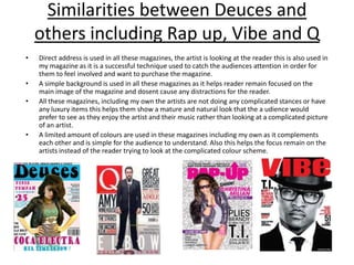
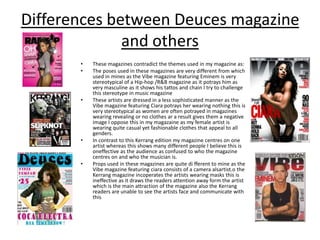
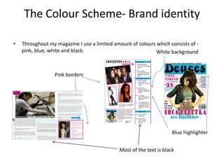
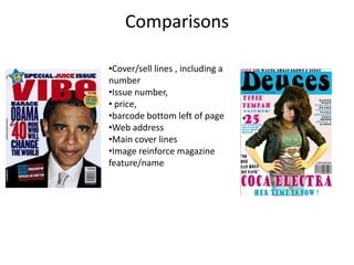
Some key similarities include using direct address to engage readers, simple backgrounds without distractions, and limited color palettes. Differences include challenging stereotypical poses of artists and revealing outfits for women. The document also discusses the color scheme, layout, and specific page elements used in "Deuces" such as borders and images of the artist.