The document summarizes feedback received from focus groups on various elements of a magazine production. Key points discussed include:
- The preferred name for the magazine was "Coast" based on a poll of focus group members.
- For the front cover, the focus group unanimously preferred the same photo.
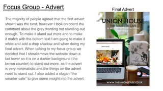
- Feedback on advert and editor's page layouts led to changes being made to improve balance and suitability for the magazine theme.
- A contents page design was changed to a more unique layout based on focus group input.
- Revisions were made to billboard designs to reduce clutter and better communicate the magazine based on focus group suggestions.
- A new website template was chosen with additions
Francesca Gottschalk - How can education support child empowerment.pptxEduSkills OECD
Francesca Gottschalk from the OECD’s Centre for Educational Research and Innovation presents at the Ask an Expert Webinar: How can education support child empowerment?
Introduction to AI for Nonprofits with Tapp NetworkTechSoup
Dive into the world of AI! Experts Jon Hill and Tareq Monaur will guide you through AI's role in enhancing nonprofit websites and basic marketing strategies, making it easy to understand and apply.
Embracing GenAI - A Strategic ImperativePeter Windle
Artificial Intelligence (AI) technologies such as Generative AI, Image Generators and Large Language Models have had a dramatic impact on teaching, learning and assessment over the past 18 months. The most immediate threat AI posed was to Academic Integrity with Higher Education Institutes (HEIs) focusing their efforts on combating the use of GenAI in assessment. Guidelines were developed for staff and students, policies put in place too. Innovative educators have forged paths in the use of Generative AI for teaching, learning and assessments leading to pockets of transformation springing up across HEIs, often with little or no top-down guidance, support or direction.
This Gasta posits a strategic approach to integrating AI into HEIs to prepare staff, students and the curriculum for an evolving world and workplace. We will highlight the advantages of working with these technologies beyond the realm of teaching, learning and assessment by considering prompt engineering skills, industry impact, curriculum changes, and the need for staff upskilling. In contrast, not engaging strategically with Generative AI poses risks, including falling behind peers, missed opportunities and failing to ensure our graduates remain employable. The rapid evolution of AI technologies necessitates a proactive and strategic approach if we are to remain relevant.
Welcome to TechSoup New Member Orientation and Q&A (May 2024).pdfTechSoup
In this webinar you will learn how your organization can access TechSoup's wide variety of product discount and donation programs. From hardware to software, we'll give you a tour of the tools available to help your nonprofit with productivity, collaboration, financial management, donor tracking, security, and more.
Honest Reviews of Tim Han LMA Course Program.pptxtimhan337
Personal development courses are widely available today, with each one promising life-changing outcomes. Tim Han’s Life Mastery Achievers (LMA) Course has drawn a lot of interest. In addition to offering my frank assessment of Success Insider’s LMA Course, this piece examines the course’s effects via a variety of Tim Han LMA course reviews and Success Insider comments.
Instructions for Submissions thorugh G- Classroom.pptxJheel Barad
This presentation provides a briefing on how to upload submissions and documents in Google Classroom. It was prepared as part of an orientation for new Sainik School in-service teacher trainees. As a training officer, my goal is to ensure that you are comfortable and proficient with this essential tool for managing assignments and fostering student engagement.
2. Focus Group - Magazine Name
Date of meeting - 27/09/2017 Purpose of meeting - To discuss the name of my magazine
After gathering people together that I think matched my target audience for my magazine together, I
made a poll on a group chat I made with them to discuss what they thought of the possible names for
my magazine. I explained to them the type of magazine I wanted to create and gave them 4 names and
asked them which one they thought would suit my magazine the most and what ones they liked the
sound of the most. The four options were; Thanet Life, The Thanet Magazine, Thanet Coast and Coast.
The results are displayed on the pie chart below. The name the people liked the most was ‘Coast’ where
45% of people thought Coast was the best name.
3. Focus Group - Front cover images
After taking many photos of my
model for my front cover, I
wasn't sure on which picture
would be best for my front cover.
I narrowed my favourite ones
down and asked my focus group
which one they preferred and
luckily they all prefered the
same one so picking the photo
for my front cover proved to be
easy.
4. Focus Group - Front Cover
In the process of making my front cover, I experimented with
different things such as the subtitles around the outside. After
making some examples I consulted my focus group and asking for
their opinions to help me decide how I should make my front cover
look.
For my cover, I wanted to make a part of my front cover stand out
(as it was something the audience could win). I tried adding a circle
to try and get it to catch readers attention. However I wanted to do a
comparison without the circle to see what way I preferred it.
After discussing with my focus group and getting their feedback, we
decided it was better off without the circle because the front cover
flowed more and looked more sleek and professional. The circle
didn’t tie in as much with the rest of the magazine theme. Therefore
I kept my production for my front cover as the bottom image.
5. Focus Group - Advert
When making the advert page for my magazine, I was happy with the main image but wasn’t sure on where to place the titles or the
colour of them. I made a few variations and asked my focus group which one they preferred and if they thought I should change
anything.
“I prefer the first design as the titles seem to be balances and no to much at the bottom, I also like the variation of the colour of
fonts”
“I think the light grey colour of the address on the first one can get lost and it isn’t standing out”
“I think you should add a slogan as some people may not understand it is for an internet cafe as it’s something that is more rare to
find”
6. Focus Group - Advert
The majority of people agreed that the first advert
shown was the best, however I took on board the
comment about the grey wording not standing out
enough. To make it stand out more and to make
it match with the bottom text I am going to make it
white and add a drop shadow and when doing my
final advert. When talking to my focus group we
decided that I should move the website down a
tad lower so it is on a darker background (the
brown counter) to stand out more, as the advert
is very minimalistic and the things on the advert
need to stand out. I also added a slogan “the
smarter cafe” to give some insight into the advert.
Final Advert
7. Focus Group - Editor’s Page
For my editor’s page I wasn't 100% on how I wanted
the layout to be for my magazine. So I made rough
layout’s and asked my focus group which one looks
the best and suit’s my magazine the most.
After discussing with my focus group the majority of
the group preferred the bottom design and when
showing them the rest of my production they said it
suited with the rest of my magazine theme the most.
They preferred the bottom design because it
showcased more photos and mentioned the people
that ‘work’ for the magazine, this will help the
audience connect to the magazine more as it makes
it more personal (uses & grats) and it shows what
goes into the magazine.
8. Focus Group - Contents
After doing my mock up for my contents page, I came
across a contents page which I really liked the layout
of. I asked the group to see if they think I should keep
with my original plan or try doing a contents like the
Sussex Magazine inspiration which I liked.
“I think you should try it as it is more of an unique
design therefore it may stand out more against other
magazines”
From this feedback I made the contents page and
showed my focus group and they preferred the
second page as it is more unique therefore I kept that
the way it is for my final production as they liked the
way it looked.
Mock up
Inspiration
Final
production
9. Focus Group - Billboard
After making my first billboard, I went to my focus group to ask for their thoughts and opinions and this is what the overall
thoughts were and some quotes from the members of the group.
“I like the idea of the magazine, however because there are so many apple products displayed I think it looks a bit busy”
“Maybe include the sell line to make it relate to the magazine more”
“I think you should add a magazine because it just looks like you can access it only on technical devices and it doesn’t look like
you can get a physical version of the magazine”
“I like the colour theme and the fact you have shown you can access the magazine in different ways”
After realising there was too many devices on the screen I decided to get rid of some, add a magazine to showcase the fact I
was advertising a magazine and then add the sell line to make it more relatable to the magazine.
10. Focus Group - Billboard
After taking in the feedback from my focus group I came
up with 2 different billboards and asked for their
opinions. Here’s a quote from one member of my focus
group;
"I prefer the second one as I like the way the magazine
and devices go down at an angle and the top billboard
still looks too busy, however I like the add of the sell line"
The majority of my focus group had decided on the
second one as it looks for slick. The first option there
was too many devices on the billboard and when people
look at the billboard they may get overwhelmed or
confused, as a billboard is something that people tend to
look at for only a matter of seconds I need to get the
product across quickly. So I chose the second option for
Production
11. Focus Group - Website
Feedback from my original website included;
“The page looks too spaced out and not like a
regional magazine”
Me and my focus group both weren't very impressed
with my first website therefore I asked them to help
me decide on a new template for my website and the
first one didn’t suit its purpose very well.
A lot of people in my group really liked my photos I
had taken too, and one person suggest I make a
gallery page to showcase some more images
therefore I made a link to a gallery page and put my
favourite images that I took on there