1. Will Shonk
BANA STATS
3.) This problem will use the "GSS_2012.csv" data in the "Data Sets" folder. This data set
contains the results of the 2012 General Social Survey (GSS). Think of an issue that
interests you either personally, academically, or professionally that could be addressed
by examining the relationship between two categorical or ordinal variables. For
example, you might be interested in the relationship between marital status and job
satisfaction. You can find a list of the variable names as well as what they stand for from
the GSS website: GSS documentation
a). Briefly state the issue and why it interests you.
I am going to compare EDUC, respondent’s education with SEX, respondent’s gender, in one
pivot table and then use ABPOOR, low income can’t afford more children with CONDOM, did
the respondent use a condom the last time he/she had sex. As a graduate student I value
education and I heard that there were more females graduating then males so I wanted to test
the claim. The low income and can’t afford more children vs. condom usage data intrigued me
because I wanted to see if people who had low income and couldn’t afford more kids were
actually using condoms and being responsible enough to avoid pregnancy till their financial
situation was more accommodating to rear children.
b). Make a side-by-side bar chart of the distribution of the response variable by each
level of
the explanatory variable. To do this using an Excel pivot table, first select the table, right
click, and go to
Show Values As -> % of Row Total. Then insert a pivot chart. Be sure that the chart is
easy to read and labeled properly so that anyone looking at your paper could tell what is
being plotted.
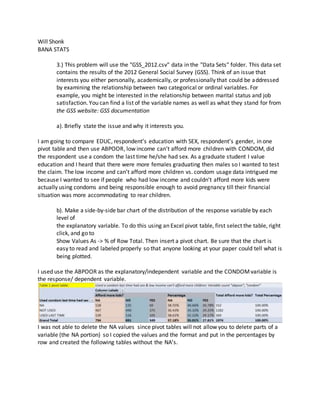
I used use the ABPOOR as the explanatory/independent variable and the CONDOMvariable is
the response/ dependent variable.
I was not able to delete the NA values since pivot tables will not allow you to delete parts of a
variable (the NA portion) so I copied the values and the format and put in the percentages by
row and created the following tables without the NA’s.
2. It was necessary to go in and add in the axis titles for the graph. Go to LAYOUT tab > AXIS TITLES
and then also add a title. The explanatory is on the X axis, ABPOOR, can the respondent afford
more children. And the Y axis is the response, or the dependent, CONDOM, did respondent use
a condom last time had sex.
I made a second chart for education and males vs females. I had to copy the values and the
format to make it into a presentable table as shown below instead of with the original 20 rows
and not in groups.
3. I grouped the years of education into “ no highschool”= 1 -12 years of education ( group1)
“highschool”= 12 years of education, “some college”=13-15 years of education ( group2),
“bachelors”= 16 years, “post undergraduate”= 17 years, “graduate”= 18 years, and “PHD”= 19-
20 years (group3
c). Conduct the chi-squared test of independence, either using the pivot table or using R.
Use the four-step procedure, explaining each step, and state the conclusion in the
context of the problem. In R, go to Statistics -> Contingency Tables -> Two-Way Table.
This will let you select the row and column variables from the data set. If you want to
enter the data directly, select Enter and analyze two-way table. With either approach,
select the "Statistics" tab under "Hypothesis tests," and tick the first three boxes. If
using Excel, you must first make a table of expected frequencies and then use the
CHITEST() function, which returns the p-value of the test.
Below I created a chi-squared test of independence in Excel making an expected values chart.
4. 1. Sum of each columns
2. Sum of each rows
3. Total sum of all frequencies for total
4. Total females (column) / total sample size = female proportions=.55
5.Total males (column) / total sample size =.45
6. Female proportion (.55) * row total (No High school 318)= expected value of females for that
row (Expected Value 175.44 Females)
7 Male proportion * row total= expected value of males for that row
8. In the expected value formulas in steps 6-7, add the "$" signed in the female/male
proportion cell to keep it fixed, then drag the formula down to get the expected values for the
remaining rows.
9. Perform the ChiSquared test, formula =chitest(original values, expected values)
10. The number from the chitest=.26, which is the P-value, we will compare the p-value to the
alpha, which s 95% certainty=.05 alpha
11. .26 > .05, therefore we fail to reject, we do not have enough evidence more data is needed
5. 12. r square (=correl)= .996 correlation, therefore there is a very strong positive correlation
between the original values and the expected values.
d). Calculate Cramer’s coefficient and explain what it tells you about the relationship
between the variables you calculated.
Cramer’sV is usedto calculate correlationintables thatare greaterthan 2 x 2 columnsand rows.
Cramer’sV correlation isbetween0and1. A value close to0 meansthat there islittle association
betweenvariables.A Cramer’sV of close to 1 meansthere isa strongassociation.
I foundthe X squared byplugginginthe yearsof educationandgendersfromabove intoRcmdr,
STATISTICS>CONTIGENCYTABLE>ENTERAND ANALYZETWO-WAYTABLE
N is large but we still fail to detect dependence .078 is not close to 1.
6. 4.) Open the "AmesHousing.csv" data set again and create a new variable named "To-
talSF" to represent the total square footage of a house. It will be composed of the vari-
ables "First_Flr_SF," "Low_Qual_Fin_SF," "Open_Porch_SF," "Scnd_Flr_SF,"and
"TotalBsmtSF " added together. As a check, if you do this correctly, the to-tal square
footage for the first house should be 2798. Also, create a variable called
"SalesPrice000s" to represent the sales price of a home in thousands.
Using R: Input a new Variable DATA> Manage Variables in active data set> compute new
variable.--> Add in “To.talSF” in the New variable name field. Add in the variable “X1st.Flr.SF,"
"Low.Qual.Fin.SF," "Open.Porch.SF," "X2nd.Flr.SF,"and "Tota.lBsmt.SF "” under the Expression
to compute.
"X1st_Flr_SF+Low_Qual_Fin_SF+Open_Porch_SF+X2nd_Flr_SF+TotalBsmtSF" NOTE the _ must
be replaced with . and there should be no “” in the actual variable nor formula.
a). Produce a scatter plot of SalesPrice000s by TotalSF. State whether the appearance of
the plot makes sense to you and why you feel that way.
In R:
X is the explanatory, and Y is the response or dependent, that is prices of homes depend on the
total square footage.
7. In Excel:
The goodness of fit line resembles a linear upward increasing line, meaning that the paired data
arrays have a positive linear correlation. That is, price will increase (depends) as total square
footage increases (independent)
b). Your supervisor looks at the scatter plot in (a) and does not like the outliers. Produce
a scatter plot with the outliers you see in (a) removed. You can delete these
observations in R or delete them in the Excel file and the re-import the data into R.
Comment on the effect that removing outliers has on the appearance of the plot.
Below is a box plot that shows where the outlying data, marked by zeros.
-100
0
100
200
300
400
500
600
700
800
0 1000 2000 3000 4000 5000 6000 7000 8000
House
Price in
thousdands
House sq footage
X House sq footage effect onY house price
8. Below is a histogram and the outlier data has been highlighted yellow. The outlier data is
located where price range starts at about the $375,000 (outlier is arbitrary so I defaulted to R’s
outlier points marked as the zeros above)
We will remove the outliers and graph a new scatter plot:
9. Removed values corresponding to sales prices under $75,000 and greater than $375,000Mean,
which represent the outliers in the histogram above
In Excel:
y = 0.0695x - 2.8554
R² = 0.6205
0
50
100
150
200
250
300
350
400
0 1000 2000 3000 4000 5000 6000
House
Price in
thousdands
House sq footage
X House sq footage effect onY house price removed
outliers
10. c). Explain why what you did in (b) that is, just removing the outliers and making a new
plot might be considered unethical. Discuss one way you could justify what you did in
(b).
This could be considered unethical because I manipulated the true numbers to now not be
representative of the true population. The aggregates now do not take into account all the
data. This is incorrectly portraying information that I could use to support a bias.
However, this could be justifiable if I presented the information, making known the outliers
were removed in order to prevent skewed aggregates. Thus the bulk of the data is more
representative of the true mean of the sample and therefore a more accurate generalization of
the true mean of what to expect from the population.
d). Suppose your supervisor wants to predict SalePrice000s using TotalSF using least-
squares linear regression. Explain, conceptually, the idea behind the least-squares
method. You shouldn’t include any calculations.
The idea behind the least squares method is that it is a method to predict the value of a
dependent Y variable basing off the value of the independent X variable, simply said, it is a
cause effect relationship.
Linear regression calculates a straight line that is called the “least squares regression line” that
minimizes the differences with all the data sets. The slope calculate a line that best fits ALL the
data sets. This line has a set slope so you follow the line where a specific square footage at the
X intercept on the X axis of the line and you will find the corresponding price at the Y the
intercept on the Y axis of the line.
e). Fit the regression line in (d) to the data set with the outliers removed using Excel or
R. Display the output from whatever program you use (a screen shot will probably be
easiest), and write down the estimated regression equation.
Using Excel, I removed the rows with the outliers stated above (omitting sales price under
$75,000 and above $375,000).Then I selected INSERT tab>, SCATTER right click graph, Select
Data >add input X Series is the total square footage, Y Series is the sales price by selecting all
the values in the SalesPrice000s and to.talSF variables, ctrl+shift+down key.
Once it is plotted, I insert an X and Y axis label selecting the graph, LAYOUT tab> AXIS TITLES
tab, and then CHART TITLE tab.
Lastly, add a trend line by selecting a data point, right click> ADD TRENDLINE> check DISPLAY
EQUATION
The equation for the regression line without the outliers is located above the points in the
scatter plot, Y= 0.0695x-2.8554, and the R^2, or the amount of data that is explained is 0 .6192,
if you take the square root of that you will get your correlation, R, which is 0.787, or in a cell put
11. in “=correl(values of house price, values of house square footage)”. With a high correlation
close to the 80% benchmark we can infer that when square footage of a home increase, the
sales price of the house also increases.
Y is the Price, the dependent variable
X is the Square footage, the explanatory or independent
f). Interpret the slope and intercept term in (e) in the context of the problem.
Y= a + bx, where a is the y intercept and b is the slope of the straight line predicting “Yhat” (the
means of Y). This line is the “least squares line" because it is the sum of the squared differences
between each data point and its estimated point on the line, and the point on the line
minimizes the differences between the points.
Y= bx + a y= 0.0695x – 2.8554
Note: the values are in thousands, so the values must be moved three decimal places to the
right, that is be multiplied by 1,000.
y= 69.538x – 2855.4
A= y intercept. The initial point at 0, no square footage. Which says, “when a house has 0
square footage, it’s average price is $- 2,855.4.
B= Gradient/slope. The increase in price per one square foot. Which says, “for every X, 1
square footage of a house, there is a $69.5 increase in price”
For every one increase in X, Y will go up the amount of the slope which is the predicted price
increase
g). Using software, calculate a 95% confidence interval for the slope parameter
and interpret the interval in the context of the problem. Show the components of the
calculation.
In Excel, go to DATA > DATA ANALYSIS tab on far right, then input the Y (dependent) TotalSF
values and the X (independent) SalePrice values.
Check the labels
Check the confidence levels put at 95%
12. For every increase in square footage of the house, we are 95% confident based on the method
used to calculate the interval that the sales price of the house will increase from $67.51 -
$71.56 on average, all other variables held constant.
13. h). What does the interval imply about the test of
and why?
The above hypothesis is the most common inference about regression, is X related to Y? The
idea is that the confidence intervals and tests get at the same idea.
If the confidence interval contains the null hypothesis of B1, which is 0, we would fail to reject
B1 = 0. If the P-value < or = to alpha, we reject H0, if P-value is > Alpha we fail to reject
F-Test is given below = 4,532 and the P-Value of the test is 0.
Therefore, we reject the H0 , 0 < .05