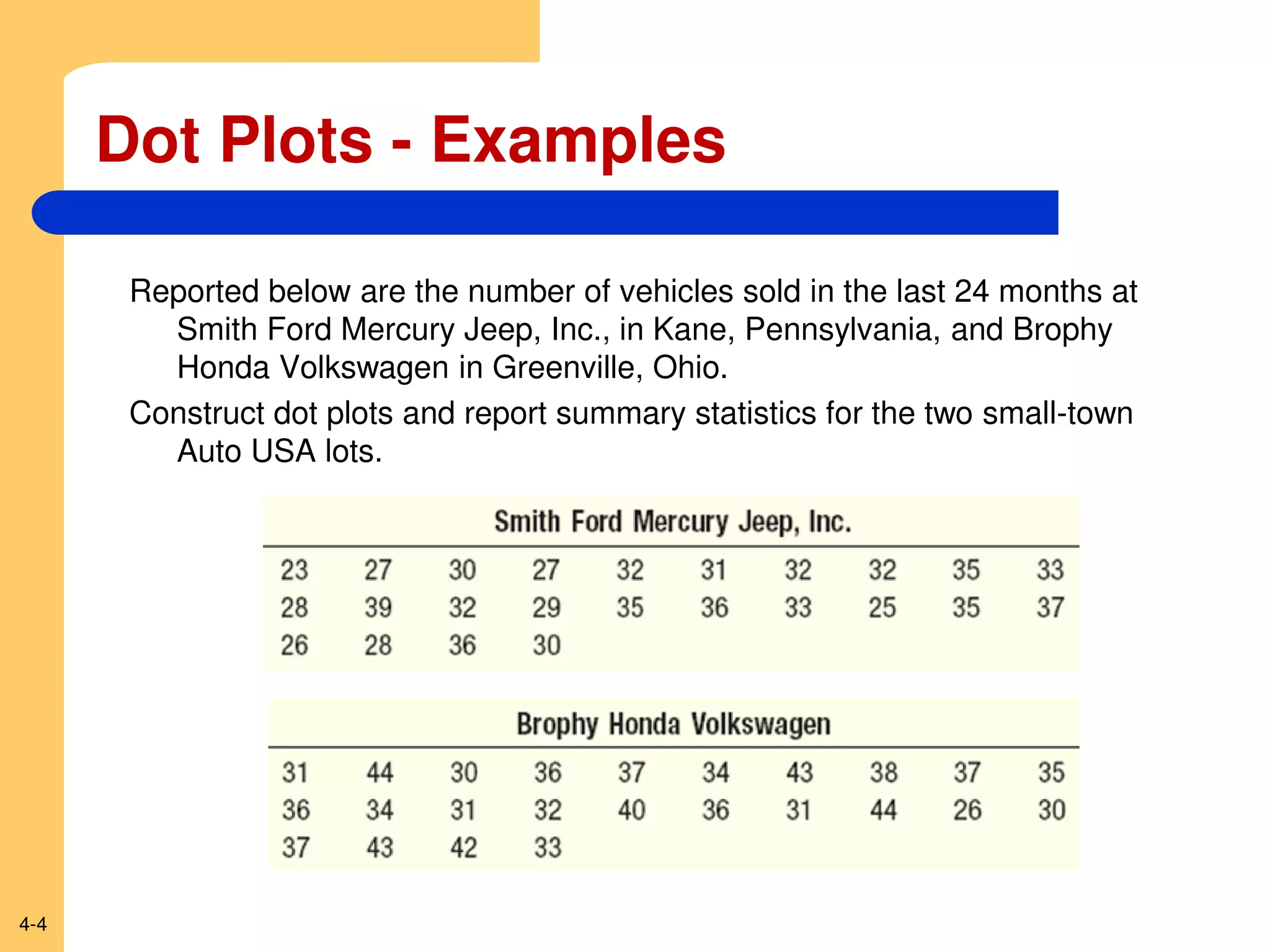
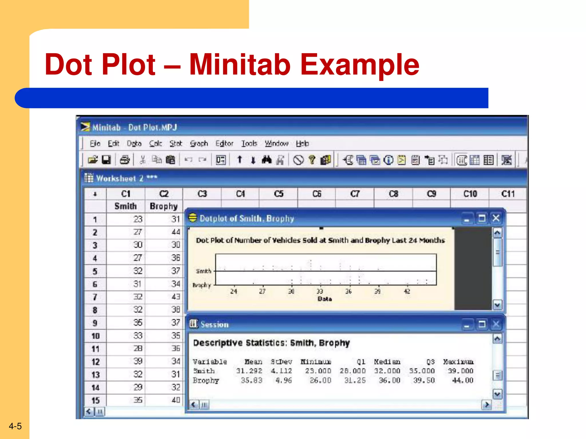
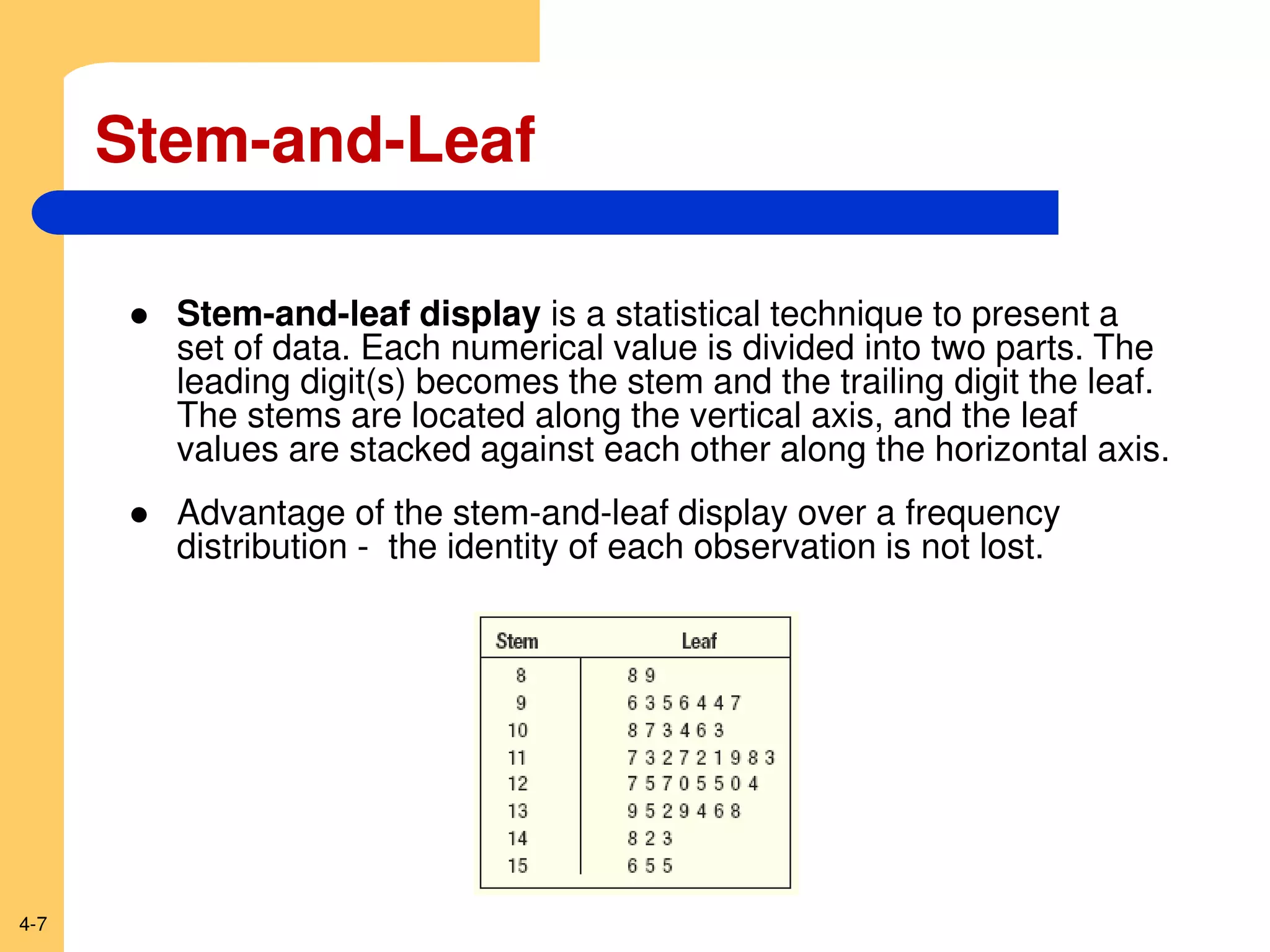
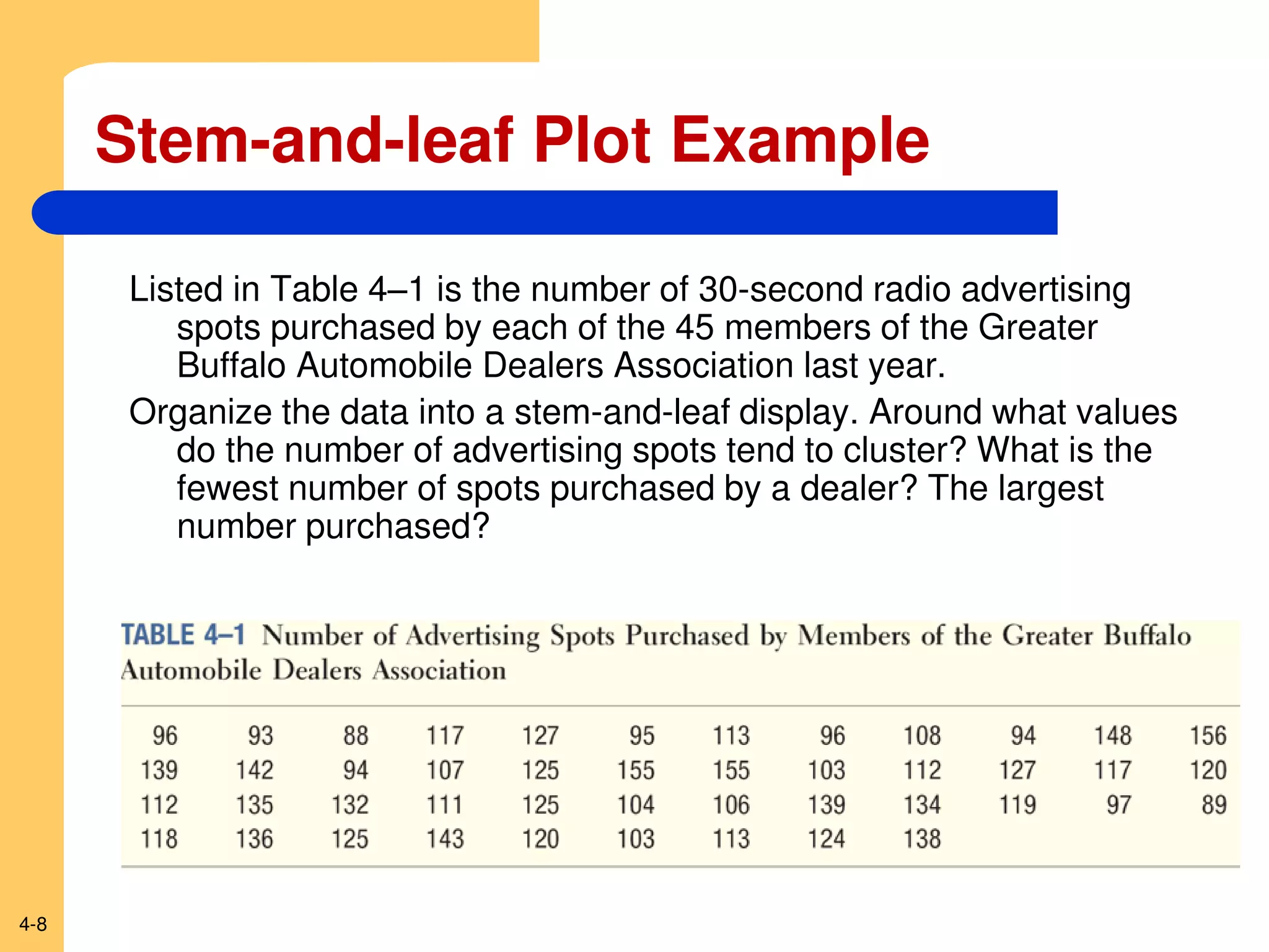
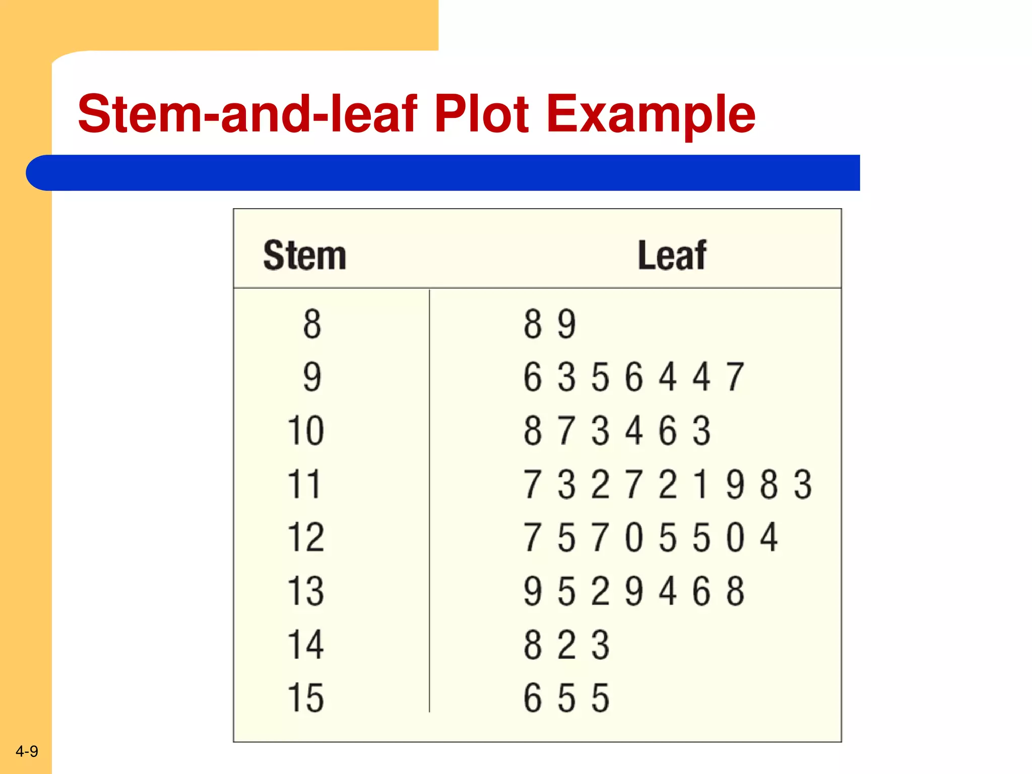
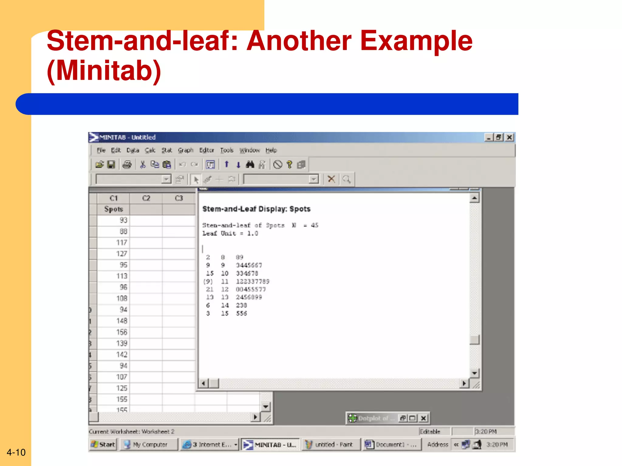
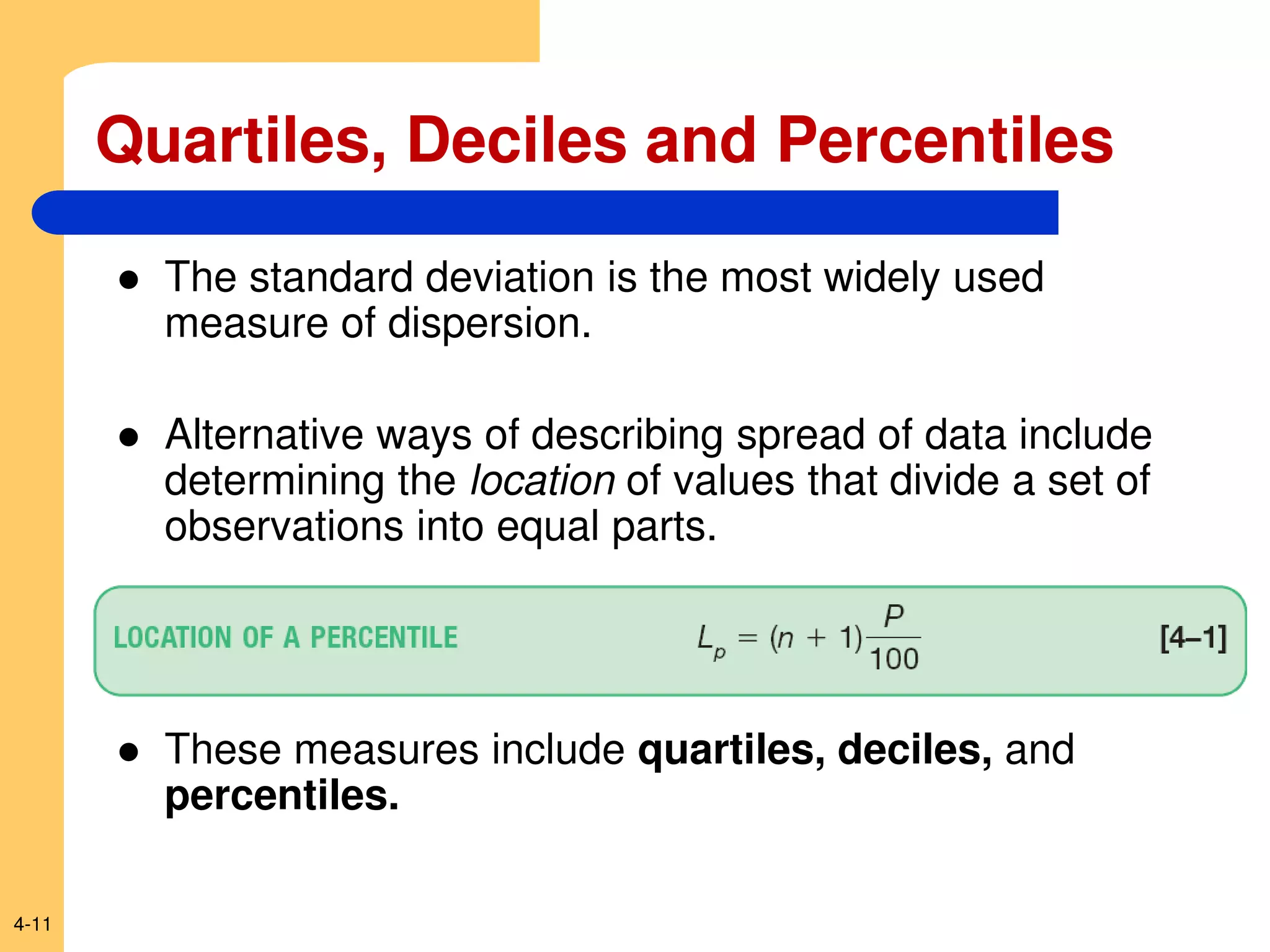
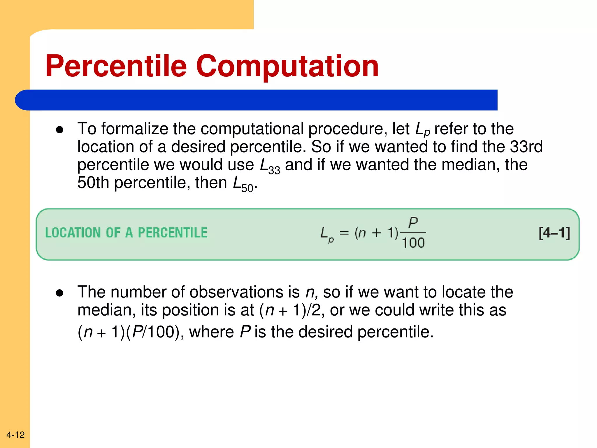
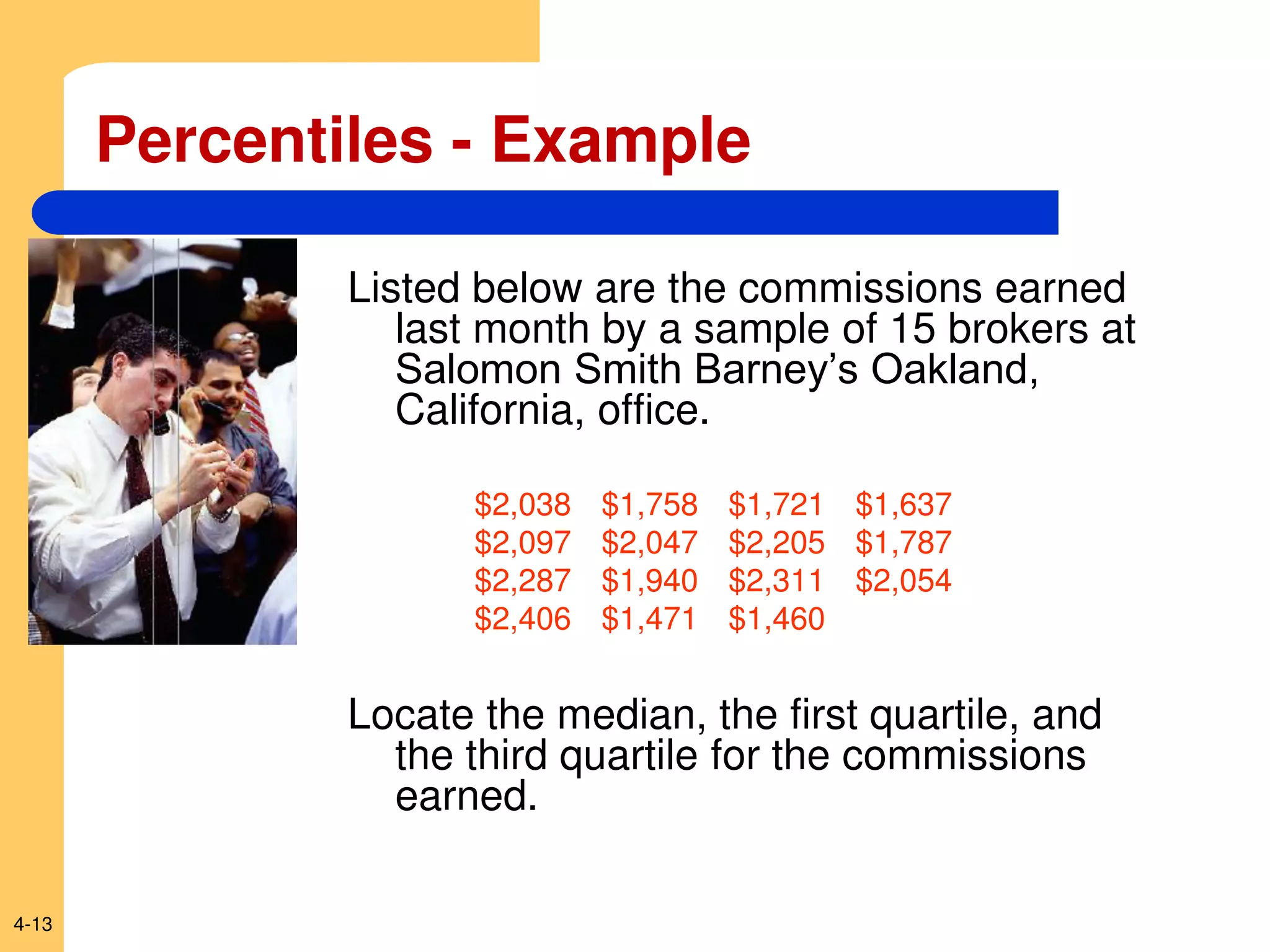
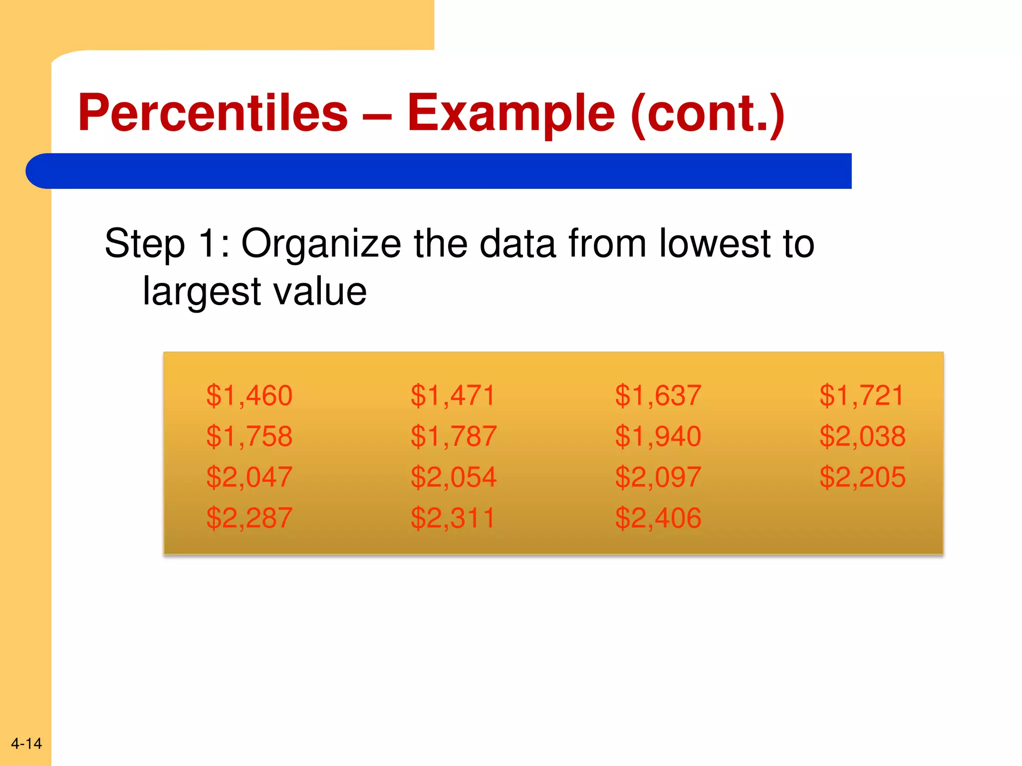
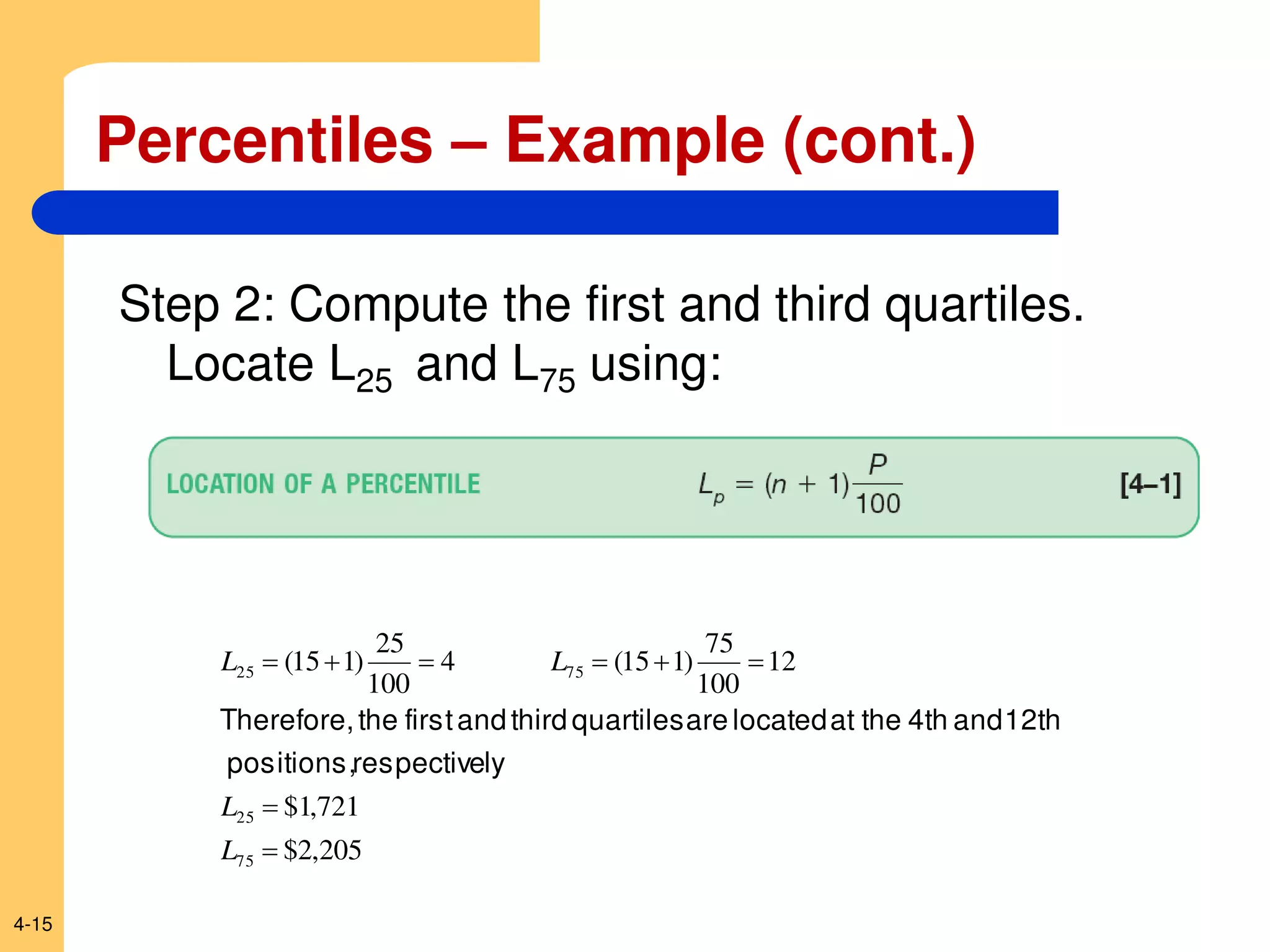
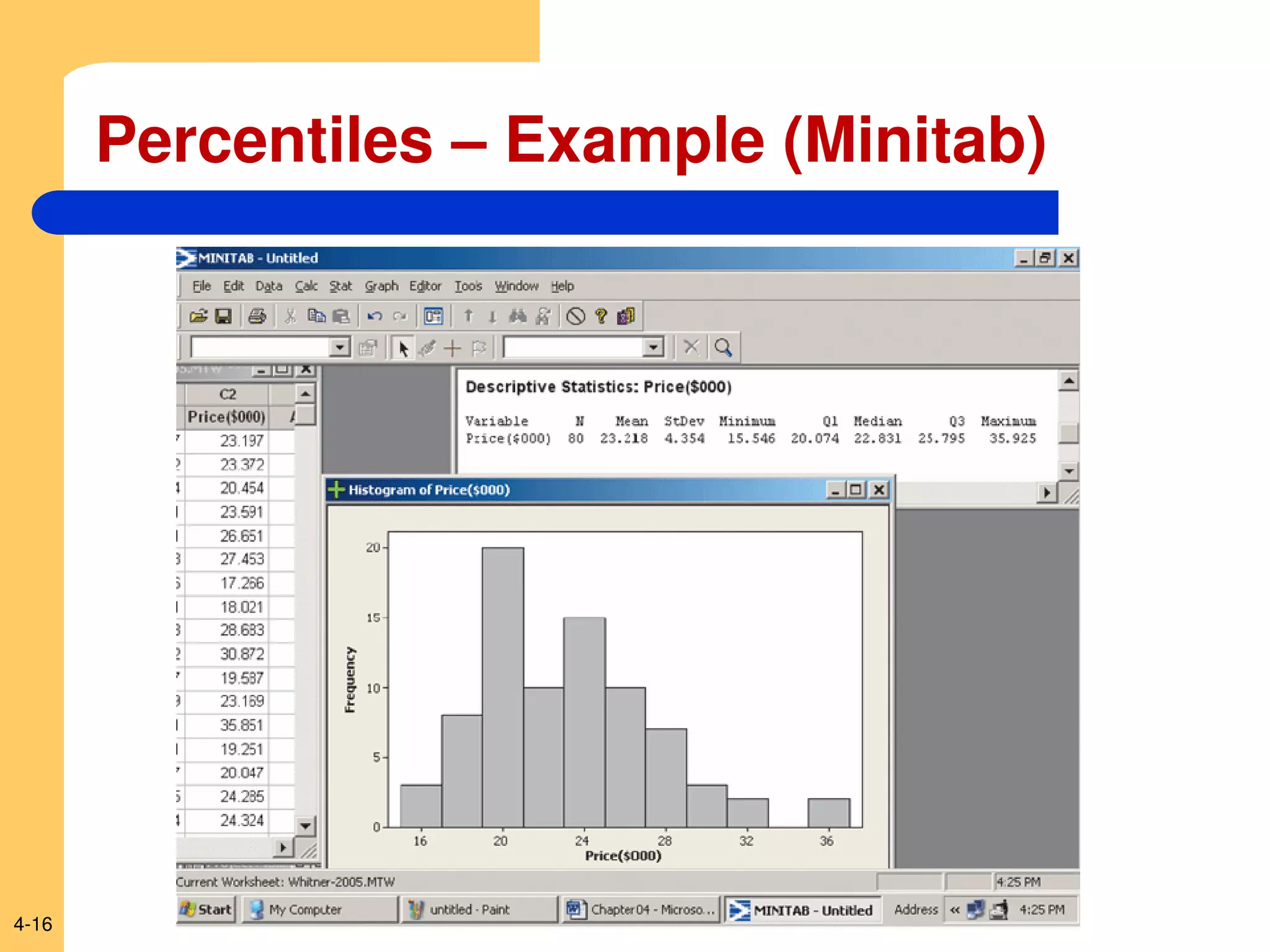
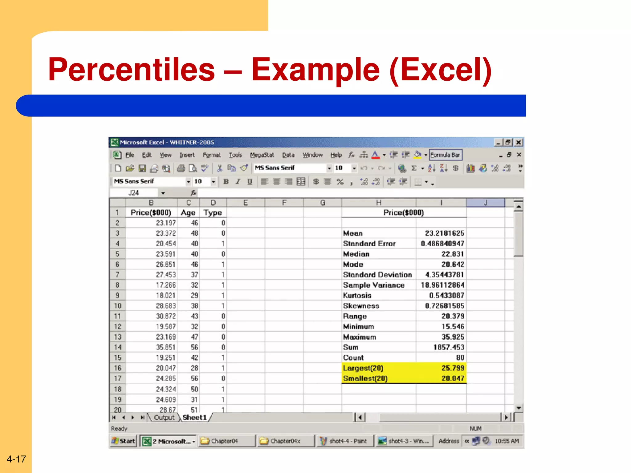
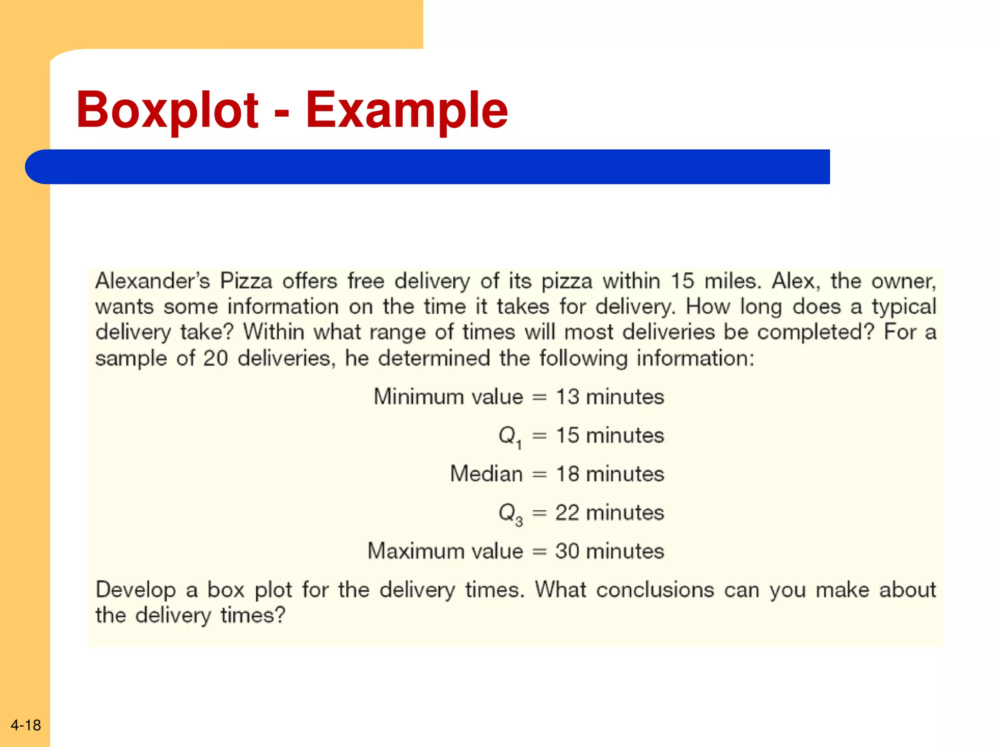
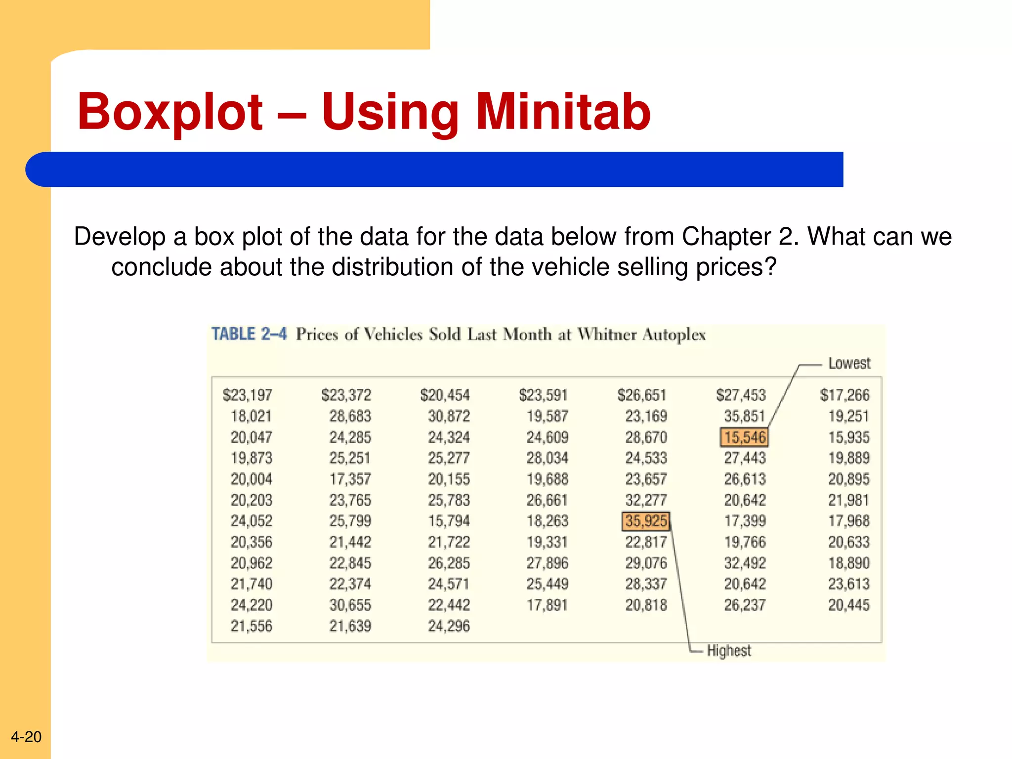
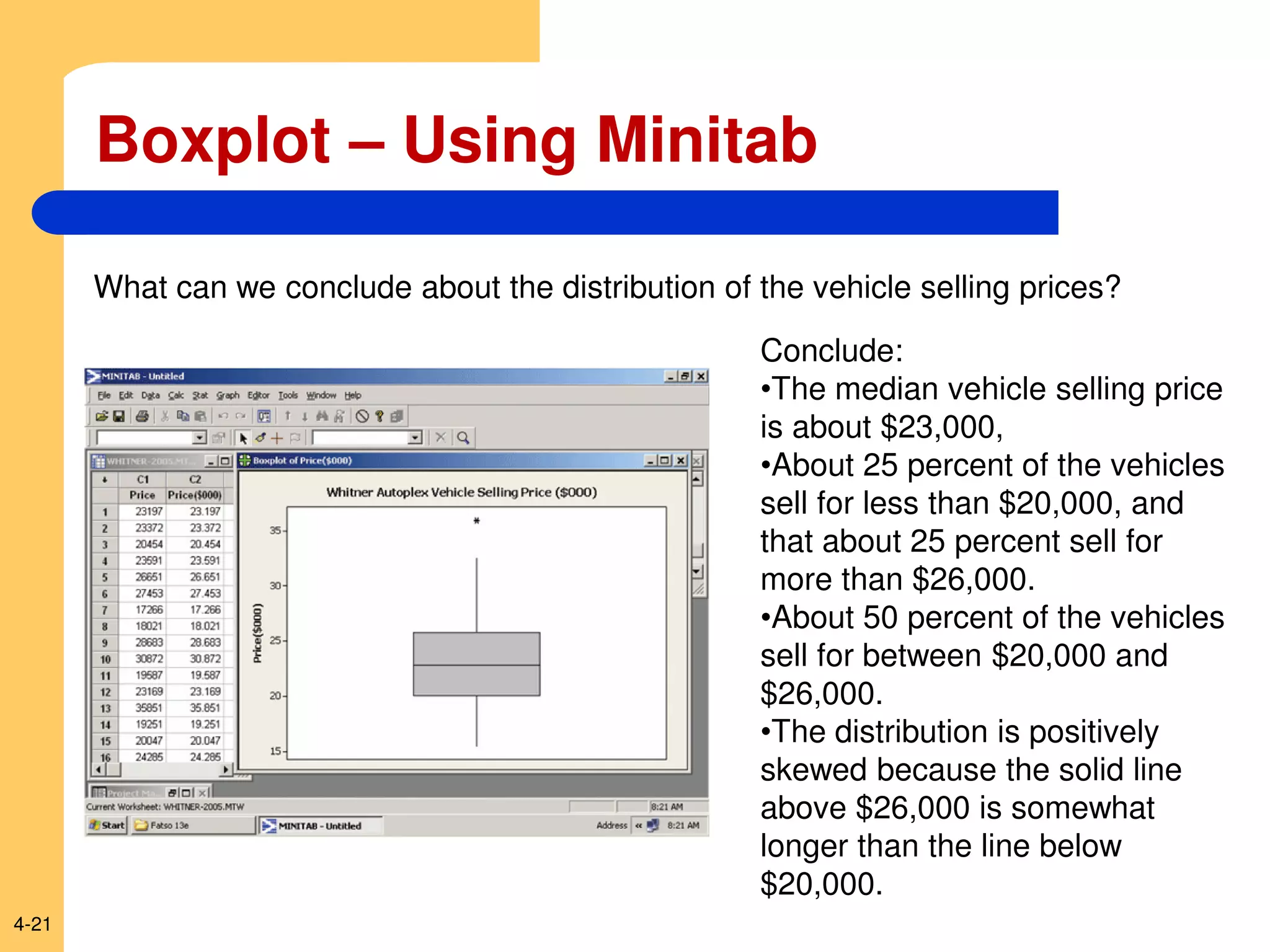
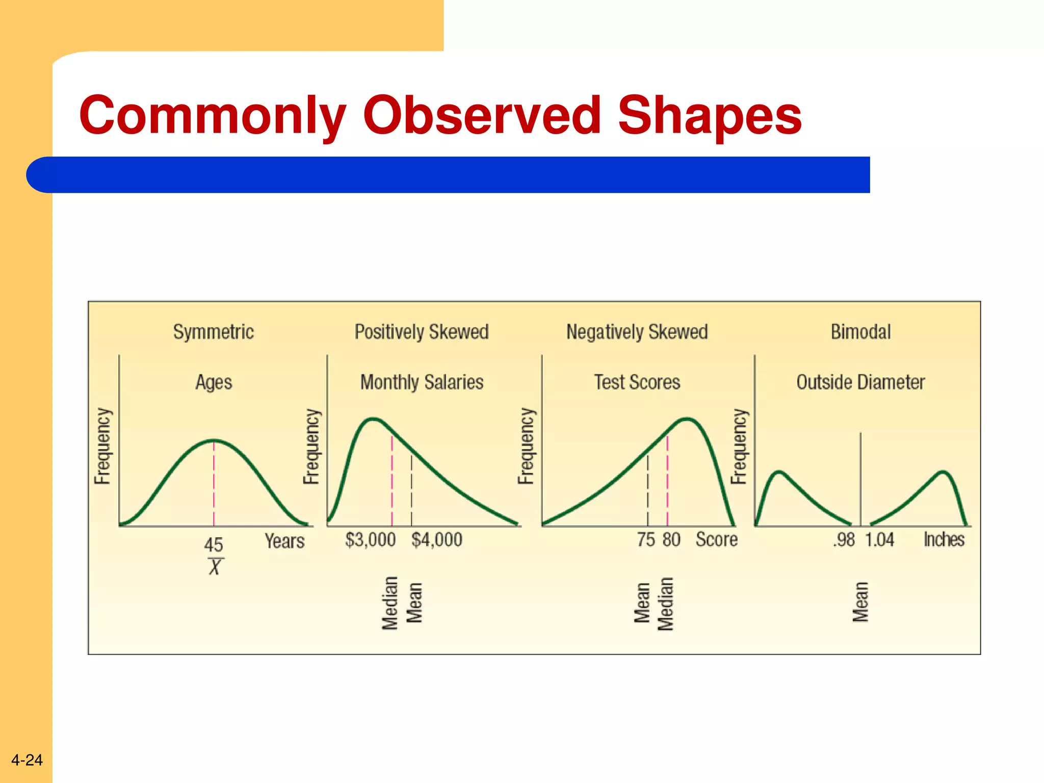
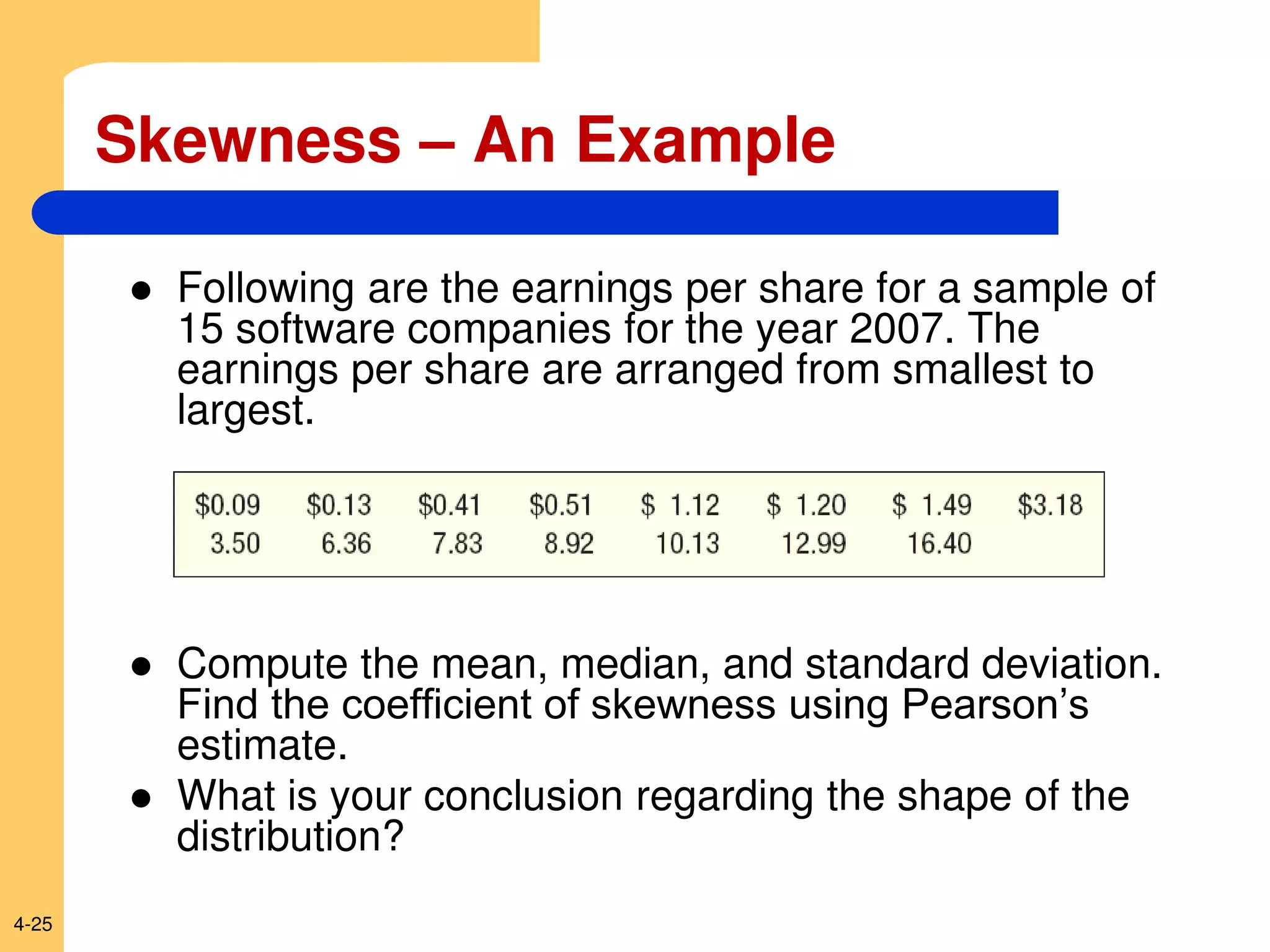
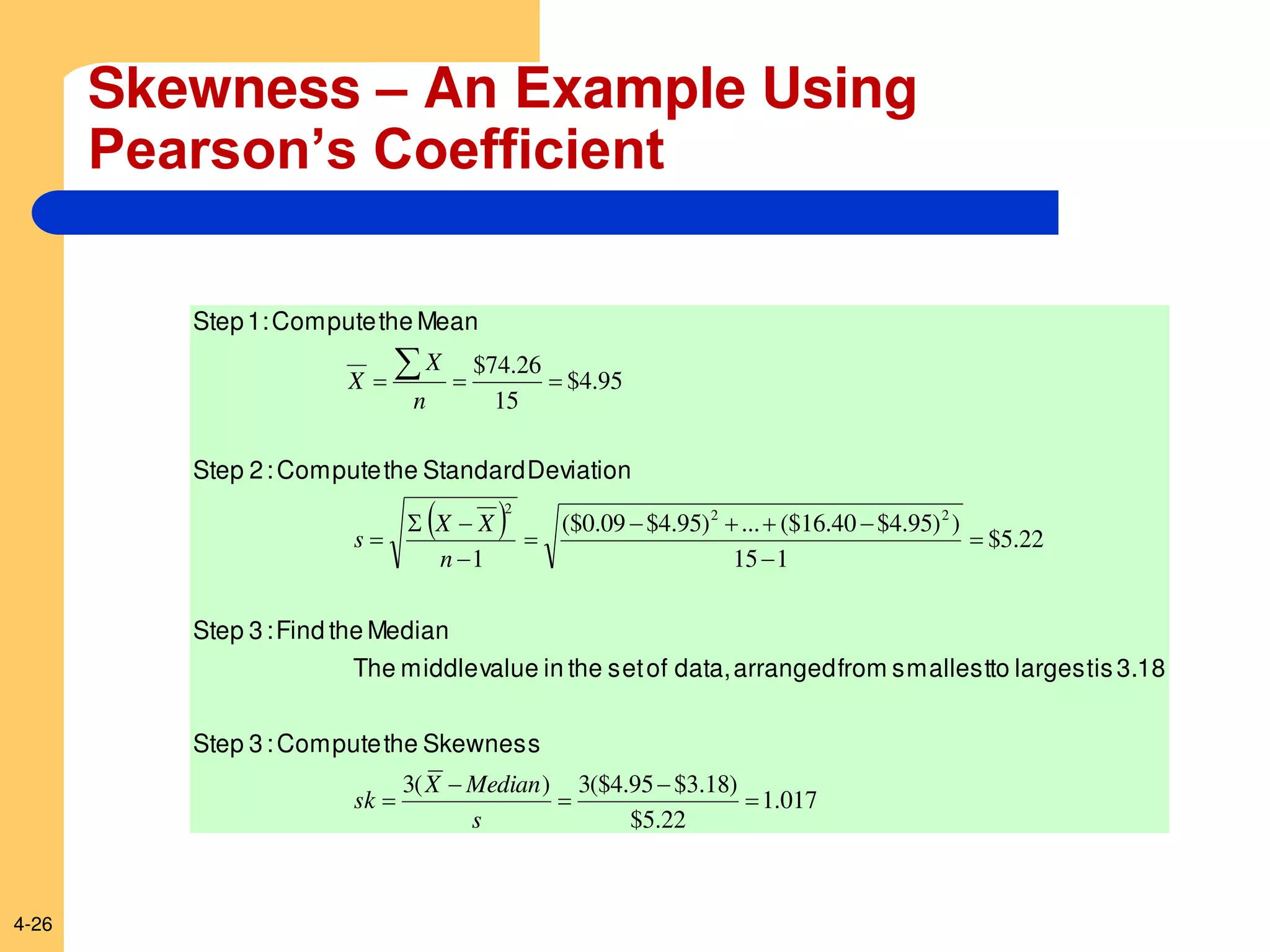
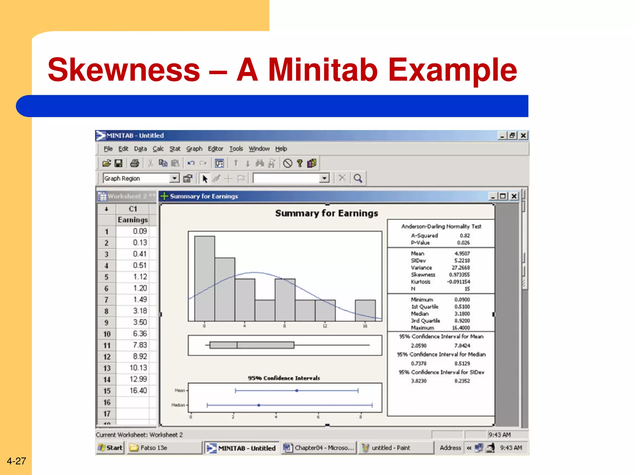
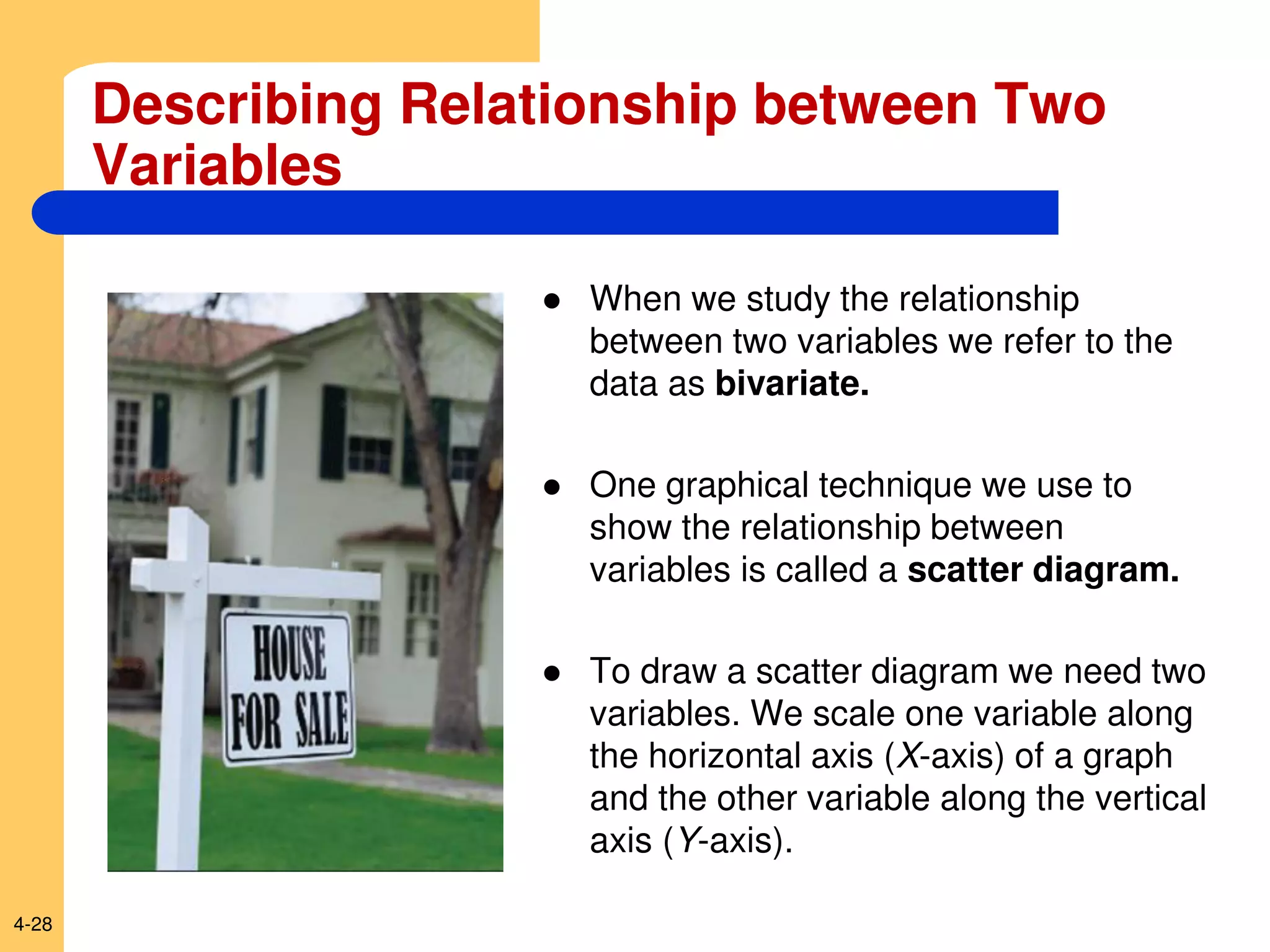
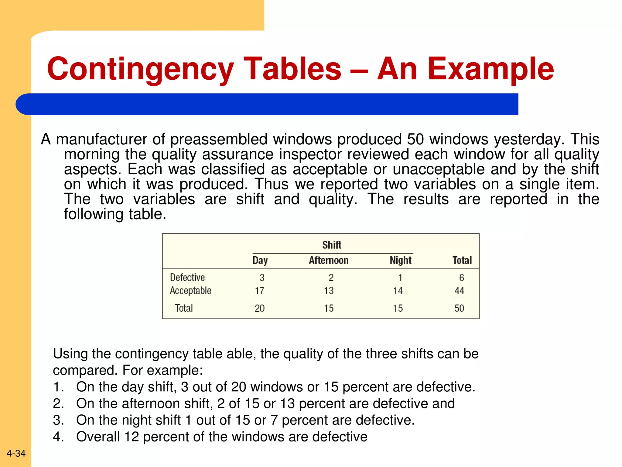
SlideShare a Scribd company logo
1 of 34
Download to read offline
McGraw-Hill/Irwin Copyright © 2010 by The McGraw-Hill Companies, Inc. All rights reserved.
Describing Data:
Displaying and Exploring Data
Chapter 4
4-2
GOALS
1. Develop and interpret a dot plot.
2. Develop and interpret a stem-and-leaf display.
3. Compute and understand quartiles, deciles, and
percentiles.
4. Construct and interpret box plots.
5. Compute and understand the coefficient of
skewness.
6. Draw and interpret a scatter diagram.
7. Construct and interpret a contingency table.
4-3
Dot Plots
 A dot plot groups the data as little as possible and
the identity of an individual observation is not lost.
 To develop a dot plot, each observation is simply
displayed as a dot along a horizontal number line
indicating the possible values of the data.
 If there are identical observations or the
observations are too close to be shown individually,
the dots are “piled” on top of each other.
4-4
Dot Plots - Examples
Reported below are the number of vehicles sold in the last 24 months at
Smith Ford Mercury Jeep, Inc., in Kane, Pennsylvania, and Brophy
Honda Volkswagen in Greenville, Ohio.
Construct dot plots and report summary statistics for the two small-town
Auto USA lots.
4-5
Dot Plot – Minitab Example
4-6
Stem-and-Leaf
 In Chapter 2, frequency distribution was used to organize data
into a meaningful form.
 A major advantage to organizing the data into a frequency
distribution is that we get a quick visual picture of the shape of
the distribution.
 There are two disadvantages, however, to organizing the data
into a frequency distribution:
(1) The exact identity of each value is lost
(2) Difficult to tell how the values within each class are distributed.
 One technique that is used to display quantitative information in
a condensed form is the stem-and-leaf display.
4-7
Stem-and-Leaf
 Stem-and-leaf display is a statistical technique to present a
set of data. Each numerical value is divided into two parts. The
leading digit(s) becomes the stem and the trailing digit the leaf.
The stems are located along the vertical axis, and the leaf
values are stacked against each other along the horizontal axis.
 Advantage of the stem-and-leaf display over a frequency
distribution - the identity of each observation is not lost.
4-8
Stem-and-leaf Plot Example
Listed in Table 4–1 is the number of 30-second radio advertising
spots purchased by each of the 45 members of the Greater
Buffalo Automobile Dealers Association last year.
Organize the data into a stem-and-leaf display. Around what values
do the number of advertising spots tend to cluster? What is the
fewest number of spots purchased by a dealer? The largest
number purchased?
4-9
Stem-and-leaf Plot Example
4-10
Stem-and-leaf: Another Example
(Minitab)
4-11
 The standard deviation is the most widely used
measure of dispersion.
 Alternative ways of describing spread of data include
determining the location of values that divide a set of
observations into equal parts.
 These measures include quartiles, deciles, and
percentiles.
Quartiles, Deciles and Percentiles
4-12
 To formalize the computational procedure, let Lp refer to the
location of a desired percentile. So if we wanted to find the 33rd
percentile we would use L33 and if we wanted the median, the
50th percentile, then L50.
 The number of observations is n, so if we want to locate the
median, its position is at (n + 1)/2, or we could write this as
(n + 1)(P/100), where P is the desired percentile.
Percentile Computation
4-13
Percentiles - Example
Listed below are the commissions earned
last month by a sample of 15 brokers at
Salomon Smith Barney’s Oakland,
California, office.
$2,038 $1,758 $1,721 $1,637
$2,097 $2,047 $2,205 $1,787
$2,287 $1,940 $2,311 $2,054
$2,406 $1,471 $1,460
Locate the median, the first quartile, and
the third quartile for the commissions
earned.
4-14
Percentiles – Example (cont.)
Step 1: Organize the data from lowest to
largest value
$1,460 $1,471 $1,637 $1,721
$1,758 $1,787 $1,940 $2,038
$2,047 $2,054 $2,097 $2,205
$2,287 $2,311 $2,406
4-15
Percentiles – Example (cont.)
Step 2: Compute the first and third quartiles.
Locate L25 and L75 using:
205
,
2
$
721
,
1
$
12
100
75
)
1
15
(
4
100
25
)
1
15
(
75
25
75
25








L
L
L
L
ly
respective
positions,
12th
and
4th
the
at
located
are
quartiles
third
and
first
the
Therefore,
4-16
Percentiles – Example (Minitab)
4-17
Percentiles – Example (Excel)
4-18
Boxplot - Example
4-19
Boxplot Example
Step1: Create an appropriate scale along the horizontal axis.
Step 2: Draw a box that starts at Q1 (15 minutes) and ends at Q3 (22
minutes). Inside the box we place a vertical line to represent the median (18
minutes).
Step 3: Extend horizontal lines from the box out to the minimum value (13
minutes) and the maximum value (30 minutes).
4-20
Boxplot – Using Minitab
Develop a box plot of the data for the data below from Chapter 2. What can we
conclude about the distribution of the vehicle selling prices?
4-21
Boxplot – Using Minitab
What can we conclude about the distribution of the vehicle selling prices?
Conclude:
•The median vehicle selling price
is about $23,000,
•About 25 percent of the vehicles
sell for less than $20,000, and
that about 25 percent sell for
more than $26,000.
•About 50 percent of the vehicles
sell for between $20,000 and
$26,000.
•The distribution is positively
skewed because the solid line
above $26,000 is somewhat
longer than the line below
$20,000.
4-22
Skewness
 In Chapter 3, measures of central location (the
mean, median, and mode) for a set of observations
and measures of data dispersion (e.g. range and the
standard deviation) were introduced
 Another characteristic of a set of data is the shape.
 There are four shapes commonly observed:
– symmetric,
– positively skewed,
– negatively skewed,
– bimodal.
4-23
Skewness - Formulas for Computing
The coefficient of skewness can range from -3 up to 3.
– A value near -3, indicates considerable negative skewness.
– A value such as 1.63 indicates moderate positive skewness.
– A value of 0, which will occur when the mean and median are
equal, indicates the distribution is symmetrical and that there is no
skewness present.
4-24
Commonly Observed Shapes
4-25
Skewness – An Example
 Following are the earnings per share for a sample of
15 software companies for the year 2007. The
earnings per share are arranged from smallest to
largest.
 Compute the mean, median, and standard deviation.
Find the coefficient of skewness using Pearson’s
estimate.
 What is your conclusion regarding the shape of the
distribution?
4-26
Skewness – An Example Using
Pearson’s Coefficient
 
017
.
1
22
.
5
$
)
18
.
3
$
95
.
4
($
3
)
(
3
22
.
5
$
1
15
)
)
95
.
4
$
40
.
16
($
...
)
95
.
4
$
09
.
0
($
1
95
.
4
$
15
26
.
74
$
2
2
2




















s
Median
X
sk
n
X
X
s
n
X
X
Skewness
the
Compute
:
3
Step
3.18
is
largest
to
smallest
from
arranged
data,
of
set
the
in
value
middle
The
Median
the
Find
:
3
Step
Deviation
Standard
the
Compute
:
2
Step
Mean
the
Compute
1:
Step
4-27
Skewness – A Minitab Example
4-28
Describing Relationship between Two
Variables
 When we study the relationship
between two variables we refer to the
data as bivariate.
 One graphical technique we use to
show the relationship between
variables is called a scatter diagram.
 To draw a scatter diagram we need two
variables. We scale one variable along
the horizontal axis (X-axis) of a graph
and the other variable along the vertical
axis (Y-axis).
4-29
Describing Relationship between Two
Variables – Scatter Diagram Examples
4-30
In Chapter 2 we presented data
from AutoUSA. In this case the
information concerned the prices
of 80 vehicles sold last month at
the Whitner Autoplex lot in
Raytown, Missouri. The data
shown include the selling price
of the vehicle as well as the age
of the purchaser.
Is there a relationship between the
selling price of a vehicle and the
age of the purchaser?
Would it be reasonable to conclude
that the more expensive vehicles
are purchased by older buyers?
Describing Relationship between Two
Variables – Scatter Diagram Excel Example
4-31
Describing Relationship between Two
Variables – Scatter Diagram Excel Example
4-32
Contingency Tables
 A scatter diagram requires that both of the
variables be at least interval scale.
 What if we wish to study the relationship
between two variables when one or both are
nominal or ordinal scale? In this case we tally
the results in a contingency table.
4-33
Contingency Tables
A contingency table is a cross-tabulation that
simultaneously summarizes two variables of interest.
Examples:
1. Students at a university are classified by gender and class rank.
2. A product is classified as acceptable or unacceptable and by the
shift (day, afternoon, or night) on which it is manufactured.
3. A voter in a school bond referendum is classified as to party
affiliation (Democrat, Republican, other) and the number of children
that voter has attending school in the district (0, 1, 2, etc.).
4-34
Contingency Tables – An Example
A manufacturer of preassembled windows produced 50 windows yesterday. This
morning the quality assurance inspector reviewed each window for all quality
aspects. Each was classified as acceptable or unacceptable and by the shift
on which it was produced. Thus we reported two variables on a single item.
The two variables are shift and quality. The results are reported in the
following table.
Using the contingency table able, the quality of the three shifts can be
compared. For example:
1. On the day shift, 3 out of 20 windows or 15 percent are defective.
2. On the afternoon shift, 2 of 15 or 13 percent are defective and
3. On the night shift 1 out of 15 or 7 percent are defective.
4. Overall 12 percent of the windows are defective

More Related Content

What's hot

Types Of Charts
Types Of ChartsTypes Of Charts
Types Of Chartswmassie
 
Business Statistics
Business StatisticsBusiness Statistics
Business Statisticsshorab
 
Statistics
StatisticsStatistics
Statisticsdiereck
 
Top 8 Different Types Of Charts In Statistics And Their Uses
Top 8 Different Types Of Charts In Statistics And Their UsesTop 8 Different Types Of Charts In Statistics And Their Uses
Top 8 Different Types Of Charts In Statistics And Their UsesStat Analytica
 
Write at least 150 words. 2. identifying and comparing data on a
Write at least 150 words. 2. identifying and comparing data on aWrite at least 150 words. 2. identifying and comparing data on a
Write at least 150 words. 2. identifying and comparing data on aSUBHI7
 
Graphical representation of data
Graphical representation of dataGraphical representation of data
Graphical representation of dataVadivel V
 
Presenting information presentation.
Presenting information presentation.Presenting information presentation.
Presenting information presentation.danielle93
 
Forecasting Stock Market using Multiple Linear Regression
Forecasting Stock Market using Multiple Linear RegressionForecasting Stock Market using Multiple Linear Regression
Forecasting Stock Market using Multiple Linear Regressionijtsrd
 
Different types of charts
Different types of chartsDifferent types of charts
Different types of chartsZakaria Salim
 
Tabulating and graphing the data
Tabulating and graphing the dataTabulating and graphing the data
Tabulating and graphing the dataJone Zelita Orlina
 
Lesson 5 data presentation
Lesson 5 data presentationLesson 5 data presentation
Lesson 5 data presentationMaris Ganace
 
TID Chapter 5 Introduction To Charts And Graph
TID Chapter 5 Introduction To Charts And GraphTID Chapter 5 Introduction To Charts And Graph
TID Chapter 5 Introduction To Charts And GraphWanBK Leo
 
Data visualization 101_how_to_design_charts_and_graphs
Data visualization 101_how_to_design_charts_and_graphsData visualization 101_how_to_design_charts_and_graphs
Data visualization 101_how_to_design_charts_and_graphsAtner Yegorov
 

What's hot (20)

Visualization-1
Visualization-1Visualization-1
Visualization-1
 
Types Of Charts
Types Of ChartsTypes Of Charts
Types Of Charts
 
Business Statistics
Business StatisticsBusiness Statistics
Business Statistics
 
Statistics
StatisticsStatistics
Statistics
 
Session02
Session02Session02
Session02
 
Top 8 Different Types Of Charts In Statistics And Their Uses
Top 8 Different Types Of Charts In Statistics And Their UsesTop 8 Different Types Of Charts In Statistics And Their Uses
Top 8 Different Types Of Charts In Statistics And Their Uses
 
Charts And Graphs
Charts And GraphsCharts And Graphs
Charts And Graphs
 
Write at least 150 words. 2. identifying and comparing data on a
Write at least 150 words. 2. identifying and comparing data on aWrite at least 150 words. 2. identifying and comparing data on a
Write at least 150 words. 2. identifying and comparing data on a
 
Graphical representation of data
Graphical representation of dataGraphical representation of data
Graphical representation of data
 
Presenting information presentation.
Presenting information presentation.Presenting information presentation.
Presenting information presentation.
 
Ways of presenting information
Ways of presenting informationWays of presenting information
Ways of presenting information
 
Forecasting Stock Market using Multiple Linear Regression
Forecasting Stock Market using Multiple Linear RegressionForecasting Stock Market using Multiple Linear Regression
Forecasting Stock Market using Multiple Linear Regression
 
Different types of charts
Different types of chartsDifferent types of charts
Different types of charts
 
Tabulating and graphing the data
Tabulating and graphing the dataTabulating and graphing the data
Tabulating and graphing the data
 
Visualization-2
Visualization-2Visualization-2
Visualization-2
 
Bigdata
BigdataBigdata
Bigdata
 
Lesson 5 data presentation
Lesson 5 data presentationLesson 5 data presentation
Lesson 5 data presentation
 
TID Chapter 5 Introduction To Charts And Graph
TID Chapter 5 Introduction To Charts And GraphTID Chapter 5 Introduction To Charts And Graph
TID Chapter 5 Introduction To Charts And Graph
 
Data visualization 101_how_to_design_charts_and_graphs
Data visualization 101_how_to_design_charts_and_graphsData visualization 101_how_to_design_charts_and_graphs
Data visualization 101_how_to_design_charts_and_graphs
 
TYPES ON CHARTS
TYPES ON CHARTS TYPES ON CHARTS
TYPES ON CHARTS
 

Similar to Chapter iv

Chap 04 - Describing Data_Displaying and Exploring Data.pdf
Chap 04 - Describing Data_Displaying and Exploring Data.pdfChap 04 - Describing Data_Displaying and Exploring Data.pdf
Chap 04 - Describing Data_Displaying and Exploring Data.pdfSouravHasan8
 
LEARNING OBJECTIVESWhen you have completed this chapter, you.docx
LEARNING OBJECTIVESWhen you have completed this chapter, you.docxLEARNING OBJECTIVESWhen you have completed this chapter, you.docx
LEARNING OBJECTIVESWhen you have completed this chapter, you.docxjesssueann
 
Chapter 03
Chapter 03Chapter 03
Chapter 03bmcfad01
 
Data and Information Visualization Part 1part 1.pptx
Data and Information Visualization Part 1part 1.pptxData and Information Visualization Part 1part 1.pptx
Data and Information Visualization Part 1part 1.pptxLamees EL- Ghazoly
 
Statistics
StatisticsStatistics
Statisticspikuoec
 
Chi square test evidence based dentistry
Chi square test evidence based dentistryChi square test evidence based dentistry
Chi square test evidence based dentistryPiyushJain163909
 
As mentioned earlier, the mid-term will have conceptual and quanti.docx
As mentioned earlier, the mid-term will have conceptual and quanti.docxAs mentioned earlier, the mid-term will have conceptual and quanti.docx
As mentioned earlier, the mid-term will have conceptual and quanti.docxfredharris32
 
Measures of dispersion qt pgdm 1st trisemester
Measures of dispersion qt pgdm 1st trisemester Measures of dispersion qt pgdm 1st trisemester
Measures of dispersion qt pgdm 1st trisemester Karan Kukreja
 
Data analysis.pptx
Data analysis.pptxData analysis.pptx
Data analysis.pptxMDPiasKhan
 
What is Descriptive Statistics and How Do You Choose the Right One for Enterp...
What is Descriptive Statistics and How Do You Choose the Right One for Enterp...What is Descriptive Statistics and How Do You Choose the Right One for Enterp...
What is Descriptive Statistics and How Do You Choose the Right One for Enterp...Smarten Augmented Analytics
 
Chapter 16
Chapter 16Chapter 16
Chapter 16bmcfad01
 
Graphical Presentation of Data - Rangga Masyhuri Nuur LLU 27.pptx
Graphical Presentation of Data - Rangga Masyhuri Nuur LLU 27.pptxGraphical Presentation of Data - Rangga Masyhuri Nuur LLU 27.pptx
Graphical Presentation of Data - Rangga Masyhuri Nuur LLU 27.pptxRanggaMasyhuriNuur
 

Similar to Chapter iv (20)

Chap004.ppt
Chap004.pptChap004.ppt
Chap004.ppt
 
Chap004.ppt
Chap004.pptChap004.ppt
Chap004.ppt
 
Bab 4.ppt
Bab 4.pptBab 4.ppt
Bab 4.ppt
 
Chap 04 - Describing Data_Displaying and Exploring Data.pdf
Chap 04 - Describing Data_Displaying and Exploring Data.pdfChap 04 - Describing Data_Displaying and Exploring Data.pdf
Chap 04 - Describing Data_Displaying and Exploring Data.pdf
 
Chap004.ppt
Chap004.pptChap004.ppt
Chap004.ppt
 
LEARNING OBJECTIVESWhen you have completed this chapter, you.docx
LEARNING OBJECTIVESWhen you have completed this chapter, you.docxLEARNING OBJECTIVESWhen you have completed this chapter, you.docx
LEARNING OBJECTIVESWhen you have completed this chapter, you.docx
 
Chap004
Chap004Chap004
Chap004
 
Chap003.ppt
Chap003.pptChap003.ppt
Chap003.ppt
 
Chapter 03
Chapter 03Chapter 03
Chapter 03
 
Data and Information Visualization Part 1part 1.pptx
Data and Information Visualization Part 1part 1.pptxData and Information Visualization Part 1part 1.pptx
Data and Information Visualization Part 1part 1.pptx
 
Chap004
Chap004Chap004
Chap004
 
Statistics
StatisticsStatistics
Statistics
 
Chi square test evidence based dentistry
Chi square test evidence based dentistryChi square test evidence based dentistry
Chi square test evidence based dentistry
 
As mentioned earlier, the mid-term will have conceptual and quanti.docx
As mentioned earlier, the mid-term will have conceptual and quanti.docxAs mentioned earlier, the mid-term will have conceptual and quanti.docx
As mentioned earlier, the mid-term will have conceptual and quanti.docx
 
Measures of dispersion qt pgdm 1st trisemester
Measures of dispersion qt pgdm 1st trisemester Measures of dispersion qt pgdm 1st trisemester
Measures of dispersion qt pgdm 1st trisemester
 
Data analysis.pptx
Data analysis.pptxData analysis.pptx
Data analysis.pptx
 
What is Descriptive Statistics and How Do You Choose the Right One for Enterp...
What is Descriptive Statistics and How Do You Choose the Right One for Enterp...What is Descriptive Statistics and How Do You Choose the Right One for Enterp...
What is Descriptive Statistics and How Do You Choose the Right One for Enterp...
 
Chapter 16
Chapter 16Chapter 16
Chapter 16
 
Graphical Presentation of Data - Rangga Masyhuri Nuur LLU 27.pptx
Graphical Presentation of Data - Rangga Masyhuri Nuur LLU 27.pptxGraphical Presentation of Data - Rangga Masyhuri Nuur LLU 27.pptx
Graphical Presentation of Data - Rangga Masyhuri Nuur LLU 27.pptx
 
Elementary Statistics
Elementary Statistics Elementary Statistics
Elementary Statistics
 

Recently uploaded

Biting mechanism of poisonous snakes.pdf
Biting mechanism of poisonous snakes.pdfBiting mechanism of poisonous snakes.pdf
Biting mechanism of poisonous snakes.pdfadityarao40181
 
Painted Grey Ware.pptx, PGW Culture of India
Painted Grey Ware.pptx, PGW Culture of IndiaPainted Grey Ware.pptx, PGW Culture of India
Painted Grey Ware.pptx, PGW Culture of IndiaVirag Sontakke
 
EPANDING THE CONTENT OF AN OUTLINE using notes.pptx
EPANDING THE CONTENT OF AN OUTLINE using notes.pptxEPANDING THE CONTENT OF AN OUTLINE using notes.pptx
EPANDING THE CONTENT OF AN OUTLINE using notes.pptxRaymartEstabillo3
 
DATA STRUCTURE AND ALGORITHM for beginners
DATA STRUCTURE AND ALGORITHM for beginnersDATA STRUCTURE AND ALGORITHM for beginners
DATA STRUCTURE AND ALGORITHM for beginnersSabitha Banu
 
Software Engineering Methodologies (overview)
Software Engineering Methodologies (overview)Software Engineering Methodologies (overview)
Software Engineering Methodologies (overview)eniolaolutunde
 
How to Configure Email Server in Odoo 17
How to Configure Email Server in Odoo 17How to Configure Email Server in Odoo 17
How to Configure Email Server in Odoo 17Celine George
 
How to Make a Pirate ship Primary Education.pptx
How to Make a Pirate ship Primary Education.pptxHow to Make a Pirate ship Primary Education.pptx
How to Make a Pirate ship Primary Education.pptxmanuelaromero2013
 
Proudly South Africa powerpoint Thorisha.pptx
Proudly South Africa powerpoint Thorisha.pptxProudly South Africa powerpoint Thorisha.pptx
Proudly South Africa powerpoint Thorisha.pptxthorishapillay1
 
Organic Name Reactions for the students and aspirants of Chemistry12th.pptx
Organic Name Reactions  for the students and aspirants of Chemistry12th.pptxOrganic Name Reactions  for the students and aspirants of Chemistry12th.pptx
Organic Name Reactions for the students and aspirants of Chemistry12th.pptxVS Mahajan Coaching Centre
 
POINT- BIOCHEMISTRY SEM 2 ENZYMES UNIT 5.pptx
POINT- BIOCHEMISTRY SEM 2 ENZYMES UNIT 5.pptxPOINT- BIOCHEMISTRY SEM 2 ENZYMES UNIT 5.pptx
POINT- BIOCHEMISTRY SEM 2 ENZYMES UNIT 5.pptxSayali Powar
 
Historical philosophical, theoretical, and legal foundations of special and i...
Historical philosophical, theoretical, and legal foundations of special and i...Historical philosophical, theoretical, and legal foundations of special and i...
Historical philosophical, theoretical, and legal foundations of special and i...jaredbarbolino94
 
Pharmacognosy Flower 3. Compositae 2023.pdf
Pharmacognosy Flower 3. Compositae 2023.pdfPharmacognosy Flower 3. Compositae 2023.pdf
Pharmacognosy Flower 3. Compositae 2023.pdfMahmoud M. Sallam
 
18-04-UA_REPORT_MEDIALITERAСY_INDEX-DM_23-1-final-eng.pdf
18-04-UA_REPORT_MEDIALITERAСY_INDEX-DM_23-1-final-eng.pdf18-04-UA_REPORT_MEDIALITERAСY_INDEX-DM_23-1-final-eng.pdf
18-04-UA_REPORT_MEDIALITERAСY_INDEX-DM_23-1-final-eng.pdfssuser54595a
 
Introduction to AI in Higher Education_draft.pptx
Introduction to AI in Higher Education_draft.pptxIntroduction to AI in Higher Education_draft.pptx
Introduction to AI in Higher Education_draft.pptxpboyjonauth
 
Full Stack Web Development Course for Beginners
Full Stack Web Development Course  for BeginnersFull Stack Web Development Course  for Beginners
Full Stack Web Development Course for BeginnersSabitha Banu
 
Capitol Tech U Doctoral Presentation - April 2024.pptx
Capitol Tech U Doctoral Presentation - April 2024.pptxCapitol Tech U Doctoral Presentation - April 2024.pptx
Capitol Tech U Doctoral Presentation - April 2024.pptxCapitolTechU
 
ECONOMIC CONTEXT - PAPER 1 Q3: NEWSPAPERS.pptx
ECONOMIC CONTEXT - PAPER 1 Q3: NEWSPAPERS.pptxECONOMIC CONTEXT - PAPER 1 Q3: NEWSPAPERS.pptx
ECONOMIC CONTEXT - PAPER 1 Q3: NEWSPAPERS.pptxiammrhaywood
 
Enzyme, Pharmaceutical Aids, Miscellaneous Last Part of Chapter no 5th.pdf
Enzyme, Pharmaceutical Aids, Miscellaneous Last Part of Chapter no 5th.pdfEnzyme, Pharmaceutical Aids, Miscellaneous Last Part of Chapter no 5th.pdf
Enzyme, Pharmaceutical Aids, Miscellaneous Last Part of Chapter no 5th.pdfSumit Tiwari
 
internship ppt on smartinternz platform as salesforce developer
internship ppt on smartinternz platform as salesforce developerinternship ppt on smartinternz platform as salesforce developer
internship ppt on smartinternz platform as salesforce developerunnathinaik
 

Recently uploaded (20)

Biting mechanism of poisonous snakes.pdf
Biting mechanism of poisonous snakes.pdfBiting mechanism of poisonous snakes.pdf
Biting mechanism of poisonous snakes.pdf
 
Painted Grey Ware.pptx, PGW Culture of India
Painted Grey Ware.pptx, PGW Culture of IndiaPainted Grey Ware.pptx, PGW Culture of India
Painted Grey Ware.pptx, PGW Culture of India
 
EPANDING THE CONTENT OF AN OUTLINE using notes.pptx
EPANDING THE CONTENT OF AN OUTLINE using notes.pptxEPANDING THE CONTENT OF AN OUTLINE using notes.pptx
EPANDING THE CONTENT OF AN OUTLINE using notes.pptx
 
Model Call Girl in Bikash Puri Delhi reach out to us at 🔝9953056974🔝
Model Call Girl in Bikash Puri  Delhi reach out to us at 🔝9953056974🔝Model Call Girl in Bikash Puri  Delhi reach out to us at 🔝9953056974🔝
Model Call Girl in Bikash Puri Delhi reach out to us at 🔝9953056974🔝
 
DATA STRUCTURE AND ALGORITHM for beginners
DATA STRUCTURE AND ALGORITHM for beginnersDATA STRUCTURE AND ALGORITHM for beginners
DATA STRUCTURE AND ALGORITHM for beginners
 
Software Engineering Methodologies (overview)
Software Engineering Methodologies (overview)Software Engineering Methodologies (overview)
Software Engineering Methodologies (overview)
 
How to Configure Email Server in Odoo 17
How to Configure Email Server in Odoo 17How to Configure Email Server in Odoo 17
How to Configure Email Server in Odoo 17
 
How to Make a Pirate ship Primary Education.pptx
How to Make a Pirate ship Primary Education.pptxHow to Make a Pirate ship Primary Education.pptx
How to Make a Pirate ship Primary Education.pptx
 
Proudly South Africa powerpoint Thorisha.pptx
Proudly South Africa powerpoint Thorisha.pptxProudly South Africa powerpoint Thorisha.pptx
Proudly South Africa powerpoint Thorisha.pptx
 
Organic Name Reactions for the students and aspirants of Chemistry12th.pptx
Organic Name Reactions  for the students and aspirants of Chemistry12th.pptxOrganic Name Reactions  for the students and aspirants of Chemistry12th.pptx
Organic Name Reactions for the students and aspirants of Chemistry12th.pptx
 
POINT- BIOCHEMISTRY SEM 2 ENZYMES UNIT 5.pptx
POINT- BIOCHEMISTRY SEM 2 ENZYMES UNIT 5.pptxPOINT- BIOCHEMISTRY SEM 2 ENZYMES UNIT 5.pptx
POINT- BIOCHEMISTRY SEM 2 ENZYMES UNIT 5.pptx
 
Historical philosophical, theoretical, and legal foundations of special and i...
Historical philosophical, theoretical, and legal foundations of special and i...Historical philosophical, theoretical, and legal foundations of special and i...
Historical philosophical, theoretical, and legal foundations of special and i...
 
Pharmacognosy Flower 3. Compositae 2023.pdf
Pharmacognosy Flower 3. Compositae 2023.pdfPharmacognosy Flower 3. Compositae 2023.pdf
Pharmacognosy Flower 3. Compositae 2023.pdf
 
18-04-UA_REPORT_MEDIALITERAСY_INDEX-DM_23-1-final-eng.pdf
18-04-UA_REPORT_MEDIALITERAСY_INDEX-DM_23-1-final-eng.pdf18-04-UA_REPORT_MEDIALITERAСY_INDEX-DM_23-1-final-eng.pdf
18-04-UA_REPORT_MEDIALITERAСY_INDEX-DM_23-1-final-eng.pdf
 
Introduction to AI in Higher Education_draft.pptx
Introduction to AI in Higher Education_draft.pptxIntroduction to AI in Higher Education_draft.pptx
Introduction to AI in Higher Education_draft.pptx
 
Full Stack Web Development Course for Beginners
Full Stack Web Development Course  for BeginnersFull Stack Web Development Course  for Beginners
Full Stack Web Development Course for Beginners
 
Capitol Tech U Doctoral Presentation - April 2024.pptx
Capitol Tech U Doctoral Presentation - April 2024.pptxCapitol Tech U Doctoral Presentation - April 2024.pptx
Capitol Tech U Doctoral Presentation - April 2024.pptx
 
ECONOMIC CONTEXT - PAPER 1 Q3: NEWSPAPERS.pptx
ECONOMIC CONTEXT - PAPER 1 Q3: NEWSPAPERS.pptxECONOMIC CONTEXT - PAPER 1 Q3: NEWSPAPERS.pptx
ECONOMIC CONTEXT - PAPER 1 Q3: NEWSPAPERS.pptx
 
Enzyme, Pharmaceutical Aids, Miscellaneous Last Part of Chapter no 5th.pdf
Enzyme, Pharmaceutical Aids, Miscellaneous Last Part of Chapter no 5th.pdfEnzyme, Pharmaceutical Aids, Miscellaneous Last Part of Chapter no 5th.pdf
Enzyme, Pharmaceutical Aids, Miscellaneous Last Part of Chapter no 5th.pdf
 
internship ppt on smartinternz platform as salesforce developer
internship ppt on smartinternz platform as salesforce developerinternship ppt on smartinternz platform as salesforce developer
internship ppt on smartinternz platform as salesforce developer
 

Chapter iv

  • 1. McGraw-Hill/Irwin Copyright © 2010 by The McGraw-Hill Companies, Inc. All rights reserved. Describing Data: Displaying and Exploring Data Chapter 4
  • 2. 4-2 GOALS 1. Develop and interpret a dot plot. 2. Develop and interpret a stem-and-leaf display. 3. Compute and understand quartiles, deciles, and percentiles. 4. Construct and interpret box plots. 5. Compute and understand the coefficient of skewness. 6. Draw and interpret a scatter diagram. 7. Construct and interpret a contingency table.
  • 3. 4-3 Dot Plots  A dot plot groups the data as little as possible and the identity of an individual observation is not lost.  To develop a dot plot, each observation is simply displayed as a dot along a horizontal number line indicating the possible values of the data.  If there are identical observations or the observations are too close to be shown individually, the dots are “piled” on top of each other.
  • 4. 4-4 Dot Plots - Examples Reported below are the number of vehicles sold in the last 24 months at Smith Ford Mercury Jeep, Inc., in Kane, Pennsylvania, and Brophy Honda Volkswagen in Greenville, Ohio. Construct dot plots and report summary statistics for the two small-town Auto USA lots.
  • 5. 4-5 Dot Plot – Minitab Example
  • 6. 4-6 Stem-and-Leaf  In Chapter 2, frequency distribution was used to organize data into a meaningful form.  A major advantage to organizing the data into a frequency distribution is that we get a quick visual picture of the shape of the distribution.  There are two disadvantages, however, to organizing the data into a frequency distribution: (1) The exact identity of each value is lost (2) Difficult to tell how the values within each class are distributed.  One technique that is used to display quantitative information in a condensed form is the stem-and-leaf display.
  • 7. 4-7 Stem-and-Leaf  Stem-and-leaf display is a statistical technique to present a set of data. Each numerical value is divided into two parts. The leading digit(s) becomes the stem and the trailing digit the leaf. The stems are located along the vertical axis, and the leaf values are stacked against each other along the horizontal axis.  Advantage of the stem-and-leaf display over a frequency distribution - the identity of each observation is not lost.
  • 8. 4-8 Stem-and-leaf Plot Example Listed in Table 4–1 is the number of 30-second radio advertising spots purchased by each of the 45 members of the Greater Buffalo Automobile Dealers Association last year. Organize the data into a stem-and-leaf display. Around what values do the number of advertising spots tend to cluster? What is the fewest number of spots purchased by a dealer? The largest number purchased?
  • 11. 4-11  The standard deviation is the most widely used measure of dispersion.  Alternative ways of describing spread of data include determining the location of values that divide a set of observations into equal parts.  These measures include quartiles, deciles, and percentiles. Quartiles, Deciles and Percentiles
  • 12. 4-12  To formalize the computational procedure, let Lp refer to the location of a desired percentile. So if we wanted to find the 33rd percentile we would use L33 and if we wanted the median, the 50th percentile, then L50.  The number of observations is n, so if we want to locate the median, its position is at (n + 1)/2, or we could write this as (n + 1)(P/100), where P is the desired percentile. Percentile Computation
  • 13. 4-13 Percentiles - Example Listed below are the commissions earned last month by a sample of 15 brokers at Salomon Smith Barney’s Oakland, California, office. $2,038 $1,758 $1,721 $1,637 $2,097 $2,047 $2,205 $1,787 $2,287 $1,940 $2,311 $2,054 $2,406 $1,471 $1,460 Locate the median, the first quartile, and the third quartile for the commissions earned.
  • 14. 4-14 Percentiles – Example (cont.) Step 1: Organize the data from lowest to largest value $1,460 $1,471 $1,637 $1,721 $1,758 $1,787 $1,940 $2,038 $2,047 $2,054 $2,097 $2,205 $2,287 $2,311 $2,406
  • 15. 4-15 Percentiles – Example (cont.) Step 2: Compute the first and third quartiles. Locate L25 and L75 using: 205 , 2 $ 721 , 1 $ 12 100 75 ) 1 15 ( 4 100 25 ) 1 15 ( 75 25 75 25         L L L L ly respective positions, 12th and 4th the at located are quartiles third and first the Therefore,
  • 19. 4-19 Boxplot Example Step1: Create an appropriate scale along the horizontal axis. Step 2: Draw a box that starts at Q1 (15 minutes) and ends at Q3 (22 minutes). Inside the box we place a vertical line to represent the median (18 minutes). Step 3: Extend horizontal lines from the box out to the minimum value (13 minutes) and the maximum value (30 minutes).
  • 20. 4-20 Boxplot – Using Minitab Develop a box plot of the data for the data below from Chapter 2. What can we conclude about the distribution of the vehicle selling prices?
  • 21. 4-21 Boxplot – Using Minitab What can we conclude about the distribution of the vehicle selling prices? Conclude: •The median vehicle selling price is about $23,000, •About 25 percent of the vehicles sell for less than $20,000, and that about 25 percent sell for more than $26,000. •About 50 percent of the vehicles sell for between $20,000 and $26,000. •The distribution is positively skewed because the solid line above $26,000 is somewhat longer than the line below $20,000.
  • 22. 4-22 Skewness  In Chapter 3, measures of central location (the mean, median, and mode) for a set of observations and measures of data dispersion (e.g. range and the standard deviation) were introduced  Another characteristic of a set of data is the shape.  There are four shapes commonly observed: – symmetric, – positively skewed, – negatively skewed, – bimodal.
  • 23. 4-23 Skewness - Formulas for Computing The coefficient of skewness can range from -3 up to 3. – A value near -3, indicates considerable negative skewness. – A value such as 1.63 indicates moderate positive skewness. – A value of 0, which will occur when the mean and median are equal, indicates the distribution is symmetrical and that there is no skewness present.
  • 25. 4-25 Skewness – An Example  Following are the earnings per share for a sample of 15 software companies for the year 2007. The earnings per share are arranged from smallest to largest.  Compute the mean, median, and standard deviation. Find the coefficient of skewness using Pearson’s estimate.  What is your conclusion regarding the shape of the distribution?
  • 26. 4-26 Skewness – An Example Using Pearson’s Coefficient   017 . 1 22 . 5 $ ) 18 . 3 $ 95 . 4 ($ 3 ) ( 3 22 . 5 $ 1 15 ) ) 95 . 4 $ 40 . 16 ($ ... ) 95 . 4 $ 09 . 0 ($ 1 95 . 4 $ 15 26 . 74 $ 2 2 2                     s Median X sk n X X s n X X Skewness the Compute : 3 Step 3.18 is largest to smallest from arranged data, of set the in value middle The Median the Find : 3 Step Deviation Standard the Compute : 2 Step Mean the Compute 1: Step
  • 27. 4-27 Skewness – A Minitab Example
  • 28. 4-28 Describing Relationship between Two Variables  When we study the relationship between two variables we refer to the data as bivariate.  One graphical technique we use to show the relationship between variables is called a scatter diagram.  To draw a scatter diagram we need two variables. We scale one variable along the horizontal axis (X-axis) of a graph and the other variable along the vertical axis (Y-axis).
  • 29. 4-29 Describing Relationship between Two Variables – Scatter Diagram Examples
  • 30. 4-30 In Chapter 2 we presented data from AutoUSA. In this case the information concerned the prices of 80 vehicles sold last month at the Whitner Autoplex lot in Raytown, Missouri. The data shown include the selling price of the vehicle as well as the age of the purchaser. Is there a relationship between the selling price of a vehicle and the age of the purchaser? Would it be reasonable to conclude that the more expensive vehicles are purchased by older buyers? Describing Relationship between Two Variables – Scatter Diagram Excel Example
  • 31. 4-31 Describing Relationship between Two Variables – Scatter Diagram Excel Example
  • 32. 4-32 Contingency Tables  A scatter diagram requires that both of the variables be at least interval scale.  What if we wish to study the relationship between two variables when one or both are nominal or ordinal scale? In this case we tally the results in a contingency table.
  • 33. 4-33 Contingency Tables A contingency table is a cross-tabulation that simultaneously summarizes two variables of interest. Examples: 1. Students at a university are classified by gender and class rank. 2. A product is classified as acceptable or unacceptable and by the shift (day, afternoon, or night) on which it is manufactured. 3. A voter in a school bond referendum is classified as to party affiliation (Democrat, Republican, other) and the number of children that voter has attending school in the district (0, 1, 2, etc.).
  • 34. 4-34 Contingency Tables – An Example A manufacturer of preassembled windows produced 50 windows yesterday. This morning the quality assurance inspector reviewed each window for all quality aspects. Each was classified as acceptable or unacceptable and by the shift on which it was produced. Thus we reported two variables on a single item. The two variables are shift and quality. The results are reported in the following table. Using the contingency table able, the quality of the three shifts can be compared. For example: 1. On the day shift, 3 out of 20 windows or 15 percent are defective. 2. On the afternoon shift, 2 of 15 or 13 percent are defective and 3. On the night shift 1 out of 15 or 7 percent are defective. 4. Overall 12 percent of the windows are defective